GL: I know a lot of the original art for early paperbacks was never returned to the artists. Have you been able to get your early art back from the publishers?
MH: No. It was a crime the way they treated us in the fifties and sixties. They kept it all and were so assertive about it that we just felt we didn't have any right to ask for them back.
MH: It's only in recent years, with the Graphic Artists Guild now, that the artists have gotten organized. Now we get our paintings back, but it's a shame, for years and years we didn't get anything back.
GL: Have you ever met any of the authors of the books you've done covers for?
MH: No, I don't think I've met a single author, and I've done so many covers -- I can't think of one I've ever met.

GL: So when you worked with the publisher they never brought in the author? I mean, the author sold his work and then the publisher would work with you, and never the twain should meet?
MH: No, the authors never seemed to be in on the act at all. I read every once in a while about authors having something to say about their covers, and I doubt it. I've never seen it, and I think I've probably done most of the top authors too. I've done Updike, Malamud...

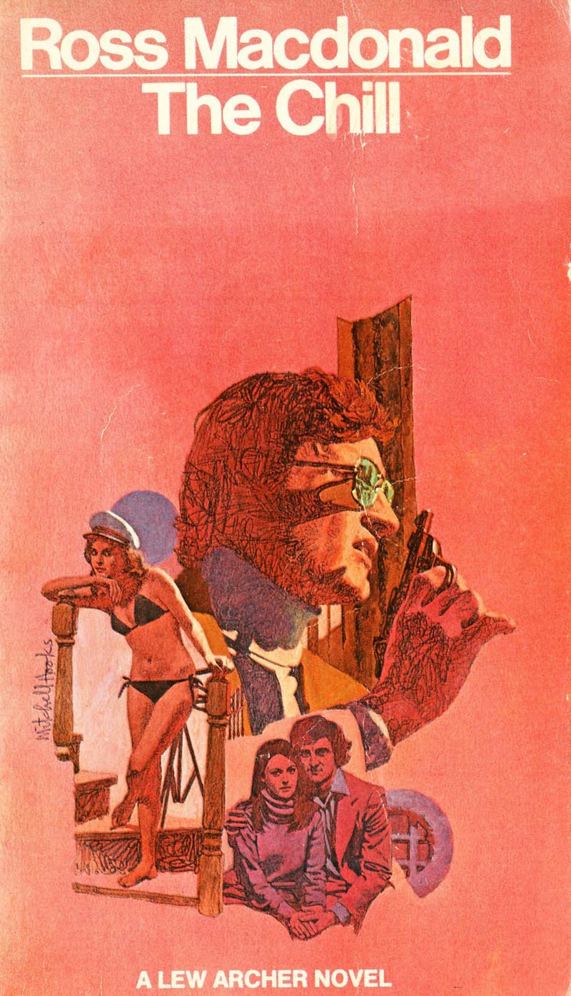
GL: What was your personal favourite of all the covers you've done and why?
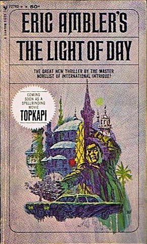
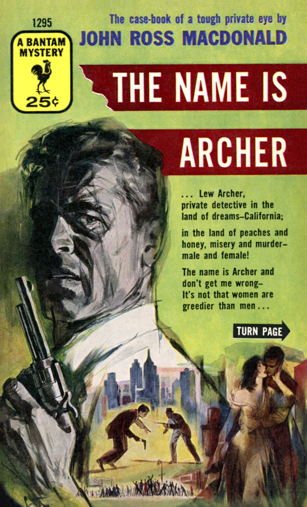
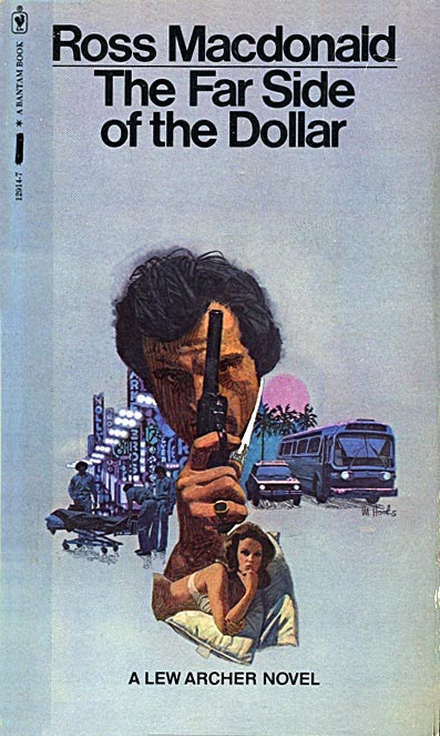
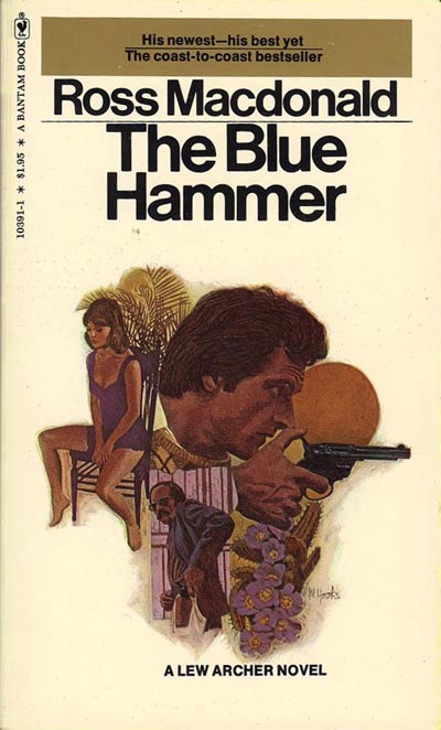
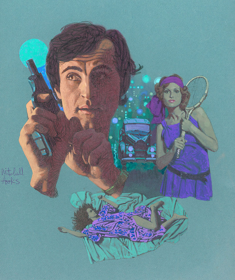
MH: I think rather than a single cover, there are two series: one you've mentioned, the Lew Archer series, because the format was so strong and they made such a nice group. But there was another series I did for Bantam of Eric Ambler books, and there were five or six of those. I think they were a little more sophisticated in concept and design. I think they would be my favorites.
GL: Then there's the opposite question. Are there any you hated?
MH: Oh, there are a lot. The trouble is, I don't remember titles too well.
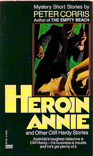
GL: I know you did a series of covers in the late sixties for the Superspade books.
MH: Well, I didn't mind those because they were kind of fun. They came out just at the time of black awareness and that was the spirit those books had, and I just tried to put that in those covers. They were kind of fun.

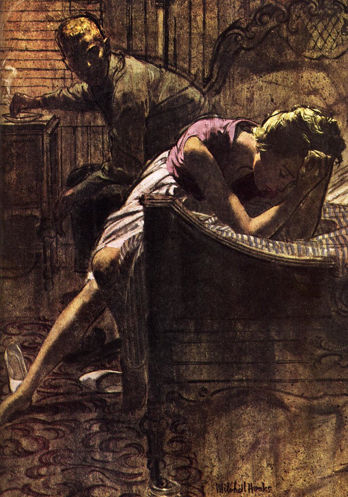
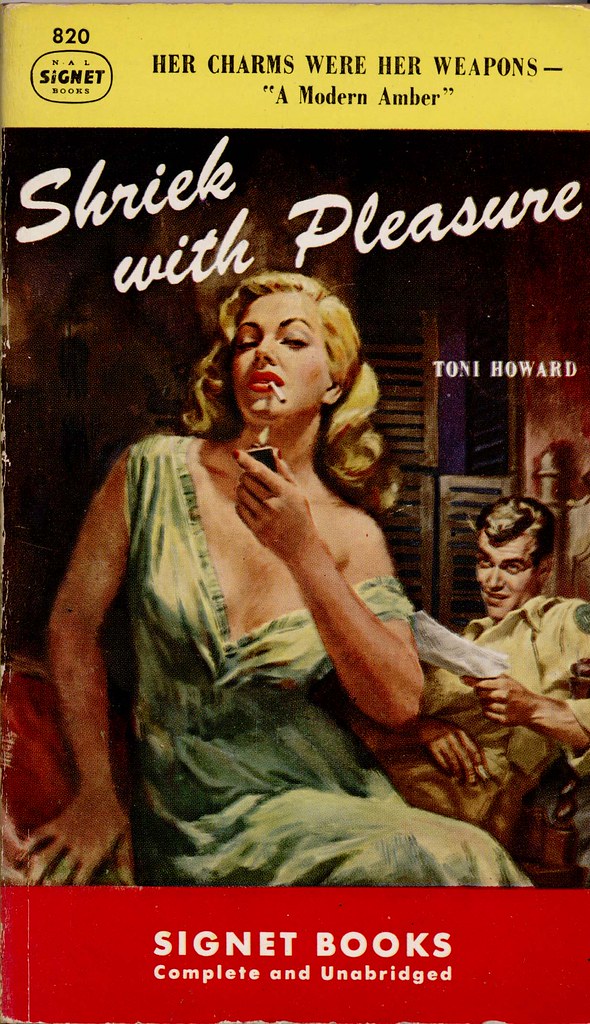
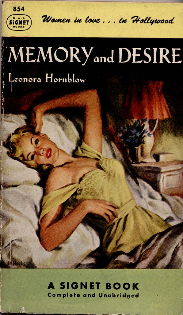
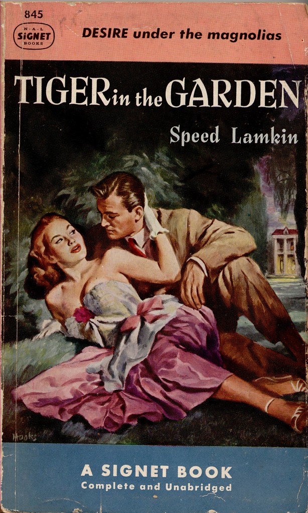
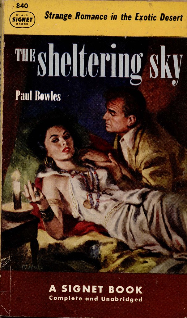
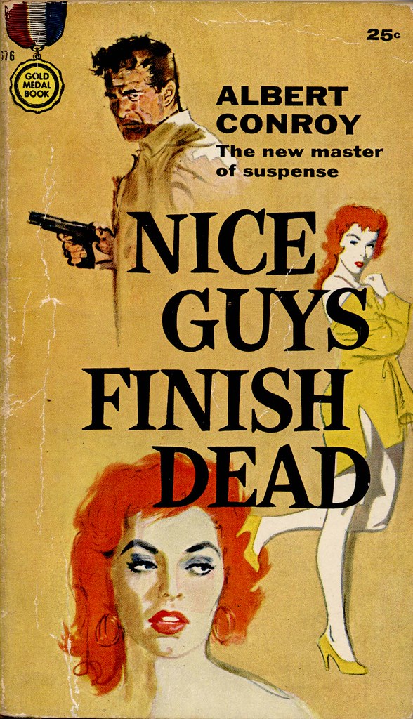
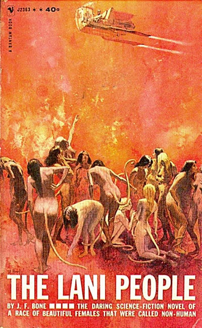
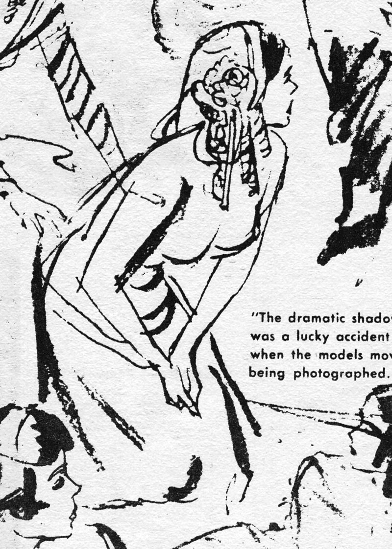
MH: The covers that I liked the least were the kind I talked about earlier, especially in the fifties and sixties, when we had to force sex on every cover.
MH: It got so I just hated that. It was forced so much. It wasn't fun and it didn't fit the books.

MH: So I would say, rather than a specific book, it was that kind of thing I hated.
* Concluded tomorrow
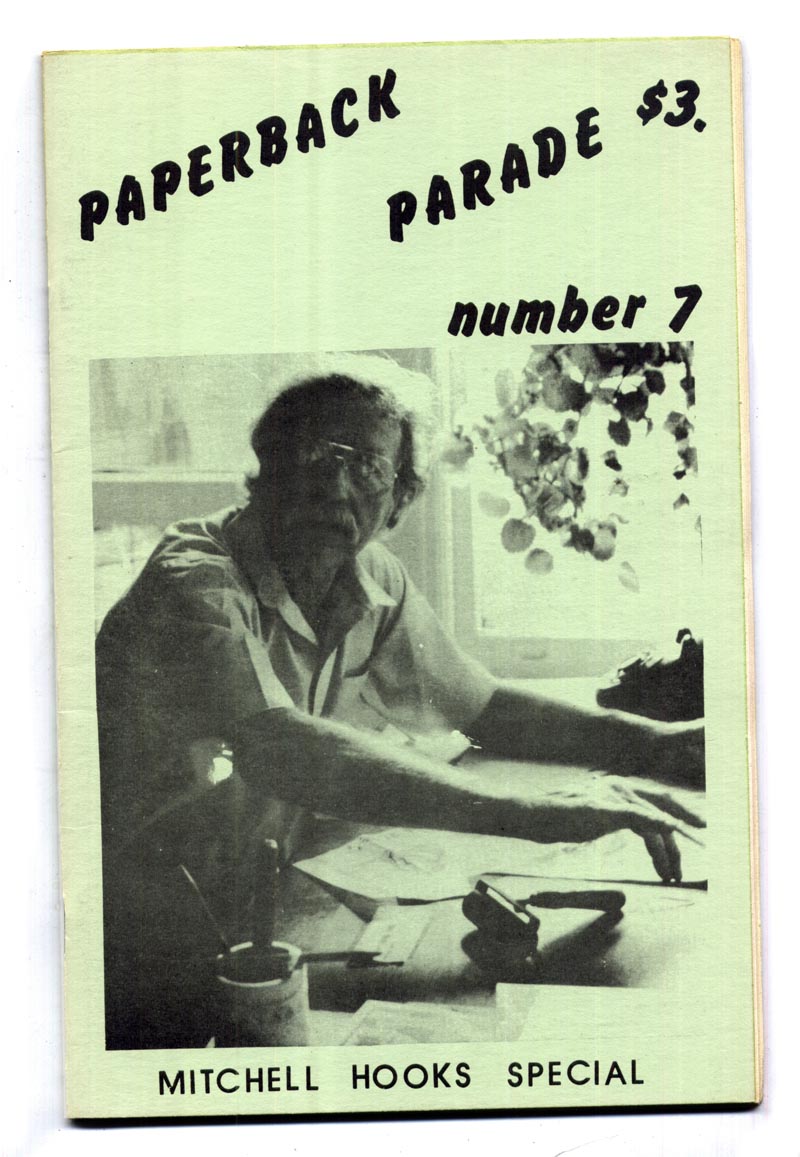
* The text above is copyright 1988 & 2013 by Gary Lovisi and originally appeared in Paperback Parade #7 (Gryphon Books)
Gary's website: www.gryphonbooks.com
* Thanks to UK Vintage for the use of his Mitchell Hooks paperback cover scans in today's post.


![1956[1969] _ Popular Library 60-2379 _ Mitchell Hooks](http://farm6.staticflickr.com/5308/5773286304_a75cdb02eb_b.jpg)