Wednesday, January 30, 2013

Murray Tinkelman on Herb Lubalin: "... he was a genius."

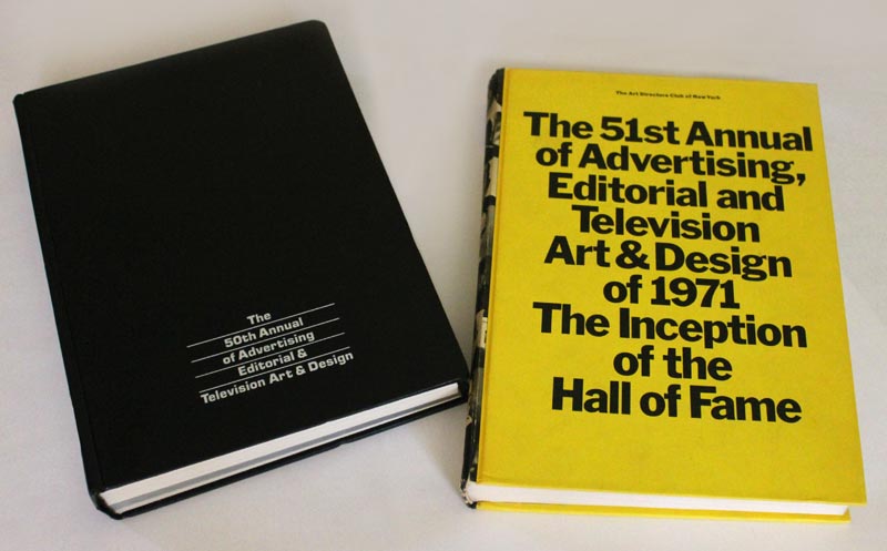
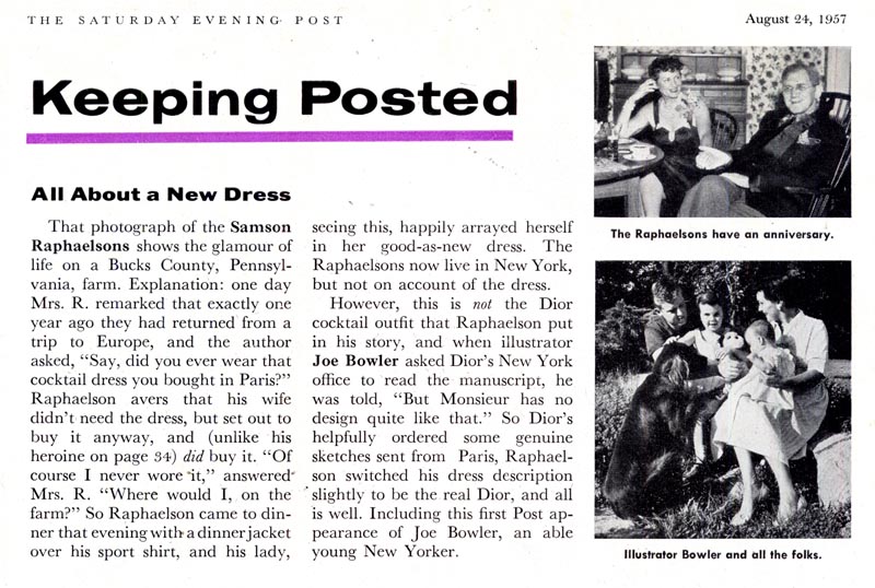
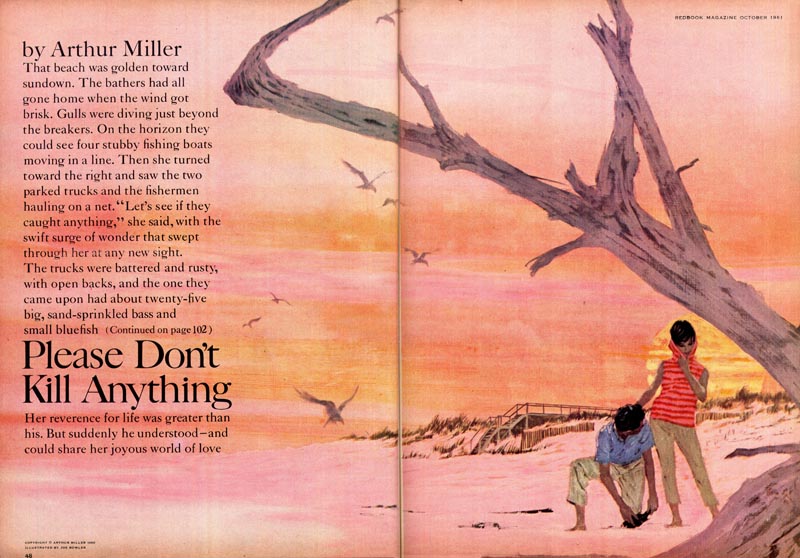
My wife got me the 1970 and '71 NYAD Annuals for Christmas and that lead me to ask Murray Tinkelman to clarify a few things about trends in illustration and graphic design at the time. Yesterday Murray explained how Pushpin Studios influenced the industry during that period. Today we discuss the role of the typographer during the same period... ~ Leif Peng


LP: From looking through these books and from flipping through magazines from the early 1970s, it seems like often the concept or solution to almost any ad or design was entirely typographic. Can you tell me a little about Herb Lubalin? I've heard his name for a very long time - I see it again and again in these early 1970s NYAD Annuals - and I'm wondering if he was one of the people who shifted the visual landscape in commercial art.

Lubalin02

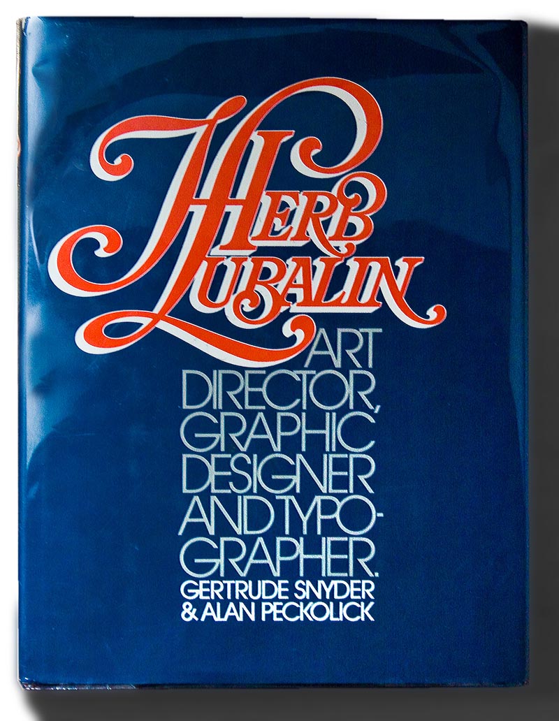
MT: Absolutely. He was an "illustrator with type."

Beards

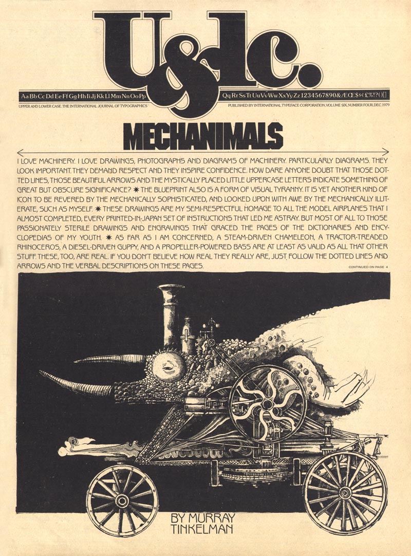
Herb was the most talented and best graphic designer I ever worked for. Whether it was when he was with U&lc (Upper & Lower Case) or some other client, he made every job I ever did for him look infinitely better after he got through with it.

(Below, the December 1979 issue of U&lc, art by Murray Tinkelman, design by Herb Lubalin)
Tinkelman51

MT: He would make additions - not on my art, but in the typography and design - he was a genius; a true, true genius.

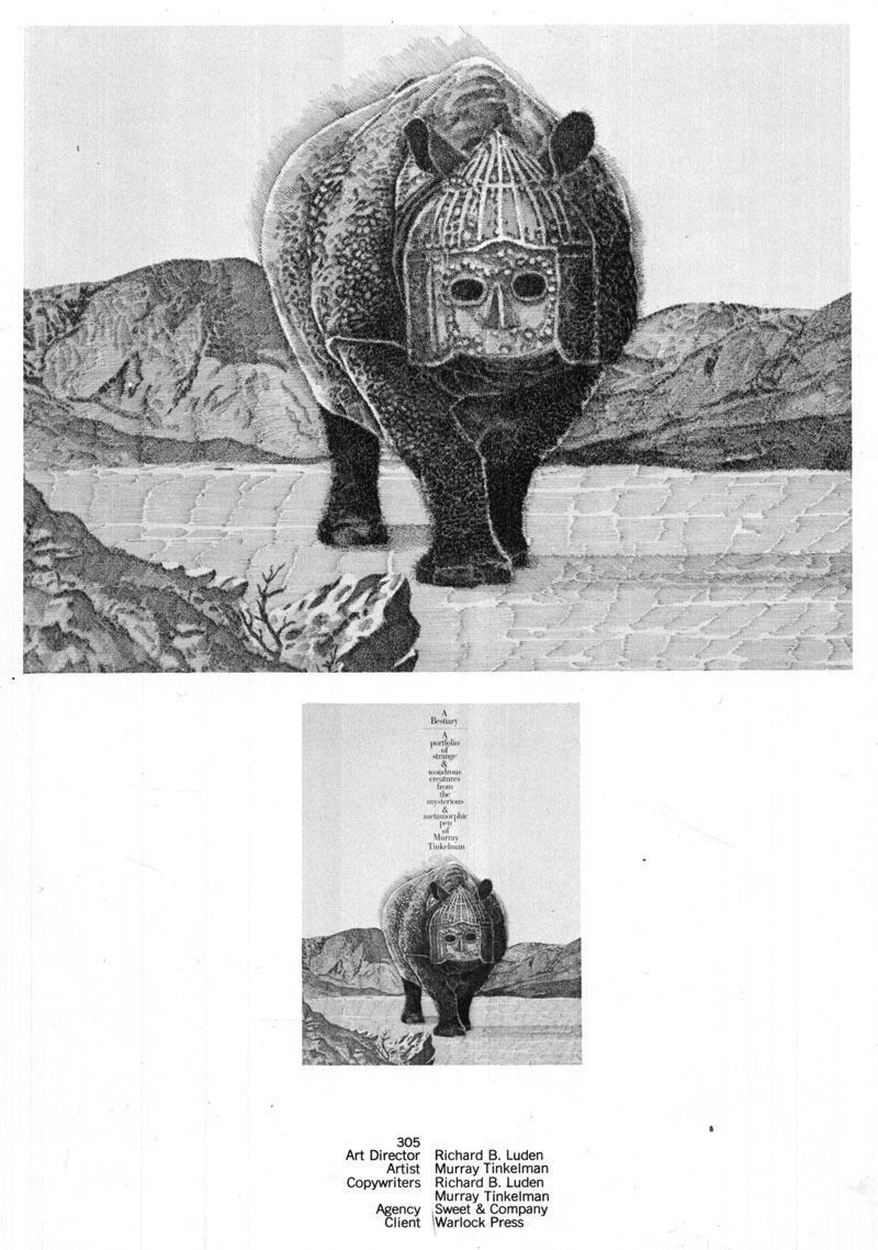
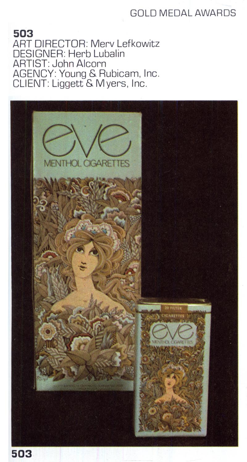
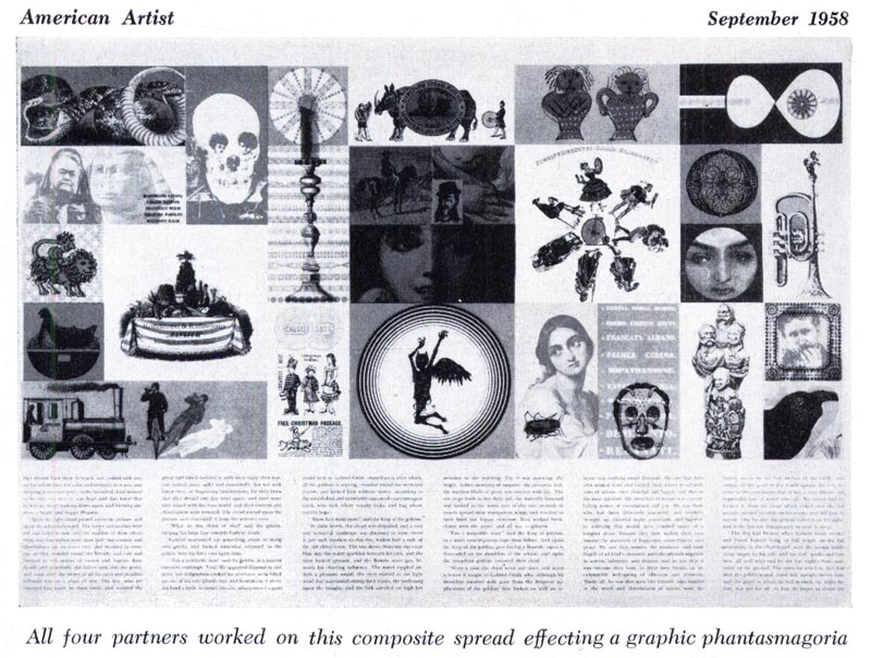
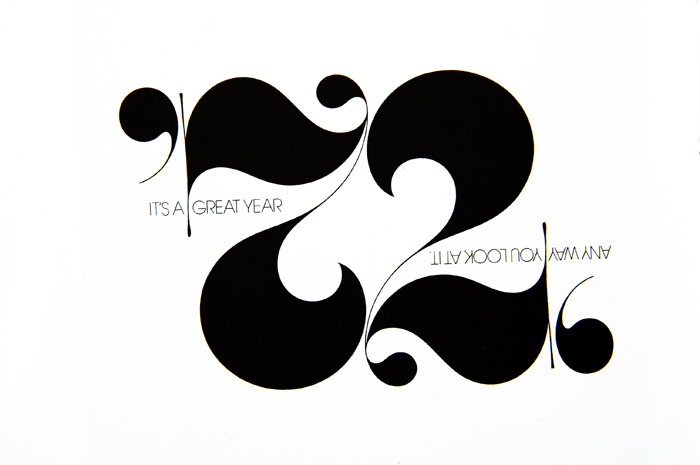
(Below, from the 50th NYAD Annual, design & art direction by Herb Lubalin, 1970)
Lubalin01

LP: And the thing is, Murray, I can't help but think that the beauty of working with type - in the manner Herb Lubalin did - is lost on most of today's designers. Do you know what I mean?

MT: Yes I do.

LP: Like, I don't think there's that same appreciation for how beautiful and vital letterforms are, the way it was when he and his fellow designers... When I look at that early '70s period in graphic arts, that typifies that period; that loving treatment of typography at that time.

Lubalin '72

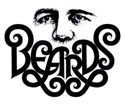
MT: Yes it does. And the use of hand lettering. Tom Carnase did a lot of the hand lettering for Lubalin.

(Below, from the 50th NYAD Annual, hand lettering by Tom Carnase, design & art direction by Herb Lubalin, 1970)
Lubalin03

LP: Right.

MT: It was, in those ways, really a golden era and I was lucky to have come on the scene at that time and work with Herb Lubalin. You know, in one of our earlier conversations I mentioned that breakthrough I had at the Saturday Evening Post... and Herb Lubalin was acting art director at the Post when that piece got published.

LP: Oh my gosh!

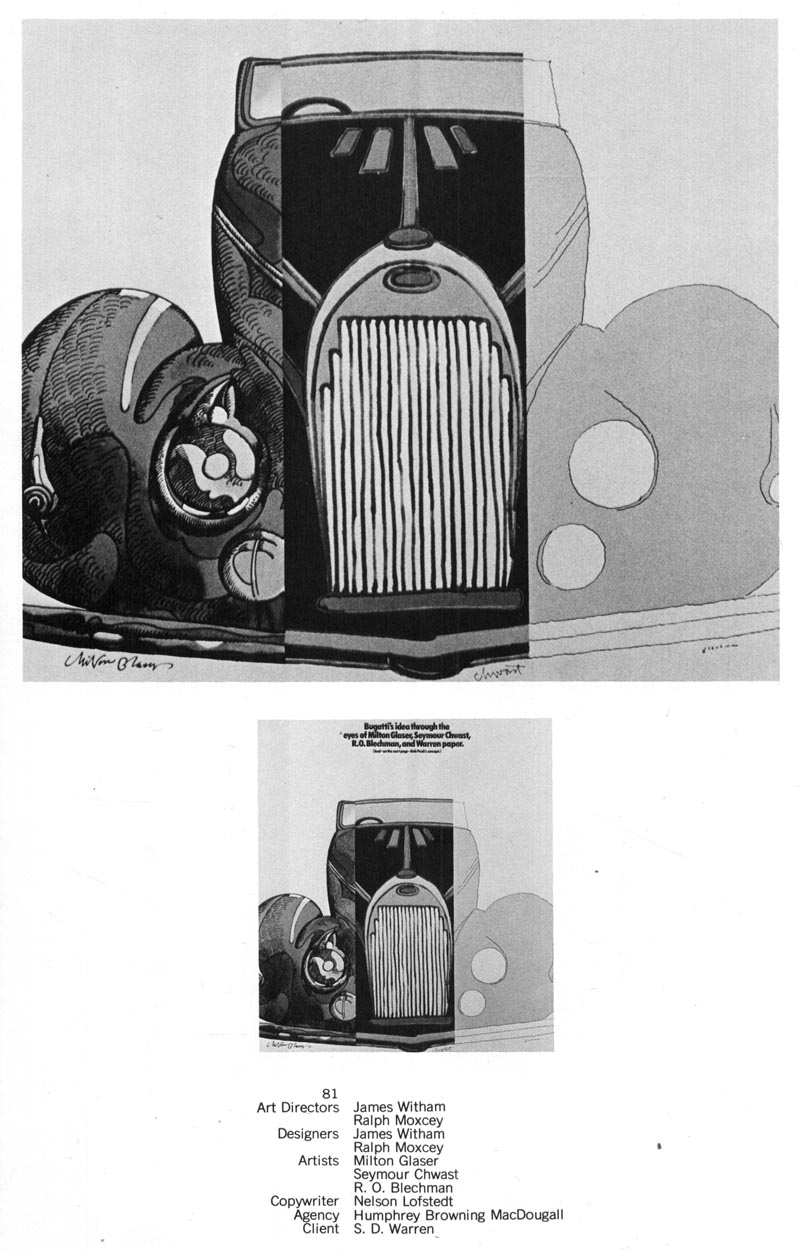
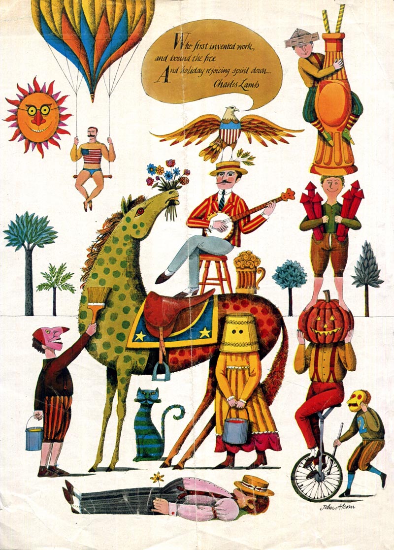
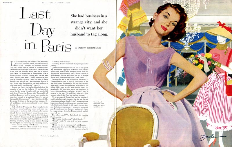
(Below, Saturday Evening Post DPS by Murray Tinkelman, October 1961, art direction by Herb Lubalin)
Tinkelman28

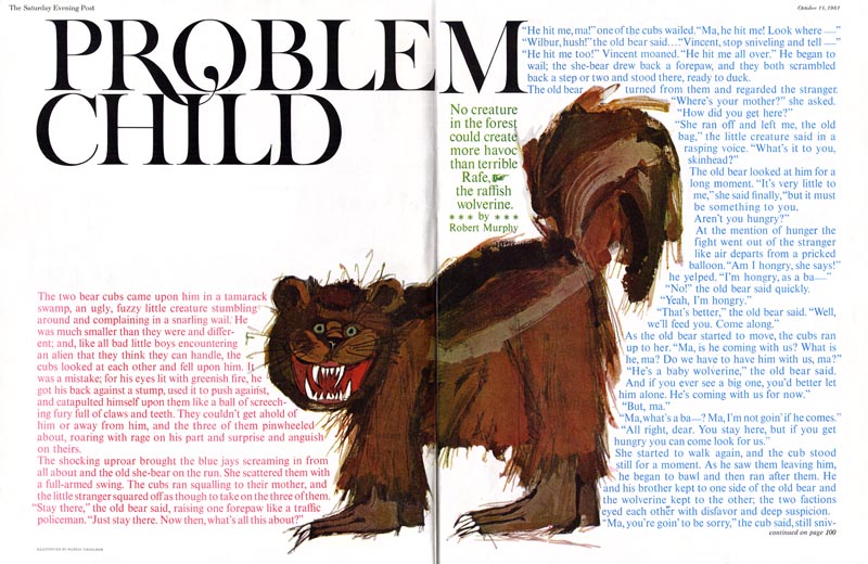
MT: Yeah. I did a painting, 18" square of this wolverine and it had a tree in the background and a little bear climbing the tree and a little collage butterfly, a pink sky... and when I picked up the magazine at a newsstand; seeing it printed for the first time ever, I thought, "My God! Where's my piece?! It's been destroyed!" And then it took about ten seconds for me to realize it was so much better now, with all that crap removed and his incredible typography surrounding what was left of my painting. (Murray chuckles)

That got in every show; it got in the Type Directors' Show (not because of my painting, because of Herb's type), it got into the Art Directors' Show (because of Herb's art direction), it got into the Illustrators' Show (that, at least, was because of my painting).

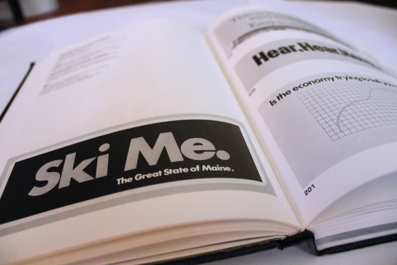
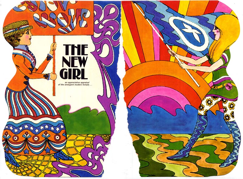
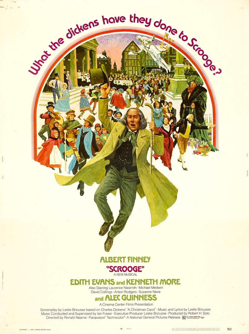
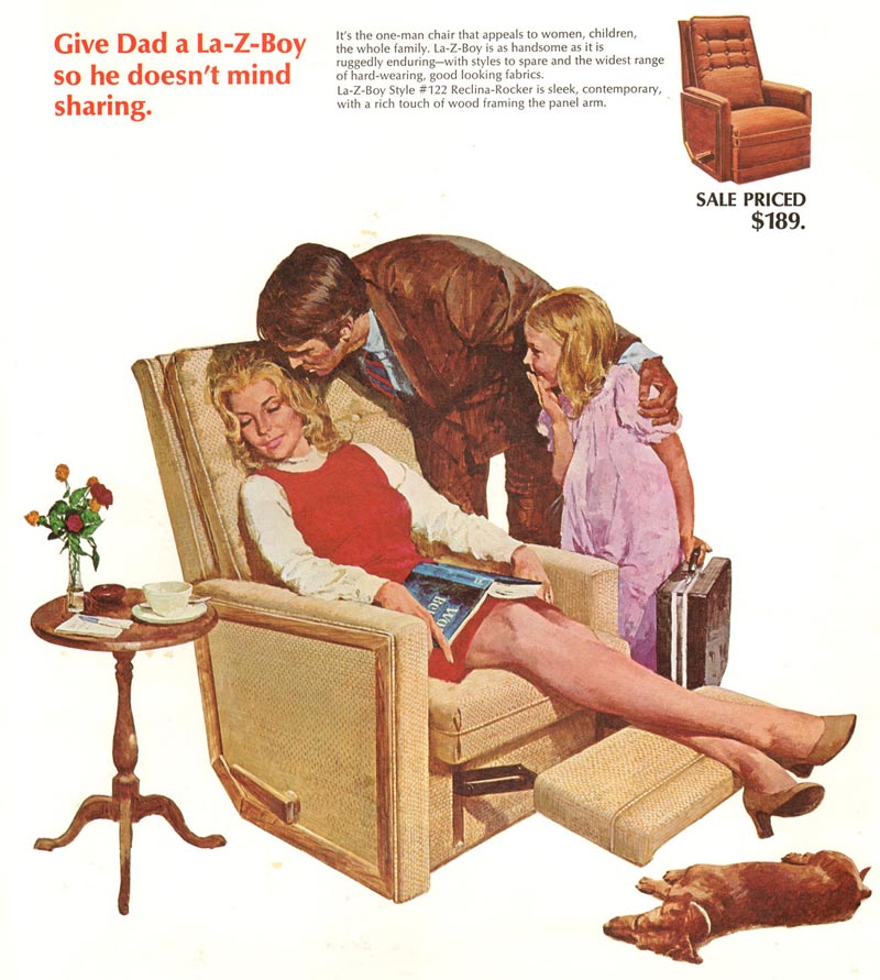
LP: Although this early '70s ad series below isn't by Herb Lubalin, I find it demonstrates in the most spectacular fashion the effectiveness of strong typography as an integral element in a powerful graphic design.

09 Audi

05 Audi

02 Audi

01 Audi

03 Audi

04 Audi

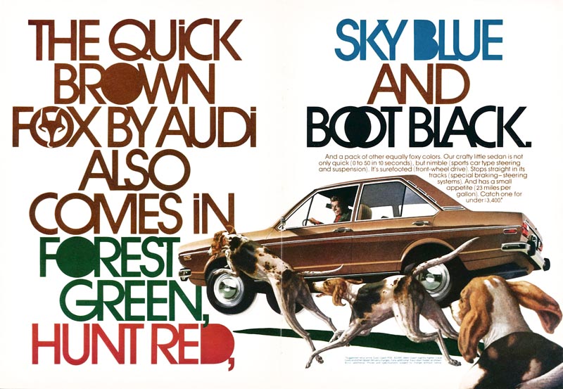
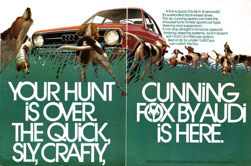
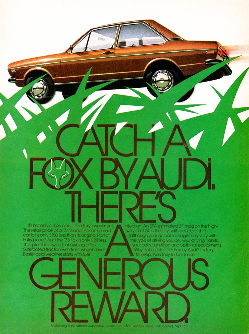
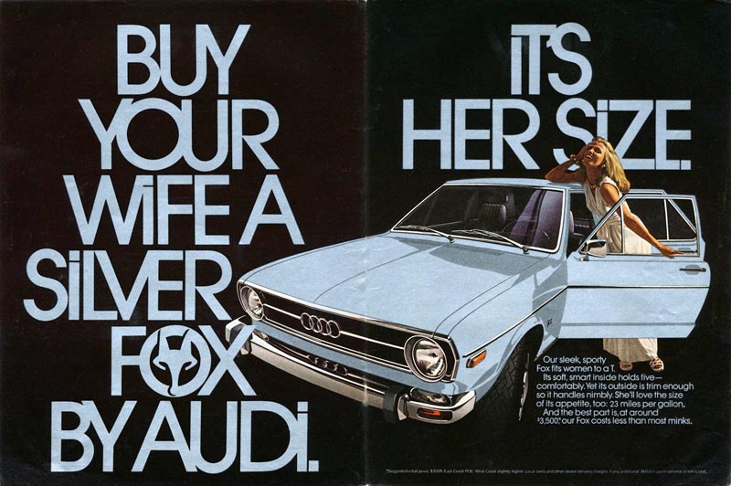
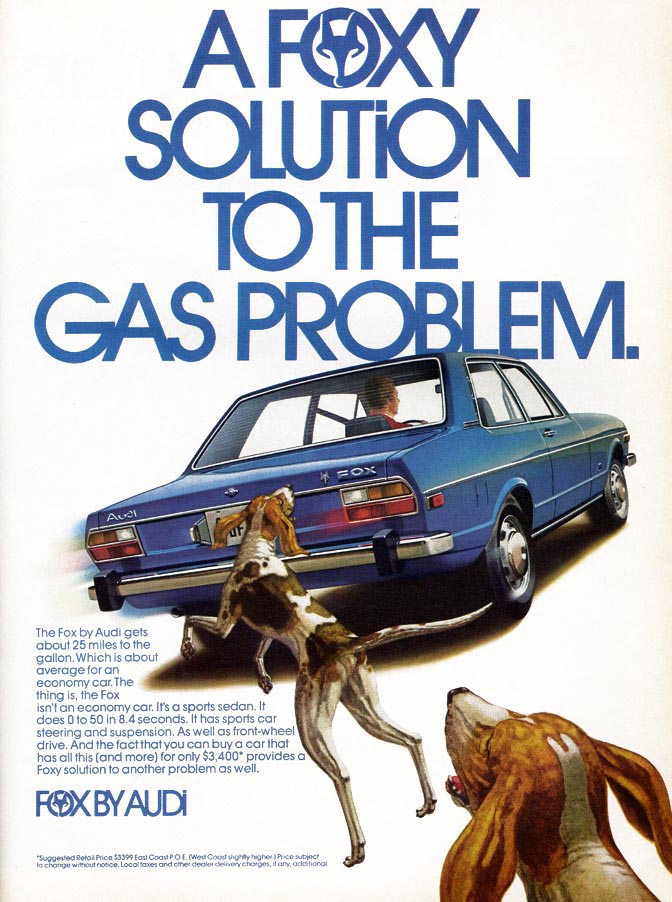
LP: Lubalin said "You can do a good ad without good typography but you can't do a great ad without good typography." I think this series proves his point.


Continued tomorrow

* Murray Tinkelman has won Gold Medals from The Society of Illustrators, The New York Art Directors Club and The Society of Publication Designers. He has over 200 Awards of Merit from The Society of Illustrators. Murray is the director of Hartford Art School’s limited-residency Master of Fine Arts in Illustration program.

* Many thanks to Tony Gleeson for providing the scans of the Audi Fox ad series

Monday, January 28, 2013

Murray Tinkelman Enlightens Me about the '70s

I am such a nerd that I get all excited about receiving old advertising industry books that other, saner people are throwing away.

So just imagine my delight when my darling wife got me the 1970 and '71 New York Art Directors Annuals last Christmas. Woohoo! I was thrilled!

NYADAnnuals01

These two books were quite a revelation. For one thing, they are entirely devoid of anything remotely resembling traditional narrative illustration.

Among all the hundreds and hundreds of pages of "the best in advertising and editorial art and design" in 1970 and '71 there is not even a hint of Bernie Fuchs or Bob Peak or any other illustrators who dominated the commercial art business during the '50s and '60s.

NYADAnnuals04

What happened? Where did all the celebrated illustrators of the mid-century - the Al Parkers, the Joe Bowlers - go?

(Hint: the men below had something to do with it)
Glaser05

I needed someone really knowledgeable about the history of illustration to explain it to me, so I called my friend, Murray Tinkelman. After all, Murray was on the front lines as it all unfolded.

Tinkelman57

And for over thirty years now he's been teaching it at the university level.

Tinkelman56

(Interesting aside: of all the esteemed artists who once worked at New York's mighty Cooper Studio back in the '50s and early '60s, Murray is the only one whose work made it into the 1971 AD Annual -- both the pieces above were included.)


So based on my observation flipping through these two volumes, the kind of work showcased in the 1970 and '71 NYAD annuals can broadly fit into one of three categories:

type-only designs...

NYADAnnuals03

... designs utilizing photography...

NYADAnnuals02

... and designs either by - or influenced by - Pushpin Studios.

Pushpin02


When I posed this observation to Murray he said, "You're right - but they weren't the only ones."

"There were a bunch designer/art director/illustrators and that was all happening around the late '50s and early '60s - and that went well into the 1970s - but Pushpin was the "big dog."

Glaser06

Murray continued, "They started in the early '50s with four or five guys; Milton Glaser, Edward Sorel, Seymour Chwast and Reynold Ruffins.

(Below, photo from American Artist magazine, 1958)
Pushpin01

"Then, through the years, they took on other people of a like mind: Isodore Seltzer, Barry Zaid and John Alcorn, for instance."

(Below, photo from the 1969 Pushpin Studios Exhibit booklet)
Pushpin05

"In many ways," said Murray, "I liked John Alcorn best. The piece he did for Eve Cigarettes?"

Unknown1101

"Wow, what a great, great piece that was."

(Below, John Alcorn, New York Art Directors Annual, 1970)
Alcorn02

"I don't know how influential Alcorn was on other people, but he was terribly influential on me.

(Below, John Alcorn, publication and date unknown)
Alcorn03

"There was a spread he did one Christmas for McCall's that was a series of panels that was one of the greatest pieces of decorative illustration I've ever seen."

(Below, John Alcorn DPS from McCall's, December 1962)
Alcorn01.jpg

Trying to get at the roots of the early '70s look - the flat, graphic style, the bright colours, the simplification of shape and a certain undeniable 'cartooniness', a tip of the hat to Art Deco and Art Nouveau... all of this and more... I asked Murray to enlighten me further.

Unknown1157

"That was Pushpin," he stated matter-of-factly. "Pushpin used the whole history of graphic design as a palette. One day they'd be Victorian and the next day they'd be Art Deco and then Art Nouveau... and they absorbed all of these "isms" - all of these design styles - into their own lexicon."

Pushpin04

But what about these other designer/art director/illustrators who also helped shape the changing 1970s graphic arts landscape?

I asked Murray for his thoughts on Peter Max; about how responsible Max was for steering the "Pop Art" trend that seems to have overwhelmed illustration in the late '60s.

Max03

He replied, "Peter Max was a huge player. I have to blush when I say it now, because I show his work when I talk about the 1960s. I loved his stuff in the 1960s. He was the most ubiquitous image maker of the period.

(Below, Peter Max Life magazine cover, 1969)
Max01

Murray quipped, "His work was on everything but toilet paper."

Continued tomorrow

* Murray Tinkelman has won Gold Medals from The Society of Illustrators, The New York Art Directors Club and The Society of Publication Designers. He has over 200 Awards of Merit from The Society of Illustrators. Murray is the director of Hartford Art School’s limited-residency Master of Fine Arts in Illustration program.

Thursday, January 24, 2013

Joe Bowler Interview, Part 6: From Illustration to Portrait Painting.

Last week, in Parts 1, 2 and 3 of this interview, Joe described the early years of his life, the beginning of his professional career, and his days at the Charles E. Cooper studio. In Part 4 and Part 5 we discussed some of Joe's major influences and his art process. In this concluding instalment of my interview with Joe Bowler, the artist talks about shifting gears from commercial art to portrait painting... ~ Leif Peng


LP: You mentioned that, because you'd worked for Collier's, you really weren't allowed to work for the Saturday Evening Post - that there was a sort of unwritten rule. So after Collier's folded, (SEP Art Director) Frank Kilker finally began giving you work...

(Below, Joe Bowler's first illustration for the SEP, August 1957)
Bowler67

JB: (Joe chuckles) Yeah... Kilker was a great character. He'd come over every Friday with his little briefcase with a whole bunch of scripts in it. And we'd all go out to lunch and get bombed - they were all martini drinkers - and then he'd pass out these scripts for Coby and Joe and when I could finally get with them, I'd get mine (he chuckles again). These scripts always had a little yellow typewritten paper that gave you the sentence - the actual sentence - that was to be illustrated. And that was it!

(Below, from the back page of that same issue, a photo of Joe and his family and a mention that this is the first appearance of Joe Bowler, "an able young New Yorker.")
Bowler68.sm

JB: There wasn't any of this reading the script and finding out for yourself, which was how it was most of the time. At the Post they really wanted this particular thing in the magazine. So you did it.

LP: So that wasn't typical of other magazines?

JB: No. Most of the time they'd give you the script and you'd read it and - in the end, I don't think they even talked to me about it. They'd just give me a script and I knew what they wanted.

(Below, Joe Bowler DPS from Redbook, October 1961)
Bowler48

JB: If it was anything that was a little off my regular thing I would do some studies and show them, but for the most part it was my choice. The Post was the only one that really got very specific.

(Below, Joe Bowler DPS from Redbook, October 1961)
Bowler47

LP: Did you ever do any paperback covers?

JB: I did one or two. I think one of the art directors called and I said, "Yeah, I'll try one." But I think I only did one or two. And that was right at the end [of Joe's illustration career] so I don't remember much about it.

LP: What about movie posters? Did you ever do any of those?

JB: Yeah. Before I came down here, Joe Mendola, who was an art rep, got ahold of me and talked me into him representing me. He said, "Oh, you'll make a million bucks on these Hollywood studio movie posters." So I said, "Ok, I'd like a million bucks." And I started to do one and I'll tell you, you really had to do two or three major comprehensives - which means "finished paintings", practically - and even then they would say "No, I don't like this, I don't like that." So very rarely did I make any money on those.

I remember they wanted me to do "Scrooge" and they said "But we want to do it differently; we want to do a portrait of Scrooge coming right at you."

Bowler70.detail02

So I got all excited about doing this painting of Scrooge. So I painted a study, and they had a big long conversation about it, and I told Mendola, "They're not gonna buy this thing. They're gonna come up with the same old crap that they always do." And they did!

Bowler70.detail01

I ended up doing this painting of Scrooge with the whole damn town dancing around him - oh, it was just terrible! (We both laugh)

Bowler70

JB: That's one of the reasons I came south, because really, nothing, nothing Joe Mendola promised would happen came true. And of course he was the type of guy who would say, "Oh, you can just knock this out, Joe. Just knock this out." Until finally Marilyn said to him (emphatically) "Joe does not knock anything out!"

(We both laugh)

LP: Now, you talk about moving south, and certainly a lot of illustrators were doing that - moving to the south west and getting into doing cowboy paintings, western art. Guys like Frank McCarthy, Ken Riley, Howard Terpning... did you ever consider doing that?

JB: No. No. I had taken on a big account; twenty-one paintings for La-Z-Boy Chairs and I'd done fourteen, and I couldn't even stomach the idea of doing seven more. (we both laugh) And the art director couldn't believe it, he says, "Joe, this is the biggest account any artist has had for years! What are you talking about?" So I said, "Look, if I can get somebody to do the other seven of these that you'll ok, would you feel better?" So not knowing him personally, but knowing who he was, I called Howard Terpning! I said, "Howard, it's Joe Bowler. I've done fourteen of these ads and there are seven more and I've taken most of the photographs, so how would you like that?" Well, (Joe chuckles) I don't think I'd hung up the phone and he was pulling into my driveway. So I gave him those seven paintings, which he did a great job on. And it wasn't more than a year that I was down south and not much longer that he was out west.

(Below, Howard Terpning illustration for a La-Z-Boy ad, 1971)
Terpning16

LP: So was that basically the end of your commercial art career? Around the early '70s?

JB: Well, what happened was, Good Housekeeping was always after me. And I started to get these portraits, and the portraits were paying a lot more than illustrations.

(Below, Joe painting a portrait in his Hilton Head Island studio, 1973)
Bowler84

And I told the art director that I couldn't do them (illustrations), but I could send pictures of these portraits. So all through the '70s, I would do a portrait of a child and send an Ektachrome to Good Housekeeping and they would use it.

Bowler62

So I was in Good Housekeeping all through the '70s and people thought I was still doing illustration, but I wasn't. I was selling the portrait originals, getting the ok from the clients, of course, and then selling the Ektachromes to Good Housekeeping.

LP: Oohh, I see.

JB: In fact, one time I did this painting of just a beautiful girl's head looking right at the viewer. I actually just made her up out of several models. And at the time, Good Housekeeping had this monthly poll asking readers what they liked the best in the magazine, what made them stop and read something and how much did they read and so on. And they got the best response ever to the painting I did of that girl's head!

(Below, portrait study of Betty Crocker by Joe Bowler, year unknown)
Bowler85

JB: So from that point on, if I just had a moment I would just paint a beautiful girl's head and sell it to Good Housekeeping. And Coby [Whitmore] did the same thing and Joe [DeMers] did the same thing! And they would just buy them because they got such a good response from the readership.

(Below, a recent example of Joe Bowler's portrait paintings, 2007)
Bowler82

LP: So once you moved down south, did the portrait painting commissions come very regularly right away?

JB: Well, yeah. I had two manuscripts left over when I moved down here and once I finished those up, I was devoted entirely to going after the portrait business. Never did much advertising at all. It just seemed to happen. And then the big thing happened in the winter of 1982: there's a magazine called "Southern Accents" that was still fairly new at the time. And they had been doing a monthly article about southern artists. And a friend of mine who was Andrew Wyeth's agent got ahold of the editor and said, "You gotta put Joe's work in there." So she did. She gave me about ten pages of portraits.

(Below, four pages from the 1982 article in Southern Accents)
Bowler86

JB: Well, we got over 1,800 requests for portraits! We told the magazine after we got about 800 and they couldn't believe it.

Bowler87

JB: That magazine became the place that every portrait painter put ads in.

Bowler88

JB: And that put me in business for the rest of my life!

Bowler89

LP: Wow. Isn't that incredible. And as a matter of fact, I understand you have a client coming by this afternoon...

JB: Yeah, this is part of a family I've done for years and years. The mother of this child that I'm going to paint is a gal that I painted when she was two years old!

LP: Oh my gosh.

(Below, a recent example of Joe Bowler's portrait paintings, year unknown)
Bowler81

JB: And then I painted her again when she was married and had two children, so I did three of them... now this is another son and she's having that done. This is a family that has bought probably in the neighbourhood of, oh, thirty five portraits of kids. It's unbelievable.

(Below, a recent example of Joe Bowler's portrait paintings, 2007)
Bowler80

LP: It really is! I mean I knew your career had taken you into portrait painting but I really had no idea you had that kind of relationship with your clients.

JB: Oh yeah. In fact, when they get that way, I don't even call them clients - I call them patrons!

(We both laugh)

* My thanks to Joe Bowler for spending so much time talking with me - nearly four hours over two separate occasions! - to ensure all of my questions were answered. Thanks as well to Joe's daughter, Jolyn, for assisting in coordinating our schedules so her dad would be available at my convenience. If you enjoyed this interview, blame Murray Tinkelman. Murray has been gently prodding me to phone Joe Bowler for at least two years, something I kept meaning to do and putting off, and I am eternally grateful to Murray for his persistance. Thanks Murray!

* Thanks also to Lawrence Levine for providing scans of the article in Southern Accents magazine.

* To see recent works by the artist, visit Joe Bowler's website