Friday, August 31, 2012

Ric Grasso: An Artist for Everywoman

Everywoman magazine, a slim second-tier woman's magazine of the 1950s, employed an interesting assortment of illustrators whose work rarely (if ever) appeared in other publications. We've looked at one previously; H.B. Vestal, another was the subject of my last post; Gustav Rehberger (although Rehberger did regularly work for both Coronet and Esquire as well as Everywoman). Still another was an artist named Ric Grasso.

Grasso05

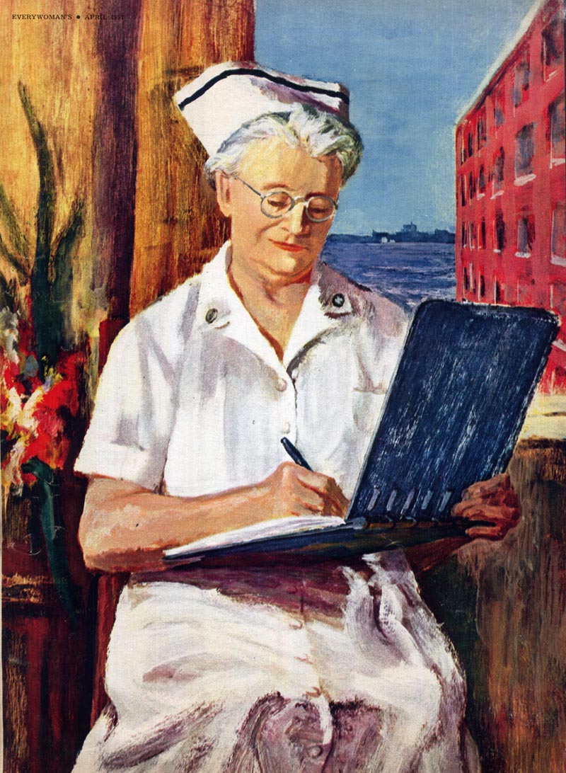
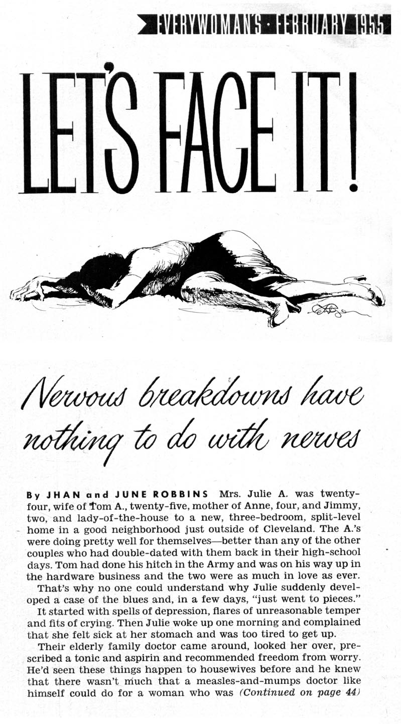
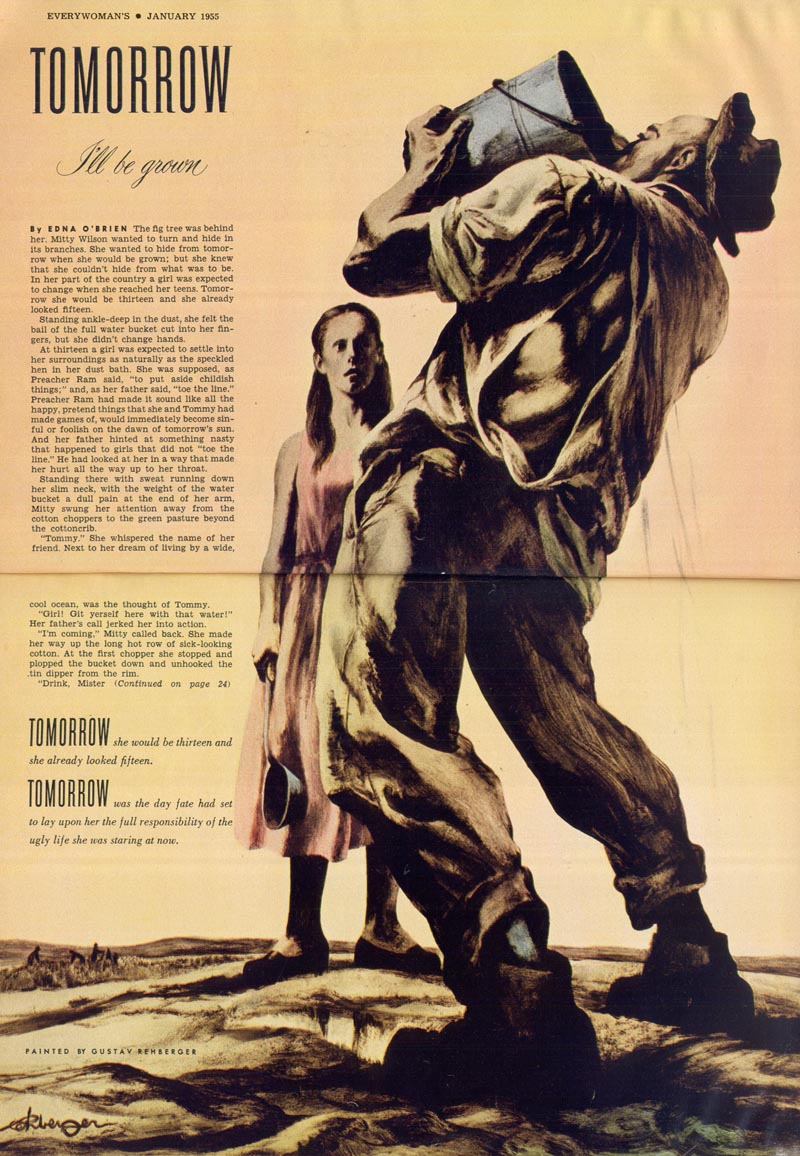
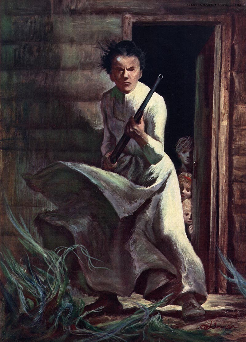
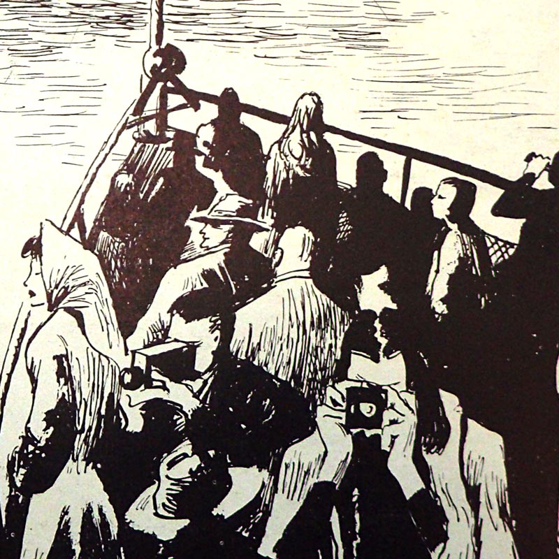
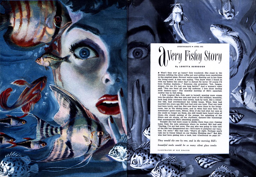
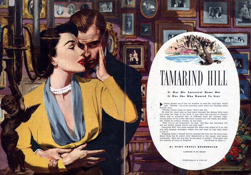
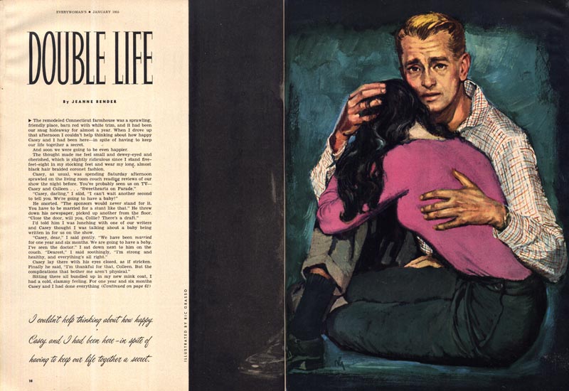
Grasso was a proficient painter of story illustrations whose work appeared regularly in Everywoman throughout the 1950s...

Grasso02.jpg

...but rarely elsewhere. This one Grasso spread (below) from Family Circle magazine is the only work of his I've seen in another publication.

Grasso11

A brief paragraph in the front of one mid-'50s issue both confirms Grasso's relationship with Everywoman magazine and provides the only biographical information I've ever seen on this artist.

Grasso03

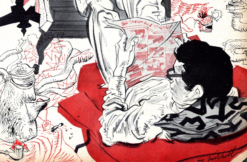
Grasso was an inventive illustrator, often employing clever graphical devices...

Grasso10

... or experimenting with technique to give his illustrations more visual punch.

Grasso04

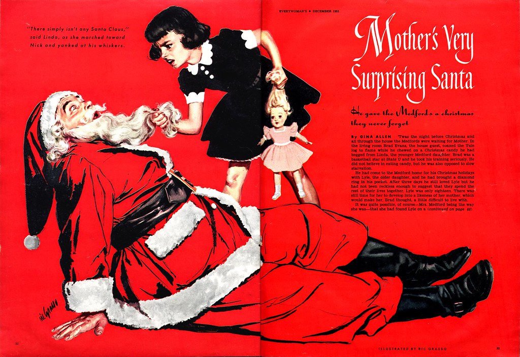
The art director at Everywoman magazine was clearly on board for some fun; agreeing for instance to allow Grasso to play out this amusing scenario...

Grasso07

... over two spreads...

Grasso08

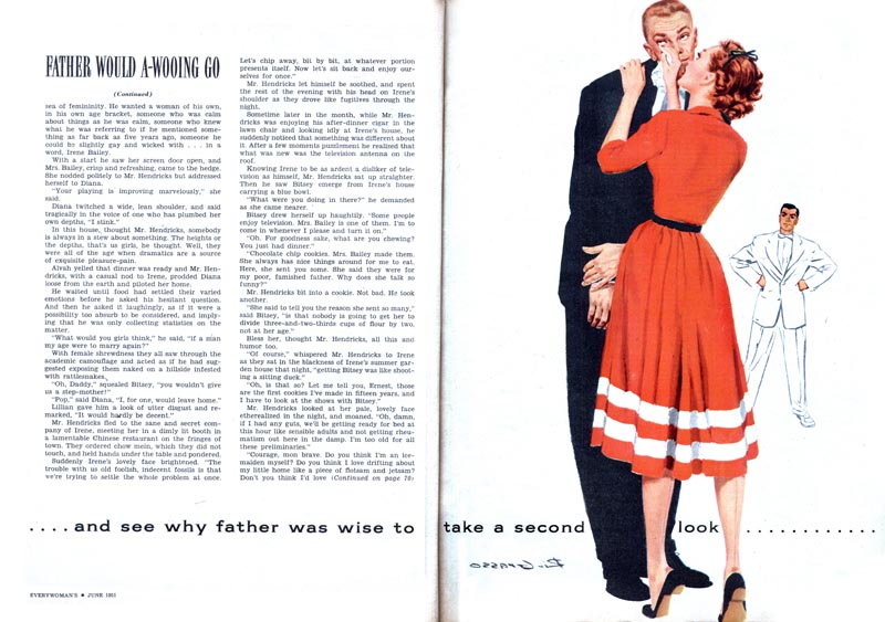
... when a different single spread solution would likely have sufficed.

Based on the examples I've seen I'm pretty sure Ric Grasso was an admirer of Al Parker's work (as was just about every illustrator of those days). His use of flat, reductive graphics mixed with classical rendering strongly suggests he aspired to achieve 'the Parker effect' in his work.

Grasso01

But in the competitive market of magazine illustration of the 1950s, being this good...

Grasso06

... did not necessarily open doors to assignments from first rate magazines like Collier's, Ladies Home Journal or the Saturday Evening Post.

Grasso09

Let's hope the work he did for Everywoman brought him both creative and monetary satisfaction. What kind of illustration work occupied the rest of his time - and what ultimately became of Ric Grasso - remains unknown.

Monday, August 27, 2012

Gustav Rehberger: "He speaks softly but he paints with a big stick"

A few years ago I wrote extensively about Gustav Rehberger's career.

Since that time I've kept in touch with Pamela Demme, Rehberger's widow, who last week sent me some interesting new (to me) examples of her late husband's work.

Rehberger60

Before we look at those pieces however, here are a few Rehberger illustrations I still hadn't scanned from some mid-'50s issues of Everywoman magazine I own.

Rehberger57

Fortuitously, one of those issues included a capsule biography and photo of the artist...

Rehberger59

Rehberger61

Rehberger58

I love how Rehberger is described as "painting with a big stick." How true! I have never found Rehberger's work to be pretty - it's appeal for me is in its energetic, unvarnished honesty.

Rehberger62

Rehberger's ink line drawings have an appeal of their own - reminiscent of Ben Stahl's work.

Rehberger63.detail01

And that finally brings us to the art Pamela recently brought to my attention:

“NEW YORK by Rehberger” - 1948 - is a show at the New York Transit Museum of 22 original subway cards (11x14) done in pen and ink in 1948 by Gustav Rehberger.

Rehberger63

He illustrated 22 places of interest around New York: The New Public Library, The Bronx Children’s Zoo, The George Washington Bridge, The Washington Arch, Square Dancing in Manhattan, the statue of Balto, Greeley Square, etc.

Rehberger64

Rehberger65

Rehberger66

Pamela tells me the artworks will be on display until 12/2/2012. There should be more information on the exhibit at the Transit Museum's website, but I wasn't able to locate a specific reference to it. I've contacted the curator and will append this post if I hear anything back.

Friday, August 17, 2012

Where Did You Go, Michael Mitchell?

Back in the late 1990s I stumbled upon a stack of old Maclean's magazines at a used bookstore in Toronto. They were a bargain at a dollar a piece, so I snapped them up. I was intrigued by the artwork in them... big double page spreads by illustrators I'd never heard of, including this one by Michael Mitchell.

Mitchell03

What an interesting, energetic style - I could hardly believe someone had been creating work like this in 1952.

Mitchell03.detail01

Since Maclean's is a Canadian magazine, I assumed Mitchell was a Canadian illustrator (I didn't know back then that Canadian publishers often bought second rights to U.S. illustrations). By chance one day I spotted his name in an ad for an art rep in the 1952 New York AD Annual. Mitchell was surely American - and an illustrator who kept some very prestigious company! Just look at some of the other artists James Monroe Perkins repped in the early '50s:

Perkins01

The next time I encountered a piece by Mitchell it was in a 1952 issue of a stack of vintage Woman's Day magazines I'd just acquired.

Mitchell02

Mitchell's style was enough of a departure from the literal realism so typical of '50s that again, I was impressed he was doing such avante-garde looking work (and getting published).

Mitchell02.detail01

That stack of Woman's Day mags yielded just one other piece by Michael Mitchell.

Mitchell01.detail01

By now I was really in love with his style and kept hoping I'd find more examples... but in all the hundreds of magazines from the '50s and '60s that I've collected over the last few years, I never found another piece by Mitchell - nor did I find any biographical info. For the time being, the door on this artist's story remained closed.

Mitchell01

Until today - when I decided to do a little more sleuthing around the Internet. It turns out that Michael Mitchell was better known as "E. Michael Mitchell" - and he is responsible for one of the most iconic book covers of the 20th century.

Mitchell04

While I wasn't successful in finding a detailed biography, I was able to determine that Mitchell actually did begin his career in Canada, then moved to New York, did illustration, then went into film as a production designer and spent much of his career working in animation. Eventually he became an instructor at CalArts. Mitchell passed away in September 2009. He was 89 years old. From the blogs of his students and fellow faculty, it's clear he was revered as an artist, instructor and as a person and will be greatly missed by those who knew him. I even found this short video on youtube featuring Mitchell and some of his production art:

Thursday, August 16, 2012

Where Did You Go, John Allen?

An illustrator/cartoonist named John Allen is responsible for three double page story spreads in the short run of Parents magazines from 1961 that I recently acquired.

Allen01

I have never seen anything by Allen before in any other magazines from the '50s or '60s. How is that possible? He was terrific!

Allen01.detail01

Maybe Parents magazine was John Allen's "big break." But why then haven't I come across his work elsewhere? It's a mystery...

Allen02

And unfortunately, with a fairly common name like John Allen, doing a search on the Internet proved to be not very helpful.

Allen02.detail01

Hopefully someone out there will be able to fill us in -- it's happened so many times before.

Allen03

For now, this is all we have - here's to the talented John Allen, wherever he went - let's hope it was to a long and successful career!

Allen03.detail01

Monday, August 13, 2012

Bob Jones: "This is my Dad" ... "This is my Dad too!"

Way back when I began Today's Inspiration in 2005, the first artist I featured was Bob Jones. I'm a very big fan of Bob's artwork. Back when I was preparing to write about his career, I was a thrilled (and bit star-struck) to be speaking on the phone with the creator of the Esso Tiger, one of Mad magazine's cover artists and a member of the famous Charles E. Cooper studio. Bob is a real gentleman and gave me all the time in the world. He also has a really soothing voice - he could have done radio!

Jones52

Bob is a tremendously versatile and talented artist. The 'realistic' style he used for the romance stories he illustrated in the Saturday Evening Post (and many other major magazines of the late '50s and early '60s) are every bit as gorgeous and beautifully designed as those of his peers at the Cooper studio.

Jones50

Recently Bob's kids must have stumbled across my series of posts on their dad from 2009. It brought a smile to my face to read their comments. There's nothing I like better than hearing the personal anecdotes that describe so much about the human quality of the artists whose work I admire.

Jones38.detail02

"You have some really cool stuff [about my dad]," commented Pete Jones. "Thanks for the tribute. I am going to see him on Block Island in two weeks. He is still painting for pleasure."

Jones47

Then a day or so later: "This is my Dad too... My brother Pete just sent this to me. Pete, those photos are of Dad. I saw the originals. I was only 4 when the Esso Tiger thing started. I remember we had Esso Tiger costumes that we wore for Hallowe'en."

Jones41

"When Dad moved his studio home I remember wandering into his studio in the middle of the night when I couldn't sleep. I would crawl onto his lap and watch him work. When I fell asleep he would put me back in bed. For years I thought Dad never slept because he always seemed to be awake in his studio."

Jones49

"Years later I told Dad what I thought. He got a good laugh about that."

Jones51

"I feel very lucky to have such a wonderful dad. I am glad his work is appreciated."

Jones46

And yes, it absolutely is. If you're interested in seeing more of Bob Jones' work and reading about his career, here are the links to my earlier posts:

Bob Jones in Grade 2: "Well, this is what I'm going to do!"

Bob Jones: "Drawing is drawing, whether it's realistic or not."

Bob Jones and the Esso Tiger

Bob Jones: Of Mice and... Mendola (oh, and Mad magazine)

Friday, August 10, 2012

Howard Terpning, Movie Poster Illustrator

During his long commercial art career Howard Terpning illustrated over eighty movie posters, creating artwork for some of the most famous movies ever filmed.

Terpning25

Terpning26

Terpning27

Terpning28

Terpning29

Terpning30

Even when the film is perhaps somewhat less well know, Terpning's magnificent, dramatic posters inspire excitement and awe.

Terpning03

Terpning08a

Despite being so prolific in this illustration niche, Terpning never received any of the original art back. The originals were owned by the studios that commissioned them and according to a recent article on Terpning in the L.A. Times, "he says most of the originals have been destroyed."

Over the years he has been able to reacquire only one of his movie poster originals; the art he created for yet another classic film, "The Taming of the Shrew."

Terpning31

Last year another Terpning movie poster original that escaped being destroyed sold at auction for nearly $14,000. Below, the original art for the 1961 film, "55 Days at Peking."

Terpning32

What an amazing opportunity to inspect Terpning's every brush stroke in such clear detail!

Terpning32.detail01

* Many thanks to Heritage Auctions, where I located nearly all of today's scans, for allowing me to make use of them in this post.

* If you're interested in perusing many more of Howard Terpning's movie posters, drop by The Sand Pebbles website.