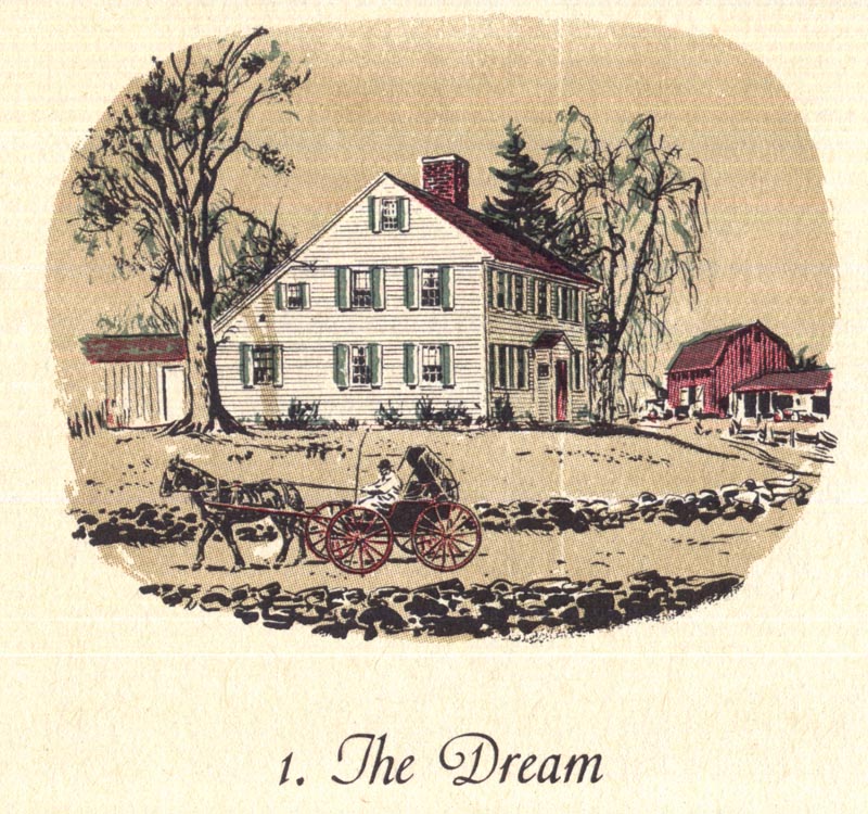
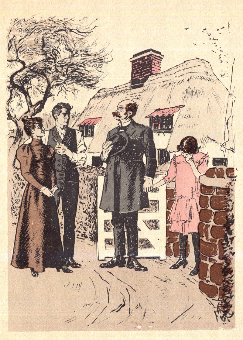
Let's finish up this week with a look at two stories by the great William A. Smith.

The first, once again from a 1960 volume of
Reader's Digest Condensed Books, is painted in Smith's typically impressive style.
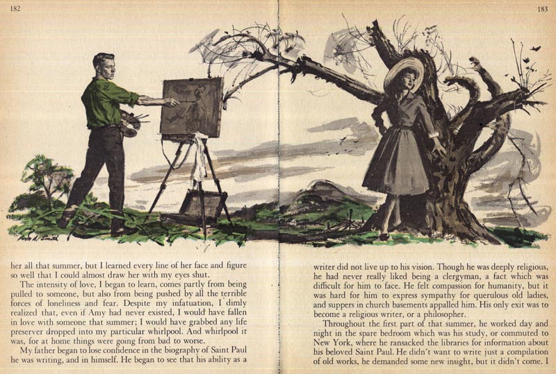
Whenever I look at Smith's work, Robert Fawcett comes to mind.
While Smith's work is far less structurally rigid than Fawcett's, they share a certain visual sensibility that has at it's root the discipline of classical art training.
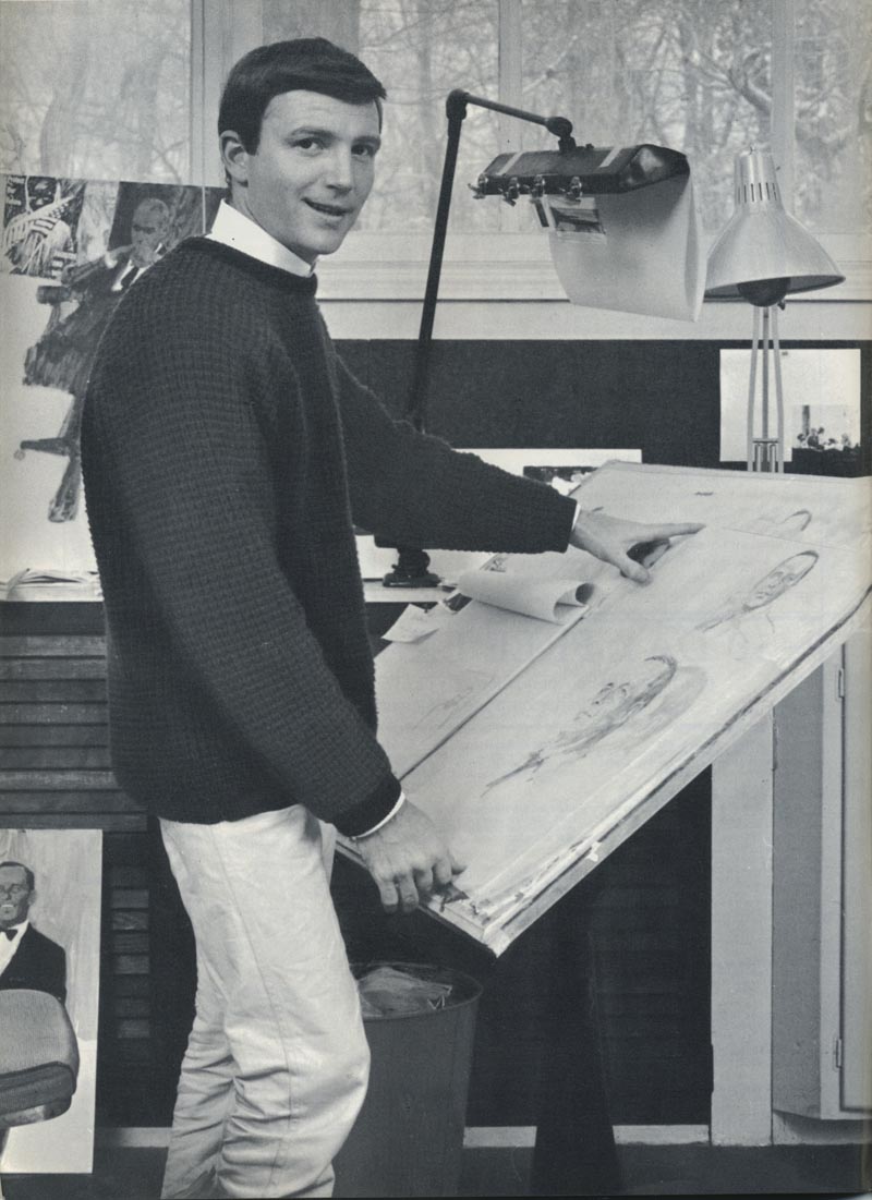
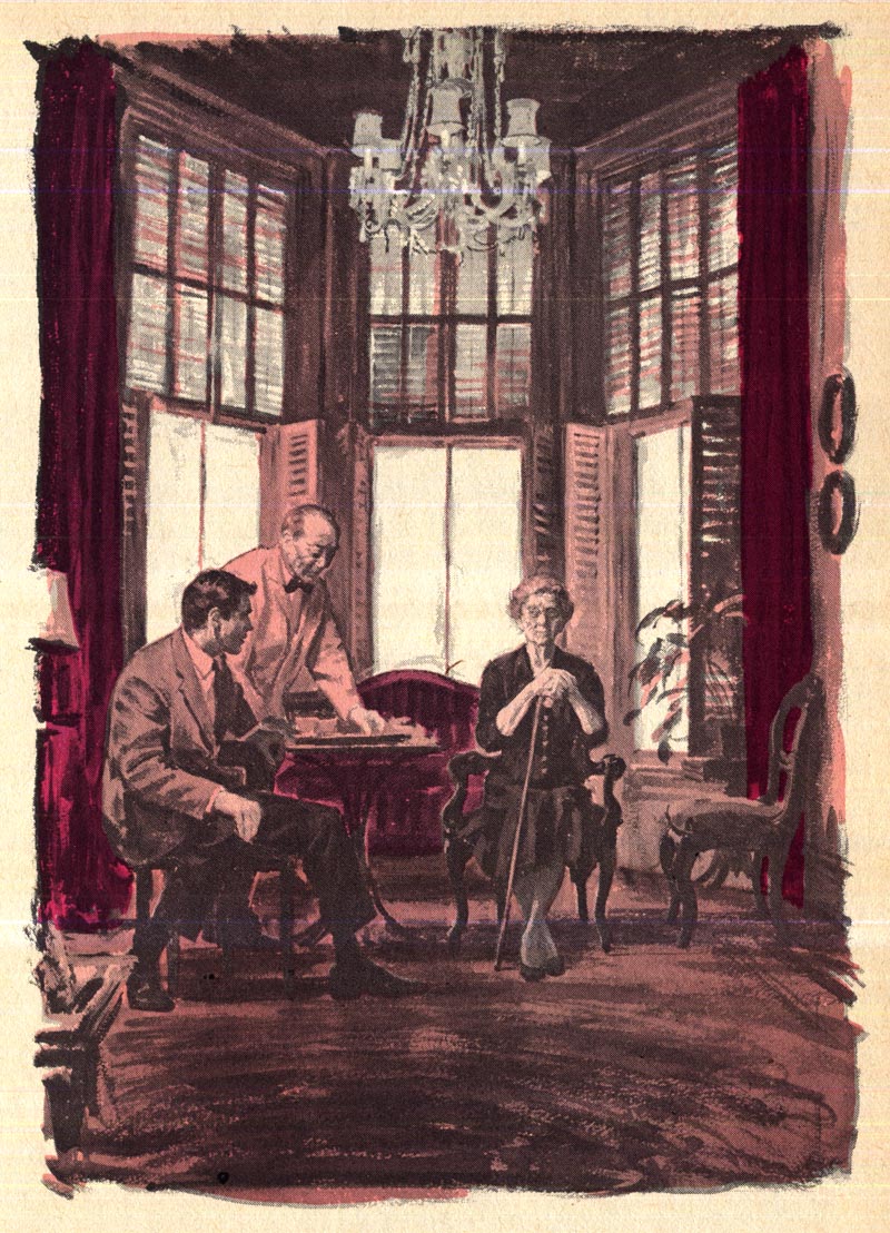
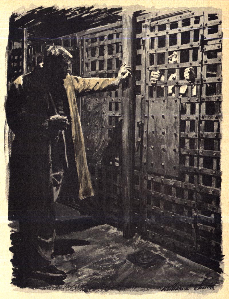 (Incidentally, William A. Smith's daughter, Kim tells me that her dad posed as the man in the trenchcoat for the reference photos he shot for this painting)
Not surprisingly, Smith and Fawcett were friends and had tremendous respect for each other's work.
Charlie Allen once shared an amusing anecdote with me about these two men. You can read it at
this link.

Also from 1960 (but from a different edition of
RDCB) is this William A. Smith-illustrated story, except this time done in line with flat colours.
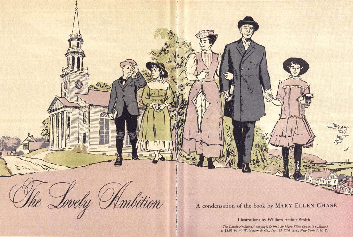
This is a relatively rare example of Smith's ink line style. Aside from
his war reportage art, this may be the first time I've ever come across another example of WAS doing line art illustrations.
It goes without saying that they are of the same exceptional quality we see in Smith's painted work...

- but more than that, they offer a pleasant surprise...
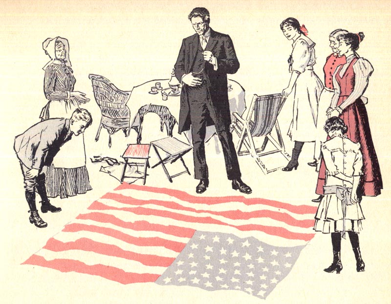
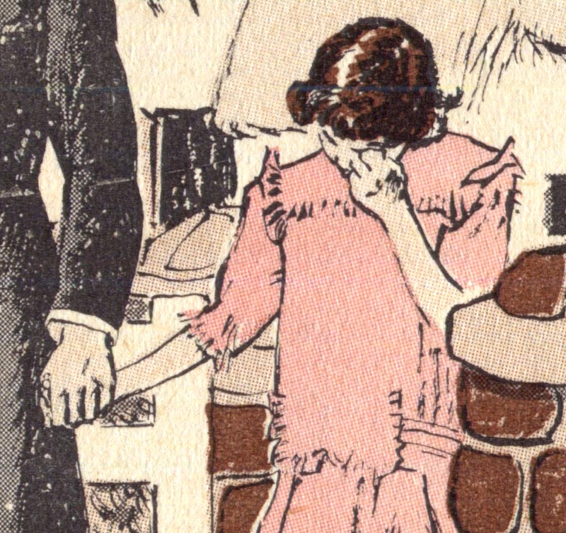
Smith shows us a touch of gentle humour in some of his linear interpretations - something not evident in his painted illustrations.

Maybe it's just me, but I see a little Robert McCloskey in William A. Smith's line art.
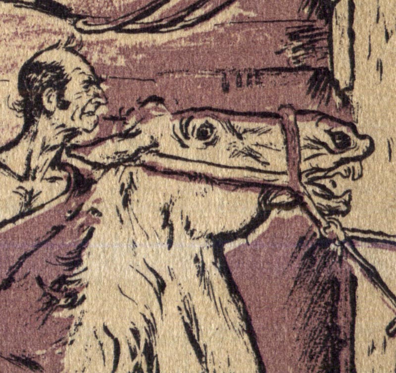
Kim Smith has vague memories of posing for this story when she was a child. Of modelling for her father's reference photos, Kim said,
"Much of the time I hated it but was mostly a good sport."
 "Now I think it was an honor and so fun to see myself and my family playing various parts, like a play."
 * Many thanks to Reader's Digest Creative Director, Robert Newman for linking this week's posts to the Reader's Digest art Tumblr page! Robert has been posting some classics from the back covers of Reader's Digest from those days on the RD tumblr page. Be sure to take a look!