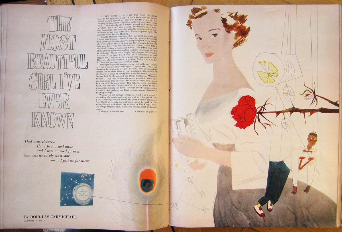
By Jaleen Grove
In his 16 years of Canadian illustrating, there are at least 12 stylistic approaches so different that the casual observer would likely not detect only one artist behind them all, although a few of these Oscar Cahén did frequently enough to ensure some “name” recognition.
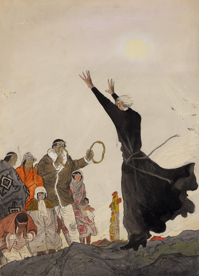
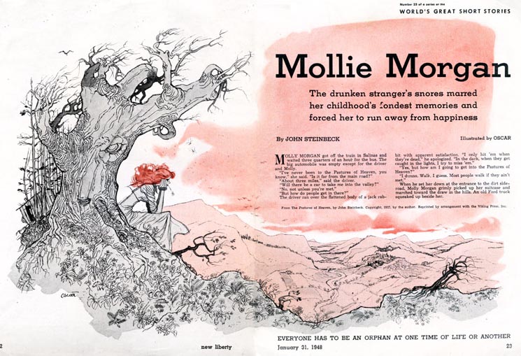
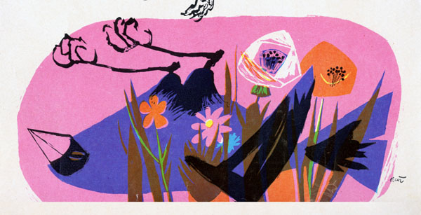
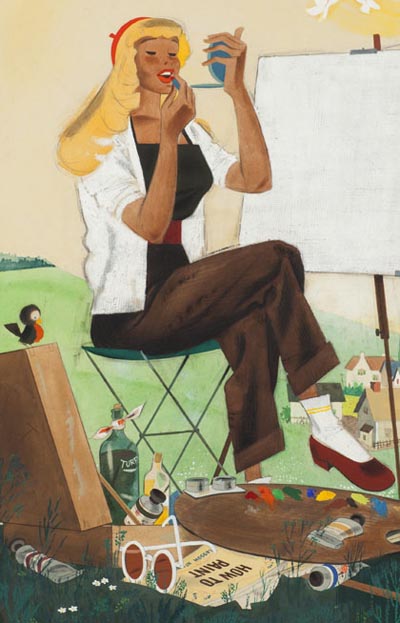
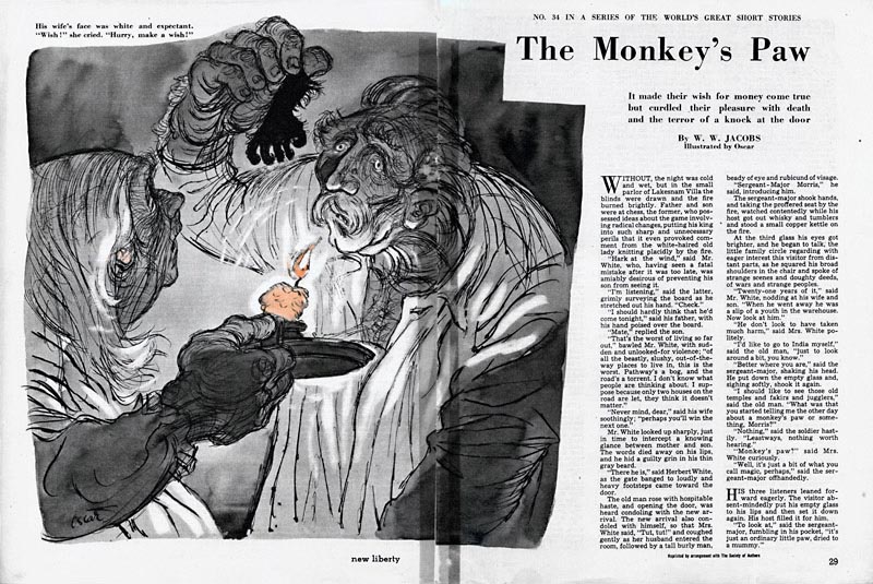 New Liberty
, 1948.
Occasionally, Oscar Cahén’s illustrations reveal innovative surprises: collaged newspaper on one story...
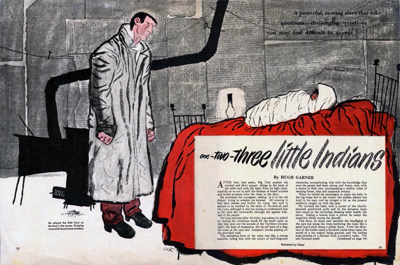
... in the mailbox of a
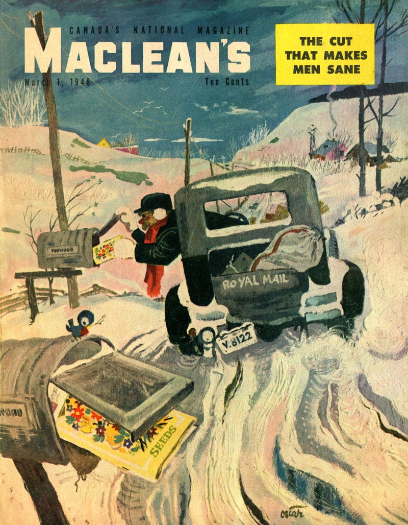
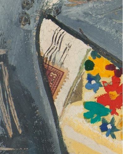
MacLean’s cover...
... a fragment of an actual postage stamp on the mail.
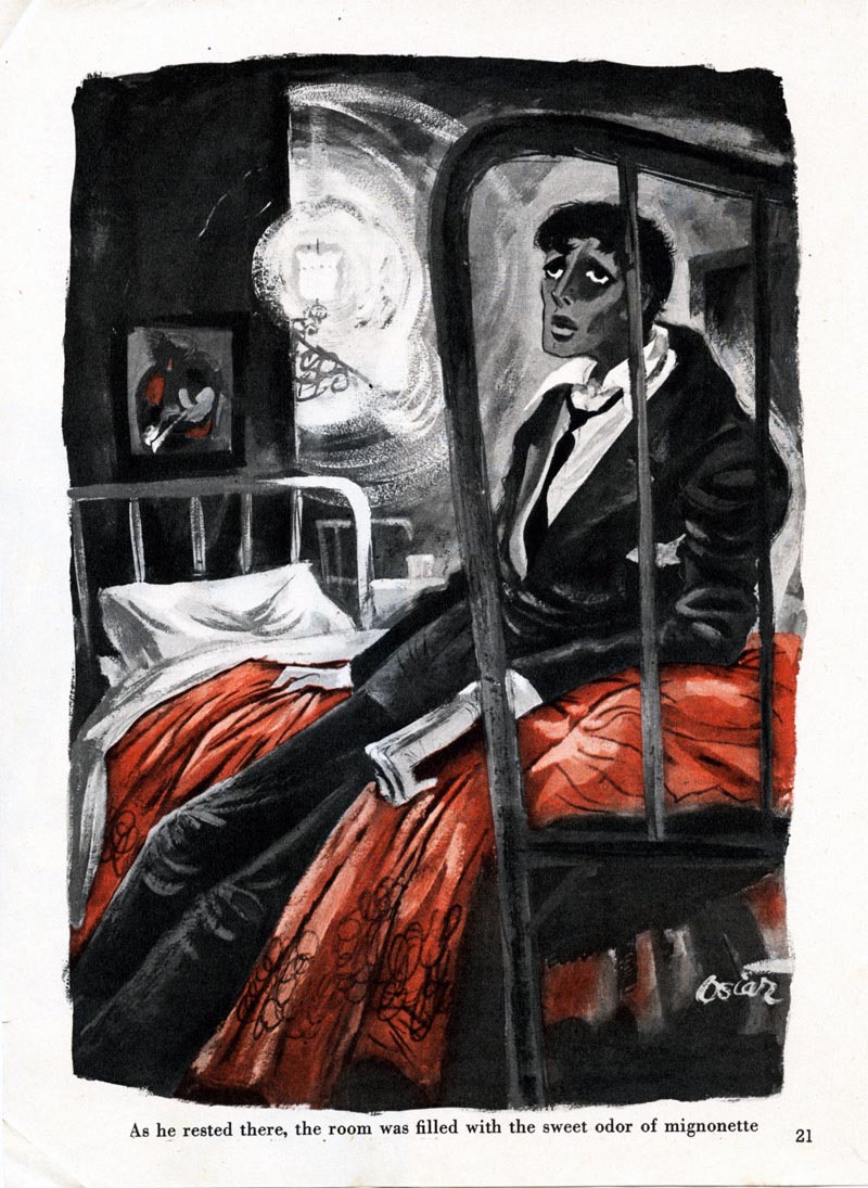
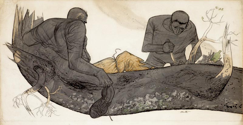
One of Cahén’s biggest breakthroughs was when he illustrated an entire book in a week, Morley Callaghan’s "Man With A Coat" for
MacLean’s, April 16, 1955. It was a rush job; the magazine put him in a hotel room with art supplies and he set to it. While many of the illustrations are in his usual loose inked line and watercolour, two stand out. In the title page, flat planes of colour and pattern on separate papers are glued together (the pink segment corrects a weaker rendition beneath) to suggest architecture and relationships of light and shadow using the barest essentials only.
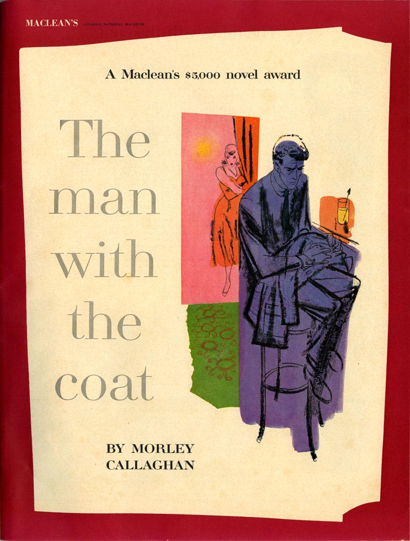 MacLean’s
, 1955.
The latter exploits transparent wet into wet over flat hot colour, the figure almost lost in shadow. In these two illustrations we can see Cahén’s interest in abstract art coming out in the formalist play of figure and ground and flatness.
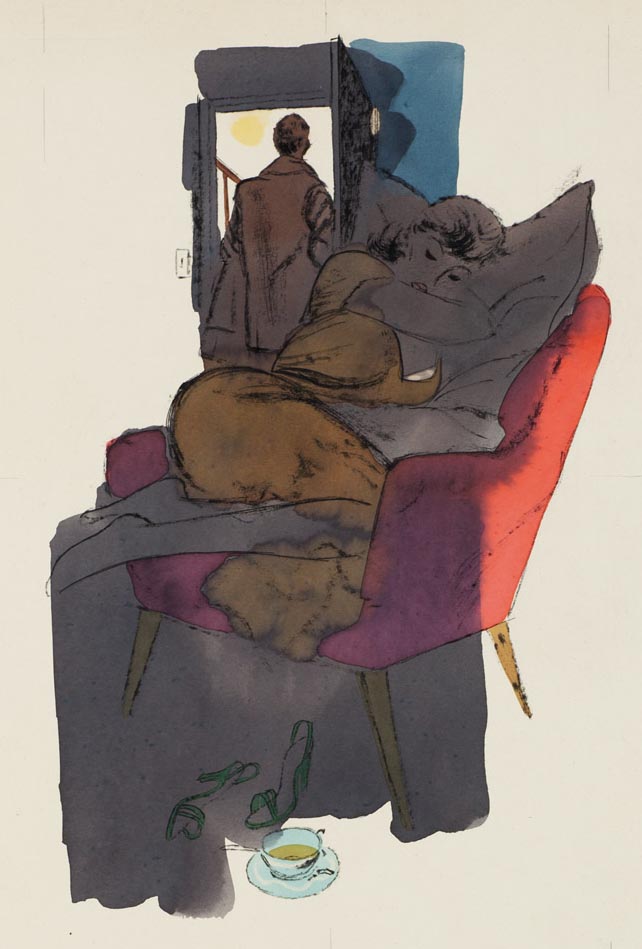 Maclean’s
, 1955.
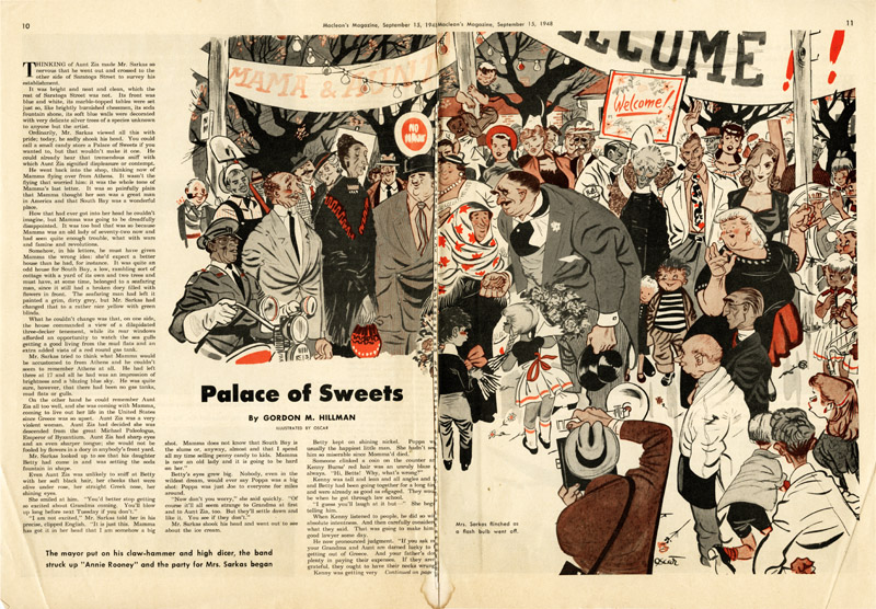
The variety of work Cahén took on was partly due to the small scale of the illustration market in Canada. In order to thrive, Canadians had to take all manner of work, from cartooning to fiction illustration to advertising. But the danger was that if a few illustrators kept appearing again and again in a limited number of publications, reader stagnation might set in. Cahén’s relentless switching of styles had the happy side effect that he could qualify for any job and never get boring.
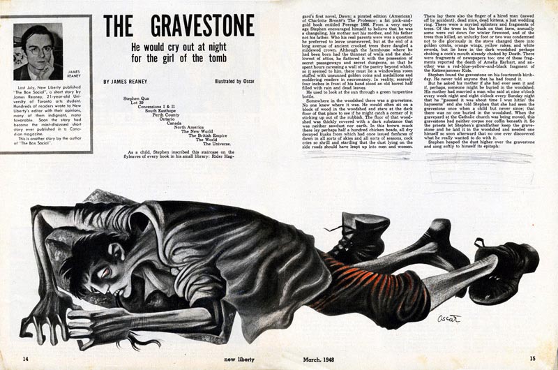 New Liberty Magazine
, 1948.
In the later 1940s cultural leaders were patriotically itching to differentiate Canadian visual culture from that of Americans, so Cahén was able to submit a lot of off-beat work. Canadian art directors were open to unconventional approaches to drawing people, unlike the more conservative mainstream American periodicals—and the public. A reader of
New Liberty wrote:
"Sir: Do you keep your illustrator Oscar in a padded cell? No one in their right mind could think up such repulsive and hideous things to represent human beings."
 New Liberty
, issue unknown.
Art Director Stan Furnival said about the first boy-girl art Cahén submitted, ”I’ll always remember that art as it came in, wrong proportions, but alive and delightful … its inclusion certainly helped give the whole magazine a more interesting quality.”
MacLean’s art director Gene Aliman remarked, “The ideally beautiful heroine and the ever handsome hero seldom exist in reality. The illustrator betrays the writer's artistry and the reader's intelligence by using stock, anonymous looking characters.” Oscar himself said:
"I do not believe that the average magazine reader is as inaccessible to fundamental emotions as expressed in good art as art directors would like me to believe. Mind you, I get a bang out of drawing cute babes! It's a lark!"
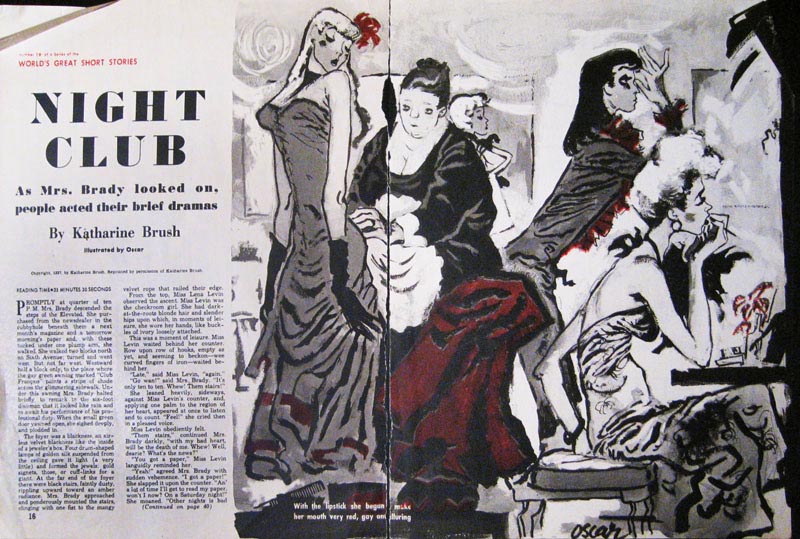
 New Liberty
, 1948.
Oscar Cahén enjoyed trying out every kind of style and medium partly because he valued, above all, avoiding formulaic approaches and ruts. He disapproved of the Famous Artists School—he felt it encouraged mindless simplification and repetition of techniques pioneered by innovators such as Norman Rockwell, Al Parker, Ben Shahn and other notables, hampering creative evolution in the field. He also denigrated what he called “American junk” and “commercial junk." But he told an interviewer from
Canadian Art magazine:
"Much of the material we are asked to illustrate is of inferior quality. Yet, good art work can be used with it and by itself will do much to raise the standard of the publication in question and stimulate the minds of its more alert readers. Commercial artists need to take more time to reflect upon this power which is at their command."
* Continued tomorrow...
* The first exhibition of Oscar Cahén’s illustration since his lifetime will be shown in New York at Illustration House in October 2011 (opening night Oct. 1). With Roger Reed, I have written a full colour catalogue with an essay and over 60 images. In this series of posts about Cahén, I will introduce him and feature some artwork that will not appear in the show, catalogue, or websites. The tearsheets and originals here are from Oscar Cahén’s estate, courtesy of his son Michael Cahén at The Cahén Archives ~ Jaleen Grove

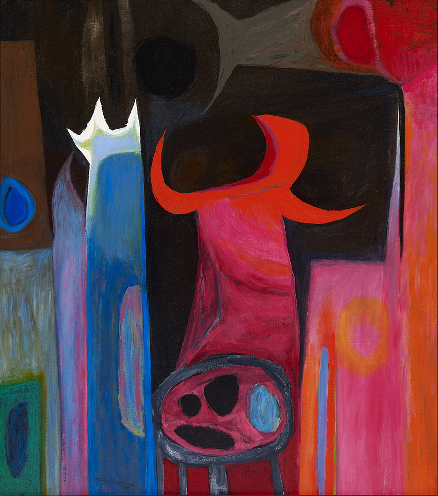
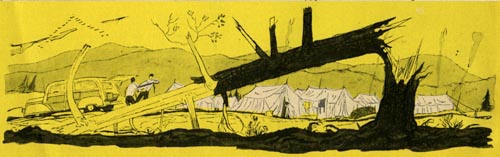
 Maclean’s, 1954
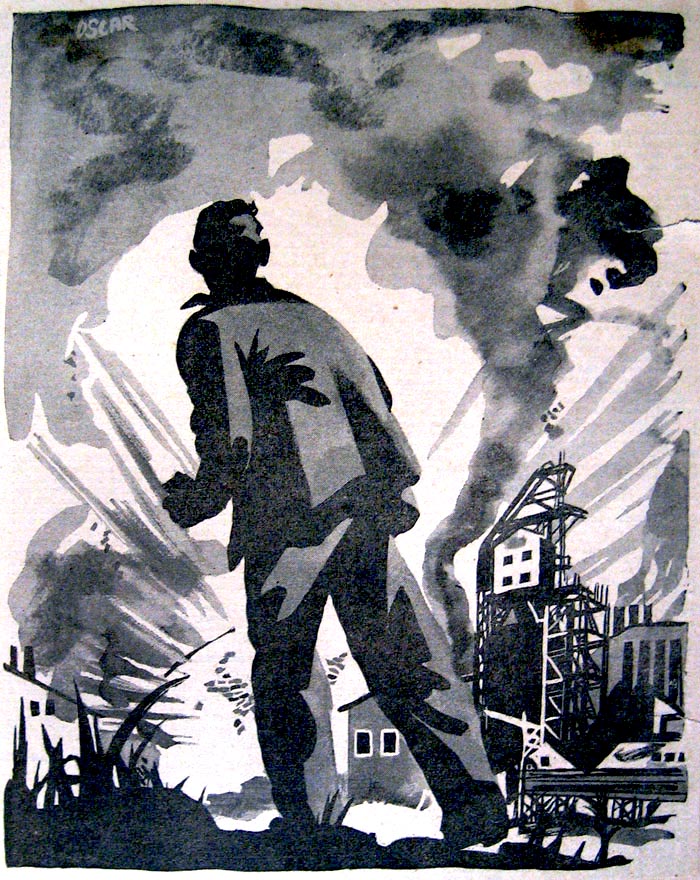
 Subjective Image
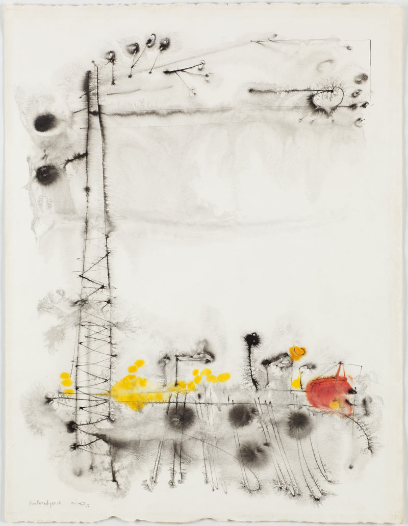 Railroad Yard
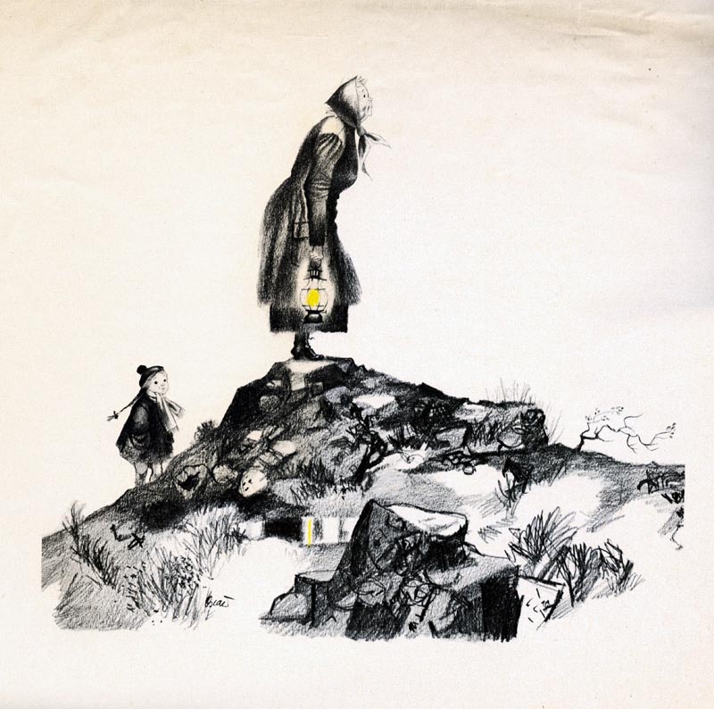
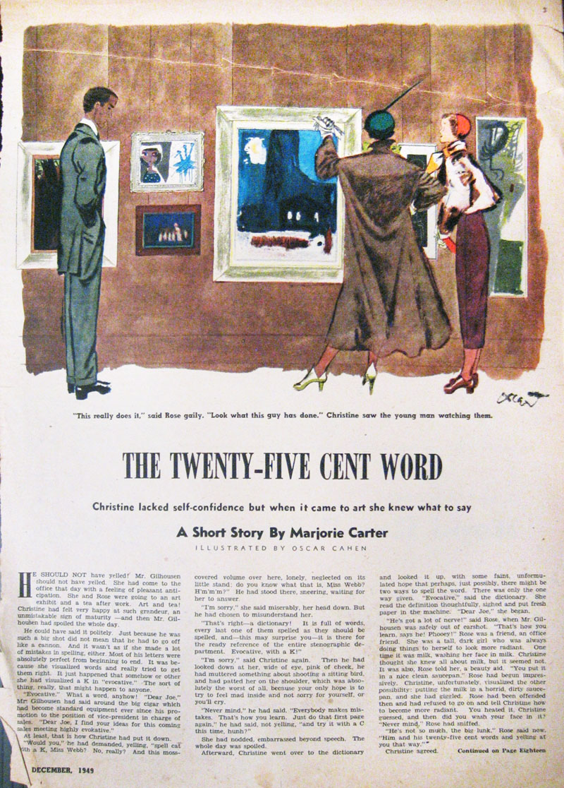 New Liberty, 1949
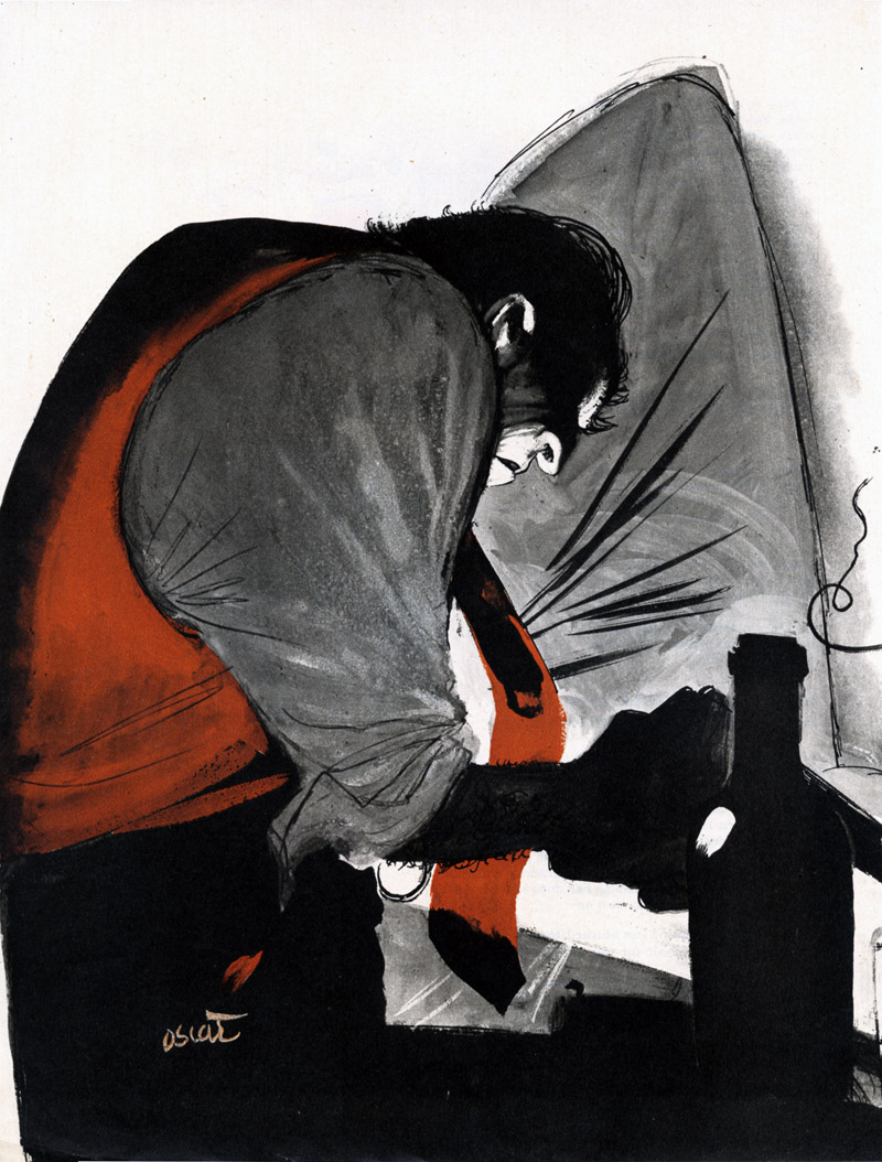 We don’t know where this image appeared. If you do, contact The Cahén Archives.
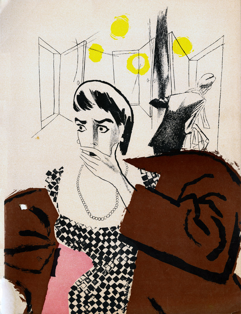 We don’t know where this image appeared. If you do, contact The Cahén Archives.
 Original art for a Maclean’s cover
 Maclean's, 1948.
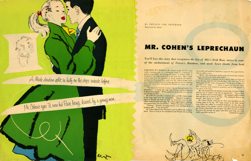 Chatelaine, 1954.
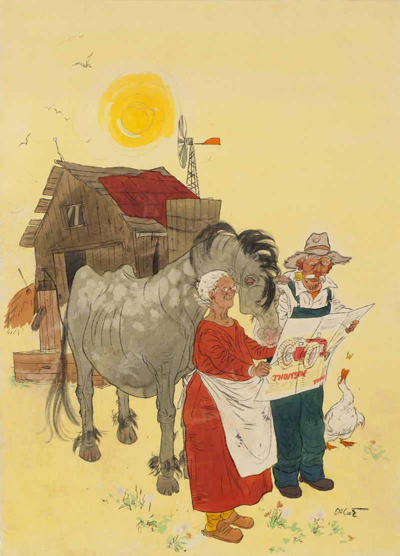 ”The House the Horse Built,” 1951. We don’t know where this image appeared. If you do, contact The Cahén Archives.
 Mayfair Magazine, 1953.
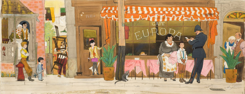 MacLean’s, 1955.
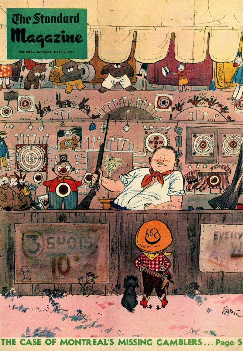
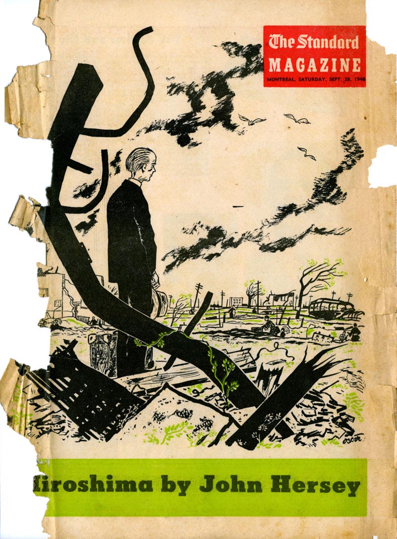
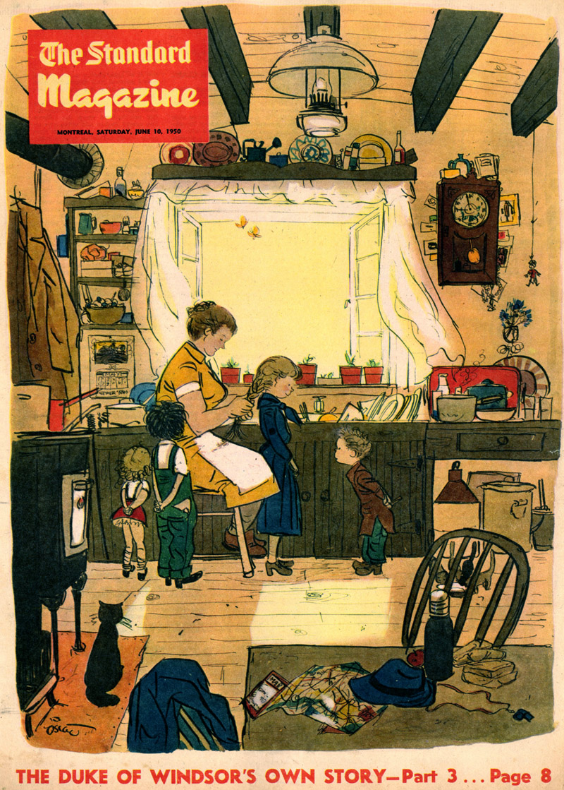 The Standard, 1950.
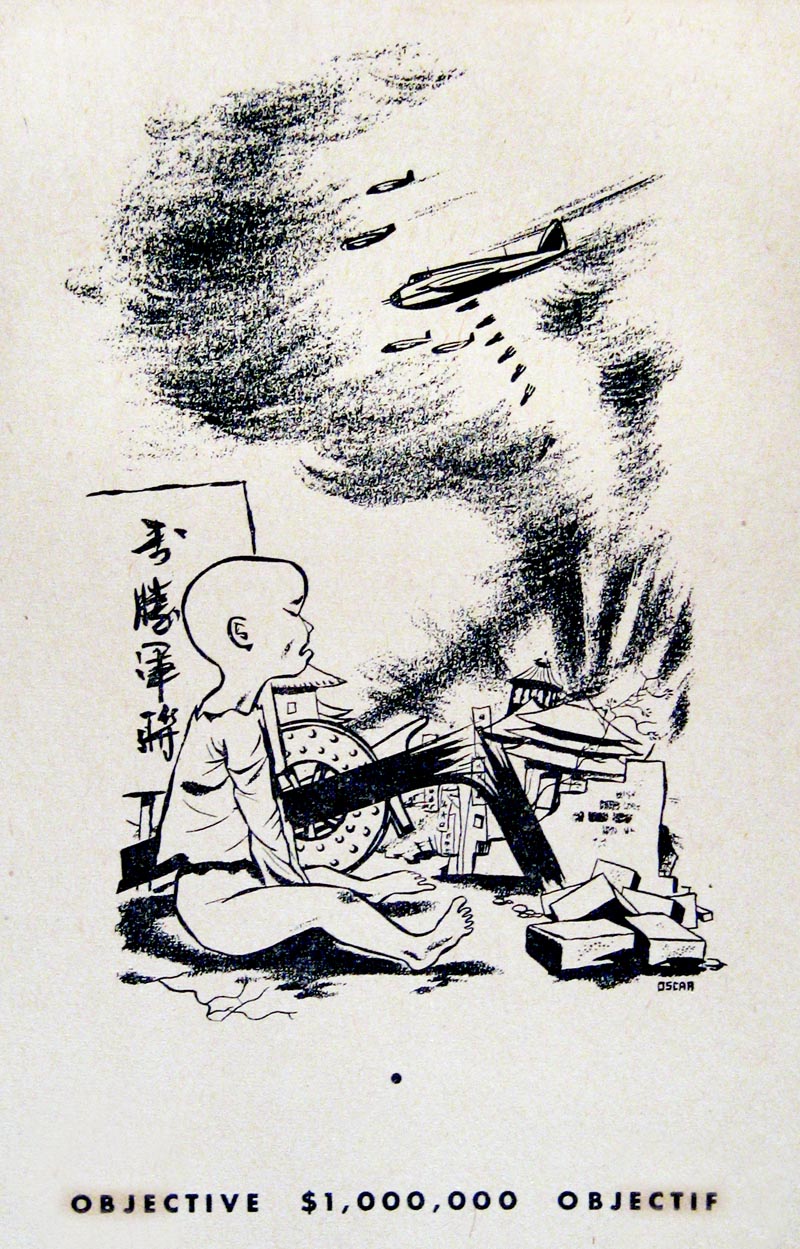
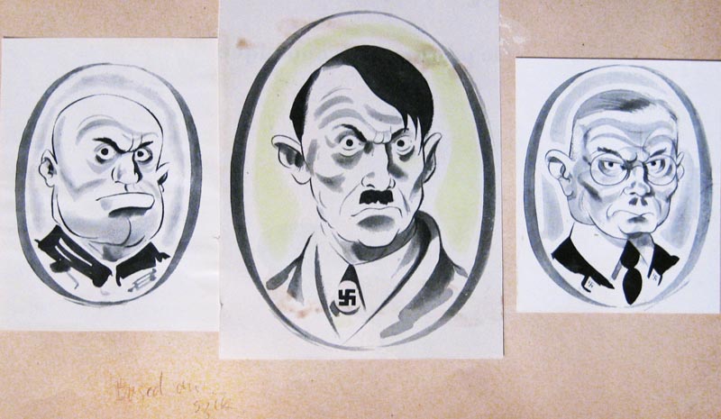 We don’t know where these images appeared. If you do, contact The Cahén Archives.
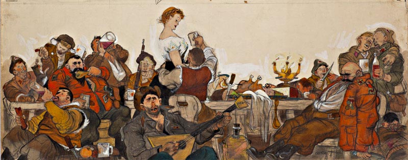
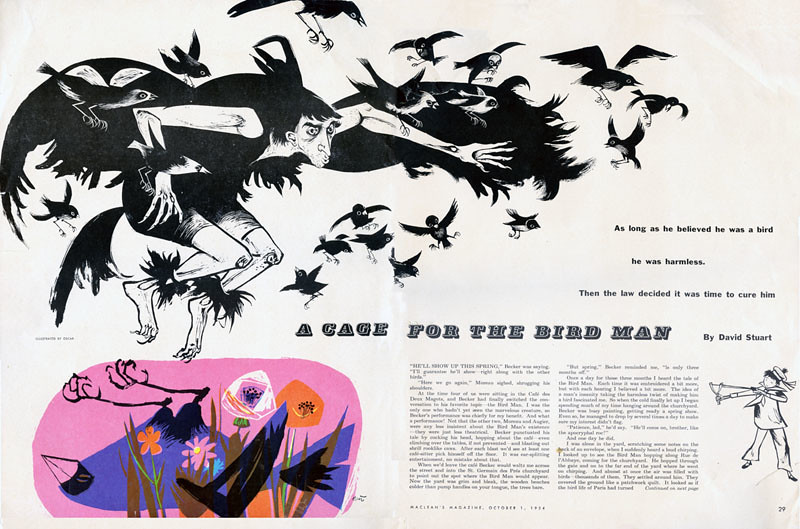
 Fiction illustration for “A Cage for the Bird Man,” Maclean’s, 1954.