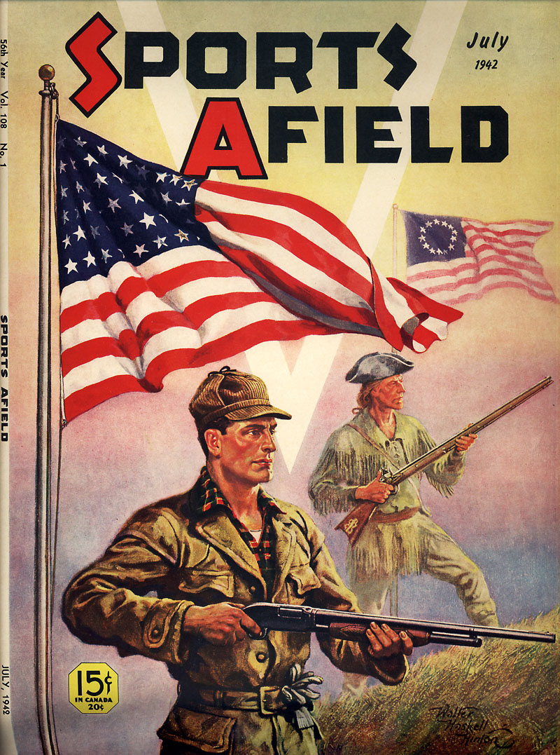
Tuesday, November 30, 2010

Illustration from an Earlier Age, Part 2

In his introduction to Black & White ImageS - Fifth Special Collection, Editor/Publisher Jim Vadeboncoeur writes, "The field of black and white art from my focused time period, 1870 to 1922 is, indeed, an embarrassment of riches. It often seems to be an unending, unfathomable sea of images that only gets wider and deeper the further I venture from my familiar Anglo Saxon shores."

Benda01

"The more I explore," writes Jim, "the more I realize how much great art we've lost. As culture, as society, as humans..."

Flagg02.detail01

"... we've simply forgotten most of our artistic heritage."

Flagg02

Jim has been a Today's Inspiration list members for quite some time now and he and I corresponded on the subject of the era he is so passionate about. In one note he explained to me, "I can trace MY fascination with the era to folks like Al Williamson and Roy Krenkel, Leif, who very much influenced Wrightson, Jones, Kaluta and Smith. As I was reading the fanzines of the late 1960s, I would learn that Krenkel was a big fan of Franklin Booth or the Williamson went gaga over Joseph Clement Coll. I can remember cutting classes at college in 1968 to pore over the shelves of early 20th century novels to see if they had any illustrations - and thus discovering the work of Coll (on Talbot Mundy) and Cornwell (on Peter B. Kyne) and being fascinated by the modernity of their work. Of course I was comparing it to comic and fantasy art, not commercial illustration - where it was anything BUT modern."

Christy01

"I grew up in the 50s looking at Colliers and the SEP. I NEVER was drawn (no pun intended) into the art on the stories. I knew it was there, but it wasn't until I discovered comic books that illustration "called" to me. Then Frazetta paperback covers woke my latent appreciation and I began following the path backwards - quite literally skipping over the illustration of the 60s and 50s and most of the 40s as I went looking for the people who influenced my favorites. I wanted to know WHO Coll was and WHAT Williamson got from him. I wanted to understand why Wrightson wasn't drawing like Frazetta anymore but was channeling Franklin Booth. What prompted this "skipping" of a generation or two in artistic influence and WHY were these "antique" styles still relevant (and effective) in the 1970s?"

Sullivant01

"It was only partially an intellectual quest. It was also that the echoes of those old styles were resonating with me AND with a generation of comic book artists and fans. When I found the source material, I understood. These guys were defining a genre (or three) and there was an exuberance there that never happened again. Sure, lots of GREAT illustration happened after the 1920s, but it was all derivative of (or in reaction to) the work of this seminal era."

Pyle01.detail01

"The fine art/anti-photography movement was a major turning point and saved the craft of illustration from the dustbin, but it became, to this poor observer, something ELSE. Something good and often great, but it's always struck me as a somehow different sort of critter. The explosion of styles and craft that occurred from 1880 to 1920 was a one-time thing and was (and will be) never repeated."

Pyle01

Since that note Jim's been kind enough to send me his latest issues of ImageS and so my education - and appreciation - grows. Its from the most recent Black & White ImageS that I scanned today's art samples. It truly is stunning work, and this is only a tiny sampling of what every issue of ImageS contains.

If you'd like to learn more about Jim's publications, go to The Vadeboncoeur Collection of ImageS

Any many thanks, Jim!

Monday, November 29, 2010

Illustration from an Earlier Age

I've got to admit, my interest in illustration doesn't really extend to the decades before WWII. I mean, I find the art of the late 19th and early 20th centuries academically interesting, but I'm not really drawn to it (if you'll pardon the pun) in the same way that I am to the post-war era. But I know many of you are.

One such person is TI list member Joseph Procopio, the founder & co-publisher of Picture This Press/Lost Art Books. Joe asked me to make readers aware of three books his company has published; The Lost Art of E.T. Reed—Prehistoric Peeps...

Reed01

... The Lost Art of Zim—Cartoons and Caricatures...

Zim01

... and The Lost Art of Frederick Richardson

Richardson01

Of the three, Richardson's work is the most intriguing to me. I was astounded to read on Joe's website that the artist created these sorts of pieces for publication in the Chicago Daily News in the 1890s. Amazing!

Richardson02.detail01

In an interview Joe did with washingtoncitypaper.com he explained that his intentions are "to preserve this cultural heritage by re-introducing these artists to new generations of working artists, historians, and admirers of things beautiful." That's certainly evident in these examples.

Richardson02

Personally, I'll be looking forward to one of Joe's future efforts: The Lost Art of the Racy & Risqué, which will include pieces by Russell Patterson, Frank Godwin, James Montgomery Flagg, Dean Cornwell and many others. That volume will be coming out in a few months, April being the goal, so perhaps we'll get to preview it at a later date.

For anyone still looking for a Christmas gift for the turn-of-the-century-illustration aficionado in their life, Joe's books may be the perfect thing.

Visit Joe's website for details.

* There are several other publishers of late 19th/early 20th century illustration who are members of Today's Inspiration. This week we'll look at some of those publishers and the artists from that era whose work they publish.

Tuesday, November 23, 2010

Cliff Roberts' Children's Books

Recently I received a note from Ariel S. Winter, who publishes a terrific blog called, "We Too Were Children, Mr. Barrie." Ariel wrote, "I wanted to let you know that I've posted a ton of Cliff Roberts art from his children's books on both my blog and my Flickr."

Cliff Roberts work has been very popular here on Today's Inspiration. My post showcasing images from "The Book of Jazz" which Roberts illustrated was especially well received. Thanks to Ariel's efforts you can now also see all the illustrations from "Thomas"...

Roberts44

... from "The Dot"...

Roberts43

... and even some of Cliff Roberts' gag cartoons for The New Yorker.

Roberts42

Be sure to visit Ariel's blog and Flickr archives of old children's books.

Many thanks, Ariel!

Monday, November 22, 2010

Wow - 2000 Followers - and Counting!

Last week while I blinked Today's Inspiration got its 2000th follower - and the number continues to rise. As well, over 5,000 people subscribe to our RSS feed. Wow; I am always so amazed and gratified to know so many people enjoy the material presented on this blog. A heartfelt thanks to all of you for your support and encouragement!

Greg Newbold on Don Weller

Back in August Charlie Allen shared a bunch of scans with us of "odd stuff" -- tear sheets he'd saved in his clip files. Among them were several pieces like the one below by an artist whose signature we couldn't decipher. "The name is 'Weber' or 'Weker'....don't know. A football article, and no idea from what magazine or publication," wrote Charlie.

Weller01

Almost immediately after that post, TI list member Greg Newbold sent me a note:

"I saw some work by Don Weller pop up yesterday and couldn't help commenting. Don is a friend of mine since I took a class from him about 20 years ago. I then worked for him off and on doing illustrations for Park City magazine until he gave it up last year. I could contact Don and set something up."

And that's exactly what Greg did - with spectacular results!

Weller07

Over on Greg's blog you'll find a fabulous two-part article he put together after interviewing his old friend. Part 1 focuses on Don Weller's early career, with many beautiful examples of the Weller's illustration art.

Weller06

Part 2 focuses on Weller's recent years as a fine art western painter and cutting horse rider.

Weller05

Spend a few minutes today enjoying both of Greg's posts - and many thanks, Greg, for the time and effort you put into this terrific two-part article on Don Weller!

Greg Newbold on Don Weller, Part 1

Greg Newbold on Don Weller, Part 2

Friday, November 19, 2010

Walter Haskell Hinton’s Calendar Pictures

By Jaleen Grove

Extremely little has been written about calendar art, probably because it has been considered the exact opposite of everything thought to be artistically tasteful by modern artists and art critics of the 20th century. Furthermore, its fan base has been mostly quiet and apparently not as self-advocating as collectors of other once-derided art forms, such as comic books and science fiction art. That calendar art has remained undocumented for so long is surprising given how ubiquitous it has been. According to the 1953 annual report of manufacturer Brown & Bigelow, 93% of American houses had calendars in them, and 47% of housewives shopped for them even though most received calendars for free from advertisers.

5-1 horses

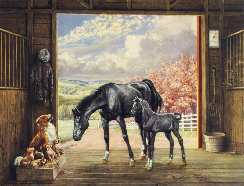
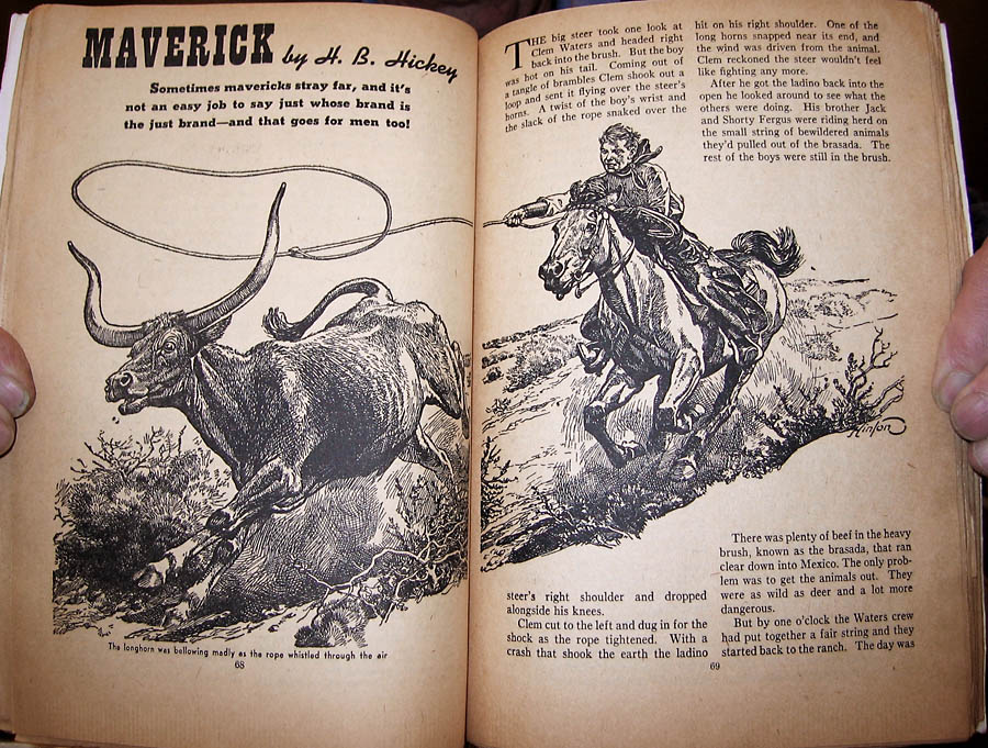
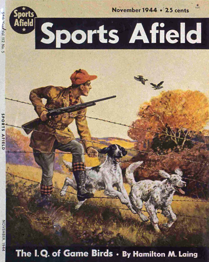
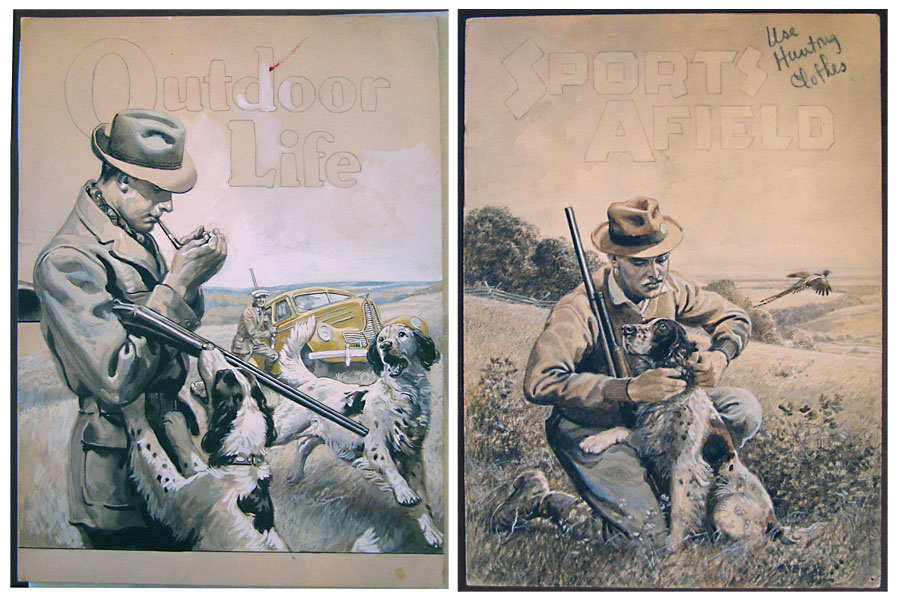
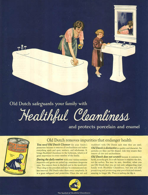
Calendars used to be issued with only one image printed on cardboard with a pad of the months stapled below it, which were torn off as time went by. In this barn Walter Haskell Hinton has placed just such a calendar, featuring a pin-up girl, on the wall to the right.
 
The space between the picture and the pad of months was printed with the name of an advertiser. Brown & Bigelow reasoned that, “Since housewives spend an average of 4 hours a day in their kitchens, the constant repetition of an advertiser’s sales message there will cause it to be virtually memorized.”

5-2 elk

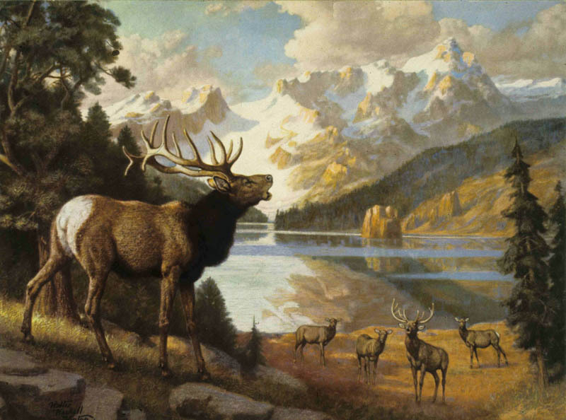
Calendars were a way for the advertiser to associate themselves with positive values, and those that were to be given away to a wide range of customers had to have pictures that were upbeat and inoffensive. Calendar art has often been dismissed for its clichés, such as the ennobled elk above, but such images were repeatedly issued because they satisfied tastes originating over 200 years ago that had never gone away, in which art was supposed to be beautiful and morally uplifting. Familiar subjects symbolically communicated traditional values: here, the majesty of Nature and nobility of the stag, an ancient symbol of virility. Selection and display of such an image affirmed the owner’s worldview and identity and conveyed this to others.

5-3 deer

Hinton’s wildernesses are always idealized, with pristine forests and healthy animals. In his 1976 interview, he spoke of how a publisher once complained when he included a realistic dead tree, such as one find in any actual forest. An interesting circular situation emerges, where calendar publishers concluded the public wanted to see certain kinds of idealized images, and so kept on issuing them, which confirmed and strengthened that taste among the buying public, further constricting artists.
 
No wonder modern artists who valued experimentation hated the stuff! But for those who felt modernity was proceeding far too quickly, and who simply wanted their art to provide a break from life’s demands, traditional and perfected subjects were reassuring and inspirational.

5-4 bear sketch

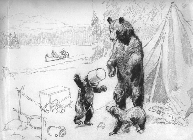
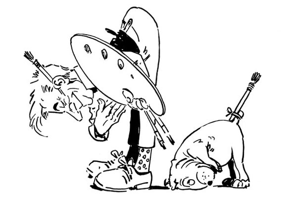
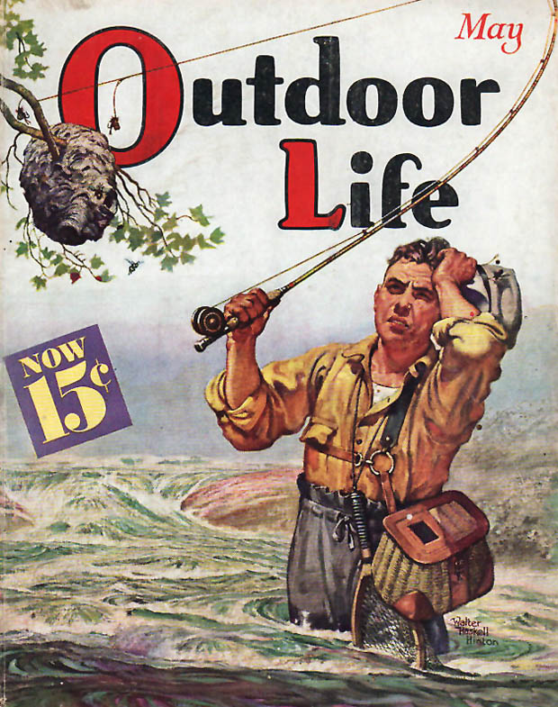
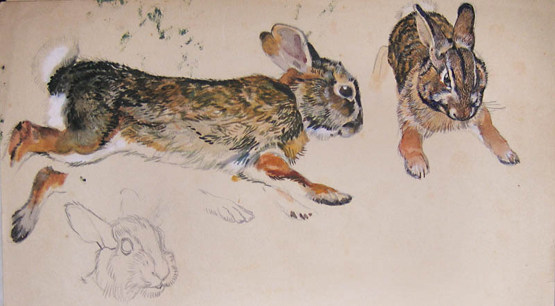
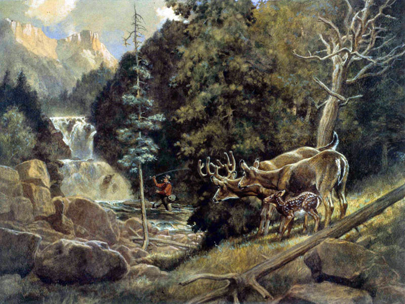
Yet even within this conservative business climate, there was room for innovation and self-expression. Hinton was an environmentalist before the term was coined, and portraying nature was for him a way of subtly critiquing the impact of modern human life. He frequently anthropomorphized his animals, bringing out human qualities in archetypical ways, as in the elk above, and in humorous ways, as in this sketch of a hapless bear cub with a bucket on its head. We might look beyond the cuteness to think about the impact of man’s encroachment on the wilderness, as the deer watching the fisherman seem to do.

5-5 starlight sm
Copyright © Brown & Bigelow

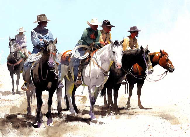
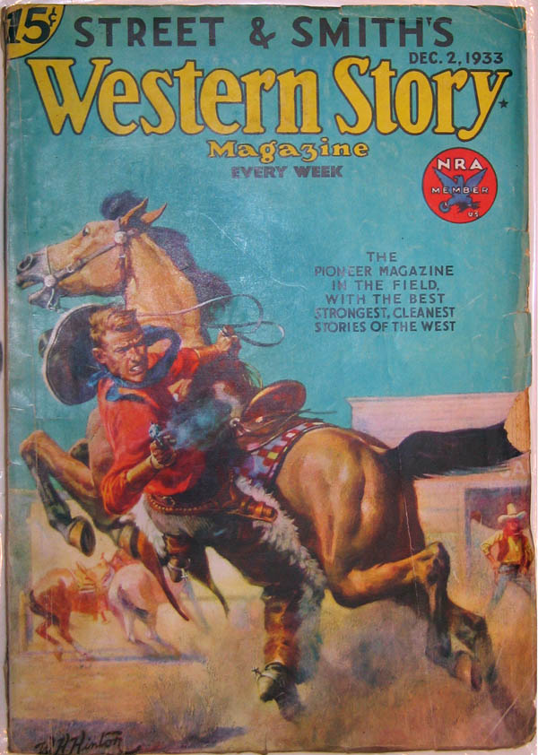
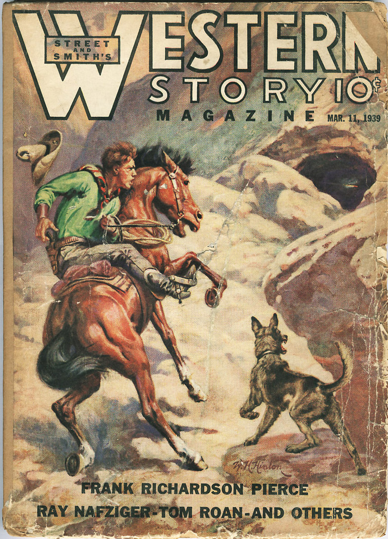
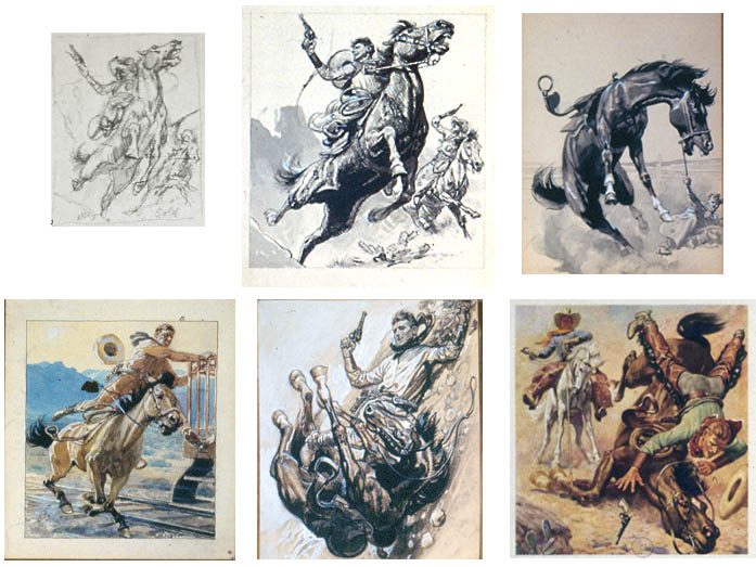
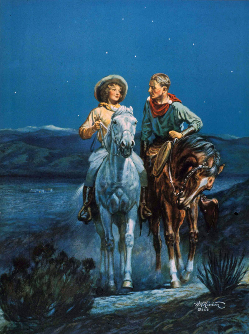
As the popularity of Westerns grew, Hinton found he could pursue this favorite theme of his in calendars too, in addition to the work he was already doing for pulps. Where the pulp magazine covers were almost exclusively macho, for the calendar art market he introduced women and romantic themes, such as in Starlight Trail above.
 
The calendar companies issued the images they bought from artists as large art prints as well. These were sold as “suitable for framing” to consumers and to hotel chain interior decorators. They were also distributed to jigsaw puzzle manufacturers, who produced millions of puzzles in the 1930s.

5-6 puzzle
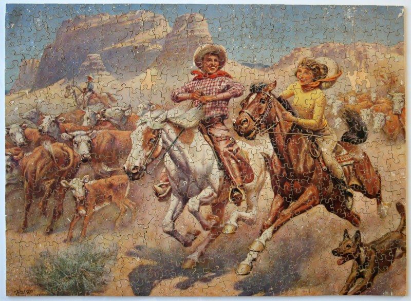
Image courtesy of the Ewing Gallery


Hinton secured important contracts producing calendar images for corporations such as John Deere, Austin-Western, and Washington National Insurance. His relationship with each lasted a minimum of 20 years.

5-7 washington
Collection of the Ewing Gallery

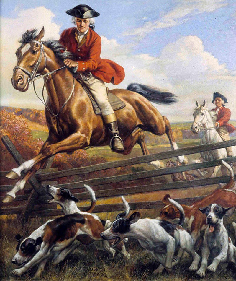
Washington National appreciated Hinton for his knowledge of history. For them, he researched historically accurate scenes of George Washington’s private life suitable for kids, rather than the military exploits that other illustrators had proposed to paint. Washington appears spotlessly heroic and compassionate (when the above painting was completed, fox hunting was not yet controversial). The series was issued in packages distributed in elementary schools, an interesting confluence of corporate advertising, education, and inculcation of patriotic values indeed!
 
5-8 austin-western

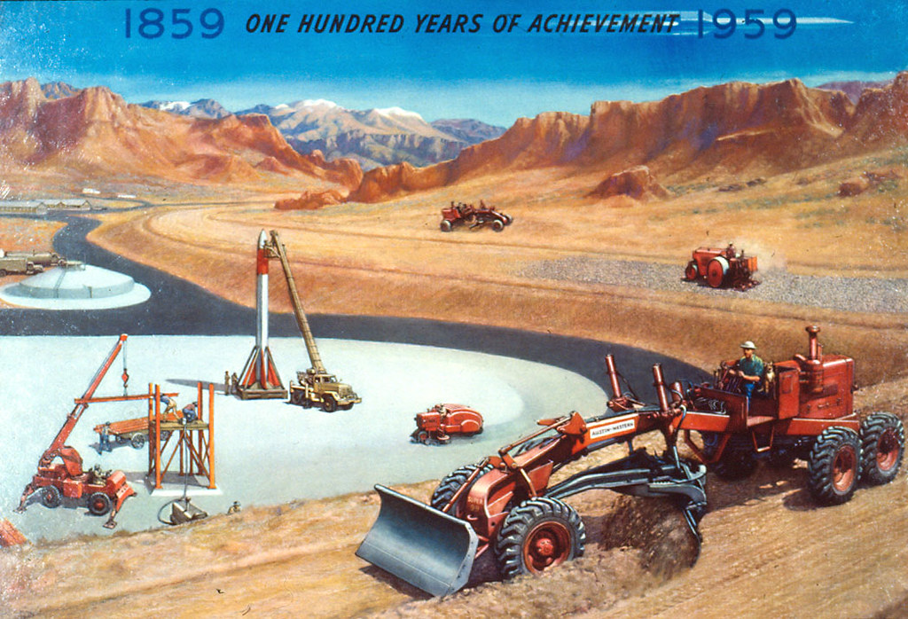
Hinton often included a dog in his work, be it magazine covers, advertisements, or calendar pictures. For heavy equipment manufacturer Austin-Western, a dog – rumoured to be the boss’s – sits next to the driver in every picture. This sentimental touch associated emotional warmth with the otherwise rather cold and imposing machines.

5-9 fox

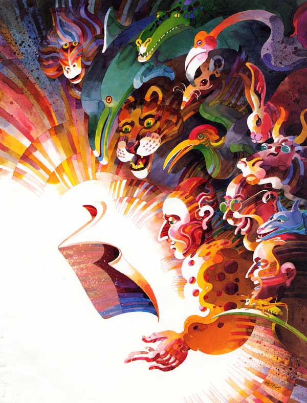
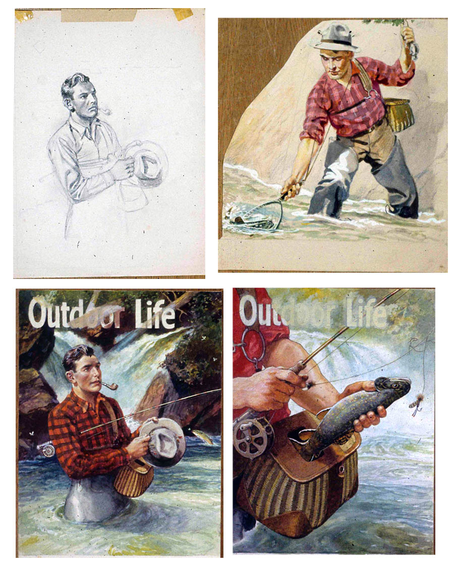
It is fitting to end this series with a painting Hinton kept all his life. This image of fox and pheasants was issued as a print, but unlike most of his work, he somehow retained the original art. In it, his earliest training as an academic landscape painter comes together with the traditions of sporting art and scientific illustration to present a dramatized scene of the struggle for survival between creatures.
 
Hinton’s greatest strength as an illustrator was his versatility. As I remarked in my first post about Hinton, he never specialized enough in any one area to win fame. But excellence in a specialization is only one way to value an artist. An illustrator such as Hinton, who had a lengthy career in a bullpen at an advertising agency, is better judged for how well they could shift gears according to clients’ needs. Hinton, who believed firmly that art should serve a greater purpose than just his own self-indulgence, made a point of developing every area of his potential so that he could be of service in as many situations as possible.
 
I would like to thank the Ewing Gallery and the Hinton family for inviting me to write on Walter Haskell Hinton and for providing access to images and documents.

* Many thanks to Jaleen Grove for this week's fascinating series on Walter Haskell Hinton! Jaleen's critical biography of the artist, published by the Ewing Gallery at the University of Tennessee, began as a fairly brief exhibition catalog essay. It grew into a 96-page book when a wealth of interviews and primary documents were obtained. The book differs from this series on Today’s Inspiration in that it explores key issues in the cultural production of commercial art, both the troubling aspects of mass-culture images and the material pleasures of them.

Because it is a non-profit educational endeavour for which she volunteered her time, Jaleen would like to invite you to advance-order a copy or donate to the project, to help with production and distribution costs.


* Walter Haskell Hinton official website

Thursday, November 18, 2010

Walter Haskell Hinton’s Pulp Westerns

By Jaleen Grove

In the 1930s, one of the most widely read pulp genres was the Western, a staple of American popular culture since the mid-19th century. When Walter Haskell Hinton lost his fulltime ad agency job in 1933, he wasted no time approaching publishers Street and Smith and Ziff Davis with cover ideas. The image below is one of his earliest, and the effort he put into the foreshortened figure shows he was serious about getting to the forefront of this field. Although the pulps did not come close to paying him what slick magazines like Outdoor Life offered him, Hinton could make a profit on them because he knew his subjects well enough to work without the time and expense of models or photographs.

4-1 early cover

Hinton also liked the subject matter. He had made sketches at Buffalo Bill’s Wild West performances as a youth, and he took an avid interest in all things Western: cowboys, Indians, pioneers, mountain men, outlaws, horses, dramatic landscapes, and wildlife. His covers are very cinematic, with plenty of action and guns, just like in the movies that were increasingly being issued by Hollywood. The cowboys are always square-jawed and tough, frequently chasing or being chased by another man, performing improbable stunts.

4-2 lasso_sm
4-2.5 cave
Images above courtesy of Steve Kennedy

Because he disdained working from photographs, Hinton’s imagination took over when drawing horses. Very little changed between his initial idea, sketched out in thumbnails, and the final composition. Horses appear on their backs, or in the air, or twisting wildly, or having spectacular wipeouts.

4-3 sketches

Some of Hinton’s best work was his black and white interior fiction illustration; he may have completed as many of these as he did covers, which number at least 25.

4-4 interior

In 1947 Hinton decided to create something for his own pleasure. Instead of simply painting what he wanted and keeping it to himself, he arranged to provide a set of covers for Ziff Davis’ Mammoth Western, with the stipulation that the originals be returned to him after they had been printed. It was excellent timing: Hinton wanted to paint Native American tribes to go with his collection of Indian artifacts, and the editors at Ziff Davis wanted to bring attention to the plight of the Navajo, who were then starving despite many of their community being entitled to GI’s benefits. The Navajo had served as “code-talkers” during the War, a key component to the survival of the United States Army troops in the South Pacific. Hinton, who had long admired native cultures, supported this political effort to get the Navajo some aid and to get all Indians the vote.

4-4.5 seminole
4-5 assin

Hinton lavished attention on this project, researching traditional costumes and cultures, rendering each as carefully as he could. He also supplied brief write-ups on the peoples he depicted, which appeared superimposed over the image. Here is a close-up of the original painting used for the above cover, enlarged about three times.

4-6 detail
Image courtesy of "Private collection"

Prominently featuring Hinton’s work and calling attention to it in their editorials, the editors’ appeal to the readership of Mammoth Western and the rest of their titles resulted in an enormous positive response. The scandal of the neglected Navajo was picked up by newspapers, and food and other relief was sent to them immediately. Soon after, Mammoth Western printed the following telegram of thanks from Tonto, Will Rogers, the Indian Citizens League, and others.

4-7 thank you

Hinton was very proud of this series, and he often took guests in his home through them one at a time, telling all about each. There are in total ten paintings in the set, and they will be on display for the first time this December and reproduced in the exhibition catalog. Those that were printed by Ziff-Davis in 1948 usually appeared on the back cover. At least one was used on the front, with a story written to accompany it. Contrary to popular belief, illustration does not always come as an afterthought to the writing!

4-8 scifi1

Hinton did not limit himself to Western topics for pulps. He completed at least three science fiction pieces, and a few romances – which I have still to locate. They are supposed to be for Love Story – tell me if you have seen them!

Concluded tomorrow...

* Jaleen Grove's critical biography of Walter Haskell Hinton, published by the Ewing Gallery at the University of Tennessee, began as a fairly brief exhibition catalog essay. It grew into a 96-page book when a wealth of interviews and primary documents were obtained. The book differs from this series on Today’s Inspiration in that it explores key issues in the cultural production of commercial art, both the troubling aspects of mass-culture images and the material pleasures of them.

Because it is a non-profit educational endeavour for which she volunteered her time, Jaleen would like to invite you to advance-order a copy or donate to the project, to help with production and distribution costs.


* Walter Haskell Hinton official website

Wednesday, November 17, 2010

Walter Haskell Hinton’s Magazine Covers

By Jaleen Grove

Chicago, as the advertising capital of the world before Madison Avenue in New York took over, meant that illustrators in that city were bound to find work doing commercial art. As we saw yesterday, Walter Haskell Hinton got his start doing just that, but he knew that he shouldn’t limit himself to advertising if he wanted to build serious prestige as an illustrator. He explained,

"In fine art they look down upon commercial art of course, but even the illustrators that illustrate new covers for magazines, they look down on the fellow that’s advertising somebody’s toothpaste."

3-1 FGH

Hinton first established his reputation as a cover artist in the area of agricultural magazines. Although they served to advertise the magazine on the news-stand, Hinton’s farm scenes often looked more like fine art paintings than advertising illustrations. Radio had not yet penetrated all rural areas, and so magazines and newspapers were the main source of information for farm families. It was not unusual for people of even modest means to have around four subscriptions, and covers were used to decorate or for crafts.

3-2 df

The mid-West was a farming region as much as a manufacturing one, and so Hinton had ready examples nearby to help the realism of his farm pictures. Here, children help with chores using modern dairy technology; agricultural magazines promoted modernism on the farm just as much as more mainstream periodicals like Ladies Home Journal promoted it in urban centers. Hinton was so effective at capturing the transition to new lifestyles from old that John Deere staff remarked he was obviously an expert on farm life – but Hinton had never lived outside of a city!

3-3 SF

Hinton had, however, been camping, hunting and fishing since childhood, since most Victorian middle-class boys were encouraged to pursue spiritual and manly experience in the wilderness. His early training as a landscape painter under Albert Fleury also gave him the skills to depict any sort of outdoor environment.

3-4 OL wasps

Naturally, when the Depression hit and he had to turn to freelancing, he solicited work from hunting and fishing magazines like Sports Afield and Outdoor Life. The latter eventually objected to Hinton working for both publications at the same time – it was not accepted practice for competitors to use the same artist, once that artist had become a regular contributor. They actually offered to pay him his original fee PLUS what Sports Afield paid in order to keep him. It seems Hinton turned this offer down; there are more Sports Afield covers overall and they appear for longer.

3-5 SA hunting

Hinton was an avid fisherman and loved dogs, so the majority of his covers show funny and serious scenes of fishing and dogs, and of fish on the line. In these, there is a touch of Norman Rockwell’s country characters and predicaments. As for Hinton’s hunting scenes, they do not often show the hunter actually taking a shot. Instead, the game is generally getting away in the foreground. This probably reflected Hinton’s distaste for killing animals:

"I felt like a dirty criminal. You just pull a trigger and you take something that you couldn’t replace if you lived to be a thousand years. That’s their home and they enjoy their lives and have just as much a right to live as I have. But I was brought up to hunt and fish. Of course, fish I don’t feel so bad about because they are a bunch of cannibals anyway. But as far as killing animals, I even feed them out here at night."

3-6 rabbit

At the Art Institute of Chicago, Hinton had been trained to work out of his memory or from life. He sometimes used photographs for reference, but he thought copying photos outright to be quite abhorrent. He made studies of figures and animals, frequently out of his head, and sometimes used his son or himself as models. The redshirted fisherman below is his son.

3-7 sketches
3-8 comps

After brainstorming many thumbnails, he worked up a comprehensive sketch to submit to art directors. These were occasionally rendered in full color, but more often he only used a limited palette in gouache. The final paintings were mostly done in oils on canvasboard, around 16x20” large.

3-9 SA V_sm

During World War II, Hinton made several patriotic covers depicting soldiers. For the July 1942 issue of Sports Afield, he juxtaposed a hunter with an 18th century War of Independence fighter in buckskins. A V for Victory floats in the background. The suggestion was that hunters’ marksmanship was an important skill for national defense, that the right to bear arms continued to be an essential part of nationalism. Hinton was very patriotic himself, and extremely proud of his son, who was a pilot with the US Army Air Corps during the War.

The inclusion of the buckskinned man related to Hinton’s other body of work on Western history, that he was producing at the same time for the pulps and calendar companies. We will look at those tomorrow.

An original painting for Sports Afield, not shown here, will be on display at the Downtown Gallery in Knoxville Tennessee throughout December 2010 and early January, 2011, along with numerous other works by Hinton.

* Jaleen Grove's critical biography of Walter Haskell Hinton, published by the Ewing Gallery at the University of Tennessee, began as a fairly brief exhibition catalog essay. It grew into a 96-page book when a wealth of interviews and primary documents were obtained. The book differs from this series on Today’s Inspiration in that it explores key issues in the cultural production of commercial art, both the troubling aspects of mass-culture images and the material pleasures of them.

Because it is a non-profit educational endeavour for which she volunteered her time, Jaleen would like to invite you to advance-order a copy or donate to the project, to help with production and distribution costs.


* Walter Haskell Hinton official website

Tuesday, November 16, 2010

Walter Haskell Hinton’s Early Advertising Career

By Jaleen Grove
 
The advertising industry had already taken its modern shape even before World War I, as marketers came to understand the power of brand identity. Walter Haskell Hinton entered the work force in 1905 at age 18, motivated to climb to the top by the need to support himself and his mother after his father’s unexpected death.
 
2-1 splitdorf
 
Living in Chicago meant he was in close proximity to many manufacturers in Wisconsin, Illinois, and Minnesota. Early on, his portfolio filled with advertisements for motorcycles, locomotives and cars, which foreshadowed his later work for John Deere, Austin-Western, and Fairmont Railway Motors. He may have made this ad for Splitdorf Magneto while he was living in Milwaukee, where he worked for Hall Taylor and then Cramer Krasselt (which is still in business today!). I haven't yet determined what the ads for Performance below were made for yet, but there were several versions.

2-1-1 - performance
2-1-1-1 - performance

Hinton went to New York in 1912, but he thought the city “miserable.” He soon moved on to Philadelphia. There, he had a studio near the Saturday Evening Post. We know he got some illustrations into the Post, but these have yet to be located (if you see them, tell me!)

In Philadelphia Hinton soon began working on some large accounts, such as for Old Dutch Cleanser, as a freelancer. He may have designed the campaign below, which he said simply showed women using the product in different ways; the company continued to use this look and feel for many years.

2-1-2 old dutch

Hinton excelled at design and illustration, but what really made him successful was his ability to come up with effective advertising strategies. One of his biggest accomplishments was his invention of the mascot Velvet Joe for Liggett & Myers’ pipe tobacco in 1917. In a 1976 interview Hinton recalled:

"When I was down east, I originated a “type” down there that was very famous. It ran for five years, and people were writing in all over the country: “Is there such a person as Velvet Joe?” …the advertising was so good – I didn’t smoke – the advertising was so doggone good on pipe smoking that I became a pipe smoker!"

"I said, 'I’ll tell you what I’d like to see on Velvet Joe. I’d like to see a blend of Mark Twain and a friend of mine who looks very much like him, a blend of those two to create this type.' So I made a sketch and they were all for it so our whole series went that way."

Using the writer Mark Twain as a model was appropriate because the ads ran in Literary Digest.

2-2 velv joe sculpt

Hinton also sculpted a bust of Velvet Joe that guided another illustrator, Leone Bracker, who was hired to do the final artwork below (Hinton got to illustrate a different campaign for Velvet Tobacco later).

2-3 velvjoe ad

Hinton also helped write the amusing verses that accompanied some of the ads, “And boy did that stuff go over!” he remarked. Unfortunately, “I never got any credit myself,” he continued. “They didn’t let me sign [the bust], and oh the thing was famous, but oh boy was I cheated on that one!” An article in a Saturday Evening Post on the originators of famous ad campaigns even attributed Velvet Joe to another man (again, if you see this article, please tell me!).

2-4 pharaoh_sm
 
Hinton returned to Chicago in 1919, and soon was made the senior artist at the Barnes-Crosby agency. There, he developed promotions for the agency itself, where illustration played a key part in the company’s services. The slogan of the series was, “Your Story in Pictures Leaves Nothing Untold.” Comparing advertising art to art of ancient civilizations, copy informed the client that, “our modern advertising can be made to live on the printed page by the use of convincing and realistic illustrations.” In these, Hinton indulged his taste for drawing horses, indigenous peoples, and exotic historical scenes.
 
2-5 clothing
 
Hinton continued to work on a wide variety of subjects, one of which was fashion. The 1920s was a time of socioeconomic class fluidity, with the population beginning to migrate from farms to cities. Ready-made clothing was relatively new, and as this ad indicates, clothing was used to convey respectability. The upright gentleman gets married, has a nice house, and succeeds at business, while his shady counterpart is associated with police and a courtroom.
 
2-6 misstokio
 
Men entering white-collar professions and their wives suddenly provided a large consumer market – momentum was building up to the eventual stock market crash of 1929. Advertising was blamed for fueling debt and desire (sound familiar?). This Miss Tokio ad, with its background of gold leaf (approximated here by the magic of Photoshop), levered the supposedly exotic mystique of Japan to seductively promote hosiery, a luxury newly sought after as long Edwardian skirts were abandoned by the liberated "new woman".

Like other illustrators during the Roaring Twenties, Walter Haskell Hinton was well paid and respected. Soon, however, he would be thrown back into the unpredictable world of freelancing.
Continued tomorrow...

* Jaleen Grove's critical biography of Walter Haskell Hinton, published by the Ewing Gallery at the University of Tennessee, began as a fairly brief exhibition catalog essay. It grew into a 96-page book when a wealth of interviews and primary documents were obtained. The book differs from this series on Today’s Inspiration in that it explores key issues in the cultural production of commercial art, both the troubling aspects of mass-culture images and the material pleasures of them.

Because it is a non-profit educational endeavour for which she volunteered her time, Jaleen would like to invite you to advance-order a copy or donate to the project, to help with production and distribution costs.


* Walter Haskell Hinton official website