Thursday, January 28, 2010

L.A. Illustration team, Wicks & Henninger

As I was flipping through a recently acquired stack of old Life magazines this dramatic illustration stopped me short. Wow, I thought, this is something I have to get scanned and posted as soon as possible!


You're probably thinking, yeah, because that illustration is really something - and yes, I think so too...

... but what really got me excited was seeing that this very cool illustration was by "Ren Wicks and M. Henninger", an L.A. art team I knew about more by reputation than example.


Over these last few years we've talked about a lot of mid-century illustrators, most of whom hailed from the East Coast. We've discovered a fair amount about the artists of Chicago, the "Art City", and thanks to folks like Charlie Allen, Bruce Hettema, and Barbara Bradley, we've discovered the rich history of the San Francisco commercial art industry. But to this day, I can honestly say that I know next to nothing about Los Angeles illustration field during those times.

In fact its thanks to Charlie Allen that I know about Henninger and Wicks. Charlie mentioned in passing that "[Ren] Wicks shared space with Joe Henninger, a competent tight illustrator and instructor at the Art Center School. He helped a lot during my one year there....was a very popular guy and good teacher. [Henninger] did aircraft jobs in those days. A conservative, detail type, illustrator."


And thanks to Will Nelson, who worked first at the L.A. offices of Stephens, Biondo, DeCicco before moving to their Chicago studio, we know just a bit about Henninger's career trajectory. Will wrote, "When I started right out of Art Center the head of the Los Angeles studio was Howie Forsberg, illustrator along with a staff which included Fritz Willis and Morgan"Joe"Henninger."

On his own, Ren Wicks is probably best remembered as a pin-up artist (a well deserved reputation), Wicks certainly had a way of delineating lovely ladies.


Here are two pretty examples where his skills were tastefully put to good use.


A somewhat more risqué Wicks pin-up can be seen at Grapefruit Moon Gallery's website.

* My Ren Wicks Flickr set.

Tuesday, January 26, 2010

Dorothy Monet's Elegant Ascot ads

Here's an elegant Ascot ad from 1952. It looks all the world like something you might expect to find Al Parker's signature attached to... but in fact its the work of Dorothy Monet.


Monet worked at the Rahl Art Studio in New York and was apparently quite a woman as well as being an exceptional illustrator. Here's what Anita Virgil, who worked at Rahl during the '50s, once wrote to me about Dorothy Monet:

"I always thought of her as the heroine of a loooooooong and lusty French novel. She was quite gorgeous, like Vivian Leigh with more nose to her. And petite. Intelligent. Literate. Adventuresome. And quite the actress, innately. Donned all kinds of elegant clothing to fit "the role of the moment" . . . and likely did a few Goyaesque Maja Desnuda numbers on her fainting couch -- and anywhere else."


Monet's illustrations for this Ascot campaign garnered some positive mention in a trade magazine of the day. For any illustrator that kind of thing has to be good for your ego (not to mention your profile in the business), but I think especially so because Monet, being a female illustrator in a highly competitive, male dominated industry, was showing the 'old boys club' that they better watch out - anything they could do she could better.


And Dorothy Monet really could do it all. I've been setting aside examples of her work whenever I can find them in anticipation of writing a week-long series on her some time. Here are a couple of funny Old Gold ads Monet did in the mid-'40s.


Notice her style here is quite different. Its more typical of a 'straight' advertising style from that period... but she manages to convey just a slight touch of humour without getting all 'big foot' and 'cartoony'. Not an easy balance to achieve. Based on what I interpret of Old Gold's strategy for these ads I'd say they were trying to appeal to both male and female customers. Monet's approach seems to really hit the mark; broad enough to appeal to guys while still gentle enough to not alienate the ladies.


Here's another ad piece by Dorothy Monet, from a 1954 campaign she did for Ballantine Beer. Its a great example of Monet's straightforward literal realism style - so drastically different from the Ascot ads - but so perfectly professional for the subject matter and client expectations.


And here's the food for thought: according to the AD&SN article above, Dorothy Monet's Ascot ads were appearing all year (1952) in Life magazine. I only have the one, unfortunately, but look at this story art Monet created for the May '52 issue of Woman's Home Companion. Was it the Ascot ads that put her in the frame of mind to design the WHC piece as she did, with a strong emphasis on flat, graphic shapes and a focus on hands and faces? Remember, this was not the way she typically worked (the Ballantine ad is closer to her most familiar style).


And if the Ascot ads lead to the WHC illustration, why was Monet chosen for the Ascot ads? Could it have been this piece Monet did two years earlier, in 1950...?

We will likely never know. But we'll definitely revisit the "gorgeous, literate, adventuresome" - and talented - Dorothy Monet. Some time soon.

* My Dorothy Monet Flickr set.

Monday, January 25, 2010

A "Pott" of (Old) Gold

There's a great show on CBC Radio about advertising called "The Age of Persuasion". This morning AoP host Terry O'Reilly was interviewed on another CBC Radio show called "Q". O'Reilly spoke about how advertising must give something back to the consumer - that there is an unwritten but plainly apparent "contract" between advertiser and consumer: you give us your time and attention, we promise to entertain or delight you in some way.

Here, in my mind, is an ad that honours the contract.


O'Reilly talks about how advertising creates its own predicament: "As an industry we create clutter," says O'Reilly, "and then we spend every waking moment trying to break through it." Well kudos to the ad agency that convinced Old Gold Cigarettes to produce this amazing ad back in 1944, because this ad breaks through the clutter.

This might just be the prettiest ad for cancer I've ever seen!


Advertisers and Art Directors take note: when is a pack shot a work of art? When you let an illustrator interpret it in his own unique, gorgeous style and to hell with photorealistic accuracy. I would gladly frame and hang this beautiful hand drawn cigarette pack 'still life' on my wall - and Old Gold would have


There are so many things about this ad I'd love to discuss and analyze, but most revelatory for me was the deciphering of the artist's signature. It took me a while to realize this Old Gold ad was the work of Rudy Pott.

Rudy Pott?


Unbelievable! I mean, I've been a huge fan of Rudy Pott's work for some years now, but this was Rudy Pott.


This was Rudy Pott.


This was Rudy Pott.


I've seen a lot of unsigned old ads done in this friendly, cartoony style as I've poured through my magazine collection... but I never imagined they might be the work of Rudy Pott.

(Yes folks, this is actually the kind of stuff that's gets us all hopped up and perky here at Today's Inspiration Central Command).


So that got me thinking... if that 1944 Old Gold ad was the work of Rudy Pott, then this 1947 Borden's Instant Coffee ad might just be by Rudy Pott as well.


The style is certainly very similar...


And that got me digging out my old back up CDs from the early pre-blog days of Today's Inspiration.


Could these old late '40s Duz detergent ads not also be the work of Rudy Pott?


Personally, I think they could very well be.


There's a little bit of info out there on H Rudolf Pott. He was born in 1899 in Philadelphia and attended art school there. Upon graduating in 1927 he immediately headed west, to New Mexico and Arizona, in the hopes of learning first hand the skills and subject matter that would make of him a first-rate Western artist in the tradition of Frederic Remington. Upon his return to the east Coast he discovered the market for Western artists was glutted.


Instead, Pott turned his skills to other subjects. He became a regular contributor to The Saturday Evening Post especially, as seen in the more realistic examples shown earlier above. And now we know his more humorous style was popular with advertisers as well - surely a lucrative source of income for the affable looking fellow seen here.


Rudy Pott died in 1974.

That's it for today. Hopefully I'll find out more about Rudy Pott in the future. When I do, I promise you'll be the first to know.

* My Rudy Pott Flickr set.

* You can hear Terry O'Reilly being interviewed on this "Q" podcast. The interview begins about 1/3 of the way along the time line.

Friday, January 22, 2010

Tom Hall: "... how terrific my Dad's illustrations were"

From an email message that arrived in December 2006:

"I have just discovered your website and blog.....Tom Hall was my father. It is quite fascinating to me that someone would be interested in my dad's artwork after all these years."

This was exciting news for me! Tom Hall was one of the first artists I became aware of when I began studying mid-century illustration. Unfortunately, he was also one of those artists about whom there was really no information available. Hall's daughter, Nan, had discovered a post I wrote here on the TI blog - and proceeded to fill me in on her dad's career...

"So many of the illustrators mentioned really bring back memories of my childhood and youth (Al Dorne got me my first job in NYC a zillion years ago!). It is really too bad my father was not very good about PR re: himself and, while it breaks my heart that he is not in any of the anthologies of illustration, it is great that illustrators today know his name. He was considered a pretty big deal in Chicago in the 40s and 50s."


"A brief bio : He was born in 1908 and lived in most of his life in Chicago, Illinois (except for a period early on when he was around 20 yrs. old that he lived in New York City). He attended the American Academy of Art in Chicago but I'm not sure when that happened. His first job was at Vogue Wright Studios - I think they did a lot of clothing catalog work - where he first got to put the hi-lights on buttons and then graduated to herringbone patterns and the stitching on jeans. On his first day at work they sent him to all the art stores to buy vanishing points - the stores were in on the gag and told him they had run out of them but so and so might have them. Kind of a dirty trick but also kind of funny. He got to pull it on the next poor sucker that came to work on his first day."


"Anyhow, I think that is how he began doing men's fashion illustration. I guess that is what he was most known for. As I said, he did work in New York early on. At some point he was asked to become a member of the Society of Illustrators. Whenever he was in New York he always went there and spoke often of Ted, their bartender, who always knew him - and everyone - by name, even if they didn't go there very often."

"He really tried to make Chicago the center of illustration in the late 40's and 50's. He had a studio called Stevens, Hall, Biondi with Barry Stevens as the rep. I think Reno Biondi was another artist. I think after that he was a part of Verne Smith, Inc."


"One (or both?) occupied one of the McCormick mansions on Rush Street" [Note: see SHB ad above] "and they had everyone under one roof - artists, reps, photographers, lettering men, etc. I think Austin Briggs was part of the stable and I will have to think a bit to come up with other names."


"He was most known for men's fashion illustrations and did Hart Schaffner and Marx men's clothing ads for at least 18 years. They have some of the originals in their corporate offices in Chicago which I visited quite a few years ago when my son was attending the Art Institute. I have many, many tear sheets of those and other ads that he did. (My mother was his clippings person and she dutifully tore them out of the Post, Colliers, etc.)."


At this point Nan and I lost touch for some time. My plans to present a week on Tom Hall were shelved as I turned my attention to other illustrators and their stories. Then, a few months ago, a new email arrived from Nan:

"Hello Leif, I am Tom Hall's daughter - we emailed briefly quite a while ago. Now that I am retired I have more time to devote to putting together a book about my Dad's illustrations and art work. In some ways, your blog is partly responsible for my undertaking the project since, while I knew how terrific my Dad's illustrations were and how popular they were back then, I had no idea anyone else even knew about him!"

For now, Nan says she only intends her book about here dad to be for the family. "I am doing it for my children - who were born after Dad died in 1965 - and my grandchildren since there really is no one else to tell the story," she wrote. Hopefully Nan will consider making it available to the public at some point in the future.

* My Tom Hall Flickr set.

Thursday, January 21, 2010

Jack Welch: " ...an extraordinarily talented man."

A couple of years ago I wrote a post about a long running series of ads from the '50s for Jello. These delightful, cleanly designed ads were illustrated in a wonderful, distinctive style by an artist named Jack Welch. (If you read that post you'll see what a revelation it was for me to make that discovery)


Last year Welch's son-in-law, Bob, stumbled upon my post. He sent me this very interesting additional info:

"Dear Mr Peng; The Jello animals were, indeed, the creation of my father-in-law, Jack Welch. I love these drawings and have tried to get the originals from the agency, but no one could find them."

"Jack was also responsible for the Birdseye kids (late 40's and early 50's). These kids were then transformed into Pekochan, who is the advertising logo of a Japanese candy company. Pekochan is the most widely recognized illustrated character in Japan."


"The model for the Birdseye kids and Pekochan was my wife, Janet who continually gets Pekochan memorabilia from our sister city of Nanae."


"When my daughter went to Nanae, she was treated like royalty and when the Japanese come here they all want their pictures taken with Pekochan and her daughter."


Jack Welch illustrated quite a few other high profile advertising campaigns during his career. One of my favourites was for U.S. Keds.


I had hoped to learn more about Jack Welch from his son-in-law but haven't had time yet to pursue our correspondence further. Hopefully, at some point in the near future, we can pick up where we left off. In his most recent note Bob wrote, "We would be pleased to share more of Jack's life with you and can try to send you electronic copies of some of his other work."


He concludes, "Thanks for bringing Jack's work back into the light of day, he was an extraordinarily talented man."


* My Jack Welch Flickr set

Tuesday, January 19, 2010

Ric Estrada: "...quite possibly the kindest, most humble gentlemen I have ever known."

Over the course of the last couple of weeks, as I prepared and presented the long series of posts on Albert Dorne you've been (hopefully) enjoying, I've maintained an ongoing correspondence with my friend Kent Steine. Kent shared some tremendous stories about Dorne with me that came via his old art teacher Owen Kampen, who had worked for Dorne at the Famous Artists School. Kent also made passing reference to another friend, Ric Estrada, whom he said had been a protegé of Dorne's. "I'll save the Ric Estrada story for later," Kent kept writing at the end of each note.

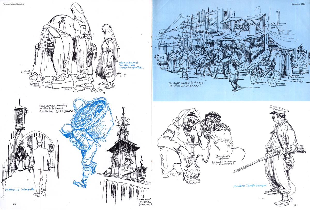
Later finally arrived a few days ago. With Kent's permission, I'm sharing the entire thing with you here - and including some Ric Estrada material I also happened to find in the Summer 1964 issue of Famous Artists magazine.
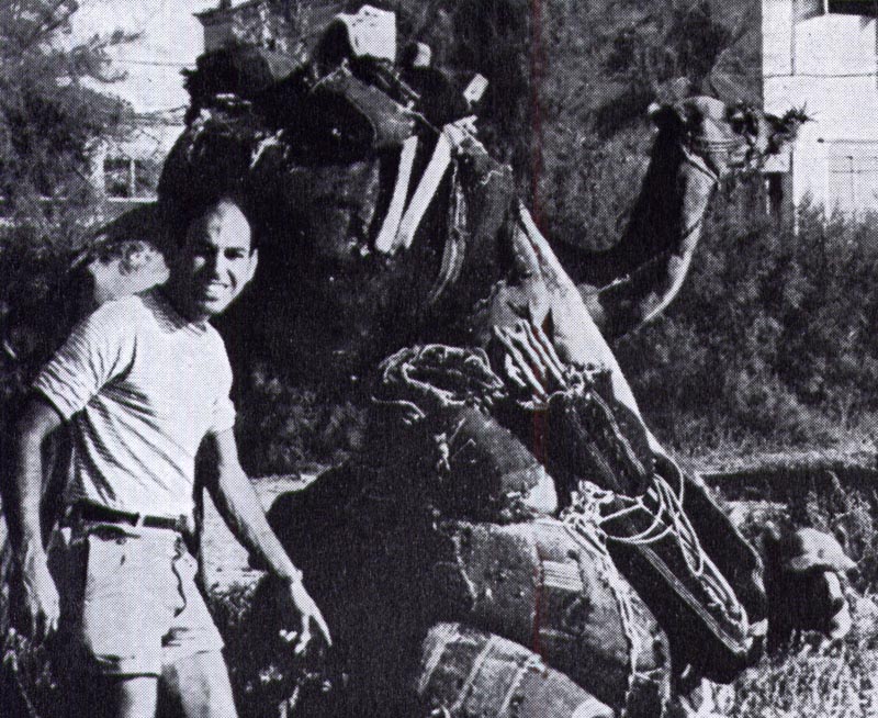


From Kent Steine:

Hello Leif,

Along with my teacher, Owen Kampen, I have mentioned the name Ric Estrada to you several times over our correspondence. Ric is an old friend and great fellow. Please allow me to tell you a little about him before I get to the final Albert Dorne story Ric told me many years ago. It took me a while to assemble this, my apologies for being late on the draw.


Ric was born in Havana, Cuba, and came to the U.S through the sponsorship of his uncle, journalist Sergio Carbo, and his friend, Ernest Hemingway. Hemingway was a positive influence on his early life.


Ric attended the Art Students League from 1948-50, studying under Howard Tafton. He studied advertising design at the School of Visual Arts in'52 and '53 and had completed the FAS course in 1951. A number of years ago, I had encouraged Ric to apply for the position of Chairman of the Art Department of the school I was instructing at during this time. The following is part of his professional biography, sent to me and dated May 2, 1992:

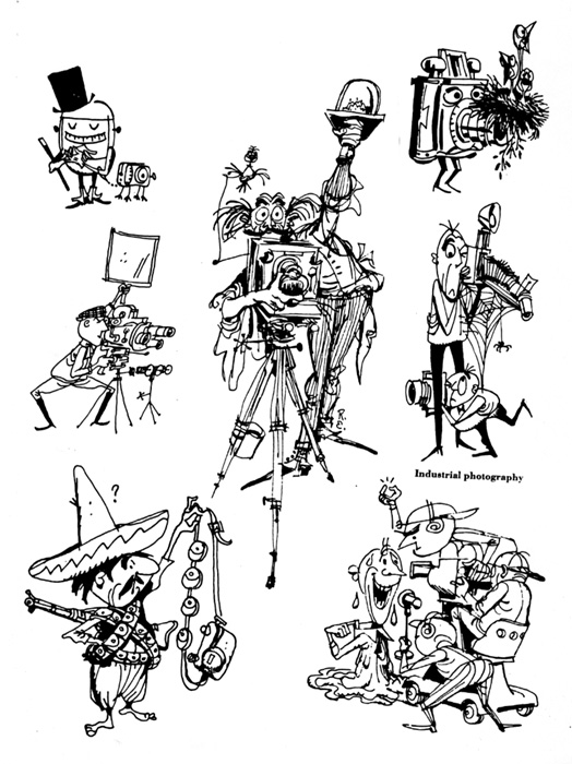
"In New York, I was lucky enough to become a protegé of Albert Dorne, the highest paid illustrator in America at that time, and founder of the highly successful Famous Artists Schools. In subsequent years I illustrated many texts, brochures and publications for them, including: The Famous Writers Course, Famous Photographers Technical Manual, and co-art directed the FAS Course for Talented Young People, later adopted as an art text in Sweden."


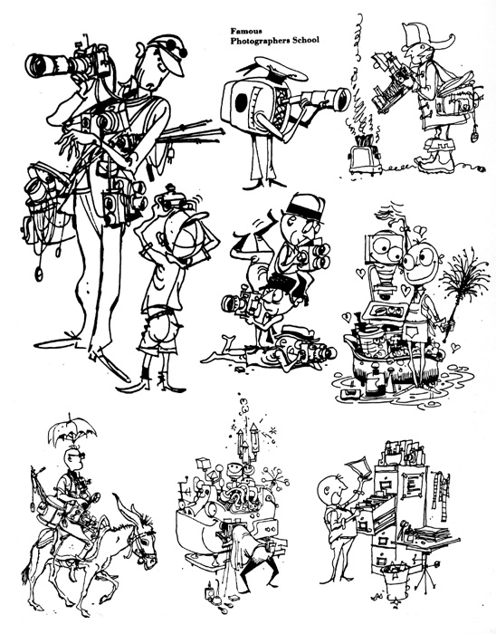
Ric did a great deal of comic book work during the 50's and early 60's for Hillman, St. John, National/DC, Ziff Davis and EC. He drew roughly 500 pages a year of action adventure, romance and war stories for the better part of sixteen years.

He also ghosted for Dan Barry during the 50' and 60's after Barry had taken over Alex Raymond's Flash Gordon daily. He also worked for Topps doing card sets like "Pirates of the Caribbean", "Frank Buck", "History of WWII" and "Ripley's Believe it or Not". He also did a lot of work on the newly launched Alfred Hitchcock Mystery Magazine, and Manhunt Magazine.


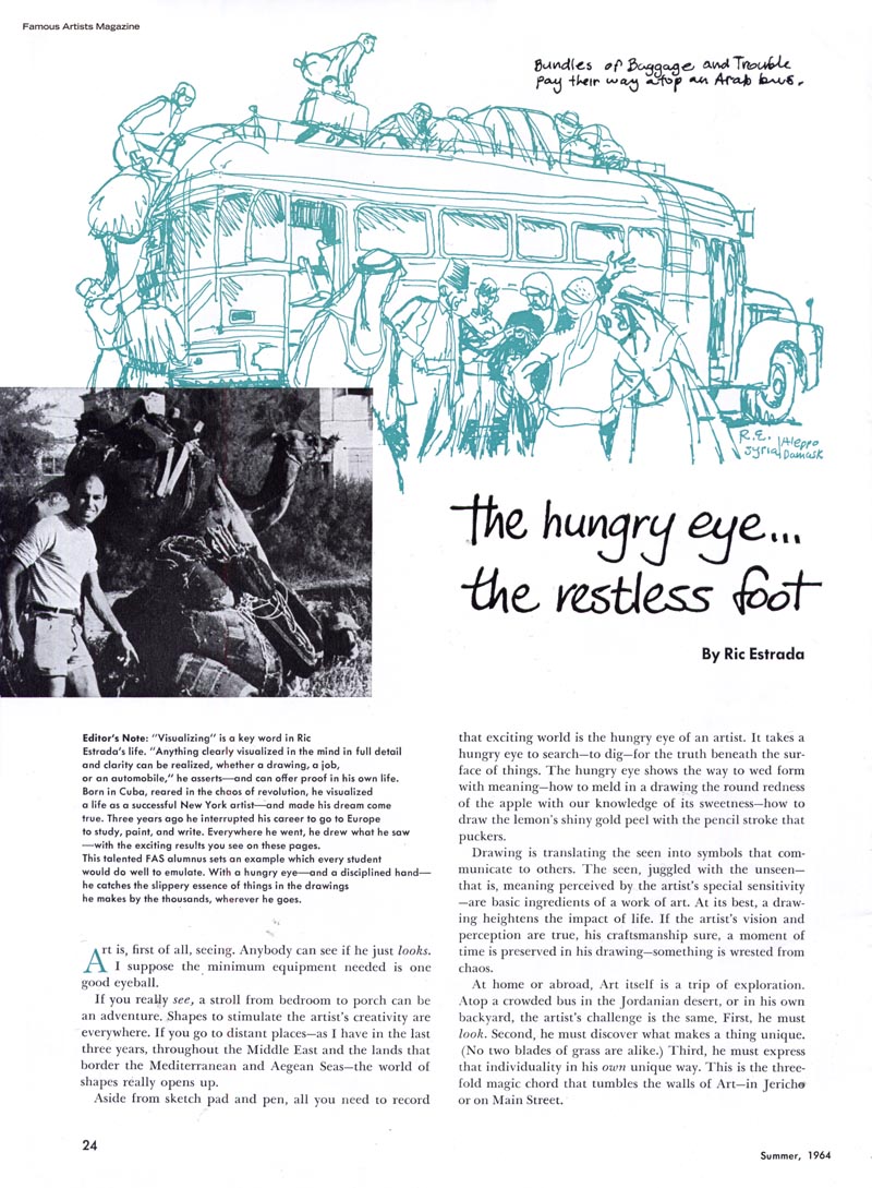
In the sixties Ric moved to Europe working for publications writing and illustrating, but ended up in West Berlin doing film work HELLO WEBER . . . GMBH, an advertising film studio, storyboarding and co-directing T.V. commercials (including the first prize winning Kodak Instamatic commercial). He also wrote and did political cartoons for Spandauer Volksblatt during this time.


He returned to New York in the 70's and divided his time between advertising and editorial work. He wrote for 
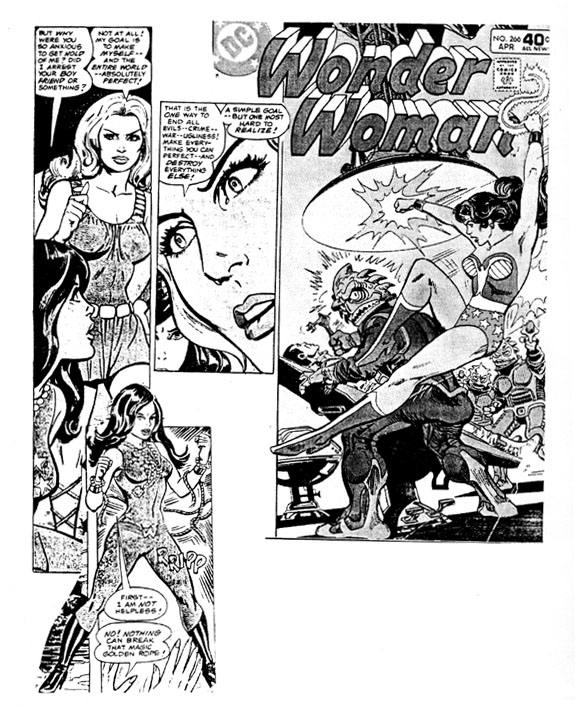
Dance Magazine, and drew storyboards for Ted Bates Advertising Agency for clients such as Hertz, Breck Shampoo, Coors, Alpo... moonlighted comics for Warner Communication, DC Comics (Superman, Batman, Wonder Woman Sgt. Rock, Kanigher's Gallery of War, Karate Kid, Richard Dragon, Kung Fu Fighter, League of Superheroes, and others)... illustrated children's books for McGraw Hill, Holt Reinhardt & Winston- CBS, Franklin Watts, Continental Press, and Readers Digest.


He illustrated lavish brochures and LP covers and liners for the Longines Symphonette Recording Society... illustrated a campaign promoting historical silver coins for the Danbury mint. Around this same time Ric taught drawing, color markers, graphic storytelling and the business of art at the Joe Kubert School of Cartooning two days a week for two years.


In the early eighties Ric moved to California and started doing storyboards, layouts, BG designs, and presentation illustrations for Marvel Studios, Filmation, Hanna Barbera, TMS, Saban Entertainment, DIC, Film Roman, and Warner Brothers.


As a staff artist at HB much of the other studio work was freelance. Ric also illustrated for Disney's Adventures Magazine.

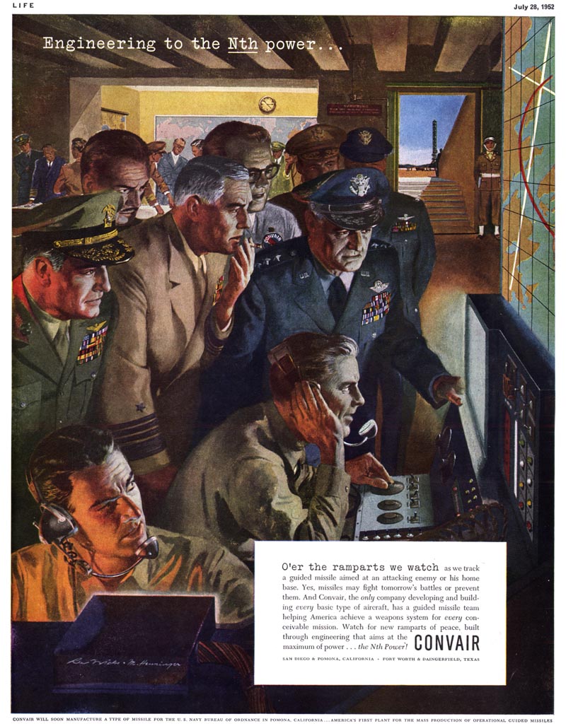
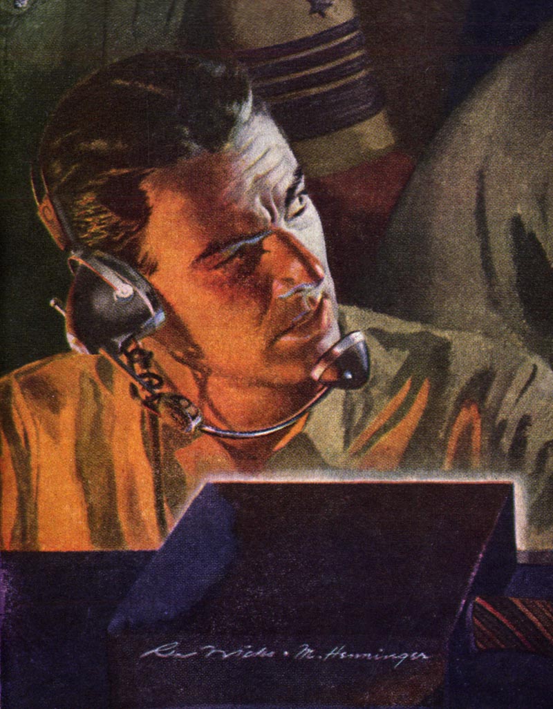
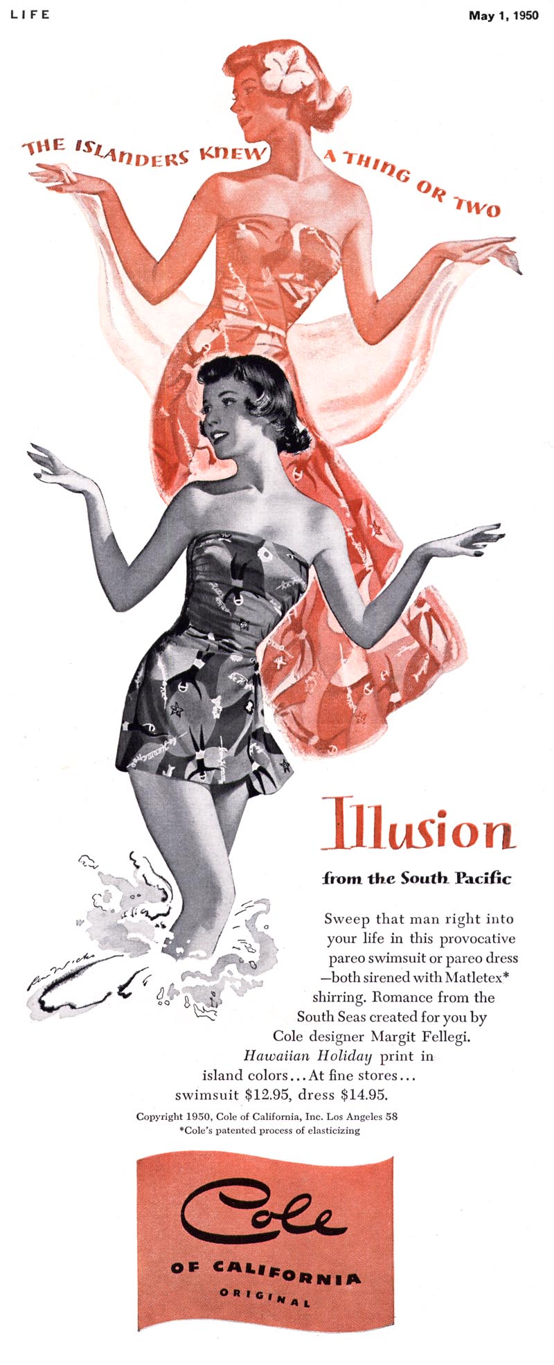
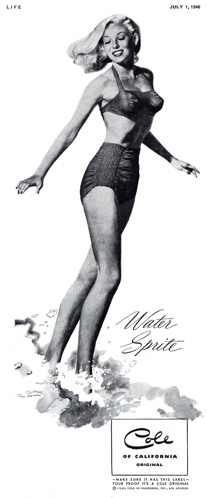
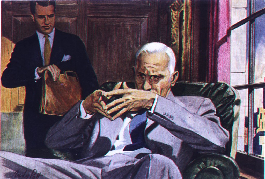
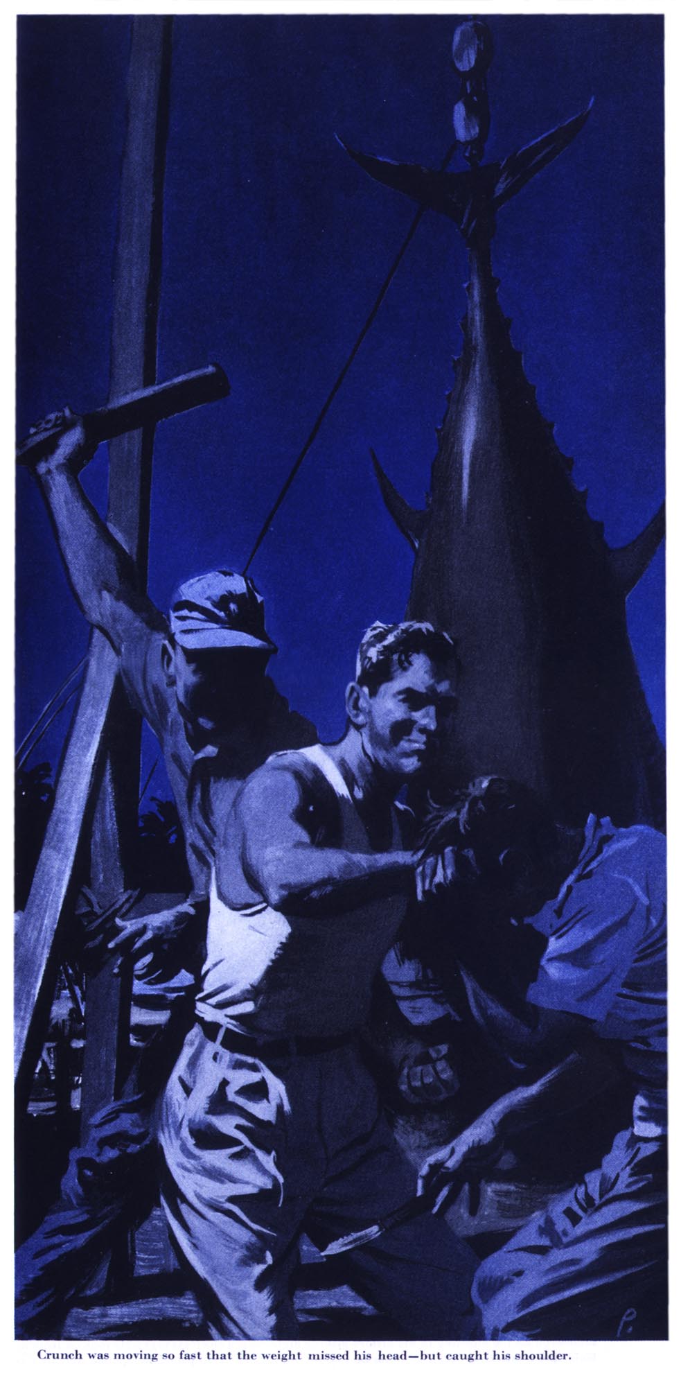
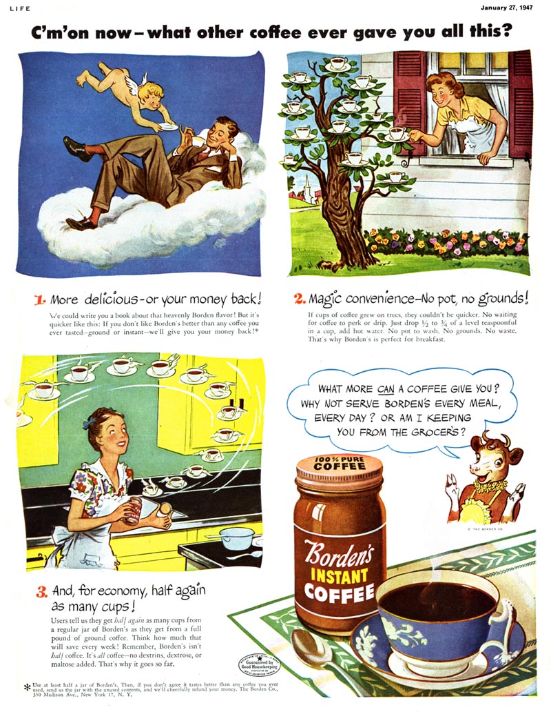
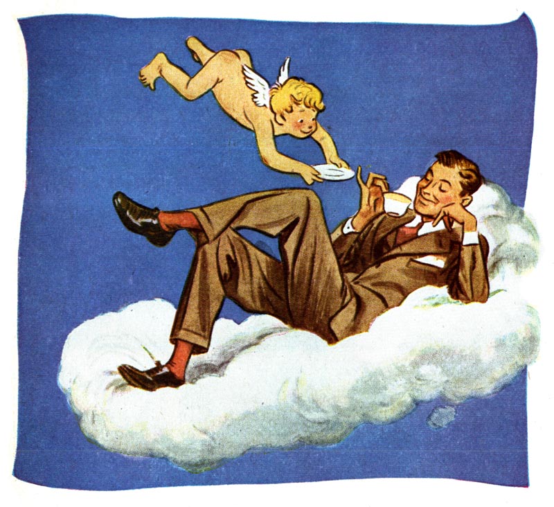
Time to get back to the story related to me, about Albert Dorne. Leif, I could go on for a week about Ric. It is easy to see why Mr. Dorne took a personal interest in him. I have attached some of his super-cool work for your perusal.


Mind you, Ric Estrada is quite possibly the kindest, most humble gentlemen I have ever known. His admiration and devotion to Mr. Dorne seemed that of a son. He couldn't say enough about Albert Dorne's friendship and generosity over the years.


Ric once told me a story of unexpectedly attending a holiday party in the early 50's with Mr. Dorne. Not having been able to dress for the occasion, it had been pointed out that he wasn't wearing a necktie by one of the other attendees. Seeing an uncomfortable situation arising with a young unknown artist at a swank party, Mr. Dorne unknotted his own tie and gave it to Ric.

Quite possibly the most telling story that represented Albert Dorne's character and personality was also the the saddest. Ric was there with him the day he passed away. He had apparently been admitted to the hospital to perform a routine procedure. But something happened. A chart was misread, or something... that lead to him being given incorrect medication, or unnecessary action. Frankly, the facts surrounding this story were so enervating that I have long forgotten the specifics. They don't matter. He died unnecessarily.

To make matters worse. He knew. He knew before the doctors. According to Ric, Mr. Dorne accepted his untimely fate without resentment or anger. He had lived a rich full life to that point, and had touched a great many people.

Not sure how to end this one, Leif. Its a brick wall in the life and story of a great guy and superb illustrator. We should be thinking in terms of another 20 years of this man's life.

Hope you enjoy Ric's material. . .

With every good wish,
Kent