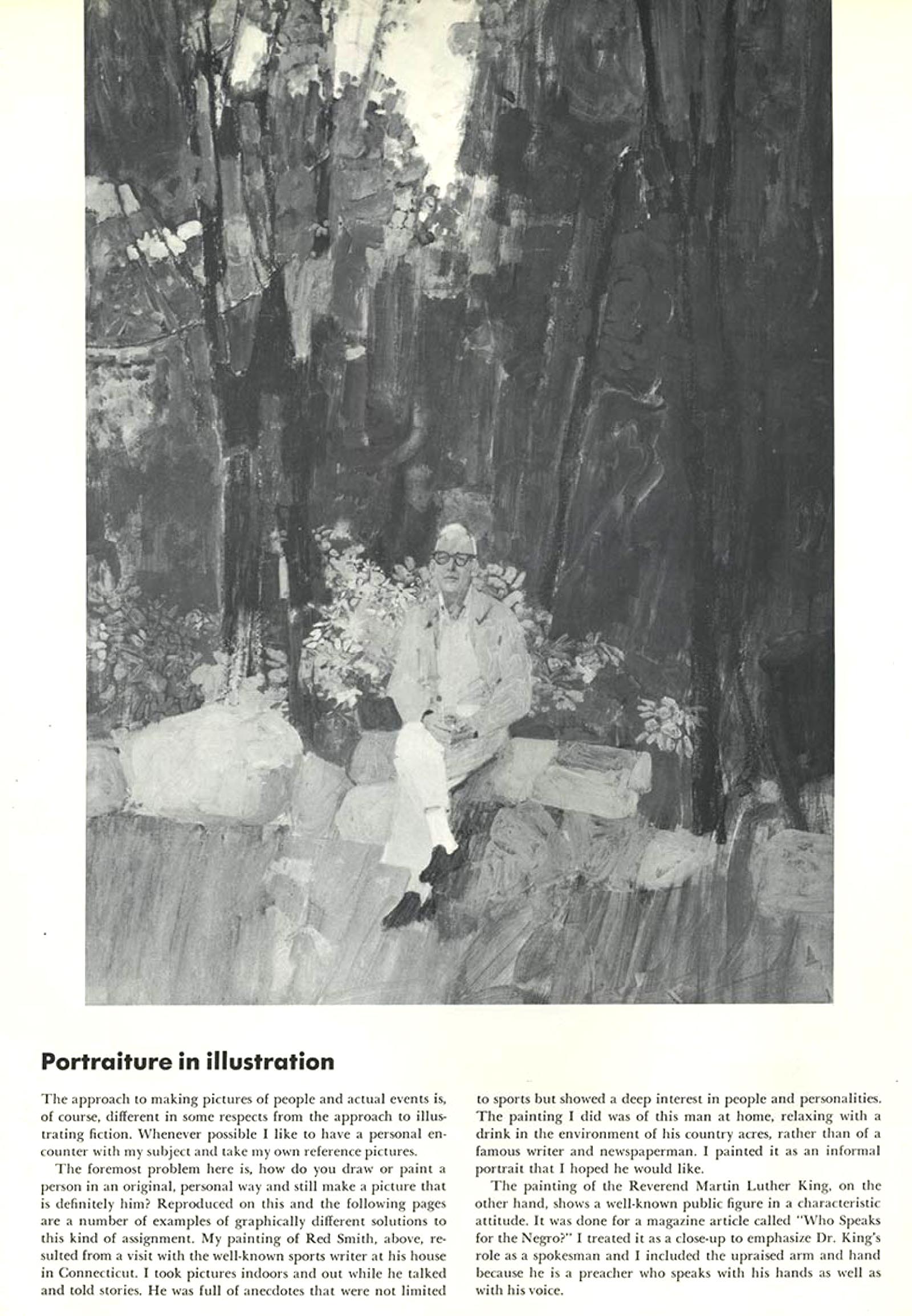
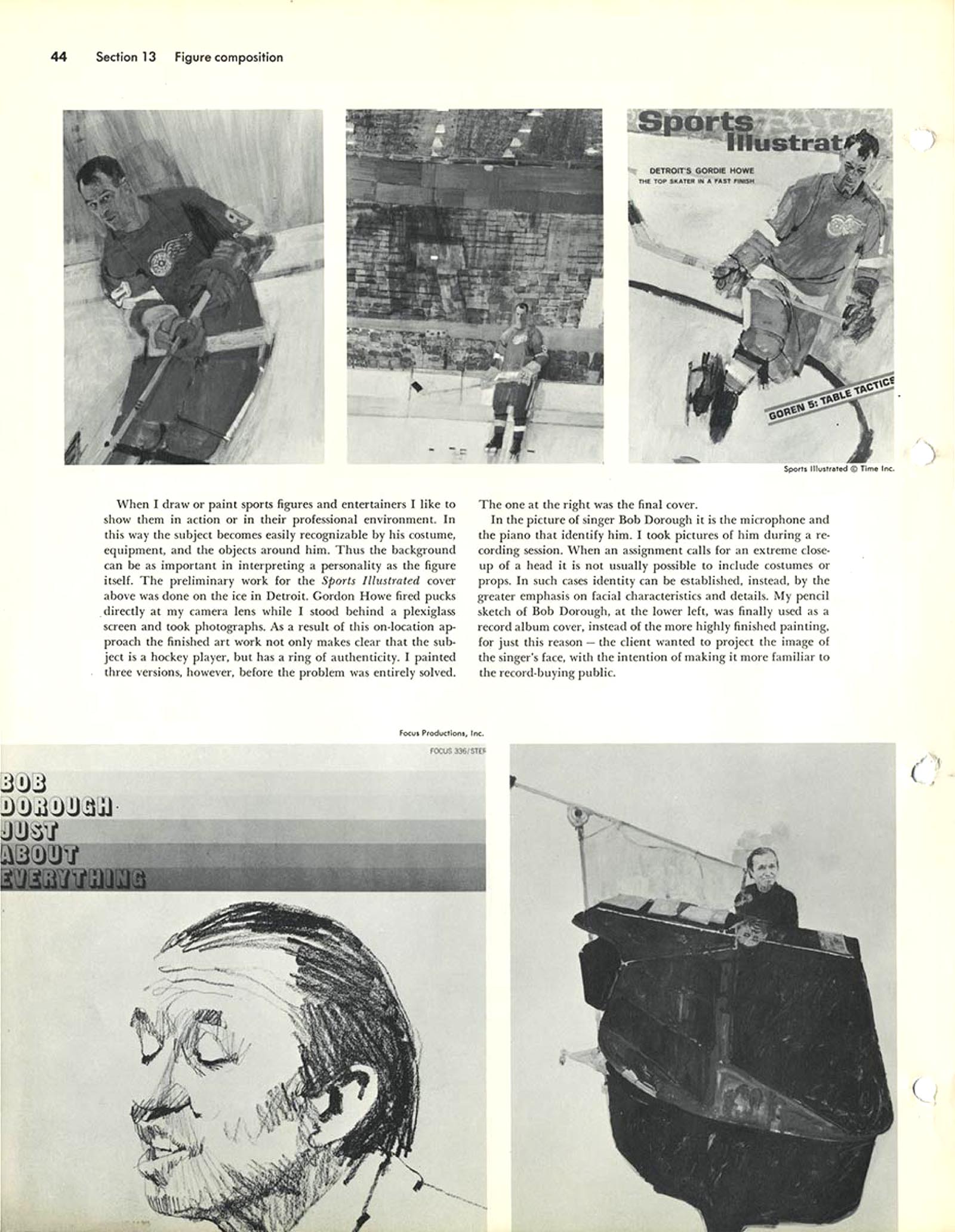
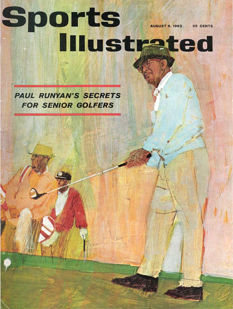
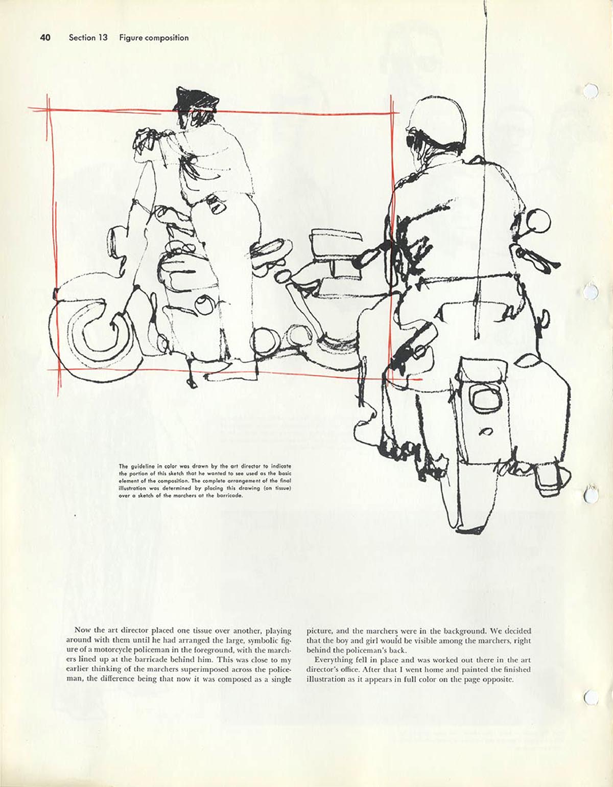
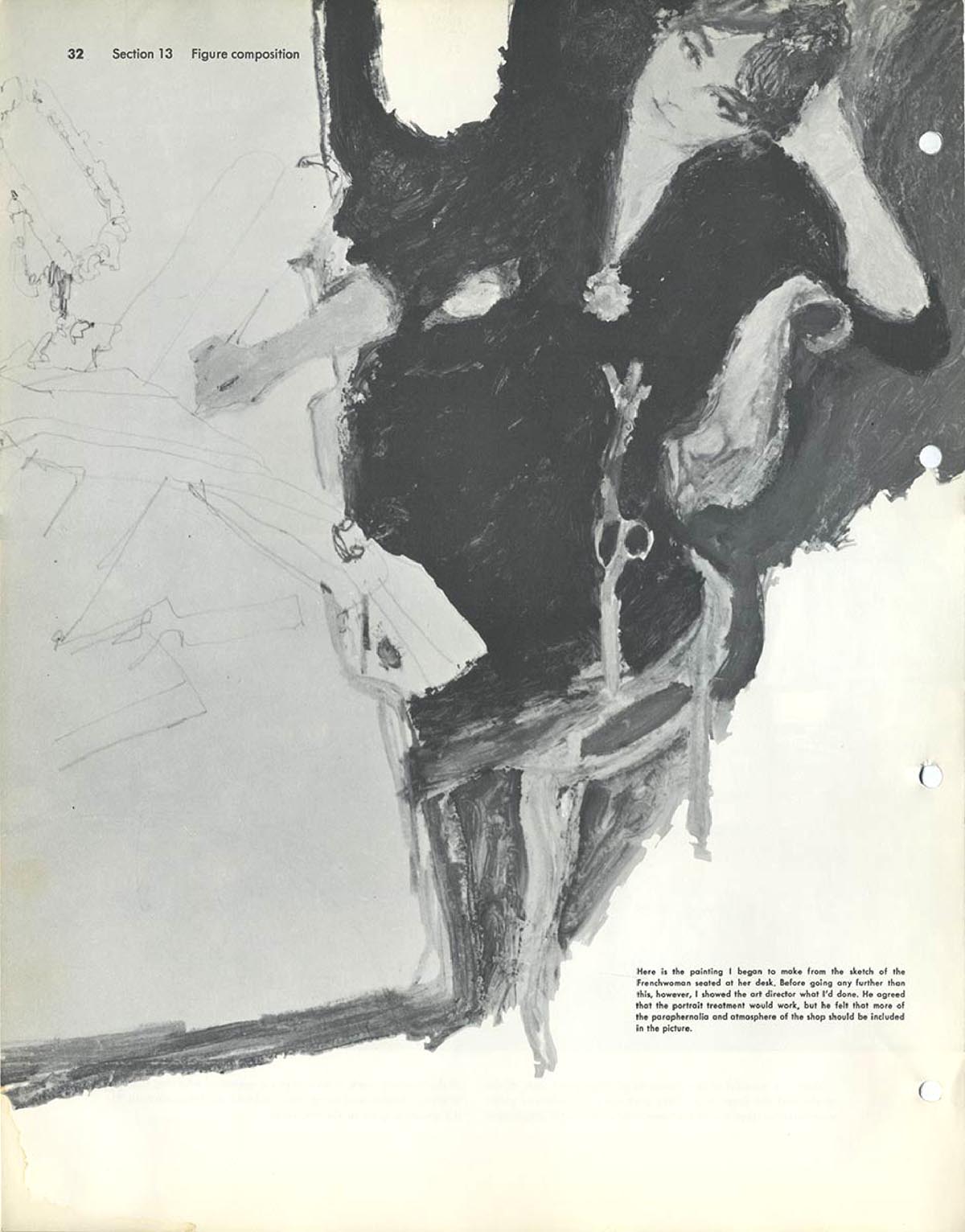
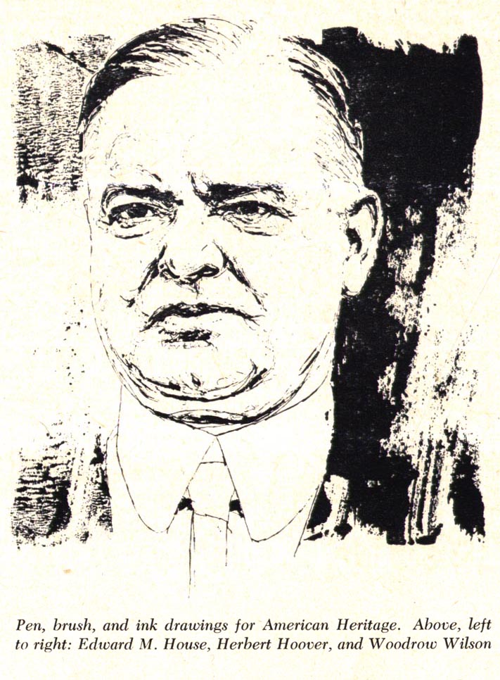
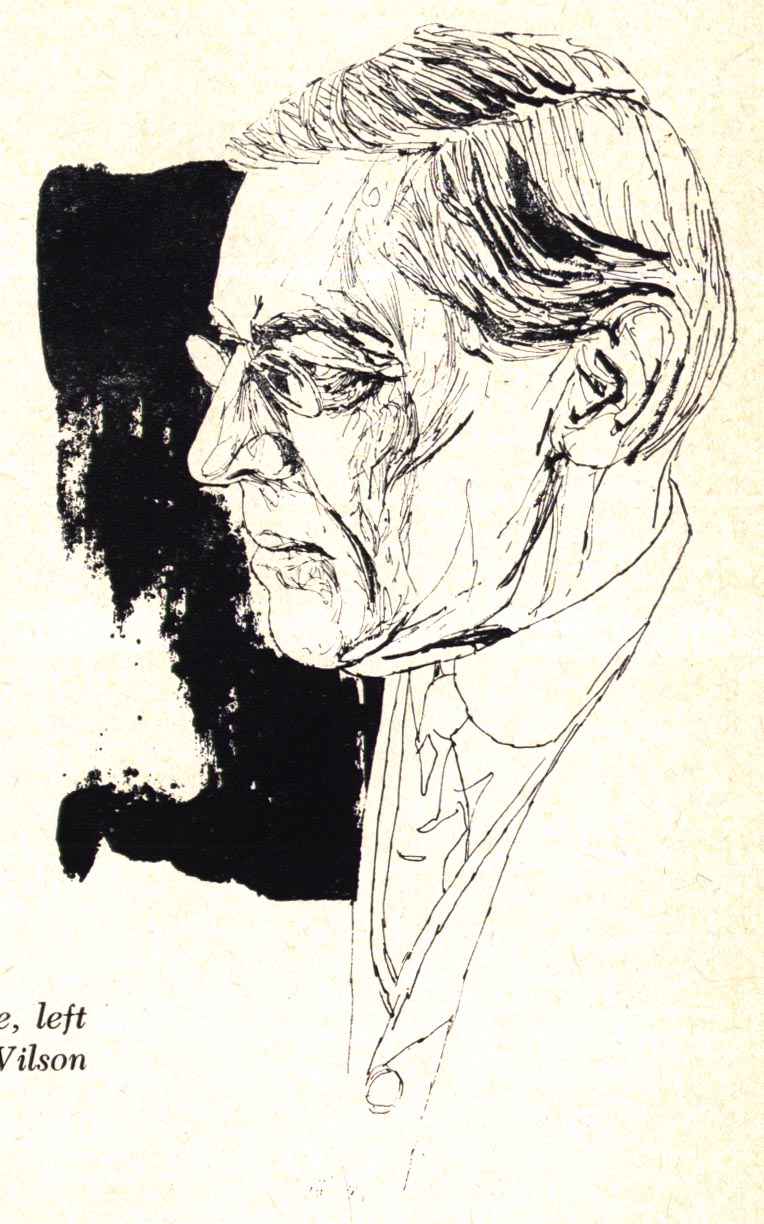
From the March 1959 issue of American Artist magazine"I start each drawing as though it were to be a 'finish'. If it develops unsatisfactorily, I start another. Often I make several starts. I draw quickly and my style is such that this re-doing system is not much more time-consuming than the preliminary pencil sketch method would be."
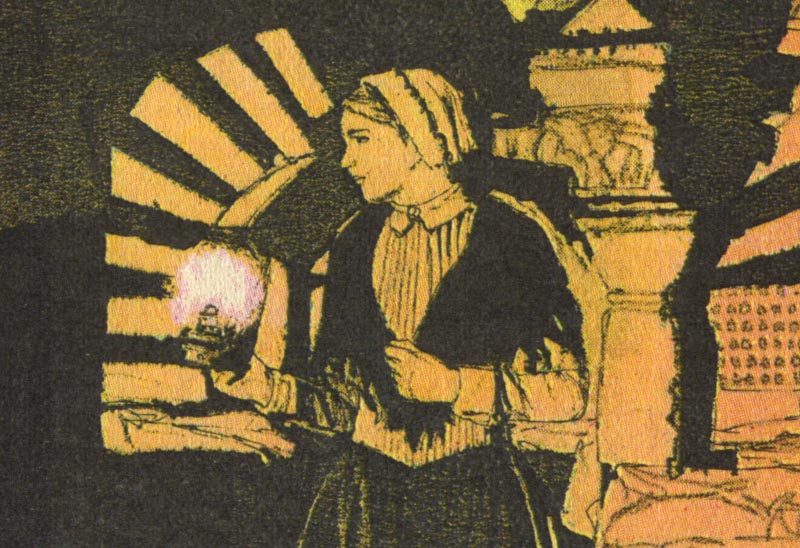
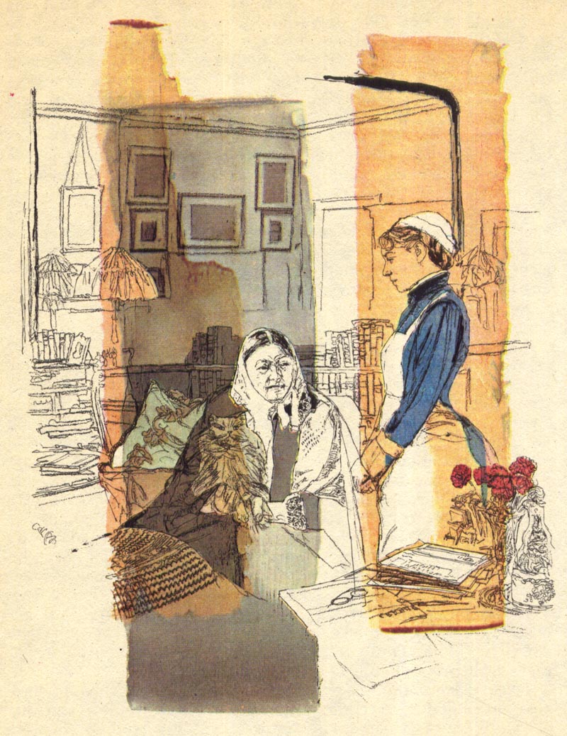
"My illustrations are all based upon drawings in ink. Some are straight black and whites..."
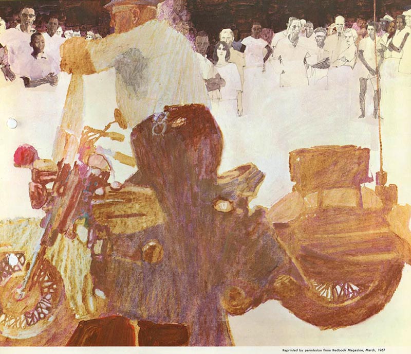
"... but even those in color are essentially drawings..."

"... over which tints are applied."
"In making illustrations I seldom use a pencil for preliminary guidance, preferring to draw directly with the pen. The drawing is done purely in outline. When that seems satisfactory, I put in the important dramatic, solid black areas and the half-tone values."
"In a colored illustration the pigment is applied over the ink."

"Later, I insert the smaller, incidental blacks. Colored inks are my basic color source."

"Basically, my method is as simple as the preceeding paragraph states, but as each step permits unlimited variation, the procedure can become as elaborate as desired."

"I believe in experimentation, and whenever feasible, I test new methods for novel incidental effects. For example... in adding the color (colored inks) I may employ a brush or an ink roller like those used in block printing."

"It is used, of course, only to cover large, simple areas. The other shapes must be masked out. I use frisket paper for the large expanses and liquid frisket for details."
"Drawing ink, of course, is much thinner than printing ink and of different composition and does not lend itself to flat, even coloring, but as I am always alert for fortunate accidentals, this offers quite an advantage in my eyes."
"I make many experimental variations with frisket in solid masses and in line. Let us imagine the subject is a figure clothed in decorative costume. The elaborate line drawing may be made with frisket on plain white paper. Color as desired is then applied over the drawing, and when the frisket is removed and the white line design is modulated suitably, the result is striking and unusual. True, a similar effect might be achieved by drawing the outline design with white ink..."
"... but to me the unmechanical, fortuitous result of the first method is infinitely to be desired from an artistic point of view."
* My
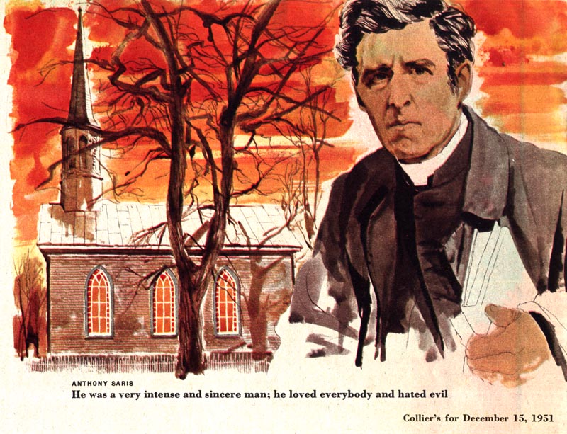
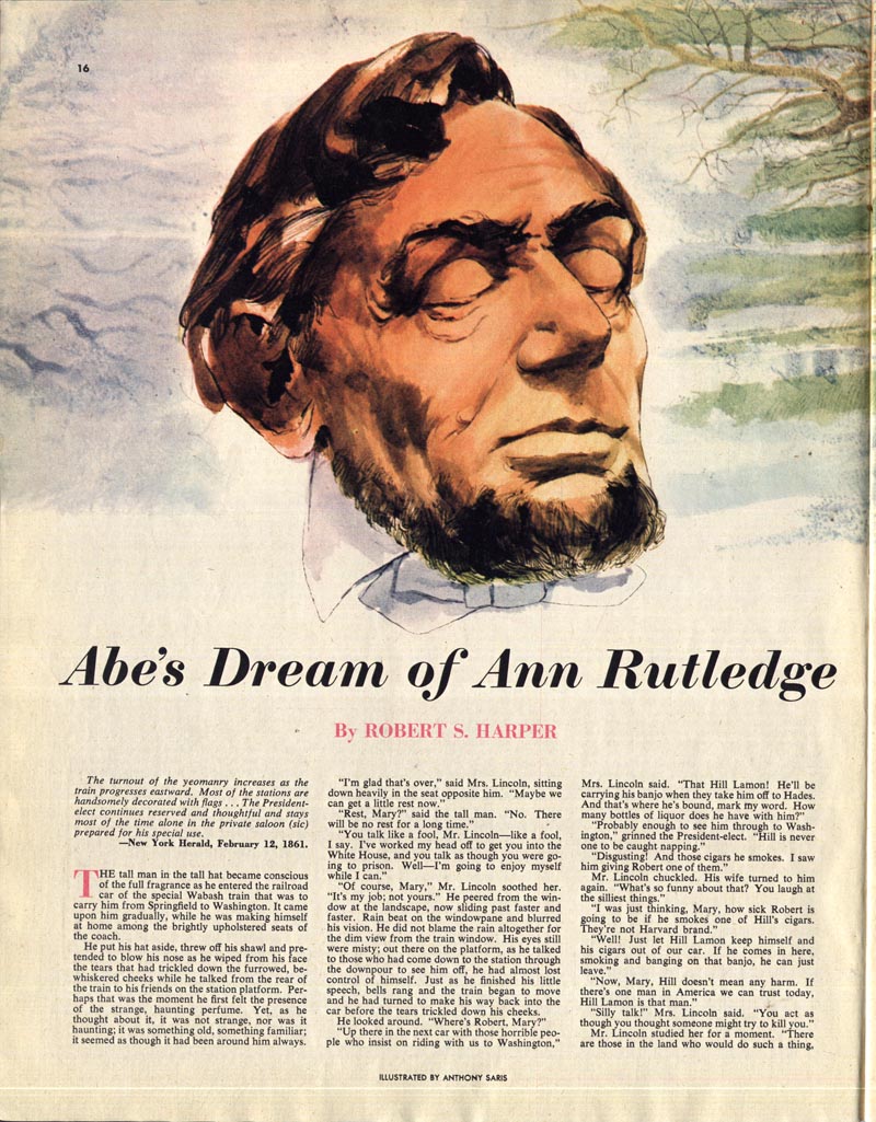
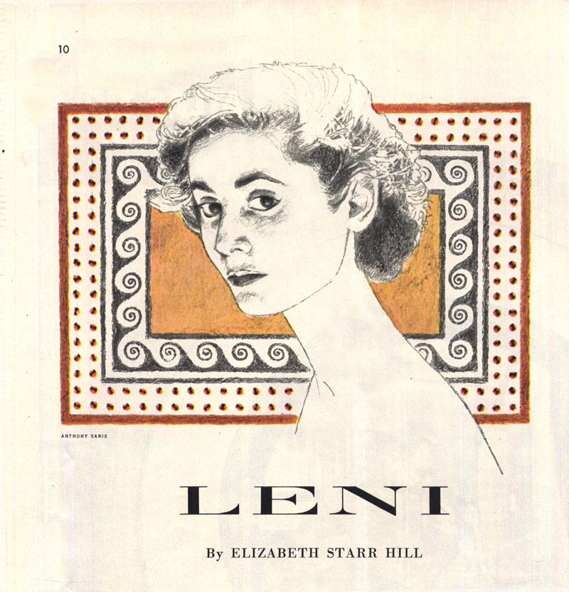
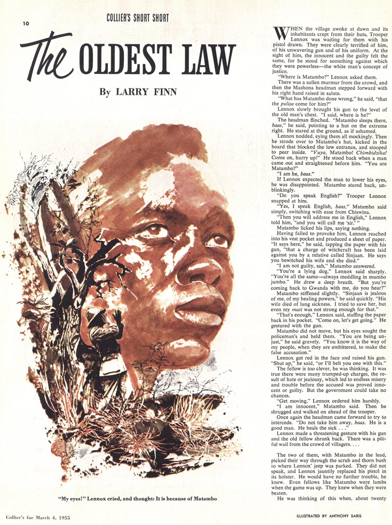
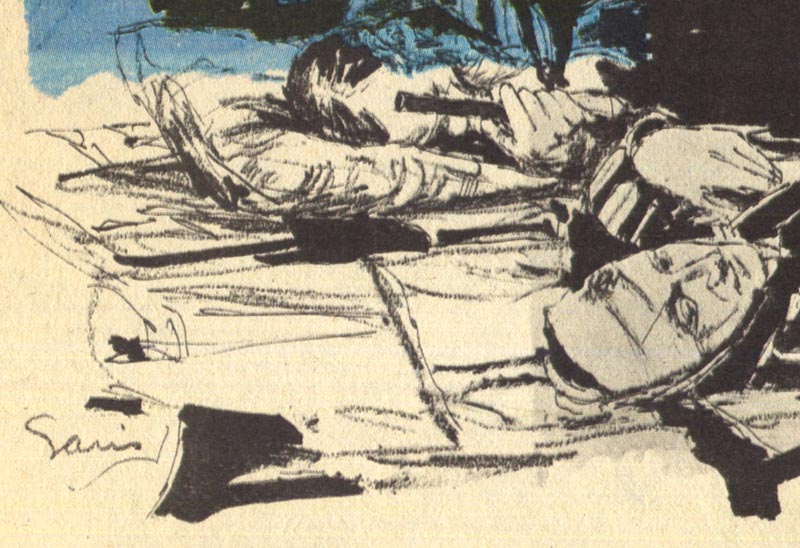
Anthony Saris Flickr set.
* Charlie Allen's latest CAWS -
a dozen amazing b/w ink-line drawings from the '50s and '60s - not to be missed!