Wednesday, September 30, 2009

Cover Story: Good Housekeeping

For illustrators today; how would you like to be the cover artist of a nationally circulated magazine with several million monthly readers? That would be a nice feather in your cap, wouldn't it?

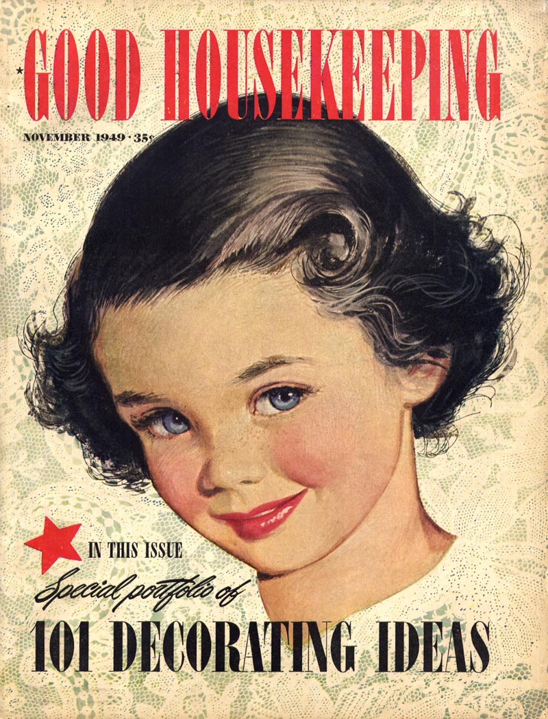
Now consider this: how would you like to be the cover artist of that same magazine every month for nearly 12 years?


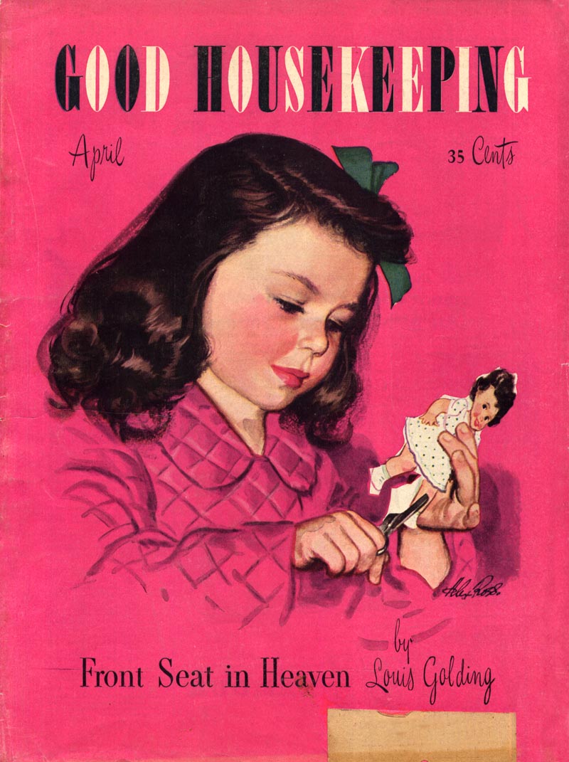
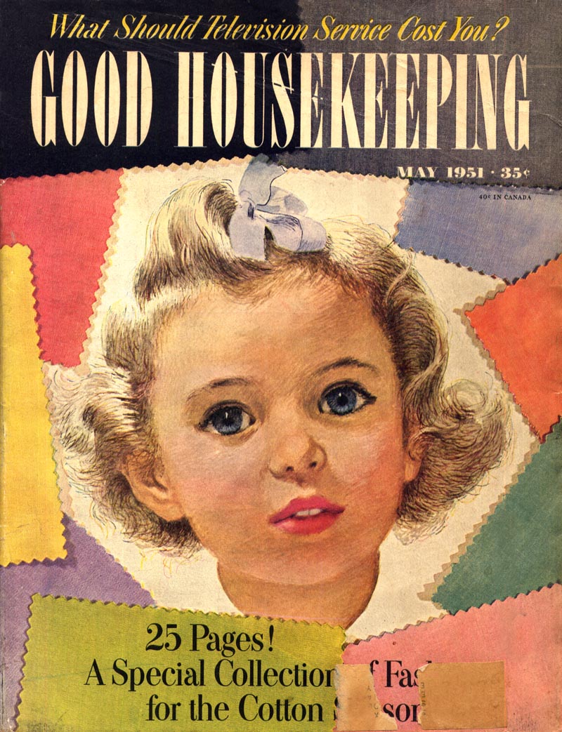
That was the case for Alex Ross, who illustrated nearly every cover of every issue of Good Housekeeping from 1942 to 1954 - an assignment that must surely be without precedent anywhere at any time in the annals of illustration history.


Considering the importance of magazines during that era as a primary source of information and entertainment, you can appreciate the magnitude of having been responsible for creating all that high profile artwork.

Now imagine what it would have been like to be the little girl who modeled for all those covers seen by millions of Americans every month from coast to coast.


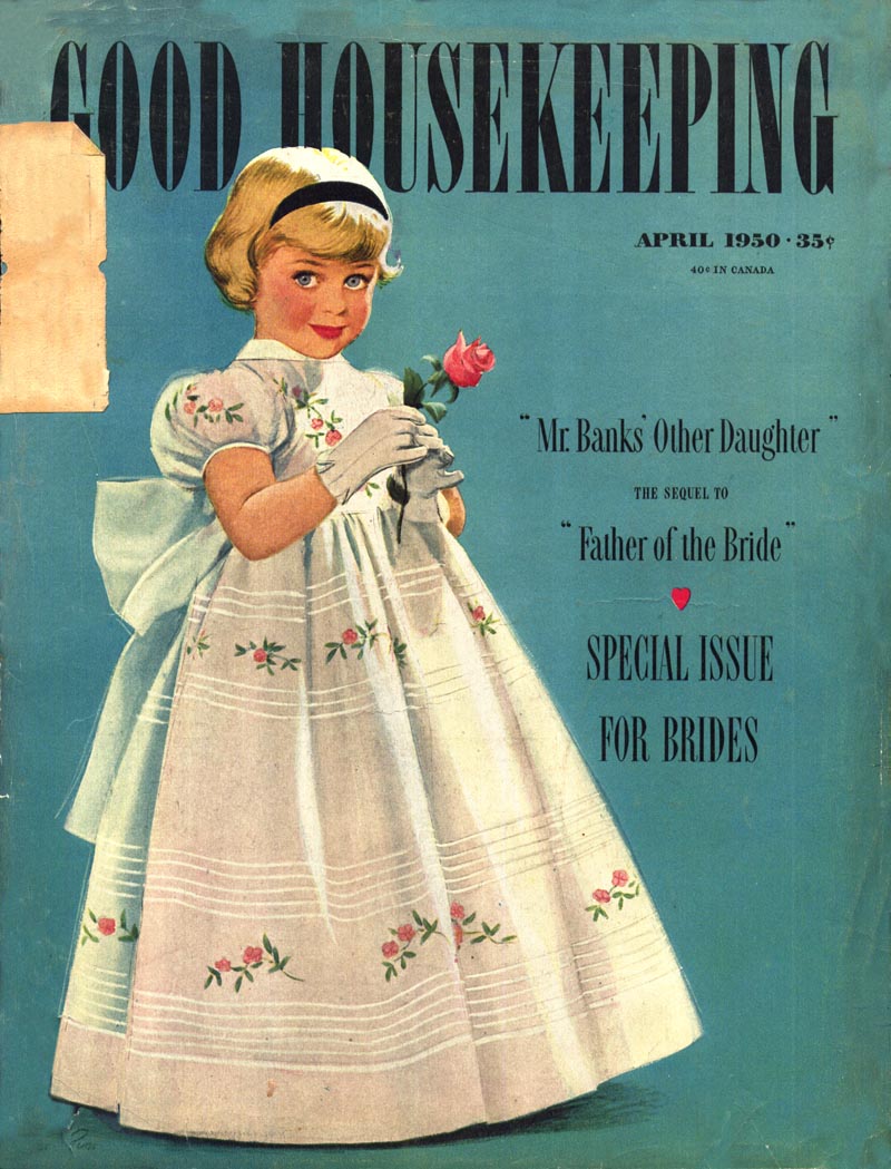
That was the case for Alex Ross' daughter, Wendy, with whom I have been corresponding over the last few months. She described to me how her dad came to enjoy such an extraordinary assignment:

"His first big break came on April 19th, 1942 (the day I was born), when one of his illustrations was chosen from a roomful of contestants to be a Good Housekeeping cover. He called me his "good-luck charm," and I was the little girl (or sometimes even the little boy) on about 90% of the covers from 1942 until 1954. The editor of Good Housekeeping at the time was Herb Mayes. He and dad became life-long friends, and he was commissioned to do 130 more covers over the next dozen years at around $2,000 a piece."


In the coming months Wendy and I will be collaborating on a thorough examination of her dad's career, something I am really looking forward to, since Alex Ross has always been one of the mid-century illustrators whose work I have most admired.


Consider this just a small sample of what's to come.

* My Alex Ross Flickr set.

Tuesday, September 29, 2009

Cover Story: Fortune magazine

Hopefully this won't rile up the gang of crusty curmudgeons who commented yesterday, but in my opinion, some of the best, most forward-reaching magazine covers of the 50's were those commissioned by Fortune magazine's AD, Leo Lionni. I have the greatest admiration for Lionni. I think the man was a genius.


Leonni was at the centre of one of the most heated debates this blog has ever seen, back in February, when I showed a simple, child-like drawing he did in 1940 that won an Award of Distinctive Merit from the New York Art Director's Club.


Without revisiting that debate in detail, I'd just like to emphasize that, during a time when literal representation in illustration was king, the publishers and editors of the leading business magazine in America trusted Lionni to choose these and many other similar illustrations month after month for the covers of a magazine that (one could safely say) was being read by the most influential, powerful and conservative audience of the day.


These pieces would probably fit comfortably in the Museum of Modern Art, even today. But make no mistake: they are commercial art - commissioned for the purpose of selling a product - Fortune magazine - to the consumer, and it was Lionni's job to provide the kind of visuals that would increase sales. If he had failed he would have been replaced, but in fact he was Fortune's AD for well over a decade and only left in 1959 because he chose to quit the magazine business and pursue children's book illustration.


Whether you love or hate this kind of avant-garde approach to illustration, the fact remains that this magazine must have popped off the news stand. It was a great way to put a fresh face on the often dull topics of business and politics. Try doing a Google Image Search for "Fortune magazine' and see where we are sixty years later.

Photo after photo after photo of businessmen and politicians staring at the viewer. Very exciting. Ugh.


Art directors could learn a lot from a close study of what Leo Lionni accomplished half a century ago, in far less liberal times.


This guy had big balls and knew how to use them. ADs today need to grow a pair. The end.

Monday, September 28, 2009

Cover Story: Sports Illustrated

Take a look at the typical magazine rack these days and you'll probably notice something missing: illustration.


Someone used to say you could gauge the condition of the illustration market by what was on the cover of Time magazine. If Time was using illustration then most other magazines would follow suit and thus illustration assignments in general would experience an up tick. If Time was on a photo cover jag, then the illustration market would experience a downturn. Well, I dunno what Time is doing these days, but if their cover was once some sort of illustration 'canary in a coal mine', then I'd have to say that bird is dead.


These days in magazine covers its "photo or bust" - and preferably a photo of some celebrity's bust! You have to wonder what the point is. How is your publication supposed to stand out on the stands if your cover shows the same thing everybody else is showing month after month after month? What kind of marketing strategy is that?


This week, let's take a look at the days when magazines actually considered illustration a viable (perhaps even superior) alternative to photography. If a few creatives with some clout in print media happen to be reading this week and wake up to what they've been missing, there might even be some Time left for the illustration business.

* This week's topic arose because Charlie Allen (who has already so generously shared a wealth of Bernie Fuchs images with us from his files in recent weeks) sent the three Fuchs SI covers you see here today. Many thanks, Charlie!

* And speaking of Charlie, his latest CAWS is up a day early this week. If you didn't visit last week to see Charlie's amazing marine paintings, be sure to drop by Charlie Allen's Blog right now for some more gorgeous, eye-popping artwork, presented extra-large so you can better appreciate the details.

* My Bernie Fuchs Flickr set.

Friday, September 25, 2009

Bernie Fuchs: "an important moment in his life"

In reference to Tom Watson's guest post a few days ago, David Apatoff wrote, "For [those] who are curious about that "truck ad," I believe you can find it in the Society of Illustrators Annual for 1959." And not long after, Tom Watson himself sent the scan below from that SI annual.


David also provided the following quote about that truck ad from Bernie Fuchs:

"I was 26 or 27 when I painted this, and yes, I painted the truck and everything else in this picture. I'm trying to remember whether they had one of the older guys in the studio touch up some of the chrome on the fender after I was done. Chrome was pretty hard to get right. But I don't think so. It was a long time ago. Later I specialized in people and backgrounds, and the cars themselves would be painted by artists who were more capable than I was. My art director submitted this painting to the Society of Illustrators competition without even telling me. I had no idea there was such a thing until he came to me and told me that the jury had picked my painting to be in the show."

Speaking of Bernie Fuchs' automotive art, here are a few scans, courtesy of Charlie Allen...


Charlie writes, "The Edsel ads especially good....though didn't help the ill fated car down the line."


He continues, "Head honcho art director for Foote Cone on those ads.....Fred Ludekins, no less!"


Having done his fair share of auto advertising art during the same period when Bernie Fuchs did these pieces, Charlie gives us the benefit of his vast personal experience: "on Fuchs and photos. Even, or maybe especially, on cars....the artist can't 'trace' or Lucy the photo....it just doesn't work. Autos need, or needed back in those days, an amazing amount of tweaking, stretching, tucking, changing reflection patterns, etc. etc. If 'photo copying' were easy, everybody and his uncle would have been successful artists and illustrators in my time."


Charlie adds, "I like his ads and the more conservative techniques. But you have to admit, his loose editorial style [was] brilliant. Far out for the times....and so well designed, drawn, and painted."


Next comes this note from Bryn Havord in England:

"I was very saddened to learn that Bernie Fuchs had died. I've had a privileged life, and one of those privileges was to publish a lot of his work when I was a women's magazine art director in 1960s London and, of course, I consider that I have been privileged to continue to see his beautiful work develop over the years. Not an easy task as I live in the United Kingdom and have not been to the States since the mid 60s."


Bryn continues, "Bernie's work had a profound effect and influence on the English women's magazine illustrators working at that time: in particular when he was working in pencil with Liquitex acrylic washes. Liquitex wasn't available in England at the time, and a large trade developed when the artists had friends in America sending tubes and jars of the paint over the Atlantic so they could try and emulated Bernie's work."


Bryn elaborates on the anecdote Tom Watson described on Wednesday about how Bernie Fuchs' painting style changed because "he was trying to find a method of creating the effect of a still life illustration of a glass of beer on a shiny bar top." Bryn provided us with several scans from the issue of Lithopinion, the magazine that sent bernie to England to paint scenes from London pubs.


Bryn writes, "That visit to England proved to be a catalyst in Bernie's career; he never used acrylics ever again."


"Bernie was quoted in the catalogue of his recent 50 year retrospective at the Telluride Gallery thus: "I started working in oils because I was inspired by the rich glow of sunlight passing through an amber mug of ale in London. I wanted to be able to capture that feeling in a painting..."


Bryn continues, "I also attach a scan of a recent painting by Bernie of a couple of wine glasses painted for the Telluride Wine Festival in 2008. It's interesting to compare the wine glasses to the beer mug, forty years has seen a development in sophistication, not only in technique, but in the choice of drink!"


Regarding that experience in England while on assignment for Lithopinion, Bryn concludes, "I think it was an important moment in his life which needs illustrating."

* Many thanks to Bryn Havord and all the other contributors who made this week possible: Charlie Allen, Harold Henriksen and Tom Watson, as well as everyone who contributed comments.

* My Bernie Fuchs Flicks set

Thursday, September 24, 2009

Bernie Fuchs and the Illustrators Workshop

TI list member and frequent contributor, Harold Henriksen, sent the scan below, which he calls "a favourite painting by Bernie Fuchs".


As well, Harold shares the following anecdote about meeting the artist...

Harold writes, "I first saw Bernie's work when I was my first year of art school in 1959 and have clipped his and other illustrators work since. I was hired as an illustrator in 1967 and was in my late thirties when I attended The Illustrators Workshop."


"It was from June 26-July 22, 1977. My wife and three daughters one, three and four yrs. old went in my '76 Rabbit. My wife & daughters stayed with friends in Queens & I went to Marymount College in Tarrytown, New York."

"We were instructed to bring a comp sketch for an assignment we would do at the workshop. We would do one more after the first was completed. After meeting the faculty we showed our comps & received suggestions. Each of the artists showed slides and spoke about their work on succeeding days. We visited the artists studios in their homes or in Bob Peak's case a building he had his studio in."


"When it was Bernie's turn he said he felt like he was on the gong show, then his first slide came on and it the audience reacted with awe. When he spoke to you about a piece of your work he had crits that were useful and encouraged us to find our own way."


"When we went to his studio at his home his oil paintings were rolled & tied."


"He was pleased when some of the first to arrive mistook him for another student."


"He was friendly and for one so supremely gifted was humble and easy to talk to."


"I am glad I was able to attend at the time and still am."

* Many thanks to Harold Henriksen for sharing his story and the scan at top, as well as the Illustrators Workshop brochure page below it.

* The remaining scans today are courtesy of Charlie Allen - thanks Charlie!

* My Bernie Fuchs Flickr set.

Wednesday, September 23, 2009

Bernie Fuchs... “A Guiding Light” part 1

by Tom Watson

* Note: For some bizarre reason I'm unable to post both Tom's text and images together in one post. There must be some weird coding issue at work but I don't have the time or technical expertise to sort it out. I'm sorry I have to present the material this way today, but in the interest of making everything available to readers, here's Tom's text - and then scroll down to the next post for the related images by Bernie Fuchs. ~ L

When Leif asked me to write my thoughts and recollections of the illustrations of Bernie Fuchs, I thought... what can I say that hasn’t already been said so eloquently? I never met Bernie Fuchs, but like so many, I wished I had. However, I remember the first time I... or I should say, we students saw a magazine truck ad, illustrated with the look and feel of an Austin Briggs illustration... but, there was no signature. We thought, if Briggs did it, his signature would be there... so, “who is this guy?!” It was 1959, and I was an illustration major at the Academy of Art in S.F. Yes, it was 50 years ago, and that first Fuchs illustration I saw was more than likely sometime in September. When Leif informed me of his passing last Friday, the year and month profoundly came to mind.

I knew little about the world of illustration in 1959, but I was fast becoming familiar with the top guns of the 50’s, like Al Parker, Austin Briggs, Coby Whitmore, Joe Bowler, Joe De Mers, Robert Fawcett, Jack Potter and a host of others... but “who was this guy that seemed to have just fallen out of the sky”. We just stared at that impressively complicated illustration without a name.. full of overlapping, well painted and well staged figures. “Do you think he illustrated the truck too?”, we wondered. “This guy is really good, but who is he?!” Even our instructor Bob Foster (who became a successful paper back cover illustrator for the Sci Fi market in the 60’s and 70’s) was scratching his head and commented, “It isn’t Austin Briggs, but he comes awful close”. Just about that time, we were beginning to see these amazingly well done illustrations, mostly in gouache, by a guy with an odd name.. or at least for a 19 year old, well almost 19, “Bernie Fuchs” was an odd name. Bob Foster apparently did some research and found out a little about the new, soon to be top gun illustrator.. and we were able to attach a name to that remarkable illustration for the truck ad, that we were so impressed by, earlier.

Well, this rapidly elevated our search for the month’s top gun illustrators in the selected magazines, such as McCalls, Ladies Home Journal, Cosmopolitan, Redbook, Fortune, Esquire and a few others. We found a new bright light, and we were hungry to see much more of his work. From that time on, Bernie Fuchs did not let us down one bit.. in fact, he thrilled us with every new story illustration, and he became our central focus. They were masterfully drawn, skillfully painted and he he had his own brand of beautifully designed figures, overlapping one another in unique ways, creating a visual flow throughout the composition. And, his beautiful use of negative space, was stunning to us. He seemed to have the knowledge and skills of a seasoned veteran in his 40’s.. but he was still only in his 20’s! “How did this guy get so good, so fast”... as we literally watched it happen before our eyes, one incredible illustration after another. It gave us hope that there was opportunity for young upcoming illustrators in magazine story illustration... but it was clear, you had to be good.. really good!

By the time I was out of art school and working at my first illustration job in 1963, Bernie Fuchs had literally catapulted to the top, and he was THE man to watch! Sports Illustrated was now added to my list of magazines to watch for some really cool illustrations. He was loosening up and experimenting with a combination of charcoal pencil under-drawings, with loose transparent brushy Acrylic washes on top of a gesso textured illustration board... at least that is what it looked like to me. He was setting the standard for illustration all over the country. A.D.s wanted something that a photograph couldn’t do, and Bernie Fuchs had the solution every time he was given an assignment. Photography was forcing the issue, and he responded with top quality innovative illustrations, employing unique compositions and interesting abstract shapes and textural effects. The thing with Bernie Fuchs was that he never rested on his laurels. He just wasn’t satisfied pumping out more of the same that had won him awards and gave him the top assignments month after month. He just kept digging for something different, and IMO, he NEVER sacrificed quality to experiment and be different.

Since I didn’t know Bernie Fuchs, I can only tell you that looking at his work, I see a sensitivity that must have run deep in his soul.. a sensitivity and perhaps an instinctive understanding of wonderful design, delicate superb draftsmanship, subtle carefully developed color schemes, innovative compositions and skillful brush manipulation. But, all those surface qualities can’t work alone when doing an illustration.. the concept is the first step, and Bernie Fuchs was a master at developing an effective unique concept.

By the mid 60’s he began experimenting in mixed media, changing his color schemes and developing heavier textural effects. I watched his work become somewhat less literal, and more design oriented, but he always paid attention to accuracy and draftsmanship. He later began using thicker painterly effects, covering any underlying pencil marks, and working in more dark and light opaque patterns. His work was now in nearly every aspect of editorial and advertising illustration, as well as posters and book illustrations. And then, because of an assignment for Lithopinion, in which he was trying to find a method of creating the effect of a still life illustration of a glass of beer on a shiny bar top, he began experimenting again with different painting effects. His solution was to apply thin stains of mid and dark tone colors on canvas in oil paint, and then rubbing out the lights, and painting back into the light areas with subtle more opaque hues. He stayed with that procedure, perfecting it, and adjusting it for a variety of assignments. And, it worked well for him in his fine art endeavors as well.

Those are my impressions of Bernie Fuchs, for the last 50 years, who has provided me with inspiration and knowledge in every drawing and painting I see of his. His work was one of the major influences that revealed to me the possibilities, and helped make life exciting as a student, an illustrator and later in fine art. While teaching, I told my art students.. “look, analyze, admire and learn from the great illustrators and great painters.. they can teach you volumes”.

And Bernie Fuchs is certainly worthy of being called a great illustrator.

* Many thanks to Tom Watson for sharing his thoughts and recollections of Bernie Fuchs with us, as well as providing all of today's scans. I still have quite a few BF illustrations to share this week (thanks to our own Charlie Allen) but would very much like to have some interesting anecdotal text to accompany them. If you would like to do the share your thoughts on Bernie Fuchs as a guest author, drop me an email at leifpeng[at]gmail[dot]com.

*And be sure to drop by Charlie Allen's Blog to see the latest CAWS: Charlie's magnificent marine paintings.

Bernie Fuchs... “A Guiding Light” part 2

by Tom Watson

* Here are the images Tom sent to accompany his text in the post above. Many thanks, Tom - and apologies for the awkward presentation today! ~ L


* Many thanks to Tom Watson for sharing his thoughts and recollections of Bernie Fuchs with us, as well as providing all of today's scans. I still have quite a few BF illustrations to share this week (thanks to our own Charlie Allen) but would very much like to have some interesting anecdotal text to accompany them. If you would like to do the share your thoughts on Bernie Fuchs as a guest author, drop me an email at leifpeng[at]gmail[dot]com.

*And be sure to drop by Charlie Allen's Blog to see the latest CAWS: Charlie's magnificent marine paintings.

Bernie Fuchs... “A Guiding Light” part 3

* Note: This first attempt at today's post will remain so as not to lose comments already posted on Tom's Bernie Fuchs article presented above. ~ L


Tuesday, September 22, 2009

On Bernie Fuchs and the Nature of Immortality

Last week Bernie Fuchs passed away.


For some illustrators (for most) that would be the end of their road. Not so for Bernie Fuchs. The man may be gone but his influence on illustration will last a very long time...


... maybe forever.


I'll always remember one particular class in my first year at art college. We had just pinned up our weekly assignment in John Woods' Structural Drawing class for him to critique. John was a tall, gaunt, chainsmoking expatriate Brit with an acerbic wit and and absolutely no tolerance for foolishness. I both liked and respected him - but he also scared the shit out of me.


On that day John made his way briskly around the room offering faint praise here, a scathing criticism there... but he stopped abruptly and stared for a good long minute at the work of one of my fellow students I'll call "Dave". The room was pin-drop silent as we waited on tenterhooks for John's remarks. To my untrained eyes the piece in question looked like a pretty impressive rendering of Dizzy Gillespie. Finally, taking a deep drag on the latest of his ever-present Rothman's King-sized cigarettes, John turned and pinned Dave with his merciless gaze. "You know Dave," he said through an exhalation of blue grey smoke, "perhaps next time you could try doing your own work for my class instead of a failed attempt at channeling Bernie Fuchs."

I thought, "who?"


At that point in my life I had never even heard of Bernie Fuchs. It was the 80's and I was a clueless 20-year-old kid who had only ever looked at comic books. Sure, I knew who Norman Rockwell was (everybody knows Norman Rockwell)... but beyond that, all other illustrators were a mystery to me. I had no idea that for nearly a quarter of a century countless artists - students and professionals - had been channeling Bernie Fuchs.


For every thousand who stole Fuchs' fire, there was a tiny handful who managed to incorporate that magnificent influence and evolve it into something unique and beautiful of their own. Others would come along, imitate the imitators, and repeat the process again and again. Today - another twenty five years later - what Bernie Fuchs originated has been so thoroughly absorbed that it has become part of the language of illustration.


Sometimes I'll look at what the current crop of young artists is doing and see elements of Fuchs' style in a paintings the way I see elements of Sundblom's or Lyendecker's or Rockwell's. You see it and you think, "that person probably doesn't even realize he's painting with light the way Bernie Fuchs taught us to."

How many artists can claim to have had such a profound influence on the industry?


If imitation is the sincerest form of flattery, there aren't many in the history of illustration who can lay claim to that sort of reverence.

Murray Tinkelman relates a great anecdote about how the first time Joe Bowler saw a piece by Bernie in 1958 he said, "I don't know who the hell did this, but the business is never going to be the same."

I'd go one step further and say that after Bernie Fuchs graced us with his genius, illustration has been changed forever.


That's probably small consolation to those who knew and loved Bernie Fuchs, the man... but whatever your belief system, in a way, Bernie Fuchs has attained immortality.


Through his profound influence on illustration, he will be with us forever.

* My thanks to Charlie Allen, who provided all of today's scans.

* My Bernie Fuchs Flickr set.