Friday, January 30, 2009

Stewart Sherwood on Storyboards

Canadian illustrator Stewart Sherwood began doing storyboards in the early 60's. Will Davies had formed a studio in Toronto called Associated Illustrators with a group of his fellow top artists. The studio Sherwood had been employed at had just closed its doors, so he decide to call Will and show him his portfolio. "Will told me, 'Well we don't really hire illustrators here... but if you want to sit in the corner...' so I just basically started coming in!" (he laughs) "...and I didn't leave!"

"I just learned so much from Will and some of the others there... the atmosphere... it was just so creative... the development, the transformation of my work was just overnight. I couldn't believe it myself."

As the youngest artist in the room, and having not yet established many contacts, Stewart was grateful just to be in the presence of these others. To help him out the older established artists would send storyboard work his way.


"They used to give me some storyboards," explains Stewart, "because they felt sorry for me... because I wasn't making any money." He chuckles, "I just came in and parked myself in the corner and did samples."

"I guess I'm kind of a commercial artist," he says with an almost apologetic laugh. "They came in with storyboards for me to do and I did 'em! In otherwords, I didn't have any problem doing them for the price they were willing to pay. I viewed it as work - and actually, its good for you because boy, you sure learn how to work fast and how to draw."


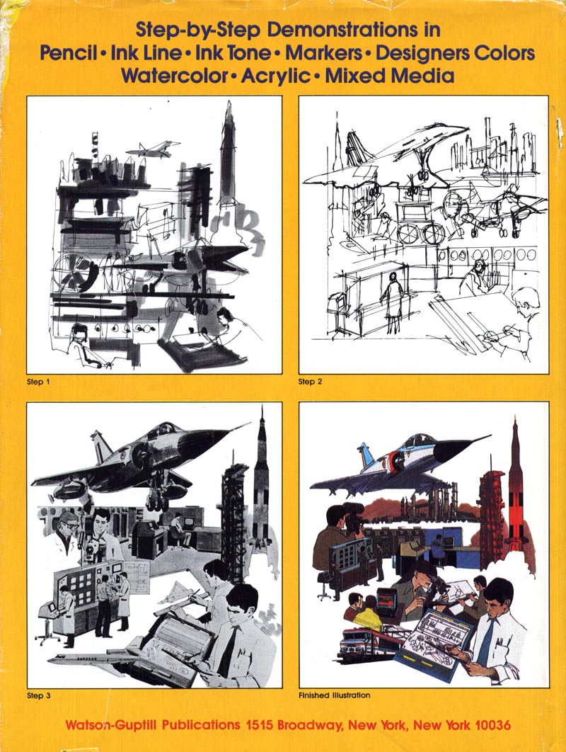
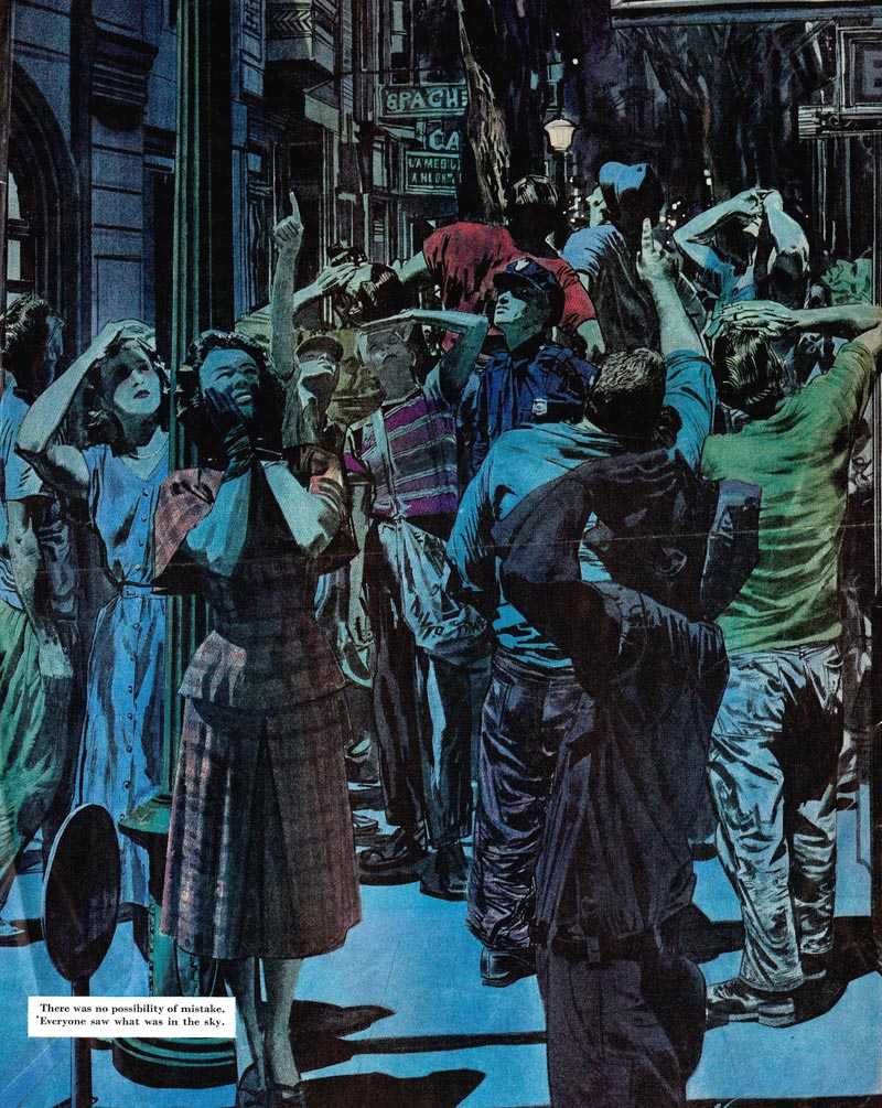
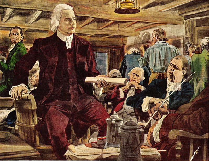
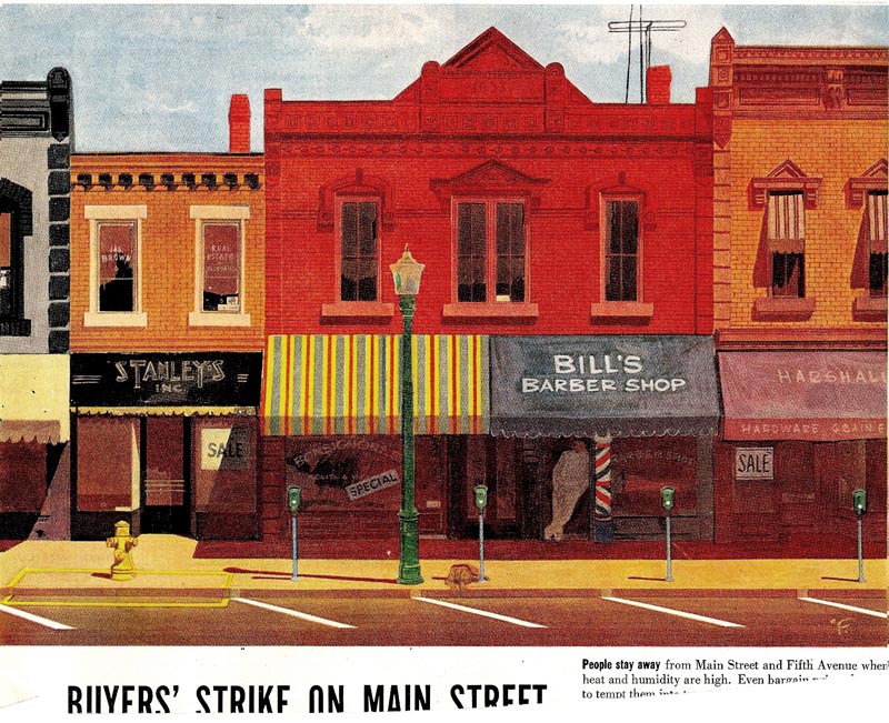
Initially, though markers were around, Stewart used chalk pastels. Over time, as he did more and more comps and layouts, he switched to markers. These examples, which Stewart did for an animatic, were done mostly in marker with some gouache paint and black chalk pastel. At roughly 18" x 24", they are absolutely some of the biggest marker renderings I've ever seen - and must have been a tremendous amount of work.

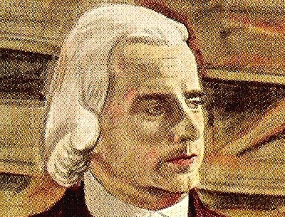
About this project, Stewart recalls that "Lorna Lampert ( the art director on the project shown here) used to call me in a lot because she liked the way I did portraits. And she felt that they looked the way they were supposed to look and that would help sell the concept to the client." Earlier in his career, to aid him in the accuracy of his drawings, Stewart says he first had to learn how to use the 'Lucie' (Lucigraph). During his early days at the Toronto art studio TDF, "the salesmen would come in with a project and say, "we need this back in an hour."

"I had never known how to use the Lucie before," he continues, "and how to find the shortcuts... and it was tough! Because I had learned how to draw and paint - but I didn't know how to work under pressure. And you know, with getting likenesses, its crazy to just sit there and just try and draw the thing."

"But," he says with some qualification, "I think the secret to the Lucie is that you do need to know how to draw. You still need to know how to break the thing down and make it work."


Drawing well and being fast are the two most important qualities a storyboard artist must possess. "It requires a special kind of skill that not too many people have," he wisely points out. "I did a lot of other things in the way of finished art, but I found with storyboards, very few guys could do it."

"I used to watch guys around me who'd be thinking, 'Oh, this is easy,' but then they'd end up doing these wooden-type of figures. Half the battle is to capture a certain kind of feeling in the drawing. Its not just a matter of putting a figure here or there... your drawing has to actually look like you know what you're doing."


"The drawing has to sing a little bit, you know, the drawing, the line and the feeling of it... and if you can capture that in marker or pen or chalk, it doesn't have to be modelled up that much. So long as it captures a moment in time."

Most illustrators are too rigid - they can't get into that."


I ask him when he stopped doing storyboards and he says it was some time in the 1980's. "The biggest thing with storyboards is the deadline pressure," says Stewart. "Often you would end up working nights on them. I did a lot of storyboards because I guess I was a little more money-oriented then," he chuckles. "Later on I wanted to focus more and more on finished art so I guess I kind of sacrificed on that."


"You know," he says thoughtfully, "it really wasn't my favourite kind of thing to do... but I was always proud of the stuff I did. And I enjoyed it, too. Its a special art."

* At some time in the near future, I hope to bring you an entire week devoted to exploring Stewart Sherwood's career.

* Stewart Sherwood's website

Thursday, January 29, 2009

Storyboards: "A new and challenging field"

Thanks largely to DVD special features and movie fan websites, the general public today is on a first name basis with the term "storyboard". I ocassionally do cartooning demonstrations for my wife's grade 4 and 5 classes, and even kids that young know exactly what I'm talking about if I say I draw storyboards. I find that kind of remarkable...


Twenty years ago, hardly anyone outside of those working in an ad agency (or, I suppose, a film studio) knew what a storyboard was. Go back 50 or so years, when television was just becoming America's preferred mass media, and I'll bet that even many artists were unfamiliar with the term.


That might explain why the editors of American Artist magazine had Larry Berger, an art director specializing in TV commercials at BBDO, write an article on the subject for their February 1953 issue.


"Television is the newest and perhaps the most challenging field ever to face an artist," wrote Berger. "It has possibilities and limitations that demand new combinations of skill, training and creative thought."

"The agency's TV art director is primarily responsible for planning the visual appearance of commercials. He does this on a storyboard like the one illustrated below. Now it is not necessary to be a top illustrator to render a storyboard, but it is essential to be able to draw what the camera is expected to record."


"It is essential to be able to visualize the best way of displaying the product - clearly and dramatically, and in the most attractive manner possible. It is necessary to do the same for other elements that will be associated with the product - live actors, animated cartoons, puppets or mobiles. Indicating nebulous images isn't enough because the production of the commercial depends to a great extent on what is indicated on the storyboard. If the board isn't exact in its backgrounds, composition, camera angles, and demonstration techniques, the final commercial is not likely to be much better."


"The artist who comes into television has a good start. The training acquired in an agency art department or studio is invaluable - but it is not enough. In print advertising, a man can specialize in either lettering, illustration, or layout. But the television artist must be a composite of all - and that is but a part of his equipment. Remember: a printed advertisement can carry many elements and still be good; there is relatively no restriction to the time it takes to absorb its message. But the television commercial must always stress brevity and simplicity. It must tell its story in eight seconds, twenty seconds, or at the most one minute. Therefore, though the advertising sense acquired through print media is very helpful, the artist doing TV commercials must acquire a television sense as well. He must develop a sense of timing and correct emphasis, a feeling for visual continuity and for harmonious relationships between moving objects."

"Most important, he must acquire the ability to relate a story that will hold the attention of the audience and sell the product."


Berger concludes, "Since this article is directed to artists, little mention has been made of the other people who work directly with the artist in planning TV advertising. This does not mean that their jobs are less important. Television is no one-man operation. What the TV artist can contribute towards better television commercials, what he can innovate in the field of production techniques, will largely determine his future."


"It can, I think, prove to be the most fruitful profession an artist ever found himself in."

It would be interesting to hear from some storyboard artists today if they feel Larry Berger's assessment of their career choice rings true.

Wednesday, January 28, 2009

The Changing Materials Technology of Comps

From what I've been told, the preferred medium of the comp artist of the early part of the century was charcoal pastel. These examples from Andrew Loomis' book, Creative Illustration seem to bare that out. Loomis takes us through a step-by-step demonstration of how he typically developed a comp from a rough the ad agency provided.


During the mid-century period coloured chalk pastels became very popular for doing comp work. Though I can't help but think that even with spray fix this must have resulted in a lot of smudged layouts and stained shirts and pants around the boardroom table!


Still, in the right hands, a pastel drawing can be incredibly beautiful. Below, a comp done by Canadian illustrator Will Davies. Will preferred chalk pastel for comping and continued to use them long after they fell out of favour with the industry.


In fact, Will's pastel comps were so exceptionally beautiful that they were often used as finished art. When an art director at Ogilvy & Mather Toronto first commissioned Will to do an illustration for the Hathaway Shirt account, he was so impressed by Will's colour comp that he decided Will should do all future Hathaway ads in chalk pastel.


(Thanks to my friend Dan Milligan, who gave me this piece as a gift. It hangs in my livingroom and I had to shoot a picture through the glass - thus the lousy reproduction you see here)

The 50's saw the arrival of a new technology in art materials that changed how comps were done: the 'magic marker'.


Markers had the advantage of being fast-drying and permanent - no more smudging. They contained a felt pad (soaked in coloured dye and benzyne) that could be removed and flattened out like a small sponge, so that broad swaths of colour could be laid down quickly. The effect of marker was similar to that of watercolour but with a much shorter drying time. In the fast-paced world of advertising, this made markers an ideal tool for the comp artist.


"Marker rendering" became an artform of its own. Not easy to master, and used almost exclusively for presentation comps. Many people will give illustrations like these only a cursory glance. For me, there is an impressive quality of energetic immediacy and a beautiful reductiveness in this type of work.


I suspect that a lot of artists shun comp work because they find it to be tedious. It is in many ways the most mercenary of the illustration arts. You are required to draw fast - and your creative input doesn't generally extend beyond your ability to make a thing look good. The subject matter is often mundane and repetitive.

And as I said yesterday, the artwork is seen as nothing more than a vehicle for getting a visually illiterate client to grasp an ad concept. As soon as the concept has been approved, your drawing loses its value. No one (or almost no one) appreciates it as a piece of art.


For a some time after markers became commonplace they were ocassionally employed to do finished art, as seen in the ad below. These experiments were, however, short-lived. Marker colours fade quickly and don't reproduce well in print. And I think there was always that nagging feeling among art directors that marker drawings were not valid artworks. There really has always been a sort of weird bias against markers and marker renderers in the illustration business. Believe me, I could tell you stories.


Behind the scenes, however, markers remained the essential medium of layout art and presentation comps for nearly half a century. Only in the last ten or so years did technology cause a massive shift once again: markers have been almost completely replaced by computers, Wacom tablets, and programs like Photoshop and Painter as the primary method of producing comps.

My Will Davies Flickr set.

My Andrew Loomis Flickr set.

Tuesday, January 27, 2009

The Fine Art of the 'Comp'

Picking up on a topic Charlie Allen is discussing on his blog this week, I'd like to spend a little while showcasing the art of the comp.

"Comp", short for "comprehensive rough" is just one term for a broad spectrum of illustrations the public never gets to see. Roughs, sketches, marker renderings, storyboards, layouts - these are all terms thrown around in the business that fall under the same general category. In its latest incarnation, these kinds of illustrations have been recast as 'concept art'. Over the past few years, a huge community of artists and companies has grown on the web at a site called, appropriately enough, conceptart.org


One of our past subjects, Harry Borgman, has literally written the book on comps! I was lucky enough to stumble across a copy of the original 1979 hard cover edition on a recent used bookstore visit.


I began my professional career doing comps and storyboards... and in fact Today's Inspiration, when it was only a mailing list of a dozen or so members, was comprised entirely of storyboard artist friends.

Few people, even fellow 'finished art' illustrators, know much about or have an appreciation for the tremendous skill and discipline it takes to do this type of work. After twenty years in commercial art, I am still in awe of those who do comps well, and still struggle to achieve the quality of work I see coming from the studios of friends and associates. The best make it look maddeningly easy. It is anything but!


Comps, storyboards, and layouts are the precursor to almost any ad - be it for print or television - the public eventually sees. Sometimes drawn by art directors, more often by a 'renderer', they are the initial visual the agency uses to sell an ad concept to the client. Renderers need to be both fast and good. They need to be able to draw anything and everything at the drop of a hat. There is almost never enough time to do a good job. You are expected to do a good job anyway.

Harry Borgman drew comps and storyboards for 40 years. On his blog, he wrote an excellent assessment of what life is like for these unsung heroes of the illustration business. You can read that post here.


There is a tremendous amount of beauty and vitality in comp art, as Charlie Allen wrote in his post this week.

What I've always found a little dismaying is how rarely that has been acknowledged. Renderers are largely anonymous, and renderings are considered worthless trash after a client presentation comes to a close. In my years working in-house at a Toronto ad agency, I watched countless comps being thrown in the garbage. Many of them were, in my opinion, far superior to the art or photography that eventually made its way to the printed page (or television screen).


This week, we'll try to rectify that inequity a little. This week the comp artist gets his due.

* Be sure to visit Charlie Allen's blog and Harry Borgman's blog for some stunning examples of comps, sketches, and storyboards.

Friday, January 23, 2009

Robert Fawcett: ..."good drawing will always be the basis of the artist's craft."

From the final chapter of Robert Fawcett On the Art of Drawing:

"...a short discussion on the value of photography is pertinent here. As an illustrator I am all too conscious of the way photography has been abused, to the point where many illustrators are afraid to put pencil to paper without first photographing their subject exhaustively. Too often, as a result, they allow photography to use them, instead of them using it, in the way they might use any other studio materials."


"I have observed that illustration is more akin to the theatre than to painting and the value of lighting for dramatic effect in both the theatre and illustration cannot be overestimated. Photography can capture this in a way nothing else can equal. Imagine, if you will, a model sitting for hours under the hot lights necessary for a particular dramatic situation, perspiring and uncomfortable (and incidentally running up a bill for fees perhaps out of proportion to the job in hand)."


"In regard to models, the artist in industry is in competition with the photographer in more than one sense. Model fees are high, but the photographer can get his results in an hour. Economically, photography as an aid to the illustrator is necessary if only to allow him to compete on more or less equal terms."


"I would like to have avoided this discussion of photography in a book devoted to the purer aspects of drawing. But it would have been artificial to ignore it, especially since even many painters employ photography these days. Another of the best French painters of our times did not even trouble to take his own pictures, but painted largely from post cards bought at the local shop. And this was a fine painter, whose pictures, although they might be characterized as post-cardy in subject and concept, were never photographic. He used them simply as a point of departure."


"So much, I think, for photography. There is no contradiction here with anything we have discussed up to this time. We talk about it now simply because this chapter on illustration is about an applied art form, graphic art for industry. This is an entirely different subject, with its own conditions, its own taboos, its own peculiar problems. Most European schools devoted to fine arts shun this subject, while many American schools include elaborate courses on it. The European idea is, I think, commendable but unrealistic."


"The American way is typical of a society which places too little value on abstract learning, and which puts too great an emphasis on practicality."


"One who illustrates should give it his best. His stature as an artist is beyond his control, so he will be better for not pondering too much about it."

"But the technique of his craft is not only under his control, it is also possible of development, so the wise worker will concentrate upon it. If he fails to reach out and develop as an artist, if he remains a technician that, of course, is sad, except that I cannot feel that he would have been a better artist with less craft."

"Draftsmanship, or good drawing, will always be the basis of the artist's craft."


* My Robert Fawcett Flickr set.

* Thanks to Tom Watson and Brian Postman for contributing scans to today's post!

Thursday, January 22, 2009

Robert Fawcett: 'relentless drawing' vs 'sloppy seeing'

Fawcett: "If parts of this book seem to stress constant and what might be called relentless drawing it is only because it seems time today for an application and devotion which the student may up to now have congratulated himself on having dodged. I know of no way to avoid this completely if the desire is to become a draftsman in the sense of building a confidence that nothing visible or imagined is beyond one's ability to record on paper. This, it seems to me, is the ideal to be attained."


"And what holds the imagination back more than anything else is sloppy seeing. We must see first, then we may safely imagine more; vagueness and blurred seeing are not the same as inspired transformation of reality."


"There are those who contend that this kind of study is out moded today, that the modern artist develops somehow by himself and without formal training. It is suggested that the development of the student's intuitive perception is gravely retarded by what are sometimes referred to as the "clichés" of seeing.The vague and indefinite scribbles of the beginner are too often hailed as rare flashes of insight which will forever be denied the patient searcher. The ability to draw well, we are told, is something to be unlearned."


"It would be a matter of concern if this were true, but it is not. The keen eye that looks in wonder and appreciation at how things are, soon develops that humility which preceded the gaining of knowledge."


Excerpted from Robert Fawcett On the Art of Drawing

* My Robert Fawcett Flickr set.

Tuesday, January 20, 2009

Robert Fawcett: No Shortcuts, No Gimmicks

In the foreward to his book, "On the Art of Drawing", Robert Fawcett writes that he hopes he can "wean some away from the long, long search for shortcuts to a period of study".

"I have purposely avoided gimmicks," he writes, "which tend to lead the learning process away from the substance to be learned, and instead seem to be merely a method of painlessly attracting and holding attention."


Further on he writes, "Although content to start in the schoolroom, I have tried to move from there to the studio, to the living room and then to all outdoors. In this way I hope to avoid the tendency towards specialization which so limits the potential of many artists."


"I have never understood why some draw certain subjects superbly yet become frozen before others."

"An English artist who had just sat for his portrait by a colleague was heard later to say "So and So has just painted a portrait of me..."


"... so I suppose I'll have to do a landscape of him." - which sounds very funny at first but less so the more one thinks of it."


"If the present reader finds a drawing of a figure beside one of a landscape, the object will be not to find how different they are but how similar."


* My Robert Fawcett Flickr set.

Monday, January 19, 2009

Robert Fawcett: "We are always students"

This past weekend I had the great fortune to stumble upon an original 1958 hardcover edition of Robert Fawcett's book, "On the Art of Drawing". Only 9 bucks! Woo! I love a bargain! (There are a few copies available for cheap right now on Amazon if you are so inclined)


This book is so chock-full of goodness I had to get right to sharing some excerpts from it.

Oh, I don't mean the drawings (although I might scan a few later this week)... I mean the words. You can crack open this book and start reading just about anywhere. You're sure to find something thoughtful, thought-provoking, challenging, amusing, irritating, and... profound.

As if I didn't already have enough respect for "the illustrator's illustrator", this book might just become my new bible. I wish I'd owned it years ago.


From the Foreward:

"...the only formal training [I had in art] was a two year period at the Slade School in London. The hours were long each day, the materials restricted to pencil and paper. During that whole time it could be questioned if I ever produced a drawing worth looking at twice."

"At the time it did not seem that anything but drawing was necessary. Picturemaking or painting was something we believed would come by self-searching - by trial and error..."

"We believed that only by drawing would we begin to experience form in the most direct way, and that form was the basis of all we would do later."


"I do not mean to make it sound easy. For a time I considered calling this volume "Drawing Made Difficult," to try to counteract the influence of the many books I have seen which promise the reverse."


"The term 'student' which is used throughout is to be understood in its broadest sense - that is, that we are always students, even those of us who occasionally stand up and pontificate."

My Robert Fawcett Flickr set.

* Most of this week's scans will be from those generously contributed by various TI list members - my thanks to Harold Henriksen and Charlie Allen for today's images.


* An in-print paperback version of Fawcett's "On the Art of Drawing" is available from
Dover Books at Amazon.com

Friday, January 16, 2009

Howard Willard: A Collage of a Thousand Influences

Howard Willard was a collector. Whenever he travelled to an exotic location, he would bring back momentos - materials with appealing textures and patterns that reminded him of the people and culture of the place he had visited.


From China he brought back scraps of fabric that would normally have been used to make the soles of shoes. For his own pleasure he would take such materials, paste them up and incorporate his own brisk, calligraphic drawings, and create collaged artworks.


What started as a kind of personal work, never intended by the artist to be seen by the public, ended up becoming a new way for Willard to do his illustrations. He avidly collected old Victorian magazines and catalogues, weather-worn posters and showbills scavenged from fences and construction hoardings, and cut out the bits that interested him. These he would amalgamate into his commercial assignments.


Having travelled so extensively, its not surprising that Howard Willard created hundreds of travel illustrations. His knowledge and love of other languages led him to illustrate many language textbooks. His passion for design elements like old typography, patterned papers and fabrics, and Victorian engravings is apparent... he included them in countless advertising and editorial assignments.


Two of Willard's favourite art director clients were John Begg of Oxford University Press and C.O. Woodbury of Reader's Digest. Willard complained of being pigeon-holed and felt it was important to work with those who were artists themselves - so as to collaborate with someone who understood and was sympathetic to the problems an illustrator confronts in his work. Willard believed both these men to be such ideal clients and did many assignments for them.


As a teenager, Howard Willard had worked as a dental assistant. He was engaged in making false teeth, largely for rancher clients, and could not resist the opportunity to insert tiny cowboy designs into the plates of coloured rubber. They proved to be very popular, and the young Willard may have the distinction of being the only artist ever to produce illustrated dental plates.

Always experimenting, passionate about exploring the world and discovering its people, drawing on a thousand influences, Howard Willard always found a practical and pleasurable outlet for his restless wanderings and boundless curiousity.


Today, we enjoy the benefit of seeing the results in the work he left behind.

*My Howard Willard Flickr set.