"I just learned so much from Will and some of the others there... the atmosphere... it was just so creative... the development, the transformation of my work was just overnight. I couldn't believe it myself."
As the youngest artist in the room, and having not yet established many contacts, Stewart was grateful just to be in the presence of these others. To help him out the older established artists would send storyboard work his way.

"They used to give me some storyboards," explains Stewart, "because they felt sorry for me... because I wasn't making any money." He chuckles, "I just came in and parked myself in the corner and did samples."
"I guess I'm kind of a commercial artist," he says with an almost apologetic laugh. "They came in with storyboards for me to do and I did 'em! In otherwords, I didn't have any problem doing them for the price they were willing to pay. I viewed it as work - and actually, its good for you because boy, you sure learn how to work fast and how to draw."

Initially, though markers were around, Stewart used chalk pastels. Over time, as he did more and more comps and layouts, he switched to markers. These examples, which Stewart did for an animatic, were done mostly in marker with some gouache paint and black chalk pastel. At roughly 18" x 24", they are absolutely some of the biggest marker renderings I've ever seen - and must have been a tremendous amount of work.
About this project, Stewart recalls that "Lorna Lampert ( the art director on the project shown here) used to call me in a lot because she liked the way I did portraits. And she felt that they looked the way they were supposed to look and that would help sell the concept to the client." Earlier in his career, to aid him in the accuracy of his drawings, Stewart says he first had to learn how to use the 'Lucie' (Lucigraph). During his early days at the Toronto art studio TDF, "the salesmen would come in with a project and say, "we need this back in an hour."
"I had never known how to use the Lucie before," he continues, "and how to find the shortcuts... and it was tough! Because I had learned how to draw and paint - but I didn't know how to work under pressure. And you know, with getting likenesses, its crazy to just sit there and just try and draw the thing."
"But," he says with some qualification, "I think the secret to the Lucie is that you do need to know how to draw. You still need to know how to break the thing down and make it work."

Drawing well and being fast are the two most important qualities a storyboard artist must possess. "It requires a special kind of skill that not too many people have," he wisely points out. "I did a lot of other things in the way of finished art, but I found with storyboards, very few guys could do it."
"I used to watch guys around me who'd be thinking, 'Oh, this is easy,' but then they'd end up doing these wooden-type of figures. Half the battle is to capture a certain kind of feeling in the drawing. Its not just a matter of putting a figure here or there... your drawing has to actually look like you know what you're doing."

"The drawing has to sing a little bit, you know, the drawing, the line and the feeling of it... and if you can capture that in marker or pen or chalk, it doesn't have to be modelled up that much. So long as it captures a moment in time."
Most illustrators are too rigid - they can't get into that."

I ask him when he stopped doing storyboards and he says it was some time in the 1980's. "The biggest thing with storyboards is the deadline pressure," says Stewart. "Often you would end up working nights on them. I did a lot of storyboards because I guess I was a little more money-oriented then," he chuckles. "Later on I wanted to focus more and more on finished art so I guess I kind of sacrificed on that."
"You know," he says thoughtfully, "it really wasn't my favourite kind of thing to do... but I was always proud of the stuff I did. And I enjoyed it, too. Its a special art."
* At some time in the near future, I hope to bring you an entire week devoted to exploring Stewart Sherwood's career.
* Stewart Sherwood's website
I think these type of storyboards epitomise a kind of quality art the public never sees. So often these are treated with total disrespect by Ad people being cut-up,drawn over or junked.
ReplyDeleteHave you ever noticed how in movie credits the storyboard artist,so essential to the commissioning and integral to the look of the production, is right down the bottom of the list below the animal wranglers,personal assistants,drivers and 3rd assistant focus pullers?
These marker pieces are just incredibly gorgeous. I've been gawking all day today at the one that came as an attachment to the TI email. Makes me feel so totally unskilled!
ReplyDeleteBandito; I must admit I hadn't noticed that - but I guess I'm not surprised. As for the ad business, yes, that I know about first-hand.
ReplyDeleteHopefully this week's series gives some people pause to slow down and appreciate the quality of the work being done by these artists.
As with comics where, for the longest time, no one saw any real beauty or merit in what was considered to be totally disposable hack-work, perhaps more people (at least in the illustration profession) won't be quite so dismissive of the art of storyboards and comps.
Chrissie; I'm happy you find this work so inspiring - and can completely relate to how you feel. There were some incredibly talented marker renderers who did work like this... all us 'young guns' used to scoop up whatever we could save from the trash at our respective agencies back in the day and study it to death! Still determined to be half as good some day...
ReplyDeleteHey Leif do you have access to any more pastel pieces by Will you can blow us away with or trash salvage?
ReplyDeleteI want to thank you for all the hard work you put into this blog I hope Mrs Peng doesnt mind this particular 'love triangle!'
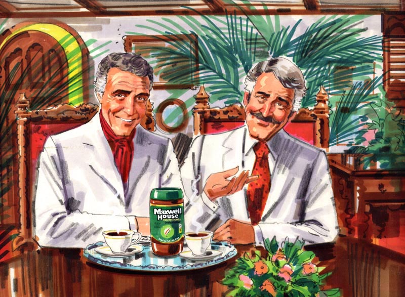
BTW.Is the guy on the left modelled on Ricardo Montalban?
ReplyDeleteHey Bandito;
ReplyDeleteI will try to dig up a couple more of Will's pastel comps. Glad you like them so much :^)
That is indeed Ricardo Montalban. He did a series of Maxwell House ads in (the 70's?) ... must be. You can find them on youtube.
What a felt-pen virtuoso!
ReplyDeleteLooking forward to some more!
In 1963 I don't recall whether markers were used for black and white storyboards in S.F. I'm not sure when markers became the norm in S.F., but it was probably around 65. My last semester at Art Center School in L.A., we were taught to use pastels for color comps and charcoal pencils for black and white comps. Unfortunately, storyboards were almost ignored in art school, and I'm not sure why. Art Center and Art Students League were considered the top schools in the country at that time, and yet Art Center apparently thought learning to comp ads would give us enough experience to do storyboard assignments... not so! Storyboards were much more complex and demanding. When I finally did switch to markers, I had to learn how to use them, and that was a real chore. They drove me nuts until I finally got the hang of them. Pastels were much more forgiving.
ReplyDeleteI don't recall the conversation with the A.D., but I probably asked him if charcoal pencil was OK to use, or he may have shown me charcoal pencil examples to follow. At the time, I was working at a small quick and dirty art studio, grinding out low budget pamphlets, fliers, brochures, newspaper ads, logo designs and anything else that came through the door. An illustrator friend that had been one of my teachers at the Academy of Art, was too busy, and recommended me for the storyboard job. It was double the pressure, because I had to please the agency, not let my friend down and work on it at night after my studio job, to meet a very tight deadline. I was a nervous wreck, and almost regretted accepting it, but I managed to finish it on time, and they were very happy with the results... much to my relief. The experience gave me much needed confidence at the time.
You mentioned comps done in gouache. I may have told you this already, but in the early 1990's, a big name C.D. from Young & Rubicam in Sidney, Australia was flown out to the S.F. office to come up with a TV ad campaign. I was recommended to comp. up the entire 2 year TV ad campaign for Chevron Corporation for their service station division. He wanted each frame to be approx.
8 1/2" X 11", so I asked him if I could use gouache on illustration board... at that large size, I felt they would go faster in gouache. He said, "I don't care if you use house paint, as long as they look great!". I don't remember how many boards I did over several months, but I wore out several sable brushes and went through a lot of tubes of gouache. He was very satisfied with all of them, and I had several very profitable months... however, afterward I needed to take a week off before I started working on other jobs.
Just kidding about feeling like a dinosaur, Leif. After all, Charlie Allen thinks I'm still a "youngster". ;-)
Tom Watson
TOM.....You really are a youngster....and these latter-day guys with markers and computers....what can I say? Just watched a bunch of Super Bowl commercials....a crazy mix of real folks, digital monsters and characters, a whole new world of visual communication. Only thing I've said that is really true....change is the only constant!
ReplyDeleteTo Leif....or 'Superpeng'...the new blog is a great idea....I'm sure you have plenty of time to spare for it. Looking back, I did a few Newpastel comps, but switched to markers as soon as they came in....50's ? Each had drawbacks. Chalks were a dusty mess...I couldn't breathe in one AD's office. Markers had benzene....later declared carcinogenic. I can believe it....gave me allergies when used. Luckily, I worked in gouache most of the time....harmless. The Will Davies chalk comps are amazing...any more? Great comments and stories on this....thanks.
This comment has been removed by the author.
ReplyDeleteมวยออนไลน์ | จ้าวสังเวียน
ReplyDeleteJapanese Restaurant Consultant
ReplyDeleterestaurant management company
restaurant management consultant
restaurant consulting companies
How to open a Japanese restaurant
Thanks for sharing
ReplyDeleteOnline Rishta
Pakistani Rishta
photo booth rentals in australia
photo booth rentals in usa
Custom Packaging Boxes
https://mccookbison.instructure.com/eportfolios/186/Little_Feats/HP_HPE6A45_HPE_Aruba_Certified
ReplyDeletethanks for sharing man http://getcrackedsofts.net/
ReplyDeleteThank-you so much for posting this blog, you have presented each & every aspect in an upbeat & professional manner.
ReplyDeleteThank-you so much for posting this blog, you have presented each & every aspect in an upbeat & professional manner.
ReplyDelete