Friday, May 30, 2008

Report from the Reubens: Marcus Hamilton

NCS members who attended The Reubens last weekend in New Orleans were treated to the first issue of a new publication... Stay Tooned magazine.

I saved my copy for the plane trip home - and read it cover to cover. One article in particular caught my attention: a profile of Marcus Hamilton, the artist who took over the daily Dennis the Menace newspaper panel when Hank Ketcham decided in 1993 that he would like to retire.


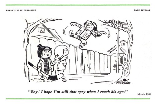
While today's images are all by Hank Ketcham, today's story is really about Marcus Hamilton. I was fascinated to read about his career, because he always intended to be an illustrator - and talks in the article about achieving that goal beginning in the early 70's with assignments from Cosmopolitan and Good Housekeeping, and continuing for the next 21 years with, "a steady stream of illustration assignments."

Hamilton writes, "I thought I had finally arrived when I had the opportunity to do the cover art for the Christmas issue of the Saturday Evening Post in 1978."


Sadly, things began to fall apart for Hamilton in the late 80's and early 90's when the computer made its debut in the graphic arts. "Art directors wanted the cutting-edge computer graphics that were getting more attention from readers," writes Hamilton. "They didn't want the 'old-fashioned' acrylic paintings and watercolors anymore."

Hamilton's assignments - and income - dropped so drastically that he was forced to take a job in a photo booth at a local Wal-Mart. Then one day in 1993, while flipping through the channels on tv, he happened upon an interview with Hank Ketcham. The Dennis the Menace creator was saying that he wished he could find someone to take over the daily panel of his long-running strip so that he might have some time to travel and paint. For Marcus Hamilton this was opportunity knocking.


What follows is an inspiring story of a career (and a love of drawing) revived - at age 50, no less. Its a moving read filled with great, personal anecdotes about the artist's relationship with Ketcham after he became the master cartoonist's apprentice and, in fairly short order, his replacement.

"Mr. Ketcham trained me to re-think my drawing style to look more like his," writes Hamilton, "its almost like that style has taken over my thinking."

"Dennis... rejuvenated my love for drawing, a love I had lost over a few years time because, during the end of my freelance career, I found myself doing jobs just to make enough money to pay my bills."


There's more - much more. Hamilton even shares a terrific step-by-step demonstration of how he composes and executes a Dennis panel - great stuff for the reader, whether you are a student, professional or simply interested in the cartoon business. Go to staytoonedmagazine.com for more details on this first issue of what looks to be a great new publication.

My Hank Ketcham Flickr set.

Thursday, May 29, 2008

Report from the Reubens: Henry R. Martin

Crescent City Books, located in a typically beautiful ancient brick building on Chartres St. in the French Quarter, is a place so jam-packed with used books that the narrow front door barely opens wide enough to allow one person to pass in or out. Books stand piled in tall columns because there is no more room on the bursting shelves, and one must often navigate the stacks by shuffling sideways along the narrow strip of floor that isn't occupied by the store's inventory.

This place was heaven to me!

It was here that I located Rendering in Pen and Ink by Arthur L. Guptill - a book I've been searching for for years - and Crescent City had it for only 10 bucks - a steal.


I was almost on my way out the door with my new acquisition when a narrow little hardcover near the cash caught my eye. A quick flip through its pages revealed a series of really wonderful cartoon illustrations by an artist I'd never heard of: Henry R. Martin. I gladly plunked down an extra three dollars for Comic Epitaphs so I could share it with you today.


Martin's work reminds me a little of some contemporary cartoonists, like Seth or Chris Ware - modern day cartoonists who have been heavily influenced by the mid-century styles.


But I'm also reminded of work done by Martin's contemporaries. I see a hint of Roy Doty here...


... a touch of Jim Flora there...


... even a little Jan Balet on some of Martin's pieces.


But as this is the only example I've ever found of Martin's work, its hard to say whether this was typical of his style or what else he produced during his career. The Internet turned up a cartoonist named Henry R. Martin who was associated with Princeton University. Based on this Henry Martin's style, however, I have my doubts that he is the same artist who illustrated Comic Epitaphs.

Still, could there have been two cartoonists named Henry R. Martin working during the 1950's? Remember what I said yesterday about coincidences?

My Henry R. Martin Flickr set.

Wednesday, May 28, 2008

Report from the Reubens: Michael Berry

Any time I visit a new town I am determined to ferret out a few of its used book stores in search of buried treasure. Luckily for me, my darling wife, Wendy, is willing to allow me to indulge in this distraction - as long as I don't overdo it. Last weekend, while wandering the narrow streets of the French Quarter, I came across a couple of really wonderful old shops, shelves filled to overflowing with yellowing old books, the scent of mouldering paper thick in the air.


Beckham's Bookshop, located across the street from The House of Blues on Decatur St. yielded an intriguing volume from the late 40's...


Merry-Go-Round, a 1948 hardcover collection of humorous art and stories that originally appeared in Pictorial Review magazine, contains some terrific artwork by several really great cartoonists and illustrators.


* As an aside, Merry-Go-Round's copyright notice indicates that the material therein came from the King Features Syndicate. By coincidence, I met a very nice fellow the next morning at breakfast in the hotel named Brendan Burford, the comics editor at King Feature Syndicate (making me think once again that there are too many coincidences in this world to be coincidental). Brendan's also a very talented cartoonist himself. He is the creator of the wonderful Synchopated Comics which you should go take a look at.

Sprinkled throughout Merry-Go-Round are several early gag panels in colour by cartoonist Michael Berry. I'm not sure why I find this kind of stuff so delightful... but I do. The scenarios are so not politically correct today. I find them charming and innoffensive in spite of the rampant use of obvious (classic) stereotypes.


If you've ever seen Berry's later efforts in Esquire or Playboy you'll recognize that the artist was still perfecting his abilities at this stage in his career. Things are a little wonky in terms of idealized faces and bodies. But somehow those imperfections and the unsophisticated colour and printing make these pieces even more attractive to my eye.


Berry is one of the cartoonists featured in Gene Byrnes' 1950 book, The Complete Guide to Cartooning. Over at The Animation Archives, they have posted the pages from the book which show Berry's photo and an interesting 'step-by-step' of his working process. Well worth taking a look.


I took a look around the internet for biographical info on Michael Berry but came up empty-handed. Perhaps we'll learn more about this talented cartoonist at some future date.


My Michael Berry Flickr set.

Tuesday, May 27, 2008

Report from The Reubens: Roy Doty

This past weekend I attended my first Reubens - the awards ceremony of the National Cartoonists Society - held this year in New Orleans. I'm still feeling a little shell shocked from the experience. And I mean that in a good way. I was thoroughly starstruck after meeting some of my favourite cartoonists, people whose work I have admired for virtually my entire life. Among those gentlemen whom I had the great privilege to shake hands and chat with was Roy Doty.

Roy and I had corresponded a little in recent months, but I had not yet had a chance to tell him that I found his work in a recent ebay acquisition: the Art Directors Annual of Advertising and Editorial Art for 1948. When I mentioned that book to Roy on the weekend, his eyes lit up and he recounted a great story about the early days of his career.

I wished afterwards that I had had the foresight to bring my little recorder. However, having not done so, I decided instead to email Roy the scan you see below after returning home -- and so today we are fortunate to have Roy's reply to my email to enjoy. Here's how he tells it:


"I'd been seven weeks in New York at that time, my discharge pay had just about run out. Studio rent and the rent on my one room apartment on East 18th Street would run out in a week. I think I had visited every art director in New York by that time. Eight to ten appointments a day. Did have a ticket back to Columbus. On that last week the phone rang on a Monday morning... it was the New York Times Magazine. Could I possibly do three drawings for them... HAH! You bet I could. On Wednesday the phone rang and it was the art director of CBS... could I do a full page ad for them... you bet... Friday the phone again rang... this time it was Seventeen Magazine... two two page spreads! The CBS ad made the 26th Art Director's Annual. That was the l947 Awards volume."

"I guess I made the Annuals every year after that for many years. The Arthur Godfrey ad was one of my favorites however."


In the accompanying text to the Arthur Godfrey CBS ad, which won an 'Award for Distinctive Merit', Roy wrote, "I got the assignment for this series of drawings from Bill Golden in the form of a thumb-nail sketch and a stern admonition to fill the spread with people - not just shapes, but people drawn in complete detail."


"I was completely enthusiastic about the idea."


Another of Roy's CBS ads (below) was featured in that same 1948 AD Annual, unfortunately at a much smaller size. Still, a remarkable accomplishment for a newcomer to the competitive business of advertising illustration - and a powerful comfirmation from the Art Director's Club of New York that this kid from Columbus had the right stuff.


Roy's note concludes,"I really was down to my return trip home to Columbus, Ohio when I got my first assignment. I ended up back in Columbus anyway..but by my own volition..and fifty five years later."

* My pal Mike Lynch has posted a great series of photos from the Reubens weekend in New Orleans - go take a look - I'm even in one!

My Roy Doty Flickr set.

Friday, May 23, 2008

Charlie Allen Explains it in Black and White

Earlier this week, a reader asked if Charlie would explain a bit about how he made his black and white pictures. I put it to Charlie, and he graciously replied:

"Glad to help....but haven't a clue whether any of this is available these days. Something similar should be. Tools....plain old wooden pen holder. Pen points: 'Hunt' number 303 and Globe (little nib, like a bank pen)....Windsor Newton numbers 2 and 4 sable brushes....Higgins India ink, or equivalent..."

"...and, (this is no longer made, in fact) Whatman hot press, or surface No. 1, illustration board. Mother is....no....necessity is the mother of invention....and something could be conjured up these days to work, I'm sure!"

All that sounded great -- but I had a feeling the illustrators out there would want even more detail. So I pressed Charlie to elaborate - and, gentleman that he is, he accommodated me:

"WOW....A complete art lesson! OK.....one steel spot per day, at least. 3 to 4 days to complete the four illustrations. Thumbnails for a beginning, then a charcoal pencil comp for BBD&O..."


"... then part Lucy and part drawing on the finished board. As with cars, certain parts can be 'Lucied', (faces for example) and the rest interpreted, or drawn. Then the ink rendering..."


"...and the reason I loved Whatman Board was that it could be erased. I had an electric eraser....and used it a lot! Some illustrations resembled a 'battlefield'! Hope this helps....but, as I learned early on, you learn by doing. And every illustrator I knew had HIS way of getting the job done!

But Charlie wasn't finished sharing his wisdom just yet. So here's some more from the master of black and white:

"Now...take cover....art lesson coming! On every color illustration since the dawn of man, the illustrator has to juggle four main elements (like a four ball juggler)....drawing, composition or design, values, and color."


"Color is the least important....the other three equally important. Best example of this was Robert Fawcett. His color was of least importance....on the other three he excelled. On B&W line art, the elements are drawing, composition, values (if halftone screen is added) and texture. Texture is the added challenge....and a lot of artists never 'got it'. "


"Have no idea why I started all this...except to say a good color illustration should photograph well in B&W halftone....and I think these 24 sheet posters do."


Whew! Many thanks to Charlie Allen for sharing such a wealth of art and information with us this week! I know I'm not alone in saying how much we learned from - and enjoyed - his invaluable contributions.

My Charlie Allen Flickr set.

Thursday, May 22, 2008

Charlie Allen on 'the other black and white'

When is a colour illustration actually black and white? When its a 'duo-tone'.


Clients hoping to save on the cost of four-colour printing, but wanting to create the illusion of colour would ask an illustrator for a black and white illustration, then surprint a single transparent colour over top. I've been around the business long enough to remember Rubylith and Amberlith - red or orange film held in place to an acetate backing sheet by, I guess, static cling. You'd tape a sheet of Rubylith over your black and white original, then cutting carefully (so as not to cut the acetate backing sheet) with an Exacto knife, peel up the areas that you didn't want any colour to surprint on. This set-up was sent to the film separator, with instruction for what percentage of a single colour the Rubylith mask should be printed at.

But Charlie didn't use that process...


"I think I used that colored film once or twice," he writes, " but never cared for it."

For the State Farm illustration below, Charlie explains his process:

"...both colors on this were done in B&W greys. No comps as I recall....so pretty much guessing on the combination or outcome."


"Most, I just painted in two colors....always B&W halftone, and then blue or whatever color. It was separated out the hard and more expensive way....color separation."

"Speaking of duo-tones, a Del Monte trade ad here
[below]"...painted in two colors and color separated in reproduction. Not very good...my 'Al Parker' mood or mode. Bad management on grey values."


"If you sense some burn-out or fatigue on this...about right. I had been going full speed for 25 years by then, and was more interested in the home-built airplane I was working on. Luckily, it never got finished! Cheers.... Chas."

My Charlie Allen Flickr set.

Wednesday, May 21, 2008

Charlie Allen's 'Steel Lady' - in B&W

After reading Charlie's note that his clients on the long running series of ads for US Steel decided to introduce a woman spokesmodel, I knew I had to see some examples and hear what sounded like one of those classic ad industry stories.


Charlie generously complied, writing, "I can hear the wheels going when the steel and BBD&O execs got together...."


'nobody wants to look at steel products, plants, tractors, etc.! Let's introduce a pretty girl to soften things up....doesn't matter if she's out in a field or factory!'


"I took a slew of shots of a beautiful model, facing different directions, gesturing, smiling forever....and used those, almost forever!"


"She was really a gorgeous model....and I used her on many ads in the '50s and '60s. Cannot remember her name.....and of course she remained nameless on the steel ads. Just a fantasy of the ad execs of those days!"


"Today's ads are about as silly," Charlie concluded, "just 'up to date'."

My Charlie Allen Flickr set.

Tuesday, May 20, 2008

Charlie Allen's Black & White World

When I asked Charlie how long it typically took to do a black and white illustration, he responded, "Can't recall exactly, but a good B&W could take a day to get models, facts and sketches going, another two to four days to render."


In reference to the piece above, he writes, "A tired newspaper proof of a Pac Tel ad done in about 1960. A friend posed for the switchboard lady. An example of line film-pos [an acetate sheet with black line art printed on it] and halftone rendering underneath."


Charlie continues, "Two examples of dozens and dozens of steel product B&W's... a real bread and butter account. Later they all had to include, totally illogically, a pretty hostess-type icon of a gal, always the same one in the same skirt and blouse."


Tomorrow, we get a good look at Charlie's "Steel Lady".

My Charlie Allen Flickr set.

Monday, May 19, 2008

Charlie Allen in Black and White

Last September we spent a week looking at Charlie Allen's career. Since then, much to my delight, Charlie has continued to share many additional scans of his work with me (usually grouped around a specific theme) and he and I have had an ongoing correspondence about these pieces.

Recently, Charlie sent a raft of scans based around the theme of 'black and white illustration'. "This week may hound you with some B&W's," wrote Charlie, "something I enjoyed as much, if not more, than color....and there was more of it out here."


Charlie explained that due to smaller budgets and more limited printing options (almost all magazine publishing was located back east, for instance) much of the artwork done by illustrators in the San Franscisco market was black and white, and often line art instead of painting.


Charlie writes, "I welcomed change and different clients and agencies. First Pan Am ad [above] was in the '50s, the models were my wife and oldest daughter. Second Pan Am [below] were hired models and a fictitious Hawaiian restaurant. I did so many travel ads, lots about Hawaii...mainly, I think, because I was less expensive than sending an illustrator or photographer over there!"


Some of the famous illustrators we've looked at in recent weeks enjoyed a sort of celebrity status in their day, but its tremendously talented but less well known artists like Charlie who's work I find equally inspiring - and deserving of recognition. This week, we're fortunate to be able to take a look at "the black and white world of Charlie Allen", with accompanying commentary by the artist himself.

My Charlie Allen Flickr set.

Friday, May 16, 2008

Gilbert Bundy's Gals: "...always beauts, and no foolin' about them."

In Illustrating for the Saturday Evening Post, author Ashley Halsey Jr. describes the amusing troubles Gilbert Bundy encountered while working on the oil painting below:

Bundy actually borrowed a huge antique mahogany 'three-way looking glass' from a friend, damaged it while hauling it up two flights of stairs, then was unable to achieve the effect he wanted by using it.


"I finally posed my model backwards or sideways in three different poses, one for each panel of the mirror, and worked direct," Bundy told the author, "Then I combined the three to get the triple-reflection effect."

Because a mirror reverses the image, Bundy had to reverse each version of the girl... then discoverd at the last minute that the legs in one panel were in the wrong position. These are the sort of error details Post readers loved to write in about - and that Post editors took very seriously. In spite of the error looking the way Bundy had wanted it to, "with next to no time left, Bundy frantically got his painted lady to put her best leg forward and the illustration was saved."


Painted ladies and best legs were a common theme in Bundy's career.

"Until the New Look made a well-turned ankle a thing of the moment instead of the past, the hallmark of a Gilbert Bundy illustration was a shapley pair of legs at full length. They were always beauts, and no foolin' about them."


Just the other day, Kent Steine sent the pin-up above and writes, "This is from the Ted Saucier (cocktail mixing ) book, "Bottoms Up". The cover has the Dorn piece reprinted in numerous thumbnail sized repeats. The Bundy is contained within."

"As you well know illustrators were considered celebrities in the old days, and among many other things, often had cocktails named after them in places like the Stork Club, 21, The Iron Gate, and the Cafe DeArtiste (Cornwell and Mr. Reilly lived above, in the Hotel De Artiste)."

"Bundy's 'Piccadilly Circus', was a concoction of: jigger of dry gin, 1/3 French vermouth, dash of absinthe, dash of grenadine, ice. . . shake well, strain into a cocktail glass."


Speaking of girls, booze and social clubs, one last point of note is Gilbert Bundy's long association with Esquire magazine, for which Bundy began producing cartoons in the early 1930's. In The Illustrator in America, author Walt Reed credits Bundy's "deftly drawn, risqué humor" as being integral to the early success of that magazine.


As luck would have it, my pal Mike Lynch posted some scans just this week from the Esquire 25th Anniversary Cartoon Album, including one by Gilbert Bundy.

My Gilbert Bundy Flickr set.