Wednesday, April 30, 2008

Ken Riley: The Importance of Drawing

Having learned that Riley drew comic book art during his earliest professional years, and remembering his statement, "I think with a pencil - in terms of line, and my paintings are essentially drawings", it made sense to me that we should devote one day this week to focus on Ken Riley's black and white line art.


The pieces above and below, excerpted from Frederic Whitaker's article in the June 1958 issue of American Artist magazine, are described as being "charcoal on a toned ground" (above) and "charcoal with grey and white gouache accents" (below).


I suspect the three pieces below from 1960 were similarly drawn in charcoal.


Whitaker writes, "There may be important artists who can't draw, but... drawing demonstrates two capabilities, that of analyzing what is seen or thought, and that of recording it, and these two faculties in combination constitute the very foundation upon which art production is based. The importance of draughstmanship was instilled in Riley personally by Thomas Hart Benton."


All of this is greatly impacted as well by an understanding of the nature of composition - and Ken Riley's vituosity at composing a picture is handily demonstrated in our final example below. Riley reinforces the importance of drawing to his working method when he says, "I make a number of thumbnail compositions in pencil. As I have said before, I think best in terms of line. After the line comes the masses. Design, which after all is an abstract matter unrelated to the appearance of reality, is the most important part of any picture [bold type mine] and this I seek to define with the lines and solid shapes."


My Ken Riley Flickr set.

Tuesday, April 29, 2008

Ken Riley: In the Beginning

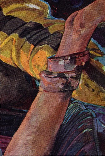
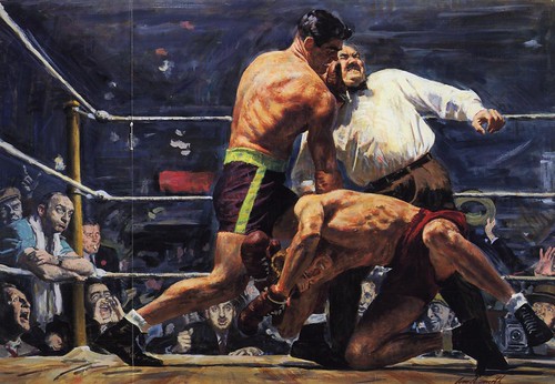
The piece below, from October 1948, is from Ken Riley's first year as a regular contributor to the Saturday Evening Post.


In this early work, done when Riley was not quite 30 years old and quite different from his later, more personalized technique, we can perhaps see the influence of the young artist's three most revered mentors: Thomas Hart Benton, whom Riley studied under at the Kansas City Art Institute, Frank Vincent Dumond, with whom Riley later studied by day at New York's Art Students' League and Harvey Dunn, Riley's instructor at the Grand Central Art School, where he concurrently took evening classes.


Next came W.W. II, in which Riley served in the Coast Guard according to author Frederic Whitaker in his article in the June 1958 issue of American Artist magazine. "Riley was assigned to the project of making permanent art records for the archives.... During this period, he designed the special commemorative postage stamp issued in tribute to the Coast Guard's contribution to the war effort. Near the war's end, Riley was transferred to the Washington area to augment the Coast Guard's treasury of painted historical records. One work of this period was a mural for the New London Coast Guard Academy."
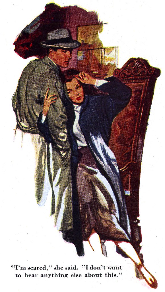

Whitaker writes, "Its interesting that one of Riley's first commercial connections [after the war] found him drawing for a comics magazine."

Interesting indeed! Because just the other night I was reading the current issue of Alter Ego magazine, and what should I find in Jim Amash's excellent interview with Joe Simon, but the following:

Simon and his creative/business partner, the legendary Jack "King" Kirby were 'packaging' comics for Harvey Publications, that is, employing all the creative talent required to produce an entire comic book for the publisher. When Jim Amash asks Simon to tell him "about some of the people who worked for you", Simon responds, "Kenneth Riley was a great oil painter. He was a star up in Washington, DC, painting murals. What we had there was the combat art group. The guys would go out on trips and make sketches, and they'd cut to headquarters in Washington, DC, and paint them... Ken was the best of them all."


Isn't that cool? Could it be possible that Ken Riley and Jack Kirby worked in the same studio on the same comic books back in the mid 1940's? I contacted Jim who has passed my message along to Mr. Simon - and with any luck we may yet find out.

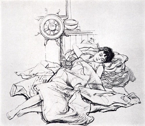
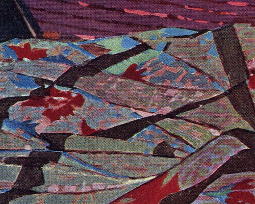
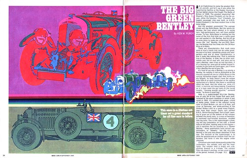
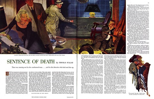
Not long after his brief stint in comics, Riley began his long association with The Saturday Evening Post. Below is the first piece he did, from the January 17, 1948 issue, taken here from the book, "Illustrating for the Saturday Evening Post".


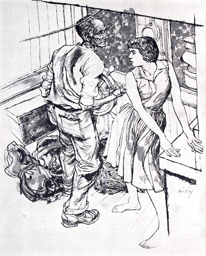
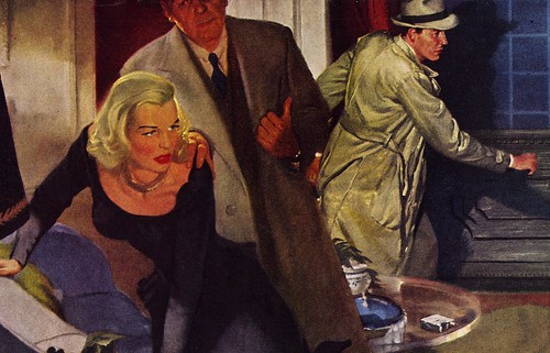
Already we can see what Whitaker means when he writes, "Riley is a master of depicting character. He creates his folk with the volume and variety and with the facility, conviction, and accuracy of a Dickens."


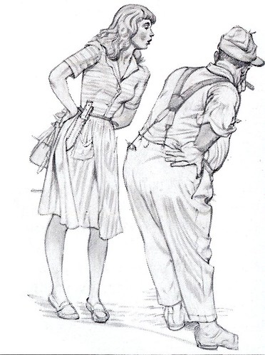
Speaking on his own behalf, Riley said, "I think with a pencil - in terms of line, and my paintings are essentially drawings. I cannot lay too much emphasis on the importance of draughtsmanship."


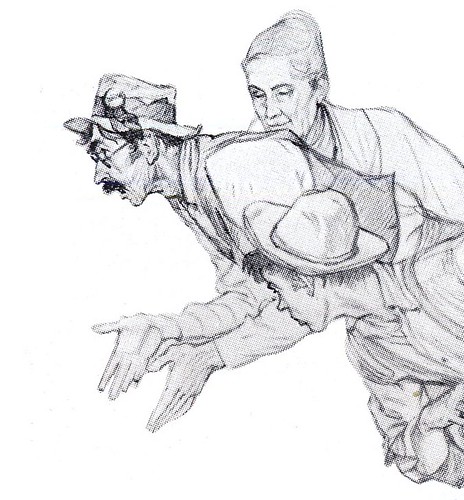
"I do not refer simply to a knowledge of anatomy and the ability to register it on paper, for after all anatomical rendering is a static business, but I think rather of the faculty of reproducing on paper or canvas the life within the figure, its swing, movement, direction, and spirit."


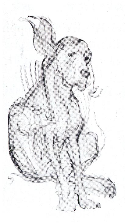
"This calls for draughtsmanship."

My Ken Riley Flickr set.

Monday, April 28, 2008

Ken Riley: "Confirmed Noodler"

Early in his article in the June 1958 issue of American Artist magazine, author Frederic Whitaker writes, "we overlook the probability that no great artist ever set out to contrive a unique technical style. More likely, the great ones simply strove for perfection alone, guided, of course, by personal convictions. The individuality of their work became manifest as a natural, unforced result."


To contradict this presumption, Whitaker then gives us the example of "a young artist [Ken Riley] who avoids the lure of easy fame, who acknowledges that anything of value must be earned by effort, and who still wins through outstanding achievement."


Of course I couldn't agree more. Ken Riley has always been a favourite of mine, and its apparent, I think, that he brings a tremendous amount of thoughtful consideration and hard work to his art.

This is obvious in his beautifully designed compositions (Whitaker says Riley goes so far as to mathematically calculate the balance of his compositions)...


... but foremost in my mind, is Riley's wonderous and unique approach to colour.


I've always been captivated by the myriad of colours that Riley invests in even the most mundane of objects in a typical painting. You can spend a great deal of time pouring over the nooks and crannies of one of his illustrations...


... then pull back to focus on the larger composition and marvel at how he has made this vast kaleidoscope of coloured bits come together and absolutely sing.


Regarding his painting technique, Riley admits in the article, "I'm a confirmed 'noodler'."


But he justifies his approach with a sound philosophy:

"In contrast to yesteryear, readers now are provided a plenitude of excellent illustrative photography which they can compare with painted illustrations. This well-informed public understands the difference between the two - realizing the special requirements of painted illustration and appreciating the illustrator's contribution to their enjoyment and edification."


This week, let's join Frederic Whitaker in hailing Ken Riley, a "graphic craftsman"... whose work shows "a little genius, imagination, emotion and personality."

My Ken Riley Flickr set.

Saturday, April 26, 2008

On the Horns of a Dilemma

Last week brought news of a very disturbing incident. My friend Luc Latulippe and dozens of other illustrators discovered that their work had been printed in a coffee table book that was being sold internationally for $100. The publisher, located in China, had 'scraped' the contents of a blog that features interviews with illustrators accompanied by examples of their artwork. You can read the whole story of this malicious deed on Luc's blog.

Also last week, my friend and fellow classic illustration archivist, Glen Mulally, alerted me that someone on Flickr had appropriated hundreds of images from our collections of classic illustration scans. Worse than the appropriation was the fact that this person was reposting the scans without any of the credit lines, dates or publication information many of us on Flickr have gone to great lengths to include.

This is not the first time we've had to deal with this sort of thing. Some people don't seem to be able to appreciate that others have invested huge amounts of time and money into scanning, organizing and posting this material out of the goodness of their hearts for visitors to enjoy and learn from. We must look like fools to these ignorant, unscrupulous creeps as we go along our merry way, tossing gold nuggets on the road for anybody to pick up.

And there's more: A while ago I discovered a blog where the person had downloaded a batch of my scans, removed all the type elements (even the hand painted artist's signatures) and was offering these doctored images as desktop pictures for others to download. "Stole a bunch of these from Today's Inspiration - help yourself!" was the note he included on the post. Fortunately, once I explained to this person that by redistributing artwork without proper credit attached he was creating Orphaned Works, he apologized and took down the scans. He hadn't really thought about the consequences of what he was doing.

All of this and more has left me in a blue funk about what I began here with the best of intentions. I now wonder if I haven't been overly generous and naive about the ignorance and greed of those opportunistic profiteers that lurk among us. I had hoped to encourage the creation of a community of kindred spirits to celebrate the accomplishments of the talented artists who came before us. Instead I find I may have inadvertently assisted unscrupulous individuals who think nothing of taking advantage of my good will.

If this blog and my illustration archives haven't already been 'scraped' I can only imagine its just a matter of time. With over 600 subscribers to the TI daily scan email list and an average readership of 1,500 visitors a day, I know that the vast majority of you - the overwhelming majority - are here for the same reason I am. You want to learn about this work and the artists who created it. You find enjoyment and inspiration in discovering and studying the forgotten treasures I present here Monday to Friday each week. Unfortunately a tiny minority of visitors who lack a sense of ethical responsibility for what we are fortunate to be able to share here might force me to shut all this down.

It was pointed out to me the other day that Robert McGinnis has shut down his website because of internet abuse and has asked another site that was displaying his work to remove it. I find it very upsetting to think that I might have been partially responsible for that because I have a set of McGinnis scans on Flickr.

So I find myself on the horns of a dilemma. How do I continue Today's Inspiration, something I feel very passionately about, while protecting this material and the artists who created it from the abuses of the conscienceless?

At the moment, because I don't know what else to do, I've removed the option to view my Flickr scans at full size. But I've been reading that its possible to navigate your way around that security measure if you really want to and besides, now all the perfectly nice people with whom I want to share these scans can't study the artwork in greater detail. I'm no tech expert and am feeling extremely frustrated by this situation. If you have any advice or opinions on the subject, I'd love to hear from you.

Friday, April 25, 2008

People Send Me Stuff: Part 5


I've been hanging onto this group of Robert Fawcett illustrations for far too long. Time to share them with you.


These are from a November 1960 issue of Look magazine - which arrived out of the blue in the mail one day from TI list member, Ken Bruzenak.


"A gift. Use them if you can,"
wrote Ken. To which I can only reply, "I most certainly can - and many thanks, Ken!"


I first heard about this group of Fawcett illustrations when I read David Apatoff's post "One Lovely Drawing, part eight" - a really good piece of writing that could have been called "Ode to a Robert Fawcett Spot Illustration". I encourage you to go read it.


David explains why these illustrations are so wonderful far more eloquently than I could ever hope to ... so I won't bother. Best to just let you enjoy the art and leave it at that. Hey, its Friday. Its been a long week.


This is where I would normally tell you to go to my Robert Fawcett Flickr set so you can examine these illustrations at full size... but unfortunately, because of some unprecedented shenannigans by people who have been abusing the gift of art I present here and on Flickr, I've decided to restrict access to my full size scan. At least until I figure out how to resolve some troubling issues.

I'll be writing more about this situation on the weekend. I hope you'll drop by - and perhaps offer your advice.

Thursday, April 24, 2008

People Send Me Stuff: Part 4

I own this album because of a very thoughtful gesture from a wonderful person named Nancy.

Nancy posted a set of vintage album covers, including this one, on Flickr and I kind of went crazy when I saw it. What I didn't realize when I told Nancy that I was green with envy that she owned this album was that in fact she didn't own it... she had simply photographed it, along with some others, at a thrift store.

Here's the reason Nancy is such a wonderful person: because I was so crazy about the Al Parker artwork on this album cover, Nancy went back to the thrift store, purchased the album and mailed it to me!


When the package arrived and I saw the return address was in Westport, Connecticut, where Al Parker himself had lived for many years during his heyday, I knew what I had to do: I ordered Ephemeral Beauty, the catalogue from last year's Al Parker show at the Norman Rockwell Museum, and had it shipped to Nancy's house. When she received it, she sent this delightful note:

Dear Leif,

I just got the book. What a nice surprise! It's so funny that Al Parker spent time in Wesport. My family moved here in 1953. My father was a photographer in town and was friends with lots of artists, illustrators, and bohemians of various stripes. The beautiful book you sent mentions Harold Von Schmidt. One of his sons, Pete, shared my dad's studio for a long time, and his brother, Eric, was a wonderful musician and also an artist. They all used to throw crazy parties together. Who knows, maybe AP was at one of them. The book is beautiful and also really interesting to me; having grown up during Al Parker's heyday, many of his images seem very familiar, and I am realizing that his elegant aesthetic formed some important part of my imaginary "ideal" world that is still rattling around in my subconscious today. It was so nice of you to send me the book, and it is such fun learning about Al Parker. I owe it all to Goodwill! Your Flickr photos and website are treasure troves. Thanks for everything and especially for telling me about Al Parker.

Best,

Nancy


Once again, my thanks to Nancy for brightening my day with her kindness to a complete stranger... and I hope reading this story and seeing Al Parker's beautiful illustration brightens yours as well.

Wednesday, April 23, 2008

People Send Me Stuff: Part 3

Recently I received the paperback cover below in the mail. The owner had contacted me to see if I would like to have it, because he was going to throw the book away.

What could I say? I hated the thought of such a beautiful Sandy Kossin illustration going in the trash. Of course I said yes - please send it.


Sandy Kossin must have done a lot of paperback covers. The ones I've seen have always been uniquely creative in their style and execution - like so much of Sandy Kossin's other work.


And the reason I've had the opportunity to see some examples of Kossin's paperback cover art is because of the hard work and generosity of a fellow Flickr archivist, Kyle Katz. Kyle has an astounding archive of paperback covers organized by artist names. You could literally spend hours looking through this collection.


So thanks today to Eric Bernard for sending the Kossin paperback cover at the top of this post... and thanks to Kyle for sharing what must surely be the most comprehensive paperback cover collection anywhere online.

Tuesday, April 22, 2008

People Send Me Stuff: Part 2

One of the happy results of my recent posts on William A. Smith was hearing from Kim Smith, the artist's daughter. Kim very kindly sent me a catalogue from a 1996 show of her dad's work at the James A. Michener Art Museum.


With Kim's permission, I am very pleased to share a few examples of WAS's magnificent work from that catalogue with you today.


We will very certainly be revisiting the life and work of William A. Smith in the future. Kim, her brother Rick, and her mom, Ferol, have all been relating some great anecdotes that you will eventually get to read here. And I have been scanning more of Smith's art from my magazine collection to accompany those stories.


But that's for another time. For now, enjoy these images at full size in my William A. Smith Flickr set.

Monday, April 21, 2008

A Last Peek at Peak

If you read all the way through last week's posts you'll already know that it was thanks to the generous contributions of several people who shared material with me that I was able to present such an abundance of art and information to you.

Even after everything we looked at, a good number of scans remain unseen on my hard drive. I'll save some for another time... but let's enjoy just a few more Bob Peak illustrations from that batch before moving on.


You know, many thoughtful folks send me stuff. Its a wonderful (and entirely unexpected) benefit of having started this blog. But I don't think its their intention to share their treasures with me alone... I believe they are happy to find someplace where this fantastic artwork will once more see the light of day.


Often I file these things away, because they fit perfectly with something I have bigger plans for in the future. But sometimes I feel badly that I'm hanging onto these contributions for so long - when I'm sure the person who sent the material is anxious for me to share it with you.


So this week I'm going to dip into the archives and present "Stuff People Sent Me". That's our theme.


To start the week, my thanks to Charlie Allen and Harold Henriksen for contribution today's scans.


If you'd like a closer look at any of these pieces, they now reside at full size in my Bob Peak Flickr set.

Saturday, April 19, 2008

Bob Peak in Iran

David Apatoff generously provided me with all the scans from this 1964 Sports Illustrated series by Bob Peak. I thought it would be a shame not to share them with you now, while we have just spent a week looking at Peak's early career. For those who are still unconvinced that Peak was much more than a 'photo tracer', these stunning illustrations should certainly prove otherwise.


In his article in Illustration magazine #6, Thomas Peak, the artist's son, writes:

"Bob’s relationship with Sports Illustrated also began in the ’60s after making contact with Richard Gangel, the longtime art director for the magazine. [He had] the opportunity to travel extensively while covering a variety of high profile — and sometimes exotic — sporting events. One of these memorable experiences came in 1964 when he was commissioned to go on safari with the Shah of Iran as they hunted for ibex (mountain goats)."


"Before leaving for the trip, Bob had to take horseback riding lessons in order to be properly trained for the seventeen day journey. Upon arriving in Iran, Bob soon learned that the entire trip was intended to be ridden bareback. However, after several discussions with the leaders of the hunting party, he convinced them to allow him the use of a saddle. Even still, Bob found it hard to keep up with the pace of the riders, and found himself falling further and further behind."


"Worse yet, his companions never looked back to see where he was or whether he was following along. After a successful hunt, Bob was urged to take part in the traditional ritual of draining and drinking the blood of the slain ibex. Not wanting to offend the Shah, he took sips of the blood, and then got sick behind a bush afterwards."


"When the group slept at the palace overnight, Bob found it hard to sleep due to the persistent crunching noises he heard all around him. When he asked one of the party members what the cause of the noise was, he was told that it was the sound of termites eating their way through the palace walls."


"Upon returning to America, Bob came down with dysentery and was hospitalized. Nonetheless, he appreciated the opportunity to go wherever Sports Illustrated would send him over the years."

* I have many people to thank for assisting me with this week's topic: Barbara Bradley, Charlie Allen, David Apatoff, Tom Watson for their advice, opinions, information and scans, and Dan Zimmer for allowing me to excerpt passages from Tom Peak's article in Illustration magazine, which are ©2003, 2008 by Tom Peak, Dan Zimmer and The Illustrated Press, Inc., and all artwork © The Estate of Robert Peak.

* NOTE: Because of the tremendous volume of material that was provided to me in preparation for this week's topic, I'll continue to post over the weekend.

There is much, much more on the artist at Bob Peak.com

My Bob Peak Flickr set.

Friday, April 18, 2008

Bob Peak: The 60's and into the 70's

The internet being what it is, there's never any shortage of opinion on any given topic. Last night, while preparing today's post, I came across this remark in a blog discussion comparing Bob Peak (and Bernie Fuchs) to Robert Weaver:

"Weaver let what he saw influence his design, whereas Peak, and Fuchs to some extent used photos of life to fit their designs. Weaver drew a lot of what he saw outside his studio, where Peak traced photos and jazzed them with an airbrush and pastels. Don't get me wrong, Peak was a great thinker... but for me, his work lacks any depth, exploration, or lasting feeling."


Really? Is that how we can sum up Peak's work? Just some jazzed up photo tracing, lacking any lasting depth or feeling?


In the late 60's, Bob Peak began a new way of working. Where his early illustrations had a tremendous degree of texture and a sort of wildly gestural quality of movement, now Peak applied his always brilliant sense of design and colour and tempered them in a style that gave a nod to the 'psychedelic' counter culture pop art movement of the day.


During this period, Peak was producing exciting new work with tremendous confidence that propelled him to the front of the pack. He received a Gold Medal from the Society of Illustrators in 1967 for his movie poster art for the film Camelot (you can see that image on the front page of bobpeak.com)

In his article in Illustration magazine #6, Thomas Peak, the artist's son, writes:

In 1973, Charles Butler Associates commissioned my father to do a series of murals for the backs of the TWA movie screens. The murals met with rave reviews from Charles Butler Associates and TWA, which led dad to do a series of menu covers for the airline. He continued to produce artwork for other TWA publications like the Getaway Adventures guides [below] with their wrap-around cover designs. This artwork was more sophisticated and subtle than the murals, but kept with the same basic design scheme and look that Bob had produced from the original four murals. Over a period of two years, dad illustrated 60 pieces for TWA. These works gave him a tremendous amount of exposure, and enabled him to receive broader media exposure through such publications as North Light magazine and Communication Arts.


The commercial artist faces many challenges in the effort to make a successful picture. A balance must be struck between the client's needs and the desire for artistic expression. To attract a broad audience, the image needs to acknowledge current tastes - and then, hopefully, push some boundaries... even if only a little. I have the greatest admiration for any artist who is able to combine all of those variables to produce truly remarkable work that appeals to a great many people. They lead the way for other artists by inspiring them to think differently about their own work. Bob Peak was one of those artists.


Charlie Allen, who provided many of this week's scans, summed it up nicely in a email he sent me last night:

"Peak was quite a talent. There are leaders and followers in every field of endeavor it seems."

* I have many people to thank for assisting me with this week's topic: Barbara Bradley, Charlie Allen, David Apatoff, Tom Watson for their advice, opinions, information and scans, and Dan Zimmer for allowing me to excerpt passages from Tom Peak's article in Illustration magazine, which are ©2003, 2008 by Tom Peak, Dan Zimmer and The Illustrated Press, Inc., and all artwork © The Estate of Robert Peak.

* NOTE: Because of the tremendous volume of material that was provided to me in preparation for this week's topic, I'll continue to post over the weekend.

There is much, much more on the artist at Bob Peak.com

My Bob Peak Flickr set.