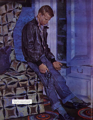
"Color creates space, movement and the most immediate emotional response. It can soothe, startle, amuse, please or anger, as well as denote time (noon or night), place or thing."
"We all possess both intuitive and educated color senses. These work together to create a personal use and response to color composition. The play of one color against another can also carry the eye throughout the composition and thereby create movement."
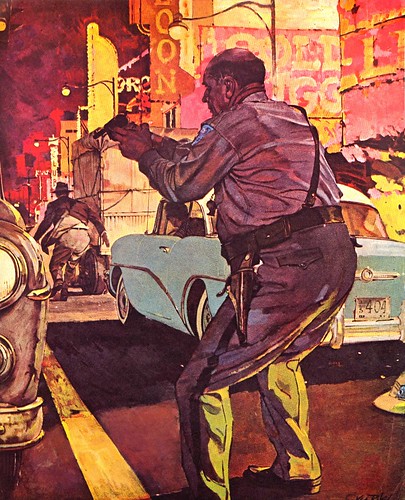
"Color is divided into two types: warm or cool. Warm colors advance, cool colors recede, giving depth to a picture."
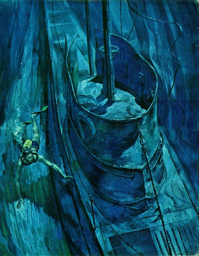
"In general, a picture carries a dominant color scheme, either warm or cool. This decision must be made in planning the picture, then the artist may select a dominant hue of red, yellow or blue."
"The closer in balance the colors are the more quiet the picture seems. Excitement can be created by inserting occasional off-beat or strident color relationships... it is wise to do color roughs in order to explore which color scheme best advances the idea."

Returning to Frederic Whitaker's 1958 article in American Artist though, its interesting to read the following comments from Riley himself:
"I have no personal painting tricks. All my methods are in current use by others. Actually I think very little about technique while developing a scene. I suppose that by now I apply pigment almost instinctively, and my whole thought while working is the development of the spirit or effect that I have in mind."
"I feel that if one's individualism is soundly based it will express itself through his outlook and his artistic conceptions rather than the mechanics of pigment application."
This caused me some confusion, because a few people this week had contacted me about 'The Riley Method' and the 'Riley Colour Wheel' - things that sound remarkably as though Ken Riley did have some sort of technique trick for applying pigment. After consulting with some knowledgable folks who might be able to shed light on the issue, I learned that what people mistakenly thought was the 'Riley Method' was actually the 'Reilly Method'.
In a special weekend post, we will clear up the confusion. Drop by and be enlightened!
Wow...these are fantastic! Finally I get what this guy was about. Thanks!
ReplyDelete=s=
Wow. Thanks. One of your better posts, yet. As someone who works almost exclusively from photos, I'v been thinking very much about how to use color to my advantage; to make my work go from realistic to more than real. Interpretation of color is, to me, far more difficult and exciting than representation of color. Keep up the great work!
ReplyDelete