
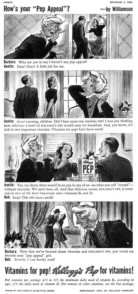
I don't know if this approach - illustration with script-like text below - qualifies as comic strip advertising, per se... but its close.

Bundy shared this assignment series with James Williamson...
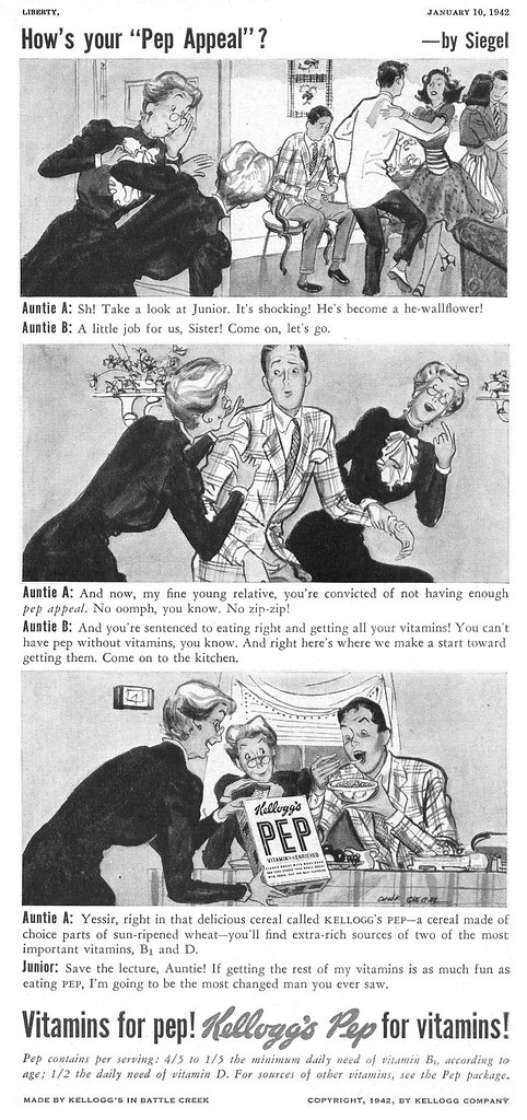
... and Dink Siegel. And here's a further curiosity: all three artists regularly did work for 'Sandfordized'... raising the question, did they share a studio at one time, or have the same art representative?
Or were they all simply known as having the sort of look that Kellog's, Sandfordized and other clients were looking for?
My Gilbert Bundy Flickr set.
These ads remind me of storyboard art for TV commercials. I personally never cared for this type of format in advertising. But, ironically I did a ton of storyboard illustrations for TV commercials and later fir the movie industry. The first time I saw a storyboard panel, I thought that it looked a lot like comic book art. I soon discovered that there's a lot more thought that goes into this type of illustration than it might appear.
ReplyDeleteTom Watson
That's a very good point, Tom - thanks. Since these ads predate television as a mass medium, I suppose I didn't think of them so much as storyboards... but they do resemble the presentation format of a storyboard in the sense of the visual always being the same standard shape and size, with script below.
ReplyDeleteThere really is a whole new skill set required to do sequential storytelling. I have tremendous respect for those artists who can do it well. It must have been a popular format at the time because there was just so darn much of it, especially in the lower end magazines like Liberty. Rather less in the major 'slicks'.
What that says about the advertiser's perceptions regarding the audience, I'll leave for others to speculate. ;-)
The dialog in these Kellogg's ads slays me! I love it!
ReplyDelete"Glamour my grandpa!"
"We pay more attention to our vittles than our vamping these days."
And I've always appreciated seeing this panel style form of advertising in old 1950s periodicals. They're like illustrated TV commercials which, I'm assuming, were more effective than simply showing a kid holding a spoonful of cereal saying "They're yummy!".
In comparison to the precedent F.Reilly this appears almost cheap.
ReplyDeleteBut is this cheap stuff in comparison with today's cheapness?
This comment has been removed by the author.
ReplyDeleteAppearances can be deceiving, Rich. Work like this might appear 'cheap' at a glance, but I think if you investigate it further and look beyond the superficial (and frankly, crass) selling points incorporated into the ads, you'll see some solid draughstmanship, excellent design sensibility, top notch storytelling skills, and highly personalized and accomplished stylization.
ReplyDeleteI can, however, understand that one might have a subjective preference for work of the type Reilly did.
Thanks for you comment! :-)
You're right, Leif. I took a second glance and found all those qualities you mentioned to be there.
ReplyDelete