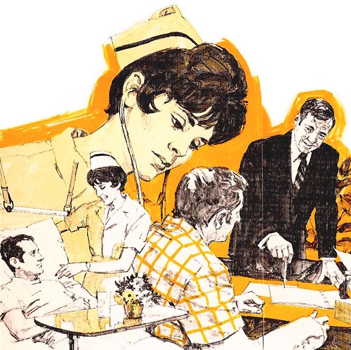
Clients hoping to save on the cost of four-colour printing, but wanting to create the illusion of colour would ask an illustrator for a black and white illustration, then surprint a single transparent colour over top. I've been around the business long enough to remember Rubylith and Amberlith - red or orange film held in place to an acetate backing sheet by, I guess, static cling. You'd tape a sheet of Rubylith over your black and white original, then cutting carefully (so as not to cut the acetate backing sheet) with an Exacto knife, peel up the areas that you didn't want any colour to surprint on. This set-up was sent to the film separator, with instruction for what percentage of a single colour the Rubylith mask should be printed at.
But Charlie didn't use that process...

"I think I used that colored film once or twice," he writes, " but never cared for it."
For the State Farm illustration below, Charlie explains his process:
"...both colors on this were done in B&W greys. No comps as I recall....so pretty much guessing on the combination or outcome."

"Most, I just painted in two colors....always B&W halftone, and then blue or whatever color. It was separated out the hard and more expensive way....color separation."
"Speaking of duo-tones, a Del Monte trade ad here [below]"...painted in two colors and color separated in reproduction. Not very good...my 'Al Parker' mood or mode. Bad management on grey values."

"If you sense some burn-out or fatigue on this...about right. I had been going full speed for 25 years by then, and was more interested in the home-built airplane I was working on. Luckily, it never got finished! Cheers.... Chas."
My Charlie Allen Flickr set.
No comments:
Post a Comment