Schwartz displays an even looser and more Expressionistic style, as we look at different assignments from different publications.

Schwartz did this dynamic illustration for Fortune Magazine in 1963, and it shows how he changed from a more traditional painterly style just 2 years earlier, to energetic sweeping brush strokes of diluted oil paint washes.
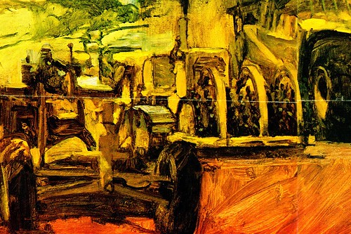
Schwartz has taken a very complicated scene of heavy construction equipment and masterfully suggested detail through value and simplified shapes. Once again he sets the mood with golden monochromatic hues and a hint of blue accent in the sky. The use of opaque light values are almost non existent here... the entire illustration technique is virtually transparent. I can only imagine that the art director of Fortune Magazine gave Schwartz nearly total freedom with this assignment... which I have to believe any illustrator would relish. In my opinion, this is an excellent example of where an expressive illustration is a far better choice than a photograph.
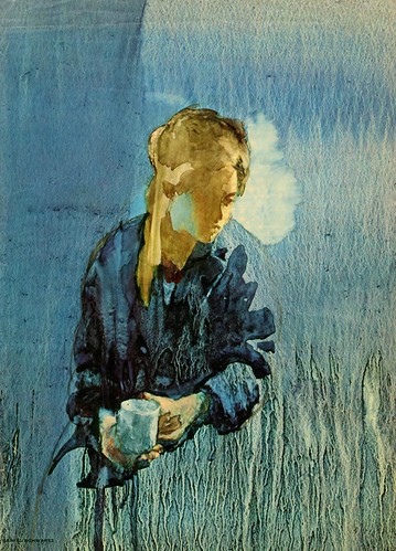
This illustration was done in 1969... for a story in Good Housekeeping Magazine, as I remember. This was 6 years after the Fortune illustration, and Schwartz was experimenting with transparent watercolor. As a fine artist, he worked in all mediums with the same degree of competence. Looking at the irregular runs and dripping effect of the lower background area, my guess is that he used a gessoed covered surface, which was very popular for many illustrators at that time. Gesso is a hard tough surface that is used to size canvas and is compatible with most all mediums. Again, Schwartz uses his strong fine arts influence in creating a very poetic thought provoking mood to this illustration.
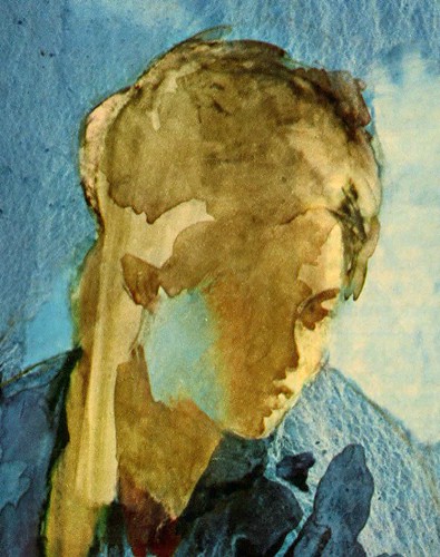
Notice how Schwartz defines the face with simple yet accurately placed subtle detail. The blue reflection from the background into the side of her face, is a beautiful touch that connects the warm head tones with the cool background tones.
It seemed to me that the illustrator’s roll, from the 1960’s on, was to find effective methods of competing with the camera. Photographs could create a sense of mood through dramatic and innovative lighting, gesture and expression of the model, but the illustrator had to go beyond those boundaries. Schwartz found the solution in his expressive surface effects and painterly application. By the end of the 60’s many art directors seemed to be wide open for new and different approaches... in many assignments, they expected it. I think that Schwartz, like Al Parker, Austin Briggs, Bernie Fuchs, Bob Peak, Mark English, Robert Weaver and other pioneers continued to strive for a fresh new look to their work, which would go beyond the limits of photography. Unfortunately the magazine industry was struggling to survive, which ironically may have helped encourage a rapid dramatic change in illustration after the 50’s.
Tomorrow: we will see Daniel Schwartz, the fine art painter, capturing a sudden changing youth movement in America’s cities.
Tom, your comments really enrich this presentation.Magazines seem not only to have survived, but flourished;is there not now an (upscale?)publication that uses illustrators of Schwartz' quality on a regular basis? The novelty and impact of illustration would seem to justify the cost. I can't understand why an art director doesn't make his reputation by suddenly committing to illustrations rather than photography.
ReplyDelete