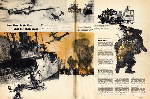
...an effective balance of color from left to right.
Once again, Kossin chooses a vignette treatment to simplify, a complicated and busy composition. Notice the interesting and effective cropping of the men in the water, and the jet overhead.
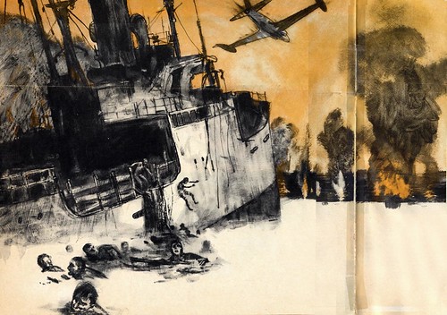
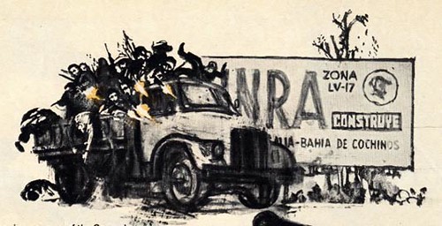
Although the detail in the large ship is greatly simplified, it is done so effectively that we think we see more than is actually there. The sign behind the truck on the upper far right, is a wonderful touch of interest and design quality. It is those extra little touches of reality that makes us feel these illustrations were done by an eye witness... which is the job of journalistic illustration. This takes a lot of imagination, research and careful decision making, of which Sandy Kossin is well equipped for the task.
One of my illustration teachers always talked about the importance of "negative shapes"... that is, the shapes in between the objects. He would say, "Always make the negative shapes as interesting as the positive shapes ". Once again Kossin strategically crops the B-26 bomber, creating beautiful negative spaces in the sky background surrounding the bomber.

Countering the angles of the bombers and black smoke are strong horizontal lines of orange tracers at the horizon line. The action swiftly moves our eye from left to right and stops us with the drama of exploding trucks hurling bodies in different directions. Although this indicates one split second frozen in time, it is a symphony of sight, sound and fluid animation. The powerful horizontal composition is full of design devices that is truly a feast for eyes and senses. The orange glow of the tracers and fire balls against the black smoke, creates a chilling impact. Notice the effective texture and rapid bold gritty brushwork indicating black smoke and along the
foreground.
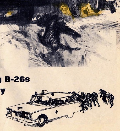
The upside down fallen soldier to the far right is an important element to direct us toward the small vignette of the ambulance and Castro's men sneaking behind it. Once again, Kossin's use of dark and light patterns are outstanding.
My thanks to Tom Watson, who clipped the these pages for his files back when this issue of Life magazine first came out, in May of 1963. This week Tom provides his insightful analysis as well as all the scans, giving me a nice break!
My Sandy Kossin Flickr set.
Thanks so much for posting these! Kossin's work is truly amazing - I can't believe I've never heard of him before. And the composition on that "Jets Howl" spread is great. Not only is each illustration well-composed in its own right, but look at how the images lead the viewer's eye in a circular pattern around the page. I'm just blown away!
ReplyDeleteThis is a great public service, Leif, and I am really enjoying Tom's insightful commentary. Thanks to both of you.
ReplyDeleteSince Mr. Kossin's son is apparently following this, and since Mr. Kossin still has the originals hanging on his wall, I would love to hear if the illustrator has anything to say about this assignment. Does he agree with the rest of us that it was special? Does he have any recollections about it? Did the art director at LIFE Magazine faint when Mr. Kossin brought these in? Hearing about Mr. Kossin's perspective would be the icing on the cake. Thanks for a great week of images.