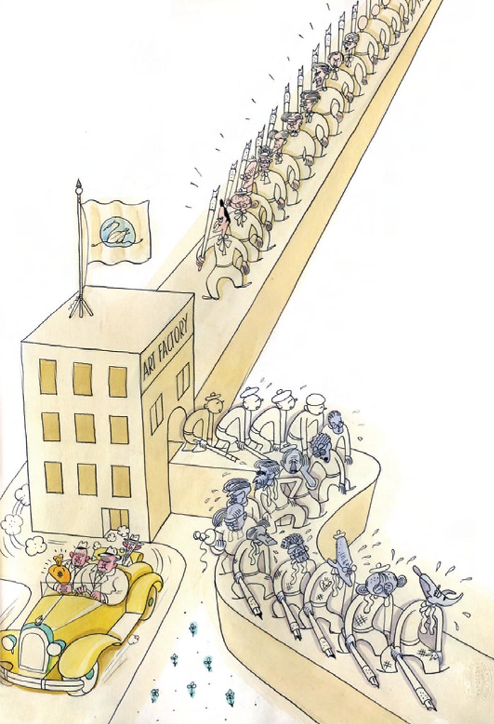
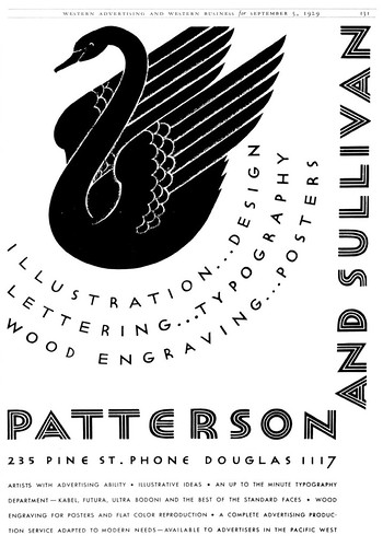
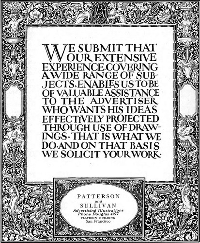
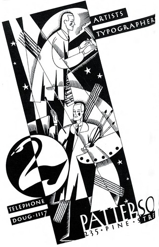
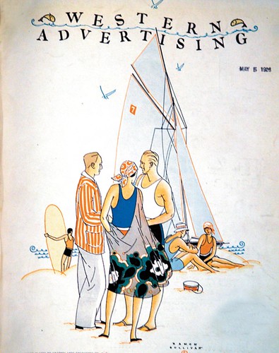
TI list member Bruce Hettema is the owner of P&H Creative Group and the author of an article in the current issue of Illustration magazine on the history of his Petaluma, California art studio, which began life in the 1920's in San Francisco as Patterson & Sullivan.In 1927, on the eve of the Great Depression but still celebrating Charles Lindbergh's historic hop across the Atlantic, P&S was prospering.
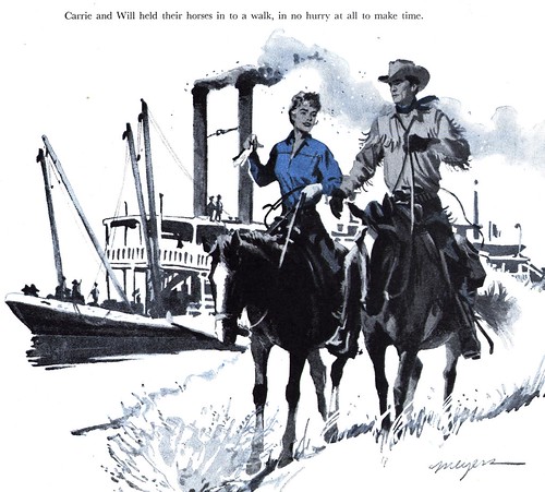
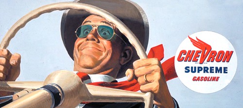
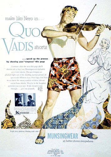
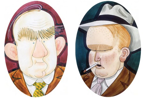
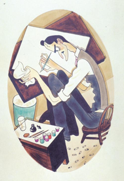
It employed more than a dozen artists, each with his or her own specialty: product, still life, automotive, fashion, portraits - you name it. P&S artists could put pen, ink, paper, and brush together to produce ideas and illustrations that virtually leapt off the page to sell products and sevices.

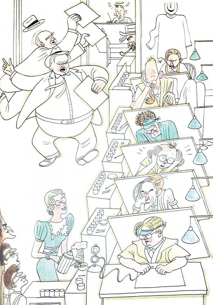
In addition to their illustration services, P&S employed a staff of graphic designers and calligraphic artists plus a comprehensive typographic department. As Patterson & Sullivan's reputation grew, they began attracting many of the country's top illustrators.

In the early years, artists such as
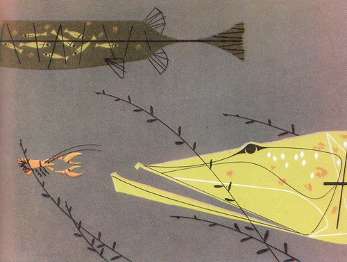
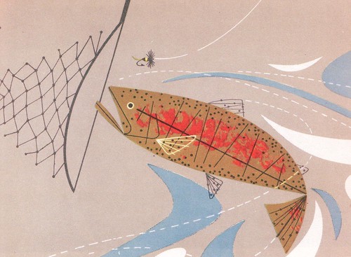
John Atherton ( whose work now hangs in museums across the country),
Stan Galli, Paul Carey, Jack Painter,
Haines Hall, Gib Darling, and Amado Gonzalez worked for the agency.
 Tomorrow:
 The realities of working in an art studio.
You can find the full length version of this article in
Illustration magazine #19.