Thursday, May 31, 2007

Al Parker: 1965


*The Norman Rockwell Museum is about to showcase Al Parker's work in a major retrospective. Go to the Rockwell Museum's site for more information.

Wednesday, May 30, 2007

Al Parker: 1958


*The Norman Rockwell Museum is about to showcase Al Parker's work in a major retrospective. Go to the Rockwell Museum's site for more information.

Tuesday, May 29, 2007

Al Parker: 1948

Unfortunately some former owner of the magazine cut some small photos from the reverse of the left-hand page. But it didn't totally ruin the piece so... here it is!


*The Norman Rockwell Museum is about to showcase Al Parker's work in a major retrospective. Go to the Rockwell Museum's site for more information.

Sunday, May 27, 2007

Al Parker: 1943

As I was mulling over what to feature this week I found myself stumped. Almost any artist or topic that follows a week of Al Parker illustrations and Barbara Bradley's stellar commentary would come off poorly by comparison.


And to be honest, the last few weeks have been a bit overwhelming here at TI headquarters -- even with Barbara's much appreciated guest writing last week. I need a little break from researching, scanning and writing these longer, multiple image posts every day.

So how do we follow a week of Al Parker? Why, with more Al Parker, of course!

I have a handful of Parker illustrations left over from preparing last week's posts and I'm going to present them chronologically one a day - without commentary - for the rest of this week. That'll be a nice way to decompress.

*The Norman Rockwell Museum is about to showcase Al Parker's work in a major retrospective. Go to the Rockwell Museum's site for more information.

Al Parker's (Illustrations of) Children


When Barbara Bradley and I began collaborating on this past week's look at Al Parker's work, it quickly became apparent that we would need to spend a day focusing on the artist's illustrations of children. Childhood is not all sweetness and light... it's often frought with danger, mystery and confusion and Parker seems to have been innately attuned to the complexities of children and the world they live in.

"I think that one of Parker's most wonderful talents was his uncanny ability to catch believable attitudes [in children] that we mortals wouldn't think of", wrote Barbara in one earlier email, and she begins her elaboration on the topic below...


"Leif, you have selected three of my favorites, all of which demonstrate several aspects of Parker’s genius. They are all wonderfully human, fresh and real in every gesture. The gestures, facial expressions, clothing, and props are not only perfect for the time period of and story of each but are fresh and interesting. Parker seemed incapable of using a visual cliché. Every prop adds to the story while simultaneously becoming an essential part of the composition. Each illustration is so masterfully designed that we can all profit by analyzing the elements in its composition, the contrast of large and small masses, masses to delicate, the contrast of curves and straights, static to dynamic, the beautiful negative spaces, etc. I smile with wonder every time I view these."

THE HIGHER LAW

"The gestures of the boys are so natural but how few of us artists would think of capturing them: the boy wiping his nose in the cold, the one warming his hand under his armpit. Having decided that they would all face forward, Parker arranged their shapes within the composition so that there was no monotony such as overlapping the vertical boys on the left."


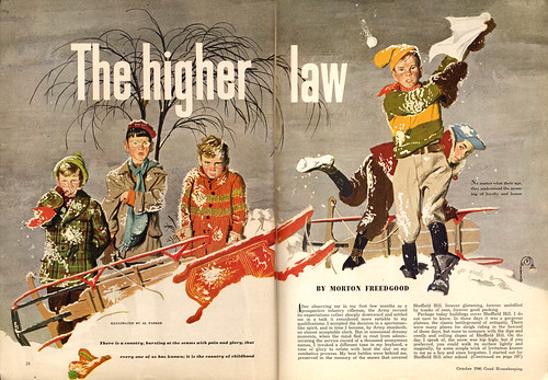
"The vertical figure on the right combines with the shape of the diagonal boy behind to make one larger shape. The sleds make a terrific pattern that echoes the curve of the snow, at the same time they break it up. Look at the variety within the negative shape of the background around the foreground. Then, look how the delicate linear branches on the left and lamppost on the right contrast with the solid foreground mass of the foreground and add to the time and place. It’s modeled in the figures, flat white in the snow, slightly horizontally textured in the sky, partially flat in the sleds. It’s mostly muted in color, appropriate for winter, with lush accents of more intense color. Beautiful snowball splats… and,the Parker accent touch, the cap in the snow."
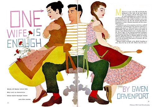

THE RICH WOMAN

"It’s fascinating to study how Parker used design elements to hint at an intriguing story that aroused curiosity and lured viewers: The curve of the woman’s back turned away from the diagonal of the contemplative child; The horizontal line of dresser and table that pulls the figures together while establishing the period and setting; The rug with a naturally upturned corner that also relates them; A purse that breaks up the severity of the dresser; The array of period props, all carefully placed and selected in size, shape, color, and texture."


"Most of the color is deliciously muted, contrasting with the comparative brightness of the exquisitely designed quilt. Best of all is the child. She is typically Parker. Her gesture with arms behind the chair and crossed feet is completely natural, uncontrived, yet unexpected. The natural use of one sock on and one in a hand to establish interrupted dressing is pure Parker. So is the ribbon around the neck. To me, this illustration is a masterpiece."
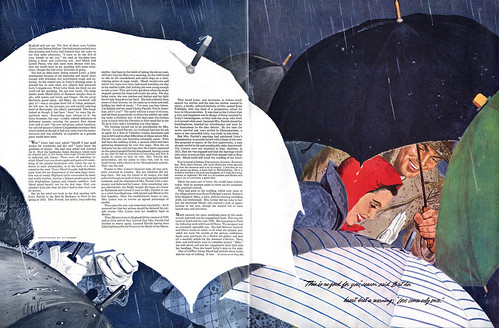


RANDOLPH

"This must be such a delight to all of us viewers that I suspect we are enjoying many of the same storytelling elements: the charming dog, paddling for all its worth; the natural swimming actions of the children, wet flowers dangling from the girl’s hair; the boy hanging on to his ballooning pants; the loosely painted water; and the effects of sun flashing through the water onto flesh, fabric, or fur. Parker’s composition is once again superb."


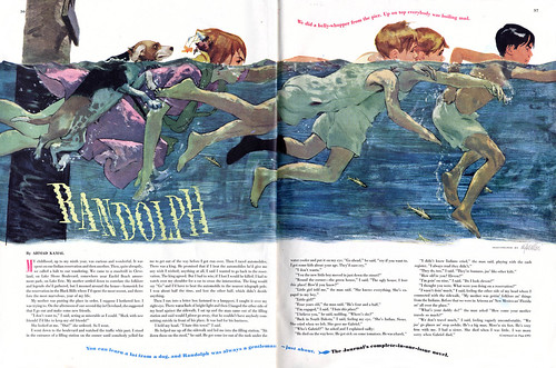
"Horizontal water contrasting with diagonal swimmers and slightly off vertical pier. Diagonals to the right balanced by the diagonal of fish through knees toward the left. Pier leading out of page stopped by sign. Large water shimmering curve of title repeated in thin curves of red and blue headings. Overlap of heads of the twins to contribute to the variety of head shapes. (Check out the pleasing never-monotonous negative spaces around the heads and around the swimming figures.) Beautiful repeat of blacks of one sock, head, and dog. And even the contrast of the upper edge of water to its dragged lower edge."

"Thank you, Leif, for giving me the privilege of discussing a few of the delights and depths of the work of my favorite illustrator, Alfred Parker."

"I hope that another time, you will run a few of over a hundred of Parker’s Mother/daughter covers for Ladies’ Home Journal. Each is a gem, a masterful little poster, and together they document an era."


My thanks to Barbara Bradley for providing us such invaluable analysis of Al Parker's work - its been incredibly enjoyable and educational to have the benefit of her tremendous knowledge and passion for this week's subject.

Last week, as we were working on the material for these posts, Barbara related the following anecdote to me. It seems like an entirely appropriate way to bring our look at Al Parker to a close:

"One thing I can tell you about what other artists thought about Parker was when Rockwell was a guest speaker at Art Center. We students, being jaded, sophomoric, and mostly interested in the most current cool work, politely went to hear him. Of course, he was so natural and charming that he had us in the palms of his hands within minutes."


"When a student asked what he thought of illustrators of the day, he mentioned only Parker, saying he was “just great”. To describe his thoughts on Parker he told a story about a parade in a small town. Behind the band followed the kids, busily copying the band members, blowing on imaginary trombones and banging on imaginary bass drums. They were so busy imitating the movements that they didn’t notice when the band turned a corner. The kids marched on, banging their drums and sliding their trombones, by then following a garbage truck. Parker was the band and his imitators were the kids following."

*Barbara Bradley is an illustrator who began her career in the early 1950's at the famous Cooper studio in New York. She later moved to San Francisco and eventually went on to become the Director of Illustration at the Academy of Art University. Barbara knew Al Parker personally and professionally and I am most grateful for the keen insight she has so generously offered to add to this week's posts. Barbara was recently fêted at The Society of Illustrators in New York. She received the Distinguished Educator of the Arts Award for 2007.

Barbara's fascinating career will be the topic of an upcoming week here at Today's Inspiration but in the meantime, take a moment to visit this blog which was set up in her honor.

*The Norman Rockwell Museum is about to showcase Al Parker's work in a major retrospective. Go to the Rockwell Museum's site for more information.

Saturday, May 26, 2007

The Advertising Art of Al Parker


Last week I talked about how there was very little difference between the elements of the Old School's advertising and editorial illustrations... both types of art contained full scenes and characters and really, the only difference might be that everyone in an advertising illustration would be holding a Schlitz, for instance.


Not so for the New School. While many New School illustrators did wonderful graphic experiments when given the opportunity on an editorial assignment, its rare to see them utilizing all their design skills when we see their advertising work. The Pepsi campaign we looked at a few weeks ago was one exception... and Al Parker's decade-long American Airlines account was the other.

Here's a little article from the March 1952 issue of Art Director & Studio News that specifically talks about how Parker will continue his editorial style treatment of AA's magazine ads.


No other artist, not even Norman Rockwell, had such an arrangement (and I mean over a period of years and years!) That, I think, says a lot about Al Parker's status during those times. "In the exciting profession of illustration," wrote the editor of Cosmopolitan in the November 1953 issue, "there is usually one artist who sets the standards for others. The leader today is Al Parker."


This past week Barbara Bradley did an excellent job explaining the nuances of Al Parker's work so I won't try to go into too much detail about why Parker was considered the leader in his field by editorial and advertising clients. The article from Cosmo sums it up perfectly: "Parker refuses to do the stale, the easy or the obvious."

While most illustrators would provide a client with the idealized, generic "types" in the typical advertising poses, Parker's keen sense of observation allowed him to create scenes and populate them with real people the viewer could identify with. For instance, take a look at the scene below...


Its hard to imagine any other illustrator designing such a snapshot scenario.

Or this scene from later on in the 50's... who but Al Parker could have suggested a sense of elegance and luxury in a huge double page spread that is mostly an illustration of potted plants and cast-aside luggage?


Of course there are compromises that any professional must make when addressing the needs of the client -- they are, after all, trying to sell something. But among the hundreds and hundreds of 50's ads I've looked at, this long running campaign by Parker is noteworthy for its distincive approach and tremendous duration.

*Paul Giambarba emphasizes the point I'm trying to make here most succinctly on his excellent blog, 100 Years of Illustration and Design, with several more American Airline ads by Al Parker.

*The Norman Rockwell Museum is about to showcase Al Parker's work in a major retrospective. Go to the Rockwell Museum's site for more information.

Friday, May 25, 2007

Late 60's Al Parker: Concept, Technique and Design


When I first found this group of illustrations in the November 1968 issue of Boy's Life magazine - and then realized they had all been done by Al Parker - I was quite frankly shocked. This was unlike anything I would have guessed to be the work of Al Parker. Though knowing of Parker's tireless urge to experiment, I suppose it should not have come as a surpise. There's a famous story of how Al Parker once illustrated an entire issue of Cosmopolitan magazine in the 1950's using 9 different styles and 9 different names.

Below is the highlight from that late 60's issue of Boy's Life table of contents page. I asked Barbara Bradley if this is how she remembers Al Parker from that period in his life.


she replied, "The Parker in the photo looks very much like the Parker I most remember, although his hair became pure white. He often wore red and always looked stylish no matter how casually he dressed."


So what to make of these unusual illustrations by this masterful artist? I have to admit, I felt out of my depth with this batch. It was only when I happened to see them in thumbnail view, as I've indicated below, that I began to genuinely appreciate what I was looking at.


Luckily, Barbara came to my rescue when she sent me her knowledgable analysis:

"Leif, you remember that we were recently discussing the elements of fine illustration: I think of these as: Concept/ or content; 2 technique, and 3 design. Drawing, color, perspective, all fall under the category of concept/content, because they are necessary to visual communication.


Some illustrators have great ideas and are superb in concept. Others, such as Rockwell, are superb in content. My premise is that every fine illustrator is unusually strong in two of these elements and at least acceptable in a third. It is hard to think of many who excel in all. Parker was one. He was great in everything!

These four illustrations, like all of them we’ve seen this week, demonstrate Parker’s great ideas, command of any technique he tried, and his extraordinary design sense. The fact that all four appeared in one issue is astounding. Parker said that he liked illustrating for Boys’ Life particularly as there was such a variety in subject matter. They were a special treat to me because I had not seen any of them. I’m blown away by “Last Jump” (no pun intended) and delighted by the design and fresh suitability of the “Caballos” technique and staging. I’d like very much to read what other blog viewers notice and enjoy.


I'd like to thank Barbara Bradley for her wonderful analysis, commentary and insight into the life and work of Al Parker and I hope readers of this week's posts will take her up on her request for your thoughts and comments!

*Because there is so much to be said about Al Parker, and because we have barely scratched the surface, there will be two additional posts this week - one tomorrow and one on Sunday - before we bring this topic to a close.

*Barbara Bradley is an illustrator who began her career in the early 1950's at the famous Cooper studio in New York. She later moved to San Francisco and eventually went on to become the Director of Illustration at the Academy of Art University. Barbara knew Al Parker personally and professionally and I am most grateful for the keen insight she has so generously offered to add to this week's posts. Barbara was recently fêted at The Society of Illustrators in New York. She received the Distinguished Educator of the Arts Award for 2007.

Barbara's fascinating career will be the topic of an upcoming week here at Today's Inspiration but in the meantime, take a moment to visit this blog which was set up in her honor.

*The Norman Rockwell Museum is about to showcase Al Parker's work in a major retrospective. Go to the Rockwell Museum's site for more information.

Thursday, May 24, 2007

Al Parker: "A superb graphic designer and draftsman all in one"

The mid-to-late 50's saw yet another step in the ever-changing evolution of Al Parker's style: the virtual elimination of any 3-dimensional rendering, as Parker began to experiment with a flat, graphic technique that was years ahead of his contemporaries. This is my favourite stage in Parker's career and I find it interesting that what Al Parker was pioneering in '55, '56 and '57 we can see influencing the other New School artists in '58,'59 and '60. For example, those Pepsi ads we looked at a while back show, I think, the impact of Parker's influence.


I asked Barbara Bradley to look at this group of illustrations and she had this to say:

Parker never pictured the same two generically beautiful faces, one for a male and the other for a female. Every one of his beautiful people was an individual. Even having been created in an era when standards of beauty were more narrow than now, the beauty of his people varied. They all had personalities. And, their types don't show the passage of time. They'd be neat people if you met them today.


Commenting on "Love Is the Name of the Game" (below), Barbara writes...

"Composed of so many flat areas of color this illustration might at first seem simple in composition. However, it is typical of Parker’s thoughtful control of everything in the picture. We can learn much by studying and appreciating a few of his decisions. A viewer would be intrigued by the figures’ gestures, might realize that the setting is Paris, the time early evening, would know that the people are smart by their clothing and interior setting."


"The darks work together as a mass to hold the lighter figures. is composed of many elements are recognizable holds the lighter figures, yet each is recognizable. His dark hair mostly blends into the cityscape but is held by the light of a window beyond, a window that lends atmosphere at the same time. Another window emphasizes her back a touch more. The magazines break up the mechanical straights of the chair, and, at the same time, add to the story. The accents of red are perfect, bringing warm to a predominantly cool composition and focusing more attention on the people. One can go on analyzing this illustration, the play of verticals, to the horizontals, to the curves, the accent of buttons, of earring, the role of the curtain, and the vase. etc etc, etc. And, one could analyze similarly for just about all of Parker's illustrations. What fun!"

"Face of the Tiger" (below)…one of my all time favorites. The loveliness of the setting, Its beautiful and varied greens, ferns and leaves, delicately rendered lilacs, contrast so effectively with the clues of a missing baby that the implied horror is intensified. Once again, everything is perfect in this illustration. Could any other illustrator have created this with as much sensitivity of storytelling and beauty of design and composition?"


"The broken branch, the bootee on the ground, pacifier and rattle, the disturbed net flying in the breeze and, most eloquent of all, the pillow showing the impression of the baby’s head, the head no longer there: they all tell the story. The more one looks at an illustration like this, the more plusses one finds. The jagged harsh lettering is one more plus. The clever way in which Parker ended the green bleed near the gutter with a branch, then softened the edge with a few leaves and fern. The softening of the pram edge with a blanket, a blanket that helps tell the story, he beautiful design of each branch of lilac blossoms. …Plus, plus, plus! Note how often Parker shows one sock off, one shoe off, one bootee off, etc,. A wonderful naturalness that simultaneously provides neat design and color elements."

"This one is so great and I’ve waxed so rhapsodically about it, I think that you should comment on the rest. The most important thing is that Parker probably designed and executed all of the titles."

"One more comment about "Face of the Tiger". ...The terror is conveyed so well without the figure that the figure doesn’t seem to be as necessary for the story as it is to complete the page composition. I like the way the blue of her dress is repeated in the buggy (or vs versa."

"Incidentally, Leif, you could show dozens of Parker’s illustrations as examples of one thing alone, how cleverly he incorporated spaces for copy in his compositions. He so often made them elements in his page compositions."


I'd like to talk about the design in his drawing itself..every shape, every fold, every line is thoughtfully designed...just as Fawcett's were. That subject, however, would take a lot of writing. The play of straights to curves were masterly. You see some of that in all of the illustrations you selected. What a fascinating combination he was, a superb graphic designer and draftsman all in one."

*Barbara Bradley is an illustrator who began her career in the early 1950's at the famous Cooper studio in New York. She later moved to San Francisco and eventually went on to become the Director of Illustration at the Academy of Art University. Barbara knew Al Parker personally and professionally and I am most grateful for the keen insight she has so generously offered to add to this week's posts. Barbara was recently fêted at The Society of Illustrators in New York. She received the Distinguished Educator of the Arts Award for 2007.

Barbara's fascinating career will be the topic of an upcoming week here at Today's Inspiration but in the meantime, take a moment to visit this blog which was set up in her honor.

*The Norman Rockwell Museum is about to showcase Al Parker's work in a major retrospective. Go to the Rockwell Museum's site for more information.

Wednesday, May 23, 2007

Al Parker: "A Great Sense of Observation"

All of the pieces today are from around 1950... from around the time Barbara Bradley began her professional career at one of the biggest, most successful art studios of the mid-twentieth century -- the Charles E. Cooper studio. In other words, while Al Parker was producing these pieces from his home studio in Westport, Connecticut, Barbara was rubbing shoulders with the likes of Coby Whitmore and Joe DeMers, who's illustrations regularly appeared just a few pages from Al Parker's in the same national magazines.

This gave Barbara a unique opportunity to hear, firsthand, what some of the most successful illustrators of the 50's thought of Al Parker's work.


I asked Barbara if she could recall how those artist reacted to Al Parker's work and how she, as a young up-and-coming illustrator, had felt about the Parker art she encountered back then. Here's what she had to say:


Having saved Parker’s work from high school and on into college and Art Center, I had a fairly good Parker file, by the time I was at Cooper’s, the only one there. Everyone I spoke to about him admired him greatly. I did notice more flat shapes in some of their work after some particularly neat flat Parker’s had appeared. I can tell you little more than that except… sometime before I left, the file disappeared.

When the Academy of Art gave Parker an honorary degree many years ago, I compiled a recording to be played while the work of the speaker was shown. It consisted of statements from other artists. I’ve probably got it somewhere. Joe Bowler interviewed an ailing Coby. Coby said so much but, as he had a difficult time speaking, the part we used was “I just loved Al”. Bernie Fuchs, David Stone Martin, Jon Witcomb all contributed. Of course, when we ran Al’s illustrations we played the St. Louis Blues. I remember that both he and Evelyn were in tears by the end. So was I.


“Wayward Pilgrim” (above) reminds me of something I notice almost whenever I see a Parker. Even if another illustrator, (mortal, that is), had the same photos and used the same technique, Parker’s design sense was so fresh and original that he would almost always do something no one else would think of or leave out something most others would put in. Look at the beautiful negative space and the way in which he so neatly left tone around the edge of the center figures.

Quite often, in a Parker’s illustration, you’ll find design elements such as the little line of lettering around the dancer’s arms and scarf. Have you seen the illustration in which he wrote,”Al Parker did the drawing” as a curved line because the curve worked better in the design than his usual signature? I watched him once, as he was about to sign a piece for me. Before signing, his hand wandered around the piece as he figured out where to put the element of whatever he wanted to write.


I saw a tiny bit of his fabulous design sense at work once when he described a piece for American Boy that he was mulling over. He described that he would put some cat tails in it and, as he described it, his hand made three chopping motions at different diagonals showing how he would use them compositionally.

Another time, as we were chatting in a pleasant no-longer-there-bar high above the SF Airport, he stopped in the middle of a conversation to briefly note two seagulls that were perched just so on some antenna or other. He immediately went on to resume the conversation. Such moments give a little insight into his great sense of observation.


Of these five illustrations, “Always Marry a Doctor” (above) is one of my very favorites. However, four of the five show a bit of Parker’s amazing variety of line and contrast of texture: the simple line on the first, the scratchy texture of the pen and ink on the woman contrasting with the original use of a pressed rose, the contrast of dragged shoulder and bold brush of the woman with delicate rendering on the trousers of the guy with a backwards coat, and the bold brush line of the Comedian.


I can pull out Parker’s pieces to demonstrate to students so many concepts of illustration, of composition, and of drawing. I often pull out a group to discuss only line quality and variety of line, another group to discuss contrast of texture and/or technique in any one piece,


And... Parker’s humor speaks for itself.

*Barbara Bradley is an illustrator who began her career in the early 1950's at the famous Cooper studio in New York. She later moved to San Francisco and eventually went on to become the Director of Illustration at the Academy of Art University. Barbara knew Al Parker personally and professionally and I am most grateful for the keen insight she has so generously offered to add to this week's posts. Barbara was recently fêted at The Society of Illustrators in New York. She received the Distinguished Educator of the Arts Award for 2007.

Barbara's fascinating career will be the topic of an upcoming week here at Today's Inspiration but in the meantime, take a moment to visit this blog which was set up in her honor.

*The Norman Rockwell Museum is about to showcase Al Parker's work in a major retrospective. Go to the Rockwell Museum's site for more information.

Tuesday, May 22, 2007

Al Parker: "Every job... a separate challenge."

When Barbara Bradley sent me the piece below, she wrote, "One of the earliest Parkers I've found, very early thirties."

As a historical reference point, it provides a fascinating look at how far the young Al Parker would go.


About a decade later, in the early-to-mid-40's, when almost all illustrators were utilizing the styles and techniques of the Old School, Al Parker was creating innovative artwork that caught the attention of his peers (and no doubt spurred many of them on to try their own experimentations).

I asked Barbara to comment on the three mid-40's Al Parker illustrations seen here today, and she graciously provided the following thoughtful analysis...


"Even in these early ones," writes Barbara, "Parker showed his extreme versatility: He approached every job as a separate challenge. The basic compositional design and approach for it, the technique, the lighting, all would differ greatly. The common grounds were that each was completely appropriate to the story and that his inspiration for each came from the story. They were never interchangeable for other stories as were illustrations of some of his followers. Every one, even in the forties, had a freshness and Parker touches that were unique to him. Props and design were like clasped hands. You can't tell which came first. On the first (above), look at the accents of dark, the placement of the plants and what they do for setting and composition, the spot of the ping pong ball, the pattern of the pillow and its delightful askewness. Value, line quality, types of people, perfect."


Regarding Al Parker's art for "Call Me Biscuit" (above), Barbara comments, "I like the contrast of texture in this one too, such as the rough heart edge and the dragged newspaper shadow. I might not have spotted the right hand page as being Parker but would have had no doubt about the left."

Of "The Search" (below) Barbara writes, "Very clever combination of full color and duotone on opposite page. the guitar head works for both."


"The design of the lettering and the way the "S" holds the key looks very Parker-like. I suspect he indicated exactly where he wanted the caption's letters to be (Parker was a great lettering designer). In the later forties, you'll find so many in which he did the captions himself. (How often he did the lettering on the Mother-daughter LHJ covers.) The keys are neat, mother of pearl inserts are simple but 'read', the cord ends are casually perfectly designed. The guitar inlay may even relate to the character in the story. I also like the combination of high contrast lighting on the figures and the hand combined with a flat graphic guitar."

*Barbara Bradley is an illustrator who began her career in the early 1950's at the famous Cooper studio in New York. She later moved to San Francisco and eventually went on to become the Director of Illustration at the Academy of Art University. Barbara knew Al Parker personally and professionally and I am most grateful for the keen insight she has so generously offered to add to this week's posts. Barbara was recently fêted at The Society of Illustrators in New York. She received the Distinguished Educator of the Arts Award for 2007.

Barbara's fascinating career will be the topic of an upcoming week here at Today's Inspiration but in the meantime, take a moment to visit this blog which was set up in her honor.

*The Norman Rockwell Museum is about to showcase Al Parker's work in a major retrospective. Go to the Rockwell Museum's site for more information.

Monday, May 21, 2007

In A Class of His Own: Al Parker

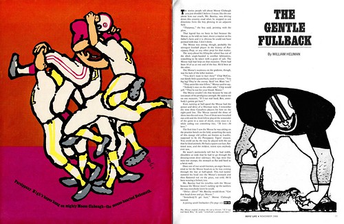
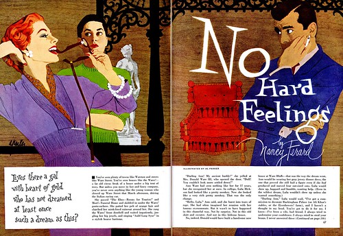
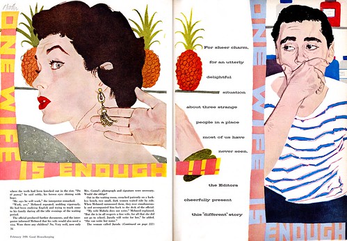
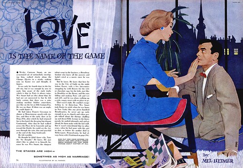
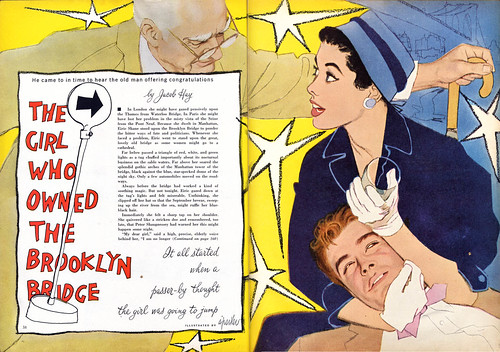
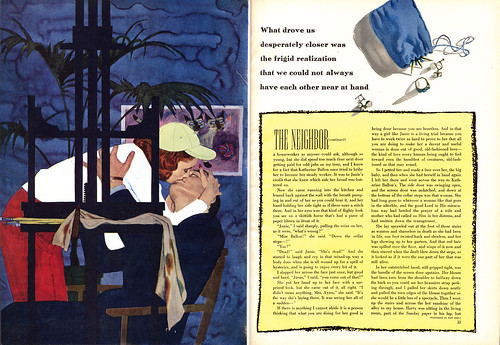
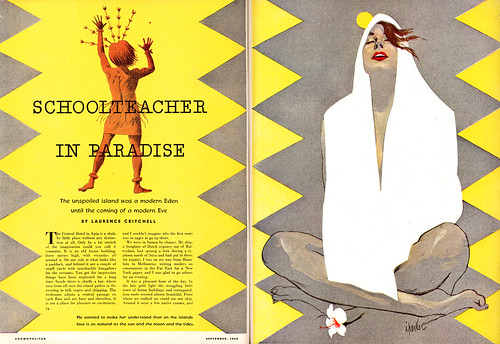
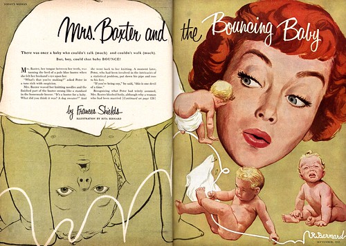
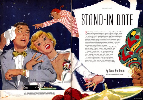
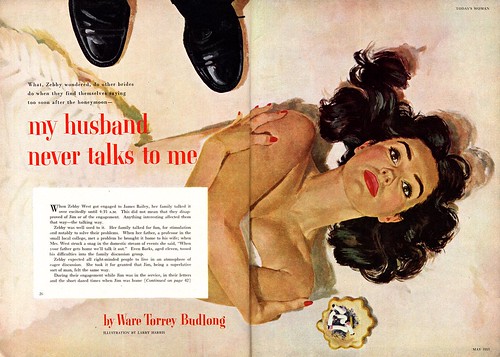
Over the last two weeks we've looked at what I call "The Old School" of illustration and "The New School" of illustration. There were a lot of reasons for the birth of the New School. Artists working in the relatively new medium of designer's colour/gouache found the chalky, fast drying paint required a different approach than oils (or even watercolour) so, by extension, flat, graphic treatments and a looser, rougher painting style with less blending were a natural result. We saw how styles changed and evolved and how some members of the Old School were among the pioneers of the of the New School. As America entered the modern, urban, atomic age of the 50's, a multitude of factors; social, cultural, economic, all played a part in the contemporary look of the New School style.


And always experimenting on the leading edge of that evolving approach to commercial art was one man whose work was being watched by the public, the clients and his peers: Al Parker.


Al Parker's biography is available in a number of locations on the net including at The Illustration House and at The University of St. Louis, so we will skip over those details here and get straight to the point:

I have wanted to better understand Parker's status as an illustrator without equal since reading this Noel Sickles interview in The Comics Journal #242. In speaking about the state of illustration in America, interviewer Gil Kane says to Sickles,

"When you started going into illustration, magazine illustration - at that point, or up to that point - had almost totally been dominated by what I call masculine illustrators - even Norman Rockwell. Then [Al] Parker came in, in the 30's, and set up a situation where - I don't know whether it was Parker who was reflecting a change in magazines or whether Parker's appearance triggered a change in certain magazines - but by degrees, women's stories started to come in.


And people like Jon Whitcomb and that whole Parker school of artists came in and, little by little, adventure illustration - which was represented overwhelmingly in the magazines during those periods - for a while was rather even [with a Parkeresque illustration] in a magazine like The Saturday Evening Post. They kept a pretty good balance, nearly always favoring the masculine illustrator. But it seemed that in advertising and in so many other magazines they were developing the people... I hate to classify Parker with them because he was so much better... still, he created a school that ultimately dominated magazine illustration for a while."


Well, clearly Gil Kane didn't think much of the New School - but why the qualifier, "I hate to classify Parker with them because he was so much better", for Al Parker?


And why did Parker deserve praise from his clients like this highlight in the September 1952 issue of Cosmopolitan magazine...


And why did my friend, Will Davies, and virtually every other illustrator who knew of Parker's work speak with such awe and reverence at the mention of Parker's name? This week, with the help of my friend, Barbara Bradley, we will try to better understand Al Parker's remarkable influence on mid-20th century illustration.

Barbara is an illustrator who began her career in the early 1950's at the famous Cooper studio in New York. She later moved to San Francisco and eventually went on to become the Director of Illustration at the Academy of Art University. Barbara knew Al Parker personally and professionally and I am most grateful for the keen insight she has so generously offered to add to this week's posts. Barbara was recently fêted at The Society of Illustrators in New York. She received the Distinguished Educator of the Arts Award for 2007.

Barbara's fascinating career will be the topic of an upcoming week here at Today's Inspiration but in the meantime, take a moment to visit this blog which was set up in her honor.

* By coincidence, the Norman Rockwell Museum is about to showcase Al Parker's work in a major retrospective. Go to the Rockwell Museum's site for more information.

Friday, May 18, 2007

The New School: "15 Guys"

When my friend, Will Davies, a tremendously talented Canadian illustrator ( and New School devotee) went to New York in 1953 to try to get work, he received much the same response to his portfolio at every art studio and magazine: "Your stuff is great... but I've already got 15 guys who can do this style."


"15 guys" is a pretty accurate estimation of the top tier of New School illustrators who had the best magazine accounts sown up. And behind them, a hundred (two hundred?) talented others, all working on the occassional editorial/story assignment between more mundane, "bread & butter" advertising projects - what Chicago illustrator Carl Kock once described to me as "A beautiful girl leaning against a television set."


Look at the four pieces by the four New Schoolers featured today. If you'll agree with me that having your work appear in Ladies Home Journal, Good Housekeeping, McCall's, The Saturday Evening Post and a few others represented the pinnacle of success for every illustrator of the 50's, then (to the best of my knowledge) none of these talented artists, whose illustrations I scanned from an old Fawcett magazine called "Today's Woman", ever made it to the top.

Why?


Certainly they were all very professional - their work is of excellent quality and they are incorporating the elements of design, composition and technique that would qualify them for top-notch assignments. Obviously, with competition so fierce, the best assignments went to those who brought something more to their work -- who went beyond being simply good and following the rules.

Even among those illustrators who enjoyed regular assignments from the most high profile publications, who brought a premium quality to their work, and who could be counted on to bring freshness and inventiveness to their assignments, there was one artist who all eyes watched - who made the New School rules - then consistently broke them and re-invented himself.


Next week: Al Parker.

Thursday, May 17, 2007

The New School: Advertising Art


So far this week we've mainly focused on the editorial - or story - illustrations of the New School artists. These same artists did a lot of advertising art as well... though generally the results were not nearly as memorable.


But let's not blame the artists for that.

"Whenever there is a trend toward realism there comes with it a trend toward sameness in advertising," writes Stephen Baker in his March 1953 editorial in Art Director & Studio News. The advertiser demands more and more realism and soon magazines begin to look like a Montgomery Ward catalogue."


"The art director's experience in buying art now becomes an all-important factor. To most clients "realism" means one thing: photographic reproduction of nature. Art directors, familiar with various techniques, know that isn't necessarily so. On today's art market there are hundreds of techniques available."


"Direction towards realism should not mean the end of ingeniously concieved ads. There is as much opportunity to make every advertising campaign unique and interesting as there was while "pure" design held the fort."


Charles E. Cooper, who oversaw the most celebrated and successful group of New School illustrators in America, encouraged his artists to take on editorial assignments (and did not take a commission on such work) rightly believing that the high profile exposure his artists received from those prominent and widely ditributed magazine illustrations would drive advertising clients to his studio door.

If only more of those advertisers had been willing to allow the New School illustrators to show off their graphic sensibility - as the magazine art directors had done. You can see from these examples how those artists tried - using that same minimalistic approach to environment, close cropping on the face and hands, that same wonderful roughly painted gouache technique -- but ultimately, too often, clients forced the New Schoolers to dial it back a notch. Too frequently their ads look like little more than rendering exercises in contemporary realism.


As Stephen Baker wrote, there were hundreds of realistic techniques available - and as often as not, advertisers chose Old School illustrators to provide the visuals for their ads. But aside from the addition of product placement in those illustrations, old school advertising art usually differed very little from old school editorial art. Figures in a fully realized environment was the norm.

Almost no advertisers granted New School artist the same freedom of expression. Pepsi, as we explored a few weeks ago, was one exception.


And there was one other... but that's a part of next week's topic.