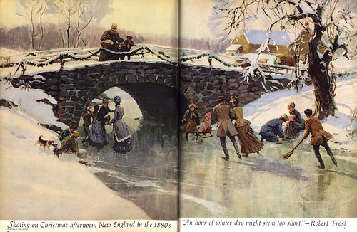
The only thing is, I suspect period pieces and historical subject matter are just about the only things a magazine art director would have considered these talent artists for by the early 60's. Not the case ten years earlier. Both Lovell and Smith regularly illustrated contemporary subjects for all the major magazines.
What had changed?

In fact, much had changed, as Tom Watson pointed out in his comment on yesterday's post. And even the New School artists were looking elsewhere for work: paperback book covers, album covers, corporate reports, textbooks, subject-specific "fine art" gallery markets. These were the places that still wanted realistic styles in large volume. Magazine and advertising clients were embracing photography with an unprecedented fervor. And when they did call for illustration, it was more likely to be of the sort we'll look at on Monday.
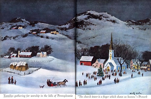
*For the third piece in this historical series from the December '62 issue of McCall's, Otto Storch made an interesting choice to accompany the work of the two well known illustrators, Lovell and Smith. I was unfamiar with artist Adolf Dehn until now, but a quick internet search turned up this thorough biography and many example of his very appealing (what would you call it? "American Primitive"?) style.
Set alongside Lovell and Smith's pieces, I think it compliments the other two artist's work very nicely - and provides a bridge to the Decorative Styles we'll look at next week.
Santa, I have only two things on my Christmas list this year.
ReplyDeletePeace on Earth....and to bring editorial illustration back into vogue.
....sigh...
Isn't it funny how the whole layout of the page reverts back to the old style when dealing with these "old fashioned" guys-- yesterday the text was innovative, curling around (and even into) the illustration. It was specifically designed to work in tandem with the art. Today, the text is confined to respectful little captions that run outside the picture, along the bottom. It's as if the typesetters and the layout people stepped back in time to accommodate these illustrations.
ReplyDeleteThanks, Leif. Can't wait to see what who's coming tomorrow!
ReplyDelete