Saturday, September 30, 2006

Famous Cigarette-Endorsing Artist

Try to imagine any national brand advertiser today thinking it would be a good idea to get an illustrator to endorse their product, since the public recognizes his name and loves his work. Its a highly unlikely scenario.

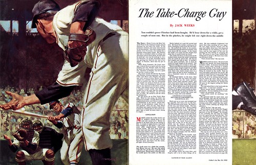
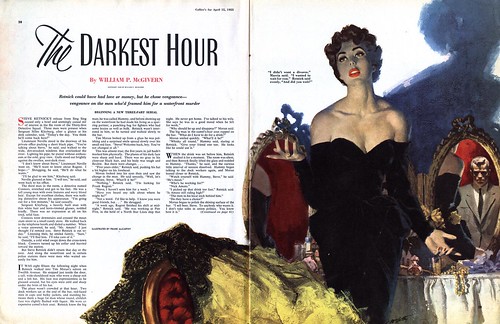
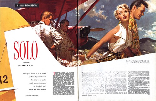
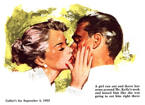
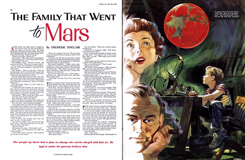
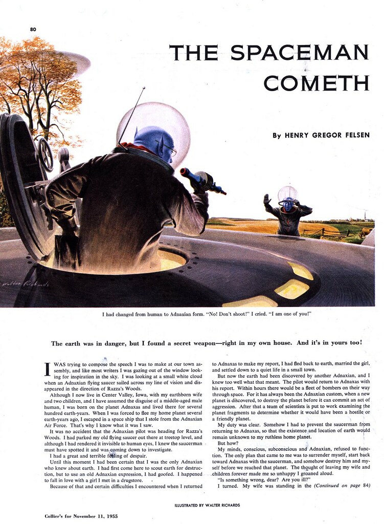
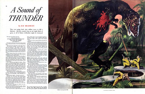
But it was a different world for the commercial artist of the 50's. Becoming a magazine illustrator was a very desirable goal - and not just for the paycheque. For the first half of the 20th century, illustrators were celebrities on par with stage and screen personalities, endorsing products, having articles written about them in mainstream magazines, and generally enjoying a kind of prominence in society that today's illustrator can only dream of.
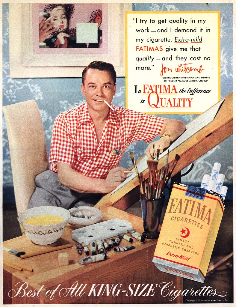
This ad for Fatima Cigarettes, featuring Jon Whitcomb serves to confirm that status once again. One has to imagine that the ad agency and their client considered many likely celebrity spokespeople; so for them to choose Jon Whitcomb suggests that they felt the public would know and admire him - which in fact is the case. Whitcomb was not only one of the most successful advertising and women's magazine story illustrators of the time, he also had a column in Cosmopolitan magazine called "Jon Whitcomb's Page" and of course, as the ad describes, he was a senior faculty member of the Famous Artists School, an art correspondence school that was so successful at the time that it made millionaires of all its founding members.

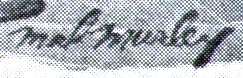
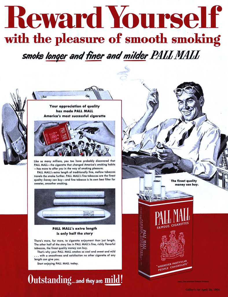
The mystery of Pall Mall illustrator Mal Murley is solved, thanks to a couple of people who went to the trouble of finding the information I was unable to locate: a biography and some other examples of his work can be found here. Thanks to bothJesse and Joe!

Finally, for those who would like to see many more scans of old cigarette ads, including many photo ads which I tend to ignore (this is, after all, an illustration blog) I recommend joining the excellent Flickr group Smooth Smoke Slogans that "Satisfy". You must get a free Flickr account and join the group to make many of the images visible due to an annoying Flickr rule.

Friday, September 29, 2006

March of the Cigarette-Smokin' Penguin

Its a sad story of the fleeting nature of fame, really...

Time was a little guy from the South Pole could come to America and make it big as the celebrity mascot of a major cigarette brand.As is often the case, modelling assignments can lead to acting gigs - sure the production quality wasn't that great - but a fella's gotta take his breaks where he can get 'em. The work was steady and required a guy who could stretch to fit many character types. It wasn't just about being a penguin month after month - no sir. But time passes and you can tell that tastes are changing. You're still on top, but you start to feel like you're second string to younger, more attractive competition.You can tell when its almost over... just like that, you're on the bottom; a bit player being squeezed out by hipper, more sophisticated types with a totally modern style. That's showbiz. Bah!

Thursday, September 28, 2006

The Sweet Smoke: Pipe Tobacco


Its pretty hard to get mad at pipe smoke. Stinky cigar smoke, yes. Acrid cigarette smoke, of course. But pipe tobacco is... pleasant. A wiff of that apple and cherrywood blend conjures up cozy images of kindly older gents, idling away the hours in country stores. Other pipe aromas make one think of drawing rooms in English manors or woodshops, or...artist's studios!

I'll always remember the smell of pipe tobacco from my first visit to my friend, Will Davies' studio. You noticed it the minute you walked through the front door, even though Will's place was at the back, up a flight of stairs and a hundred feet down the hall. I remember being vaguely astonished by the heaping ashtray of spent tobacco on the low materials table by his drawing board.

Several years later, when I had joined that studio, Will mentioned in the course of conversation one day that his doctor had told him a while back to give up cigarettes, so he switched to a pipe and now allowed himself two bowls a day. "I'm thinking about cutting back to just one, in the afternoon," he said.

Cigarettes are indicative of modern society: mass-produced, packed and sealed, endlessly identical - and fast. An efficient drug delivery-system. Cigars are ostentatious, conspicuous in their demand for attention. They speak of an eff-you attitude, they're big, smell bad and last a long time, torturing everyone who has to endure their intrusion.

But pipes and pipe tobacco are all about individuality, contemplation; about pausing with purpose to fill, pack, light and draw on one's personal blend of aromatics. No wonder that, when you look back through history, from one culture to another all over the world, where smoking took place it was typically done with a pipe.

These comic strip ads for Yello-Bole pipes are funny and kind of hokey, but the art is worth a closer look, especially if you have an interest in comic strip advertising, as I do. You'll find all three of today's ads at full size in my Smoking Flickr set.

Wednesday, September 27, 2006

Its A Psychological Fact:

Using cartoon characters in cigarette advertising attracts young smokers! I remember reading an article that detailed how, after the introduction of the Joe Camel character, teens started smoking Camels like crazy - a brand they had typically ignored.
But Joe was hardly the first Camels cartoon character. Back in 1955 Camels added these cartoon headers to their long-running series of "famous-people-who-smoke-Camels" ads.Whether this was actually a marketing strategy to attract young people to the brand is open to debate - but I doubt that was the case. Cartoon characters were being used for a great variety of adult-targeted products (much more so than they are today) and the Camels people probably thought these clever and colourful cartoons would contemporize their ads.There was certainly nothing appealing to youths about the old fogeys and generally grown up people featured in the much larger photo/endorsement section of the ads.

What I love about these Camels cartoons is the "radical" quality of the irate person who needs a good smoke: they really remind me of the work of retro-illustrator extraordinaire, Mitch O'Connell's work. If you want a closer look at all these ads, go to my Smoking Flickr set.

Tuesday, September 26, 2006

Pall Mall & Mal Murley

What do you think - does this signature read "Mal Murley"? Its been bugging me for some time.A lot of illustrators worked on Pall Mall's long series of ads designed around this black, white and red theme; Stan Klimley and Paul C. Burns among them. But my favourites have always been done by an illustrator whom I think was named Mal Murley.I can't explain exactly why Murley's monochromatic paintings appeal so much more than others - there's just something really "rock-solid" about them. As pieces of commercial art I find them to be absolutely flawless.Beyond that unusual name, the artist has left no clues about the course of his career...

More often than not, when you find a signature on a piece of advertising art from the 50's, you'll likely see that name again as a credit line on story illustrations in the same magazines. But not only have I never come across a Murley editorial piece, I've never seen his name on any other ad art. Could he have been an in-house illustrator at Pall Mall?

Perhaps one day we'll find the answer. Currently, there's no biography of the artist to be found. For the time being we'll just have to "Reward Ourselves" by admiring the Mal Murley pieces in my Smoking Flickr set.

Monday, September 25, 2006

Those Good Ol' Smoking Days!

Remember when smoking didn't kill you? When the worst thing you might experience from sucking on a coffin nail was some minor "throat irritation"?And all you had to do was ask your doctor about that. He wouldn't chastise you or make absurd suggestions like, "Maybe you should quit." Heck no! Why he'd actually recommend a smoother smoke - Try Viceroys, dear patient!Yes, smoking was in... all the cool kids were doing it! Moms and dads and sexy ladies were Being Happy and Going Lucky.This week, a look at those golden-leafed, Virginia-blended days of Smoking!

* I've got a nice little set of smoking ads you can see at full size here.

Friday, September 22, 2006

The Take-Charge Guy


I always say, writing and researching the Today's Inspiration blog is an education for me, and I have no teachers more valuable than the readers and subscribers to the TI list. Case in point: two correspondences from yesterday in regard to Frank McCarthy's career...

First, this note from Ken Steacy:

"Hubba-hubba! Who sez McCarthy couldn't do babes, besides the art directors who got McGinnis to paint all the Bond girls on the posters? Go figure!

I can't remember where I picked that up, but just check out the Thunderball one-sheets. There's one with Bond in a hot tub, and another of him standing in a wetsuit, and if those babes aren't by McGinnis I'll eat my... words!"

Ken sent this follow-up note:

"I did a quick search and came up with this article, and some scans."

http://www.ianfleming.org/mkkbb/magazine/posters.shtml
http://www.jamesbondmm.co.uk/bond-posters/thunderball-posters.php

Then later in the day, more McCarthy info from Armando Mendez:

"An interesting connection (to me at least) between Reynold Brown from last week and McCarthy this week.

I've always been interested in how these guys, no matter how talented and experienced or their previous big time credits, had to stick and move into different markets as the illustration industry changed and severely contracted in the 60s. The big movie studios, MGM, Paramount, Warner Bros, were in dire straits as well, so for a brief time, say 1960-'68, these former magazine and paperback illustrators and the last stage of the great movie poster era went out in a blaze of glory.

All the great images I remembered as a kid I learned as an adult were done by same guys.

This was the forumla: Mitch Hooks, McGuiness, Bob Peak for sex appeal, especially if the key art needed just a few big central figures. But for the all action, all star cast, huge international production, lush John Barry or Maurice Jarre score, it was likely to be Reynold Brown, McCarthy, and Howard Terpening.

There are a lot of overlapping credits here, as it was more than just the key art illustrator on the 1-sheet, but the list the three worked on includes: The Great Escape, The Dirty Dozen; Dr. Zhivago, Spartacus, Far From the Maddening Crowd, Ben Hur, The Alamo, Cimarron, Grand Prix, Around the World Under the Sea, Cleopatra and The Sand Pebbles.

The three all left the movie business to paint western scenes, Brown leaving first in 1966, with the other two soon after. But for a time their work on movie art meant a great action picture in a way a movie goer of the time readily understood."

My thanks to both gents for sharing!

Finally, for those who wish to read a biography of the artist, and get a look at that famous western art (you will likely see some here in the future as well) go to Frank McCarthy.com

* Don't forget, all of this week's scan can be seen at full size in my Frank McCarthy Flickr set.

Thursday, September 21, 2006

Rugged Men and Luscious Dolls

A friend was commenting yesterday that McCarthy sure did have "that Cooper look", referring to the top New York art studio .

I replied that he could just as well have done the romance illustrations for which some of Cooper's other illustrators were so reknowned. No doubt - but there's a subtle difference to the character of McCarthy's people: the men are just a little more manly and the women just a tad more delicious than the couples often seen in typical romance scenarios of that time. As though they are direct descendants of the archetypes that populated McCarthy's Old West. Perhaps it is this quality that lead to McCarthy's eventual involvement with illustrating movie posters for the James Bond films. Who better to interpret the velvet-gloved iron fist of Sean Connery's character, and those beautiful Bond girls?

Remember, you can find all these images at full size in my Frank McCarthy Flickr set.

Wednesday, September 20, 2006

Whole Lotta McCarthy


What a treat to discover this series in a September '55 issue of Collier's magazine. Not just the beautiful double-page spread opener but six terrific full colour spots by artist Frank McCarthy! No need for commentary from me - let's let the artwork do the talking...


Want to see today's images at full size? Go to my Frank McCarthy Flickr set.

Tuesday, September 19, 2006

The Crowd Pleaser

Frank McCarthy, the artist who was called upon to render a realistic picture of the crucial training-camp grudge fight for [author Bill] Cox's story, had only the experience of a few informal boyhood fights in Scarsdale, New York, to give him proper background.

"In my teens I was mostly a sailor," he recalls. "I took part in a lot of races and I sketched and painted everything I saw. After studying at the Art Students Legue and Pratt Institute I worked as a messenger boy and apprentice artist and gradually moved up to illustration.

"Then I made a 14,000 mile trip around the country, taking photos and sketching - all the way from New Orleans to California, Lake Louis to Yellowstone, and Montreal to Florida. The pictures and drawinga are invaluable to me now in my work.

"But I guess I owe my career to my grammar school, a progressive place where they taught me to print, not write. Somehow that got me started drawing. Furthermore, we never were made to study, so I had plenty of time."


From Collier's Credits, May 27, 1955

Monday, September 18, 2006

Frank McCarthy


Certain top illustrators have become identified with a specific genre they illustrated extensively: Robert McCall for his jets and spaceships, Coby Whitmore for his gorgeous women and their rakish suitors, and for Frank McCarthy, it would have to be his beautifully realized Western scenes, like the one you see above.

But recently I discovered that McCarthy did some excellent work for Collier's in other genres during the early to mid-50's.

This week we'll take a look at some of that other work by illustrator Frank McCarthy.

Friday, September 15, 2006

Sci-Fi... Seriously?


From love to war, when it came to fiction, mainstream magazines of the 50's covered all the bases - and thoroughly, week after week. But the handful of science fiction stories you see here this week represent the total content of the 200 or so issues of the Saturday Evening Post and Collier's magazines in my collection - just a dozen or so stories. Sci-Fi, it seems, was not much in demand with the general public - or at least the editors of the Post and Collier's didn't percieve it to be.

And when they did run a sci-fi story, the material leaned towards the hoaky, campy stuff like the one illustrated by Bernard D'Andrea (above). Reflecting that sensibility, the regular roster of mainstream illustrators seemed a bit lost with the subject matter. The D'Andrea piece is a good example of what I mean: these guys look like the fellows from the office, decked out in costumes borrowed from the set of the Captain Video tv show.
That's not to say there wasn't the occassional authentic stab at SF; both The Death Dust (above) and The Shock (below) are genuinely creepy tales worthy of EC comics or Twilight Zone status. But in general, comic books, especially EC comics, were doing this material far better at that time. I would guess the same would be true for the science fiction pulp magazines of the day, but I'm not that familiar with those publications.
Don't forget; you can see all of this week's images at full size in my new Sci-Fi Flickr set.

Thursday, September 14, 2006

Our Fascination with Mars

The men of Earth came to Mars.
They came because they were afraid or unafraid, because they were happy or unhappy, because they felt like Pilgrims or did not feel like Pilgrims. There was a reason for each man. They were leaving bad wives or bad jobs or bad towns; they were coming to find something or leave something or get something, to dig up something or bury something or leave something alone. They were coming with small dreams or large dreams or no dreams at all. But a government finger pointed from four-color posters in many towns: THERE'S WORK FOR YOU IN THE SKY: SEE MARS! and the men shuffled forward, only a few at first, a double-score, for most men felt great illness in them even before the rocket fired into space. And this disease was called The Lonliness, because when you saw your home town dwindle to the size of your fist, and then lemon-size and then pin-size and vanish in the fire-wake, you felt you had never been born, there was no town, you were nowhere, with space all around, nothing familiar, only other strange men.And when the state of Illinois, Iowa, Missouri, or Montana vanished into cloud seas, and, doubly, when the United States shrank to a misted island and the entire planet Earth became a muddy baseball tossed away, then you were alone, wandering in the meadows of space, on your way to a place you couldn't imagine.

Ray Bradbury The Martian Chronicles 1950

Wednesday, September 13, 2006

This Island... Earth!


Ok, this is not exactly a science fiction illustration done for a mainstream magazine of the 50's - its an ad for a science fiction film that ran in a mainstream magazine from the 50's. So sue me.

I must confess that This Island... Earth! is a sci-fi classic I somehow missed seeing during my late teen - early twenties late night, post-party, semi-high, semi-asleep movie viewing days. Luckily they invented the internet in the meantime so finding a synopsis of the film was a snap.

And again thanks to the internet, a thorough look at illustrator Reynold Brown's career is also available, including a biography and examples of both his movie poster art and his fine art paintings.

As for the Reynolds piece above, I encourage you to take a look at it in my Flickr archives. Click the "All Sizes" tab to enjoy the details at full size.

Tuesday, September 12, 2006

The Spaceman Cometh


I rather like this image by Walter Richards for the everyman quality he gives his alien invaders.
No big brained, google-eyed monsters here, just a couple of Adnaxian shmoes, straight out of an extraterrestrial Dilbert cartoon.

Richards had another side to his work besides the slick commercial style he employed here and in the other example at right. Walt Reed's Illustrator in America tells of Richards ' "many awards, including four consecutive first prizes in lithography" as Richards participated in many national and international shows in print-making.

Unfortunately we lost Walter Richards earlier this year. His obituary can be found here.

Monday, September 11, 2006

A Sound of Thunder


In yesterday's Toronto Star, columnist Rosie DiManno writes:

In Ray Bradbury's famous short story, A Sound of Thunder, a time traveller changes the course of evolution by stepping off a designated tourist path and crushing one little butterfly underfoot.

Cause and effect — extraordinary what-if possibilities, conjecturing about the known and unknown — are as much the purview of imagination as science.

One is driven to speculate: what if ... 9/11 had never occurred?

"It's an interesting parlour game, but the fact is it did happen," says Peter Bergen, the bin Laden biographer and adventuresome university professor who is more widely recognized as CNN's terrorism analyst.

"On some levels, they [the terrorists] got some lucky breaks. But history is made by the lucky and inflicted on the unlucky."


A TI list member recently requested that I show a certain early 50's illustration to a Ray Bradbury story from Collier's magazine. Though I didn't have that particular image in my collection, it got me thinking about doing a week on science fiction illustration in mainstream magazines of the 50's.

As luck would have it, I came across another illustrated Ray Bradbury story: A Sound of Thunder. When I first read the story in Mr. Jackson's grade 7 English class, it profoundly affected my world view. If you've never read it, I encourage you to seek it out - strip away the trappings of science fiction and you're left with a thought-provoking examination of cause and effect - of choice and consequence. In light of the sad events on this day five years ago and DiManno's reference to the story I thought it would be the most appropriate choice to begin this week.

Sunday, September 10, 2006

Also Vernon McKissack?


While searching through magazines for next week's topic, I stumbled upon this little ad signed "McKissack" in a 1958 issue of The Saturday Evening Post. Could this be the same (Vernon?) McKissack who's work we looked at a couple of days ago? I don't see a strong resemblance of style - but you have to wonder, could there have been two cartoonists named McKissack (not exactly a common name) working in commercial art at around the same time period?

Friday, September 08, 2006

Richard Gates


This smallish 1954 hardcover, discarded by the Hamilton School Board library department, is the sort of thing that really transports me back to Grade One. The crinkle of the plastic-wrapped dust jacket, the smell of aging glue and paper, and most importantly, Richard Gates' stylized illustrations, all remind me of when I first glimpsed, through books like this, an impossibly perfect Davey-and-Goliath world that seemed to have existed a decade before my birth.

Gates employs an interesting technique I haven't been able to entirely figure out. Is it part crayon resist? Part silk screen? Watercolour with drizzled rubber cement?

Whatever it is, he manages to achieve a lot of fantastic colour layering that needs to be seen at full size to be truly appreciated.

Of course, there's absolutely no information to be found on Richard Gates, but the back flap of the dust jacket suggests he illustrated quite few "True Book(s) of..." for Childrens Press of Chicago so with any luck, I may turn up more of his unique and wonderful work.

Thursday, September 07, 2006

Vernon McKissack


When I first saw Vernon McKissack's illustrations in the 1964 edition of Field Enterprise's Childcraft textbooks, I found them immediately appealing. McKissack contributed only a half a dozen illustrations to the one volume I have, but his work appears again in a 1979 edition so I expect he contributed to quite a few textbooks in this series.

Its the '64 work I really love - there's a nice energetic flair to his style which unfortunately seems to have disappeared from his tighter, more homogenized 1979 efforts.

Finding any information on the artist was not entirely fruitless - but just about. One search turned up a library listing of books and filmstrips for which he has illustration credits - more than 70 in total and as recently as 1996. But what really got me wondering is the similarity in style between McKissack's textbook illustrations and the design of the characters in Rankin Bass' 1969 tv special, Frosty the Snowman.

Could McKissack be the artist responsible for designing these characters? Perhaps someone with an animation background will read this and enlighten us.

You'll find these and several more pieces by McKissack in my Vernon McKissack Flickr set.